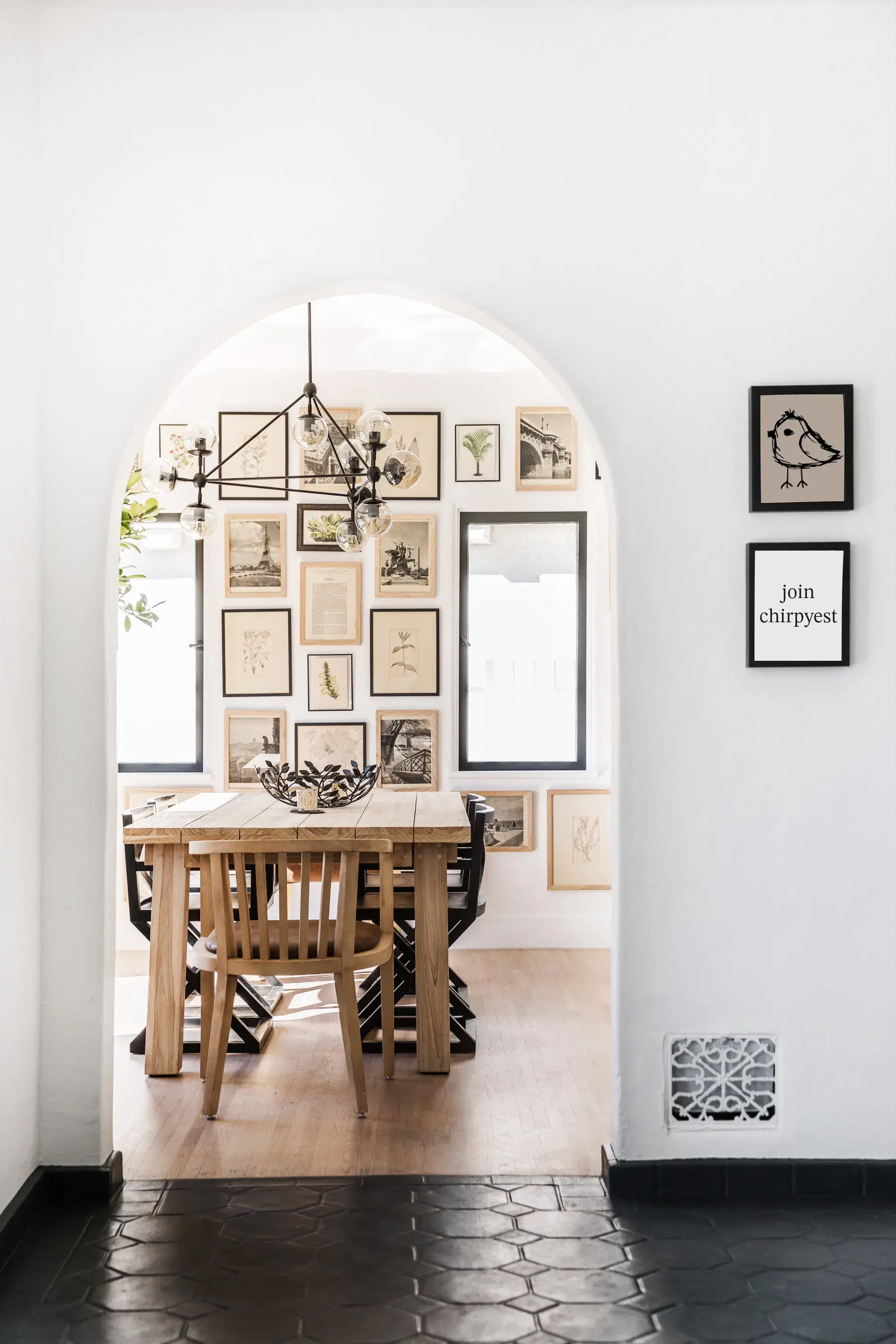
A graceful arch leads to the stately dining room in a tastefully designed home in the Pacific Palisades. (above)
Long story short…I feel very lucky. Okay…I take that back. Long story short…I feel very lucky right this minute about this post. Can’t make big statements about feeling lucky as my daily life seems filled with unexpected twists and turns that definitely cannot be equated with luck. An example of lack of luck: Last week I got home after a long week at my real job and literally thought to myself as I was walking up to my house, “Well at least everything at the house is okay.”; no less than 1/2 hour later, my neighbor is screaming my name and yelling “Coco there is water pouring down your hillside…water is gushing down from your house! Coco! Coco! Where are you?”; turns out my water main had just decided to break; yup…that’s my kind of luck.
Anyhoooo…back to why I feel lucky about this post. Out of the blue and by luck, I got an email from nice Megan the other day…she works for Hunter-Barnes, a fantastic interior design outfit based here in Los Angeles owned by talented designers Adam Hunter and Spencer Barnes.
Okay…here goes the part where I end up making the long story long as opposed to what I had promised about making a long story short.
So, I had met Adam and Spencer of Hunter-Barnes awhile back (again not sure if that was yesterday, last year or five years ago…see yesterday’s post about my inability to track time as of late) at a party for a friend of mine. They were very charming. We exchanged information and I said I would feature them on COCOCOZY. Well then life got in the way and months and years passed and no COCOCOZY post. I’m sure Adam and Spencer were thinking that I was a sham but I just forgot, I mean I just never got around to it, I had put it to the side and it was on my to do list, I mean I had a million things to do and the dog ate my homework…excuses…excuses…hee hee.
So it was lucky for me that on Monday I received a nice email about something or another about Hunter-Barnes which immediately prompted me to return to their website (which is quite nice I must say), which then in turn led me to immediately email nice Megan about this house! And so here we are. There! The shortest long story I’ve ever told (or the longest short story…you pick)!
Soooooooo…this is the stunning 11,000 square foot house that Spencer Barnes and Adam Hunter designed for a client who lives in the Pacific Palisades (a posh enclave in the Los Angeles area). It has 5 bedrooms, 7 baths, a media room, a state of the art gym, infinity pool and much more! A lovely beach chic house inspired by a famous movie and a swank hotel.
Hunter-Barnes tells me that their client loves the Hamptons home featured in the movie “Something’s Gotta Give” (that movie with Diane Keaton and Jack what’s his name and something to do about them in the Hamptons and this gorgeous house where she is writing stuff and they fall in love or something…but I don’t remember). Spencer and Adam’s design challenge was bringing the Hamptons feel to Southern California. So Hunter-Barnes decided to find new inspiration right here on this coast in the posh Santa Monica hotel, Shutters. They call the style they created for this home “Shutters Chic”! Love it!
After telling the longest short story ever…I think I will let the gorgeous pictures tell the rest…by luck, I bring you an elegant beach chic home with wonderful designer touches!
A glass front door illuminates the foyer and welcomes visitors into this home. (above)
Unconventional dark textured Holly Hunt walls, a soft blue sofa from Nancy Corzine, oyster herringbone linen drapes, a custom settee covered in Bennison Belgian Linen “Songbird” make for a dashing living room…Adam and Spencer’s favorite room. (above)
Pale blue/grey walls, bright white wainscoting an arrangement of framed coral, coffered ceilings, a large dark wood round table, beautiful dining chairs upholstered in a light blue fabric, a gleaming metal chandelier make for a serenely luxurious dining room. (above)
A red bamboo chair and built-in banquette seating give us a tease as to what the kitchen looks like. Hunter-Barnes promises more kitchen photos will come soon! Can’t wait! (above)
Dark wood walls and a chocolate brown and white houndstooth rug set just the right tone in the home’s library. (above)
The bar! A perfect place to serve up a champagne cocktail! (above)
A row of built-in bookshelves and cabinets lines the walls of the second floor landing…stylish form and great function at its best. (above)
The owner has three sons…one of which it seems is lucky enough to have this very dapper boys room.(above)
I’m ready to move in! I always judge a house by whether or not I would live there. I would live in this house in a minute. In a second. I could make myself quite comfortable indeed!
A huge thank you Adam and Spencer of Hunter-Barnes for designing such an amazing home and for allowing me to share it with my readers! (Oh and thank you Megan H. for sending photos!)
Readers…what do you think of this Pacific Palisades home? Would love to hear your take on it! Please comment below.
Happy Wednesday all!
xo
Coco
Photos courtesy Hunter-Barnes





That is a beautiful home!
Absolutely stunning. When can I move in?
Love the living room! The dark textured walls really made everything else in the room pop. Gorgeous!
It’s absolutely beautiful but would sure hate to dust 11,000 square feet!
It’s one of the most beautiful houses I’ve ever seen…
Unfortuanatelly we don’t have such elegant houses here in Greece..May I move to USA?
Elegant, peaceful and cool!!
Absolutely incredible!! Love, Love, Love
loved it..thanks so much for posting the pictures for us all to enjoy!
This is the most beautiful home I have ever seen!! Thank you so much for sharing. Feels like Hunter-Barnes crawled inside my head when they designed this space.
Oh, that home is so beautiful. Love the arch. Love the window in the stairwell. Such grace, such elegance…I am just speechless. I’d love to live there.
Wow.
lovely. arch, porthole window, bamboo chairs, and sea shell…i am drooling.
Stunning, stunning home.
X
V
Okay this home is absolutely perfection to me. The light and airy colors with the pops of black and white is just what I love. The architecture just everything about it and the location is not too bad either, Omg!!! Love this house, Kathysue
After reading that the design was inspired by both a hotel and movie, the movie that came immediately to mind was Somethings Gotta Give. Which is my design inspiration too. Everything from the color to choice of materials is quintessential Hamptons chic. Thank you for showing us such inspired work.
WOW!!!Love the clean lines, the settings, the decoration,the color scheme of each room, the images so great!!! all photos are absolutely STUNNING!!!Gosh, so chic and luxe!very delightful post.thanks, so inspiring!
Great interior design of this house, so luxurious and classy. The combination of furniture styles is also a good fit. I also adore the built-in bookshelves on the second floor’s wall.
I find it especially amusing that the “library” is void of books and instead is centered on a giant TV. Even the “bookshelves” barely hold more than a handful of books! As a current househunter, although nowhere near at this level, my biggest frustration is finding a house with bookshelves or even a huge wall where I can build shelves! And, of course, I have to figure out how to make my rugs, books & furniture fit, instead of starting from scratch, as these folks appear to have done.
That said, I would give my eyeteeth for this house and I would probably add some more of those lovely bookshelves!
I love this house, it’s gorgeous. And I don’t just mean the interior design elements. Any chance you could get your hands on the floorplans and e-mail them to me?
[email protected]
I love this house! Do you know the name of the blue grey paint on the dining room walls? I would love to find out because that is the color I’m looking for!
love it sooo much! what is the blue paint color in the dining room?