I love a decor before and after.
I like the idea of transforming a space…taking something old, re-purposing it and making it into something new. Simple concept and it works for me every time.
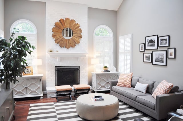
So lucky me that I got an email last week from Christine K. from Virginia interior design firm JWS Interiors. Christine was sharing the pictures of a family room in 5500 square foot Northern Virginia that had been redecorated for a family of 4 and their dog.
When the family wanted a fresh modern update to their old den, they called in interior designer Jennifer Wagner Schmidt from JWS to do the job.
Jennifer immediately said good bye to the mustard yellow paint on the walls and changed it out for a neutral gray. The exposed brick fireplace had also been painted yellow but in the redo the fireplace is put into relief by being painted a bright pure white. The old traditional furniture was exchanged out for pieces with cleaner more contemporary lines and a striped rug was added in to ground the space making it a pleasant spot to hang out in.
A picture tells a thousand words…so I’ll let you take a look at today’s BEFORE & AFTER!
| Before (above) |
| After! (above) |
What do you think of this before and after? What change do you think works the most? Please do tell!
I like the new gray color scheme and the transformation to the fireplace the best…a simple coat of paint makes all of the difference.
Happy Tuesday!
xo
Coco






I agree,it just goes to show you that a simple coat of paint can easily update a place on a tight budget! Great job!
http://www.dawnajonesdesign.com/
This living room looks AMAZING! I LOVE the fireplace painted white and the wood slat mirror really warms up all the different shades of gray used though the space. Great job, thanks for sharing!
abodelove.com
Toning down the color on the walls was a great design decision. It’s a very clean and concise space, love the sunburst mirror 🙂
http://kristinpeakeinteriors.blogspot.com/
wow – what a difference!!
Like you I love a before and after and what a great one you have shared here. Such a satisfying transformation…loving the work!
a stunning transformation!
michele
Nothing says more than that change of paint! The gray walls and white fireplace and trim…Magic
What makes the room over the top
THE MIRROR
The new color(s) really modernizes the space, as does the graphic rug and mirror. Huge transformation!
The furniture layout is not successful. It is all pushed up against the walls, save for the round ottoman. Club chairs need to be floating in front of (what I imagine is) the TV credenza. It appears that there were club chairs in the old space; too bad those weren’t reupholstered in an interesting print.
The after looks so much better. The gray tones are soothing and warm, love it!
http://www.donnaviningblog.com
Thanks so much to many of you for your comments! I’ll have many more photos of the design, which include the chairs I used up on my blog tomorrow! 🙂
Jennifer Wagner Schmidt
http://www.jws-interiors.com
Affordable Luxury blog
Love the transformation! Source on the rug?
so awesome. we are totally renovating a 1920s home right now and I would love some input.
[email protected]
hugs, Vanessa
stunning~~~!!!!! love this. love it all – the paint, the rug, the furniture. great job Jennifer.
Mindy
The rug is from Wisteria
Thanks, Jennifer/JWS Interiors
luv luv! So bright and fresh – my favorite type of style. The mirror above the mantle adds such warmth and interest. Great Job!
Can you tell me the paint color? Thank you! Love the room!
Can you tell me paint color? Thank you
Hello, what shade of paint did you use for the walls ?