All photos in this post courtesy of Jennifer Jones of Niche Interiors
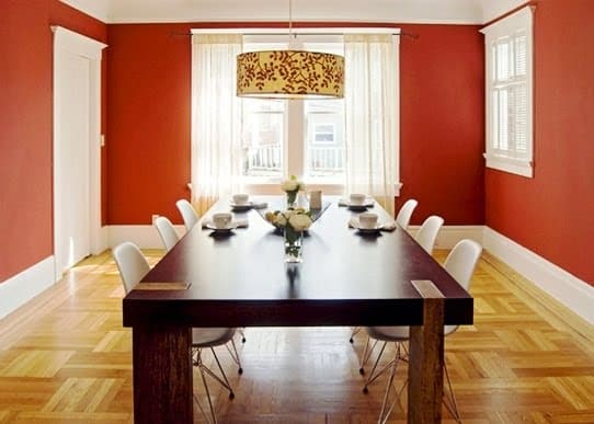
A dining room gets a makeover with walls painted red, an 8 foot long modern wood table, a hand painted drum chandelier and plastic/metal chairs – making it a friendly place for a growing family. (above)
Jennifer Jones, the principal designer at Niche Interiors, a San Francisco based interior design firm, sent me these before and after photos last week. I liked the pictures and immediately said I would post. Three different rooms…in three different bay area homes…all get back to basics makeovers that work.
I like the fact that the makeover solutions to these rooms are very basic. The design rule here seems to have been…keep things simple and clean and the room will look better. No fancy interior decorating bells and whistles with these makeovers…just the basics: fresh paint, simple furniture, good coordination and tah dah! Probably relatively economical too.
These rooms show that with a new coat of paint in a monochromatic color palette, well edited furniture with very clean lines, easy ceiling or floor lighting and good space planning, a cluttered disorganized lifeless space can be turned into a good looking room.
ROOM #1 – BLAND & BLAH BECOMES VERY VIBRANT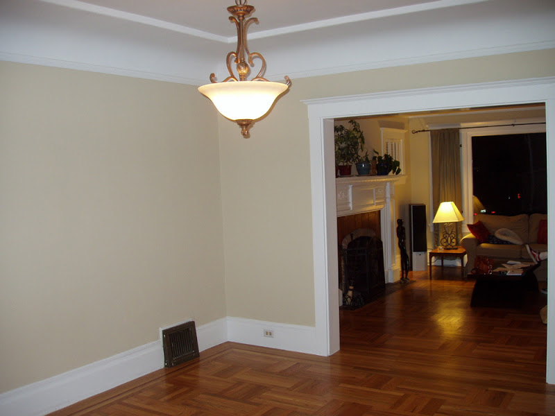
Before – An outdated ceiling light and blah wall color made this empty dining room space seem hopeless. (above)
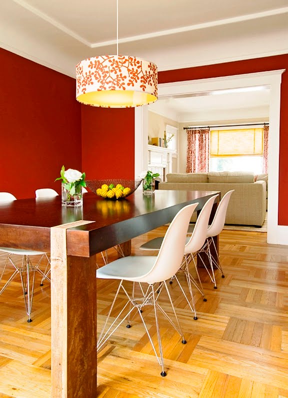
After – Warm red paint and a grand modern farmhouse style dining table make a big impact in a formerly blah space.(above)
ROOM #2 – OUTDATED TURNS MODERN
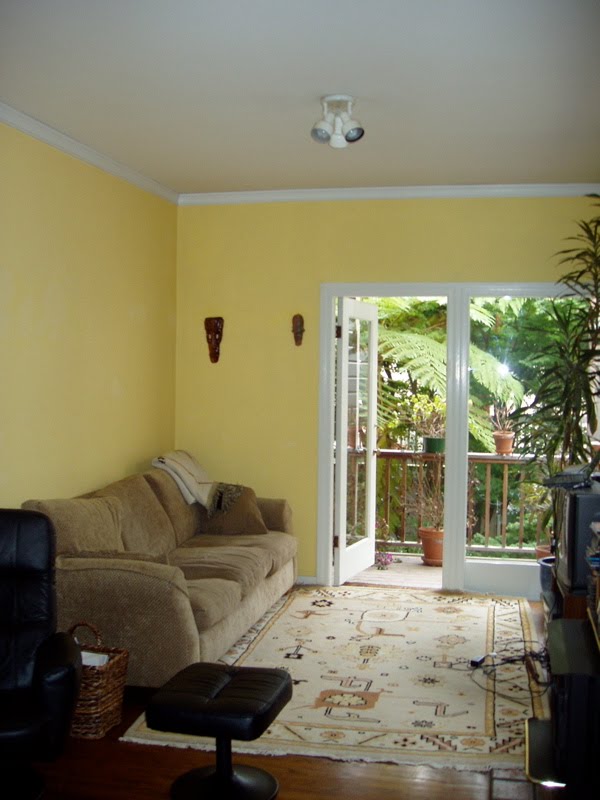
Before – Yikes! The living room in this city apartment is all wrong with yellow walls, an Aztec looking rug and a tan 1980’s style sofa. (above)
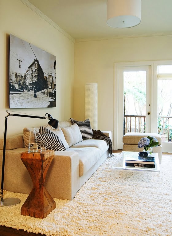
After – A neutral color palette, an architectural column, low modern furniture and a great shag rug make the new living room in this bachelor pad feel larger, brighter and far more stylish. (above)
ROOM #3 – MISHMOSH TRANSFORMED INTO REFRESHING RETREAT
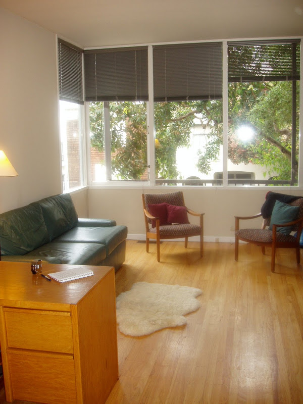
Before – This living room was without an identity with its tiny flokati rug, outdated green leather sofa, dark blinds, midcentury modern chairs and what looks like a teacher’s desk taken right from a classroom.(above)
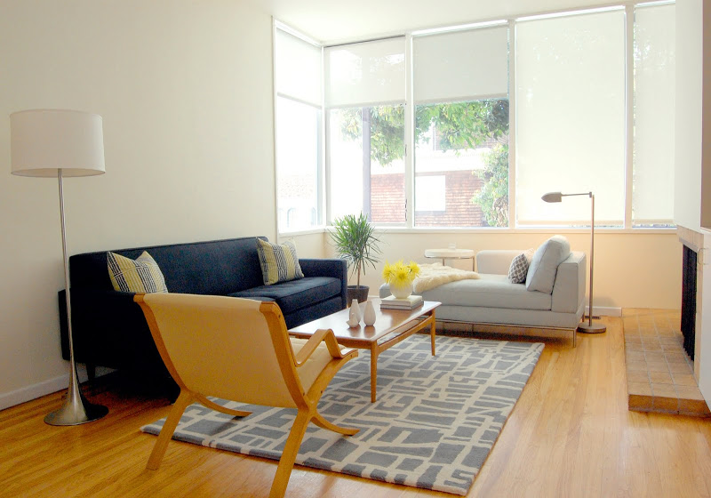
After – Ahhhh. The room now has white window shades and color palette of blues, matching wood tones and white. Simple!
Thank you Jennifer for sending along these photos.
Readers, what do you think?
xo
Coco







Love it! The bachelor pad was my favorite transformation, I really appreciate a man who has a nicely furnished home!
These are all good, really good!
I agree completely with your point that the right basic elements are sometimes all a room really needs…especially when chosen well! Great post.
Love the Blah & Bland transformation! Great post! Come by and check my blog out:
http://kitchendetailsanddesign.com/
I love the red dining room with the orange light fixture. I would never think to put those together. Great makeovers!
awesome inspiration, thank you!!
I love before and afters! These are great!
These are pretty dramatic transformations!
Another one who loves the before and after shots – very inspirational! Can we have more please?
What is the “warm red” used in the dining room?
Can anyone tell me who made the chair in the photo? Thanks!