 |
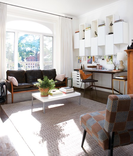
| Neutral casual den (above) |
Which version of this den do you like best. Same room…two totally different looks.
The version of this room above is very neutral – white drapes, an off white solid rug, a leather mid century modern leather sofa and modern built ins and desk against the wall.
Below, the room’s decor is punched up quite a bit with bold striped drapes, a vibrant blue rug, shiny brass accessories and more.
Which version of this room do you like best?
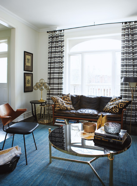 |
| Bold den with an attitude (above) |
Neutral/chic vs. Bold/attitude…which do you prefer?
Can you guess which version of this den is the later version? The do over so to speak?
Happy Thursday!
xo
Coco
P.S. COCOCOZY Pillow Giveaway – Head over to Interior Collective to read my guest post and find out how you can enter to possibly win a COCOCOZY Pillow!
Photos: House & Home





I like the second one better. I LOVE that lamp, and dislike the desk in the room. I love the dark mats in the frames too.
I love the second – the drapes and the big pillows on the couch are gorgeous. It’s hard to believe it is the same couch!
I have registrated for the pillow give a way on The Interior Collective blog, love all of your pillows and need one for my office! Thank you!
Annette F. Lewis
definitely like the second look better. Love the blue rug
Great news Annette! Fingers crossed!
xo
Coco
I’m not so sure. I would have dismantled the desk in the first photo and kept the rug and that great chair in the foreground. I think the coffee table is too large in the second photo.
I think I’m the only one who prefers the first one! It’s bright and airier.
I’d be as happy as a clam in the ocean with either one of them but if I had to choose, I’d pick the first one.
I like the first one best too!
xo
Coco
I love the first look more! The neutral chic 🙂 But I think the do over room/later version is the blue rug one.
Agree!
No AG,(and Colleen) I’m with you on the first one. My eye doesn’t know where to settle initially on the second. I am guessing that the first is the redo, though it is only my guess.
You are right about which room is the do over!
Coco
the 2nd one is more polished and has more oomph! I’d definitely prefer the 2nd one although I know the first one is what I would have ended up with if the did the room on my own!
Either would suit me just fine! 🙂
The first room is very elegant and simple but the second room has so much interest to it, the eye doesn’t know where to settle and that’s what makes this room more intriguing and vibrant. Love!
Hmm, I’ll guess that the first photo is the do-over. It’s got some of the charm from the other photo, but more toned down. The second photo looks much more masculine. While there are some interesting elements, they seem to be overdone when all piled in together. I do love the blue rug in #2 though. Would look great in my living room. My room is pretty much black and white but I’ve been trying to incorporate some blue to bring in some extra oomph.