Photos in this post by Coco of Cococozy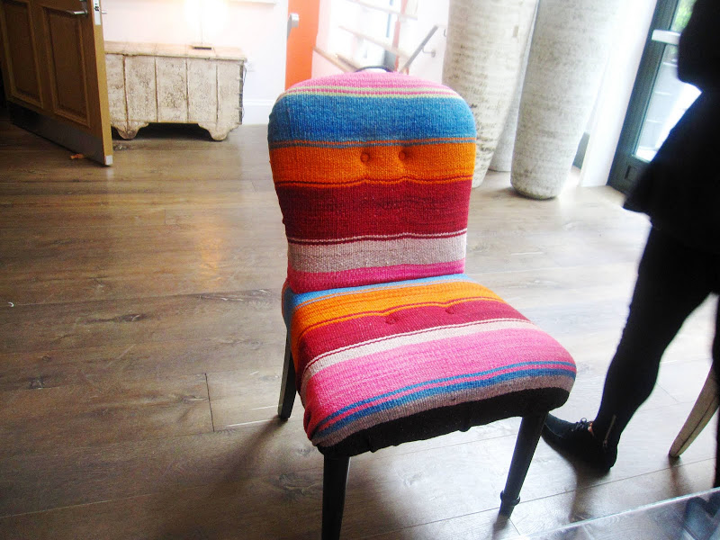
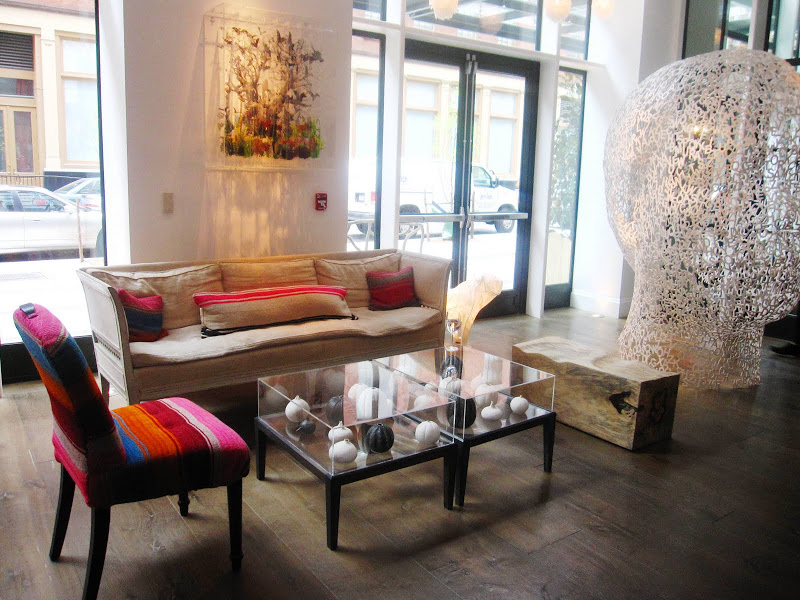
A curved back side chair with spindle legs is upholstered with Mexican blanket like fabric. (above)
When in NY last weekend, AM took me through the Kit Kemp owned and designed Crosby Street Hotel so I could see the decor. Loved it…but really liked this chair.
In the middle of a very modern sleek white lobby filled with loads of contemporary art sits this colorful striped chair. It pops against the impressive paned wall of windows and the neutral backdrop. Upon closer inspection, I realized how genius this chair actually is. In a room filled with high, art modern and classic furniture, this chair has a twist to it that the others do not.
A traditional chair upholstered in the same fabric used to make Mexican blankets or serapes. In a way, a melding of two cultures in one chair. A Mexican blanket thrown on a sofa in this space would not at all make design sense…but as upholstery it totally works!
What a great idea! If you have or find a great piece of heavy fabric with international flair, whether it be a blanket, a throw or rug that you’ve found on your travels or just while shopping, consider really incorporating it into your design by upholstering a piece of furniture with it. Imagine an ottoman, or chair seat cushions or a small love seat in some fantastic fabric from afar….it could make a great design statement.
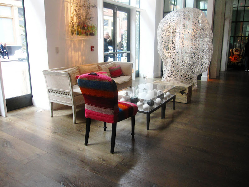
Here are some more pictures of this chair and the fantastic fanciful lobby of the Crosby Street Hotel.
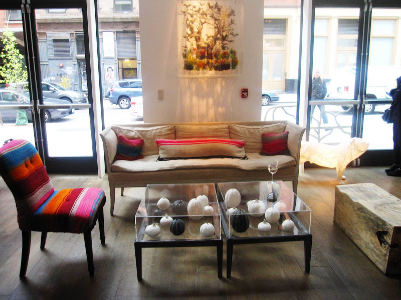
The chair’s decor companions are an eclectic mix of furnishings that include a reclaimed wood block that is used as a bench, two modern acrylic display coffee tables and a white French inspired sofa. (above)
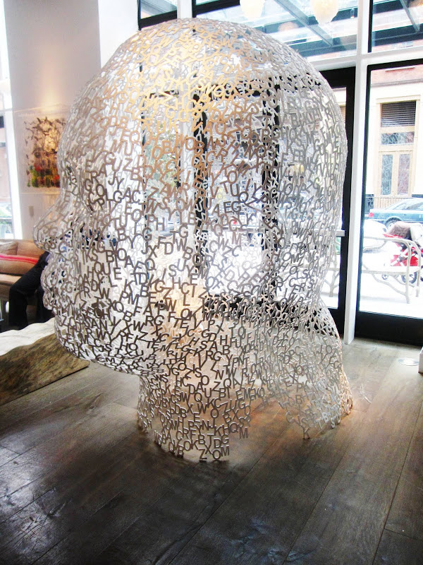
A fantastic large steel sculpture of a head made of cut out letters of the alphabet by artist Jaume Plensa sits right at the front entrance of the hotel! (above)
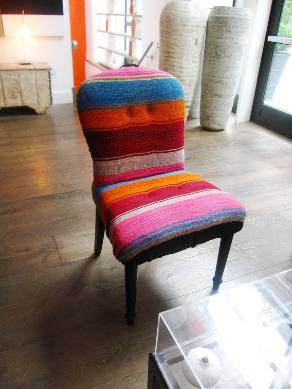
What do you think of this chair?
xo
Coco
Photos in this post by Coco of Cococozy






alone, I don’t love the chair …but amidst the sofa and tables, etc. I think it’s brilliant.
a textile not yet used in such a way…creative and unexpected. it does require the right balance. love it.
its looking like a pretty comfy seat + in that hotel it looks bangin’
I like it….I don’t love it.
That might just be because of the shape of the chair though, hard to tell.
I do really appreciate the fact the buttons were tufted to it. Makes it much better than it would be without.
I like it a lot, for its colours but qlso for the texture, I would feel drawn to sit on this chair.
Also liked it in its context.
Sharon
Looks very cozy and the colors are just so cheerful!
What a nice surprise to see a sculpture of Jaume Plensa on your blog. Just this week-end, I was actually admiring the sculpture he made in Montreal called shadows II (it is also made out of cut out letters of the alphabet but this one is the whole body of a man).
love the chair. bold and risky
a big change from the everyday
i would def have this in my house.
I agree with love megan… by itself i thought, eh. but in the room it looked cool!
love the chair too. it’s a playful vibrant twist amidst a lot of stylish seriousness. Would definitely consider for my house.
It’s an exciting relief from key design patterns. Anthropologie has a wonderful armchair, similar, but with more substance and more subdued colors.
My eyes are on those acrylic tables.
Nice combo of bold & humble-all the elements are interesting together.
I like it, it adds a folksy touch to a modern room!
I love it!
the chair is AWESOME! very cute!
LOOOOOVEIT!love your blog!