
Photo: Douglas Friedman
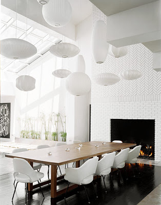
At least 12 Nelson bubble suspension lights in different shapes and sizes make a daring statement as they hang over a modern dining room table with white Saarinen arm chairs and side chairs. (above)
Daring to be different, these five rooms do dinner in a unique way. All push design to the limit to create highly styled spaces that are full of whimsy and visual interest. Would love to attend a dinner party in any of these spaces! Good food, good company and daring decor could make for a rather exciting gathering…don’t you think?
Take a look at these five daring dining rooms!!
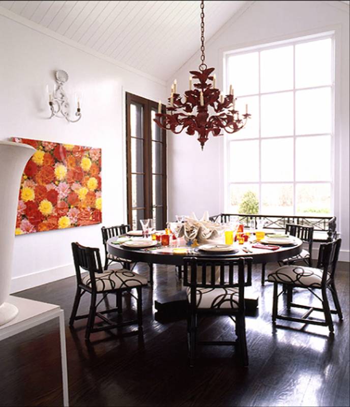
Photo/interior design: John Barman, Inc
A bold and colorful floral painting sets a playful mood in this dining room with its iron tole red chandelier, large a round dining table and chairs upholstered in a black and white print. (above)
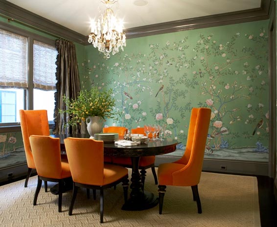
Photo courtesy of Massucco Warner Miller
Green wallpaper and orange upholstered chairs make a traditional formal dining room with a daring design.(above)
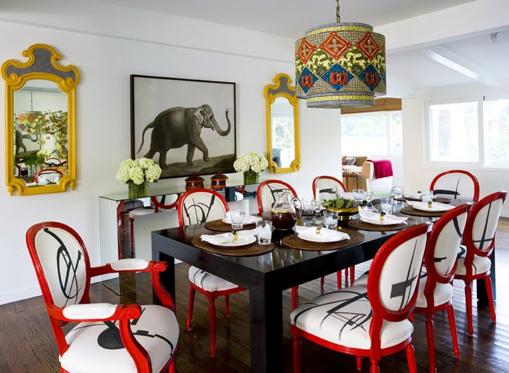
Photo courtesy of M. Design Interiors Inc.
A mix of styles daringly are melded together in this very eclectic Los Angeles area dining room.(above)
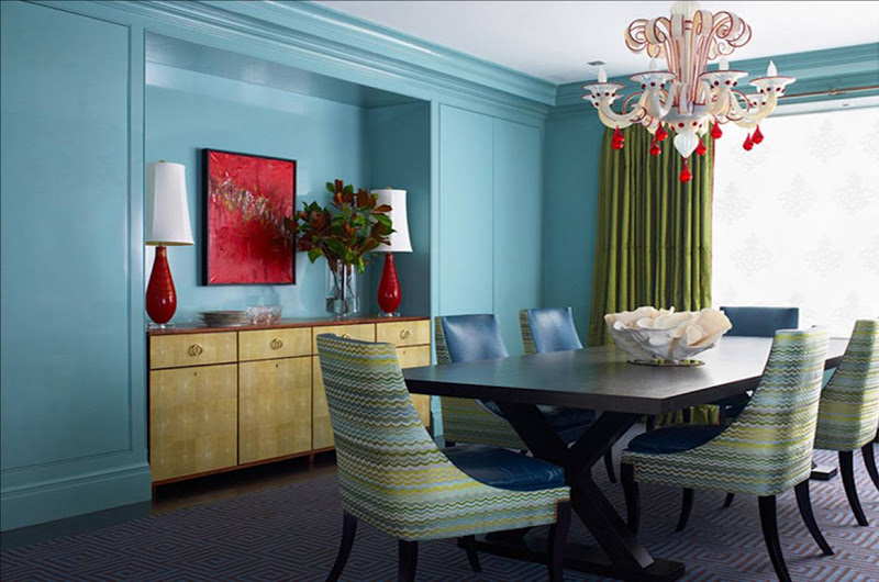
Photo courtesy of Katie Ridder
Blue room with lots of other colors too! Aqua blue walls, a fanciful white and red glass chandelier, green curtains, purple rug and multicolored dining chairs upholstered in a Missoni like fabric proudly blend together in a bold and stylish modern dining room.(above)
Do any of these dining rooms work for you? If so, which one? (I, of course, love the white one with all of the Nelson lamps…I just bought a bunch of lanterns for my patio this weekend and this reminds me of something you might see outdoors.)
Happy Tuesday!
xo
Coco
P.S. On a side note, please go to the Cococozy Facebook page to see how reader Arturo transformed his Austin home’s foyer to look exactly like a scene he saw in a 2006 movie. If you are not a member, press the “Like” button so you can leave a comment there on Arturo’s movie inspired foyer!




The Masucco Warner Miller is my favorite, mostly because that fab gracie wallpaper makes me weak in the knees! One day!
I Loooooove the orange chairs.
I love number 3 and 4… I posted about that wallpaper a few days ago. Its MAG.
http://sketch42blog.com/2010/04/one-wallpaper-two-ways/
I love the top photo, I have had that magazine photo taped to my wall for a year and now finally have a dining room similar to this
(still need to get the Nelson pendants) thanks for sharing
I love Katie Ridder’s blue dining room with the pops of red!
Although all are beautiful, I am always partial to round tables. Makes even large groups feel more intimate. Plus I love the chairs around that round table!
I’m loving number 1 – all those different pendants along with the tiles all in different directions makes it a lot of fun on the eyes!
your blog is great!
i’m your newest follower!!! keep it up xo
the orange set of dinning chair is more elegant and graceful
They’re all so unique. However the first one had my jaw dropping as in drop dead gorgeous!!!
Susan
i can’t even pick a favoirte, i love them all…but i guess if i had to pick it would be no. 1. the tilework on the fireplace and the long planter to the left of the table pushes this space over the top! thanks for the great images!
Yay! I want a ceiling covered in bubble lamps!!!!!
wow..its really beautiful..
I really enjoyed this article. The photos were mind-blowing. I liked how you perfectly described the situation for all dining rooms. All rooms were out of this world, creating a unique fairytale and story in each. My favorite would have to be the ‘electric Los Angeles area’ dining room. All dining rooms had great use of colors. At the same time, the designers didn’t spoil the room with too much, nor was it too less. Thanks for sharing this wonderful blog.
Where did you get the chairs? the missoni style fabric?