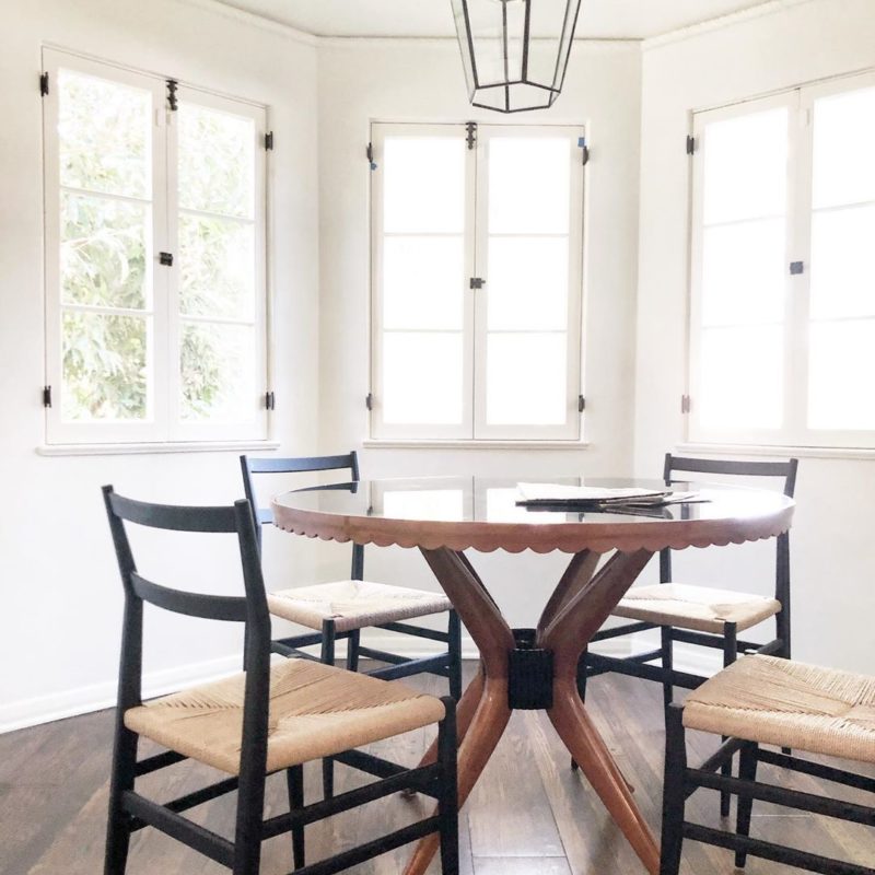
 Breakfast nook in Alison Blumenfeld Deutch’s home
Am so thrilled today to bring you a guest post from the very chic Los Angeles interior designer Alison Blumenfeld.
Alison has a wonderful effortless style – a fresh and easy manner in design that exudes good taste. I’ve been to her home…it is quite perfectly decorated with a mix of important antiques, sleek mid century modern pieces and lots of contemporary touches too. Her home has just the right balance between old and new, classic and modern. Alison manages to celebrate venerable old pieces like a gorgeous crystal chandelier from her grandmother, while honoring the sleek lines of mid century modern style with for example two facing Barcelona benches in her living room. I love Alison’s taste and aesthetic!
Hence, without further chatter from me…I am thrilled today to bring you this guest post from interior designer Alison Blumenfeld!
BEGIN GUEST POST by ALISON BLUMENFELD…
To “Un-Decorate”Lately I am hearing the same thing from clients, they all want houses that don’t feel “decorated”. This does not mean they don’t want to use a decorator, or that they don’t want to decorate their homes, it’s that they are striving for a new aesthetic. One that feels less mass produced, more personal. Perhaps it’s a reaction to the pillow littered, tassel trimmed, overstuffed houses they grew up in, or since we as a society are more casual they are striving for an environment to mirror that, perhaps it’s nothing more than wanting to define themselves in a new way. With social networks and magazines encouraging us to define ourselves through our acquisitions, associations, and interests it makes sense that the home is responding in kind.
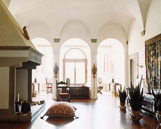
Photo: W Magazine
In the hills outside Florence, fashion royal Laudomia Pucci is bringing her own brand of modern, kicked-back glamour to her family’s 14th-century country estate. (above)
Tips for “Un-Decorating”:1. I often tell clients buy what you love, it’s the culmination of these items NOT any one item itself that will make your space your own.
2. Color is a great way to unite disparate items.
3. High and low, the same concept as wearing vintage, H&M, and designer together works well in a home. Mix inexpensive items with expensive ones.
4. Don’t buy too much from any one showroom, store, or period.
5. Take your time. As a designer I love the idea of creating a turn key space, but so often when you do everything at once it winds up being very one dimensional. The best way to create eclectic interiors is to collect over time.
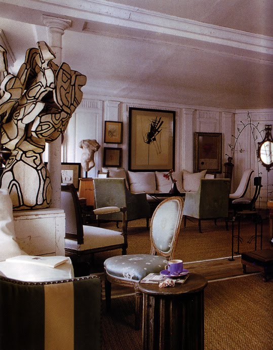
An apartment in the Marais in Paris designed by Frederic Mechiche in the
book Parisian Interiors (above)
I have always loved strange, interesting, personal rooms. Often these rooms are purely aesthetic, and would not say work well for the needs of a family. But these rooms can inspire us to think about a room in a new way. Here are some images that have been exciting me lately, a few rely entirely on the architecture for impact, for others its the unlikely pairings, but whatever the recipe these spaces feel personal, more collected than decorated.
Enjoy…
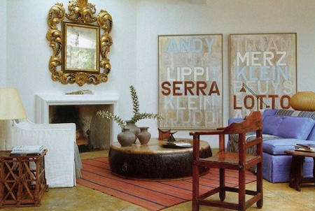
The home of Los Angeles designer Richard Shapiro (above)
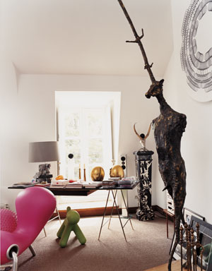
Photo: W Magazine
French antiques dealer Yves Gastou has decorated his Paris apartment and Biarritz home with no heed for the rules of interior design (above and below)
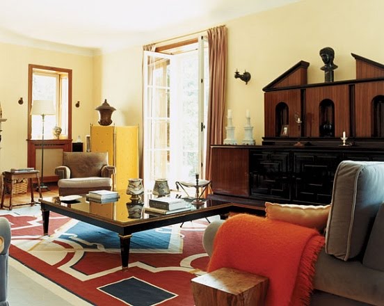
Photo: W Magazine
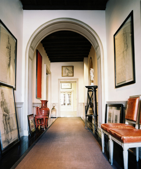
Photo: Lonny Magazine
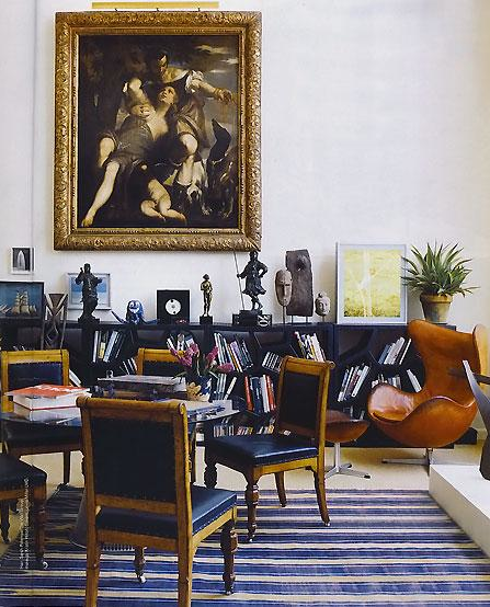
***
THANK YOU Alison Blumenfeld for this amazing guest post, these great photos and the helpful tips! I love the concept of the “un-decorate”…I’ll use these tips in my own home!
COCOCOZY readers, hope you enjoyed this guest post as much as I did! How might you do a little “un-decorating” in your home? Do tell!
Happy Friday! (Am running late as usual…maybe I should start posting at night again instead of early morning…then maybe I would be a little less rushed to work!!!!)
xo
Coco
P.S. Please remember to follow me on COCOCOZY TWITTER too! Check out my latest tweets regarding a unique party I am going to attend this Sunday! Follow along please on twitter! Tell me what you would wear to the party!





very ancient design… i like it.. 🙂
When you have a home with good bones (boiserie, beams, french doors, arches, marble fireplaces, dentil moldings, etc.), it doesn’t take much effort to create a beautiful, “undecorated” space. In fact, you could probably decorate with packing crates and it would look good. The real challenge is to take a featureless square or rectangular room with a low ceiling, oddly placed doors and windows and no architectural interest whatsoever and turn it into something beautiful. That said, these are lovely rooms and her advice is good.
That ‘undecorated room’ with the fireplace makes me want to go rip all my pictures off the wall and sweep all the do-dads off my furniture. Fabulous look, Alison!
I am with Denise. Good bones can handle a load of mess. She does give good advice. My favorite is to buy what you love. I’ve done my house slowly over 27 years, and I am completely happy with it. The things I love tend to work well together. Also, mix High and Low.. You’ve got to. I have my children’s camp ceramics tucked around the house. They make me smile.
Best,
Liz
Great Post Alison+happy weekend coco & Alison.xx peggybraswelldesign.com
Such great tips to be mindful of for everyone to go forward with,
the young and old alike! Thanks!!!
Yep! big box rooms are hard. it’s a challenge of visualization. Living in San Francisco a good majority of people live in victorians, they are beautiful, interesting, dirty, and I love it!
Coco, your blog is great, I look forward to it. I scan the pages with thirst and a little envy. Keep up the great work.
What I found most interesting and provocative in these photos is the way the art collections, sculptures, paintings and objects are presented.
They are all very attractive rooms. It should be noted that the architecture is pretty swell, too, and the furnishings do not enforce an unsympathetic departure.
Great advice….xv
I thoroughly enjoy your “work” COCO, mindful, perplexing and many tempting rooms to view.
I will say the only room “with a view” that felt immediately cliche is the Richard Shapiro room. 1st grade, no real since of design, I’m all for mixing up “periods” but his touch is null and void.
thanks for the platform,
hollyart
FANTASTIC post! I throughout enjoyed reading it. I love the rule on not buying multiple items from one showroom – reminds me of IKEA shopping habits.
Great advice – but also agree with Denise and Liz (almost always agree with Liz) – great architecture solves many decorating problems – it’s when you have to compensate for bad bones that the challenge begins. Buying what you love is key because then it all somehow works together.
I loved this post. Great direction – down with the world of perfectly matched sets and all-at-once decorating 🙂
Thanks for the un-decorated post, I love it. The only way I see interior decoration is by succeeding in getting the un-decorated look and creating great harmony, like life decorating is always a question of feeling and balance.
Have a good week COCO
decogirlmontreal
what’s with all the chairs? to fancy-shmancy for me 🙂
Beautiful use of art throughout the home, but I especially love the home of Yves Gastou. Perfect!
This is so interesting and so useful. I love all the tips. I needed hear some of them!
xo
Luciane at HomeBunch.com
My cousin recommended this blog and she was totally right keep up the fantastic work!