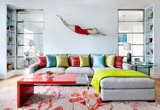
| Wooden sign with a swimmer from a 1930’s motel hangs on a Benjamin Moore Sea Foam painted wall in a modern NYC apartment. (above) |
I saw this apartment featured on the New York Times website. A city apartment with ocean front theme. Lots of vintage kitsch beach inspired pieces placed here and there. The seaside decor is not overwhelming…just subtle reminders throughout the house. The interior design theme is emphasized by the blues and the sea foam paint on the walls in this urban apartment.
Take a look.
| A concrete sailor was probably made in the early 20th century as a garden ornament. (above) |
| A wooden tray of glass fisherman floats sits on the window sill above the breakfast nook banquette in the small kitchen. (above) |
What do you think of this apartment. Do you like the idea of keeping with one theme throughout a home’s decor…or do you prefer an eclectic mix of ideas?
Please do tell.
Happy Tuesday!
xo
Coco
P.S. Running off to an early morning meeting. Late! Help. Gotta run.





I love it! And I think that it is always a good idea to keep it somewhat consistent throughout!
http://www.dawnajonesdesign.com/
I really like how this theme is used – it’s fun, but not too over-the-top, and it’s executed in less predictable ways. It works. But I think a “whole house theme” only does the trick if that’s what the home owner really wants to express – Otherwise it’s just superficial. And I think the best homes are the ones that truly express the owner’s passions.
Love this! Great example. Definitely sharing it with my readers. They are always asking about “beach themes” Thanks!
I’ve always wanted a booth in my kitchen. This is such a whimsical space. I love it!
Coco really fun, very cool! Of course I love the sea!
xoxo
Karena
2012 Artists Series