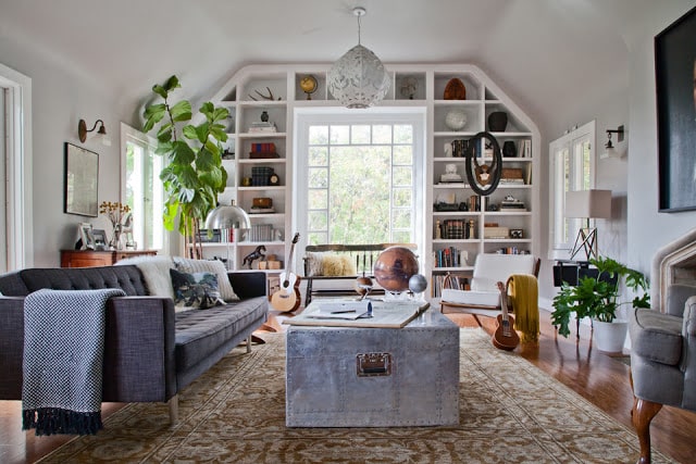
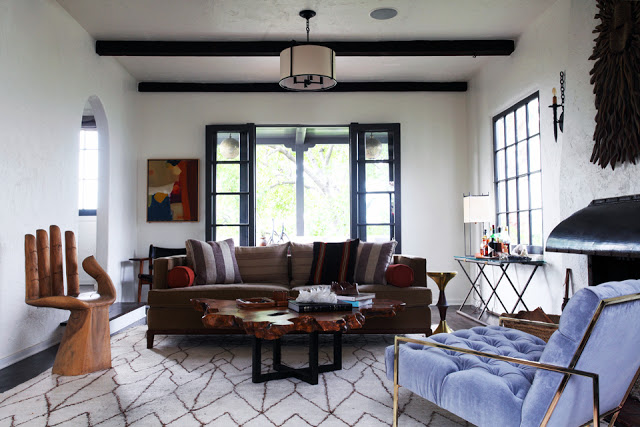
Two living rooms I like…both with an eclectic sort of vibe. What is eclectic you might ask? Well I think I would say it is a melange of sorts…inclusive decorating. In these two homes eclectic seems to be a mix of mid century modern pieces, with some industrial accents and then add in a bit of international flair and there you have it…a unique style.
Pick ONE OR THE OTHER – which living room do you like best and why?
Which of these living rooms do you like best? You have to pick one or the other.
I’m liking the first the best I think…love the built in bookshelves, the tufted sofa and the galvanized metal trunk coffee table. Must say though that brass and lavender velvet tufted arm chair in the second room is quite appealing!
Please weigh in on the comments section and tell me which room you like best!
Happy Thursday!
xo
Coco
P.S. Funny aside story…talked to best of friend AM yesterday. AM and her hubby JE went on an adventure this past weekend. They took their kids to Chuck E. Cheese’s last Sunday in New York City. It was their family’s first visit to the pizza establishment. While surrounded by families, kids and pizza, AM posted about the visit on Facebook. AM wrote: “First time ever to ChuckECheese – yikes!”. She received several Facebook comments on her post but the funniest two read: “I’ve never been. I’m too scared.” and then another friend of hers wrote, “leave immediately”. AM described the experience as surreal but apparently her kids loved it…her little cute daughter who is 3 had a meltdown when they were departing said restaurant! Parenthood!
Photos: Bethany Nauert





Definitely the first one for me. I agree about the tufted sofa and built-in bookshelves, but I also love the light in the first one.
I agree about the brightness in the first room!
xo
Coco
I love the 1st room but am obsessed with the rug in the 2nd room!
Like the huge mixture of pieces which are present in the space! Eclecticism is a style that I really like for its magnificence and experiences! The space is very appearance with a more vivid, love!
http://zepedrorodrigues.blogspot.pt/
I love the first one but this coffee table is shinier and would add more life to the space: https://www.etsy.com/listing/88677303/aviator-storage-chest-coffee-table?
Definitely the second room…it feels more relaxing to me and I can picture myself hanging out in there very comfortably. I also prefer the architecture of the second room and love the black windows and dark accents. I also love the furnishings and that rug is killer. Even the hand chair works as it adds a touch of whimsy/humor to the space, so it doesn’t take itself too seriously.
As for the first room: normally I love built-in bookcases, but the shape of that one is kind of jarring. The space also feels a little cluttered, and the palette is a bit subdued, which I’d normally like, but it feels like it’s missing something. I do love the large window though.
I like the second room. The first room is pretty and looks inviting but there are way too many ‘things’ in it for me. The second room doesn’t have pieces that I 100% love but I could live with it more easily.
love the first one…so many layers…especially the art hung on the bookshelves and the amazing pendant light. But, I think the contrast between the dark wood window frame and beams in the second room really gives a great graphic quality to the room…and the art is amazing. so hard to choose!
My first reaction would be the first one but there is something about that second room that just seems cozier and more inviting…love the unique hand chair, the rug and the brass side chair
the sofa doesn’t look very cozy, but the room as a whole is fantastic.
The first is so appealing to me. The light the bookcases, the coffee table ,
the plants, that lighting!
Xoxo
Karena
Art by Karena
The first one, hands down! Yes, it has a lot more “stuff”, but it’s not clutter, it’s life. I think that’s the main thing that makes it more appealing…the first room looks alive, it shows the personality and history of the homeowners. You feel like you could sit down and have a cup of tea with them. And this is a prime example of what an impact actual plants can have in a space: picture this room without the plants, or with just a vase of cut flowers — it changes completely.
This was a good one!
Leigh @Hudson Smith…home…
Wow, I love both these rooms. I think I would gravitate toward the top one because it has such beautiful light. I feel I could really live there with those comfy throws and built in bookcases. But I do love the second picture with its lavender lounger and funky hand chair.
I like the second room; looks less cluttered to me. I like the beams and the windows.
I like the first room too…..the inbuilt bookshelves, the sofa, coffee table and the fiddle leaf fig all make me gravitate towards it. I love eclectic as often it is the result of collecting wonderful pieces while travelling the world and often it means wonderful stories behind the whole electric look…..rather than my designer thought this piece would look good.