I feel very lucky sometimes…
The other day I got an email from Lisa from Melanie Turner Interiors. Lisa was asking if I was familiar with fabulous interior designer Melanie Turner’s work. Uh yes. I had in fact just days before been stalking Melanie’s website and even pinned a few photos on COCOCOZY Pinterest. I was saving some of them for a post I would do on this up and coming designer. So anyway, Lisa offered me photos of house they worked on in Atlanta.
Before going any further…an aside…(I hear the collective sigh…but bear with me please)…Let me qualify this feeling “lucky” thing. Feeling lucky is very different from being lucky. If you could have seen me at Home Depot last night at 9pm buying supplies in order to try to fix a hole in my wall and dealing with broken sprinklers among other things…you would not say “Oh what a lucky girl”…you’d say, “Poor thing”. So I don’t want any of you to have the misconception that this luck thing follows me around on a daily basis and taps me on the shoulder regularly to say “Hi, I am here, don’t forget to use me if you need me”. Typically I see “Luck” off in the distance and I am screaming at him to come over my way and he ignores. So please allow me in this case to have the feeling of being lucky for this one moment as I know it will soon disappear with the latest non-dilemma dilemma that is life!
Anyhooooo…back to this FANTASTIC home from Atlanta based designer Melanie Turner.
A 4 bedroom, 3.5 bathroom house in the Atlanta area. Melanie and team say they designed this for a wonderful blended family, “It is a story of a modern day Brady Bunch. Two single parents with six teenagers, two dogs, and two cats fell in love, married and moved into a five window and a door traditional fifty year old house.”
Melanie’s goal was to give the family a functioning home and a wonderful retreat. Melanie also wanted the space to feel tranquil. Previously, the home had every room a different color…in order to achieve the design goal, Melanie painted all of the rooms the same color and neutralized the wall colors…this she says created unity and simplified the space.
So without much further chitter chatter from me…please enjoy today’s SEE THIS HOUSE!
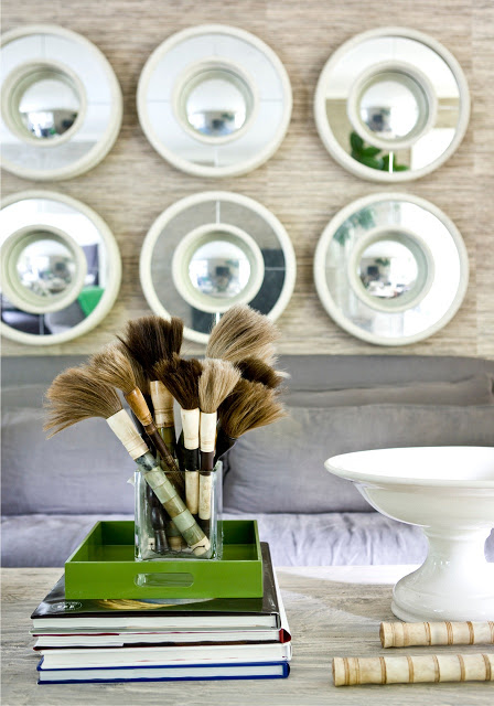 |
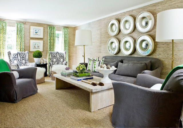
| A coffee table detail with paint brushes and a green tray that picks up the color in the drapery. (above) |
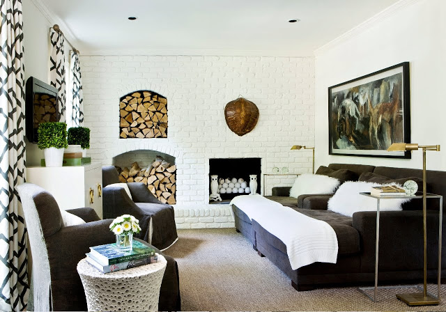 |
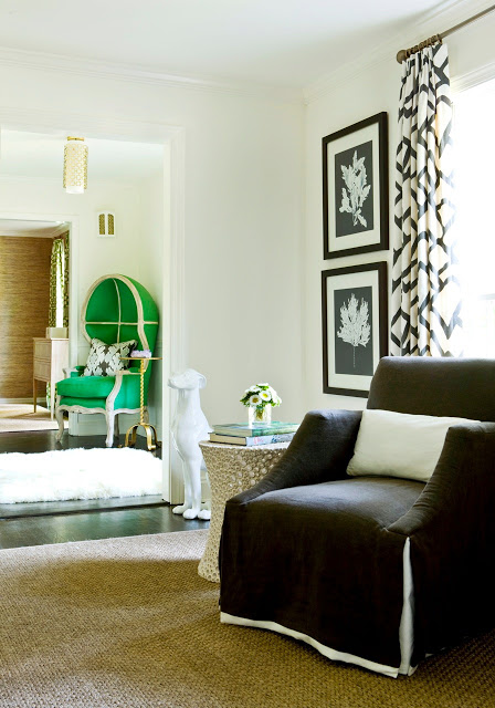
| Love this family room with a seagrass rug, the white painted brick fireplace and the huge oversized lounge love seats…a perfect place to kick back and relax. (above) |
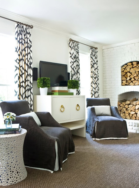 |
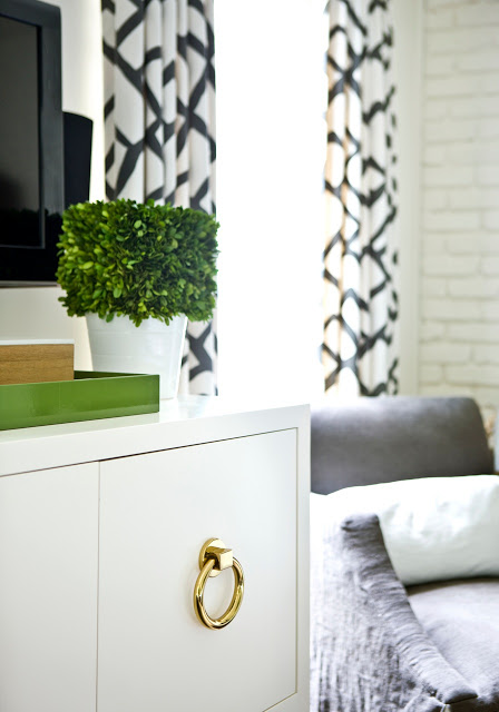
| A white lacquer cabinet with brass pulls serves as a television cabinet…the most stylish media storage I’ve seen! Also love the slouchy two layered slipcovers on the armchairs here. (above and below) |
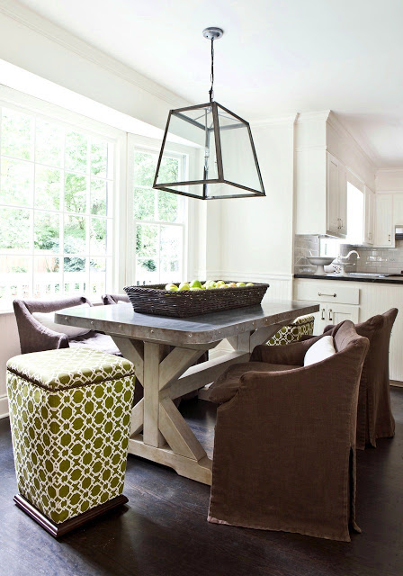 |
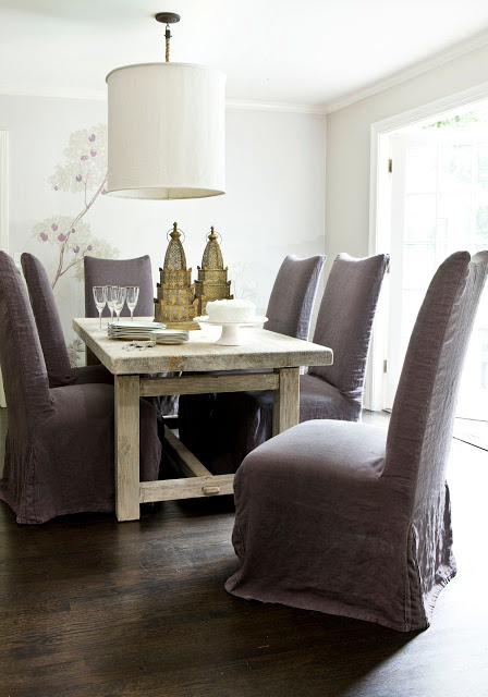
| The perfect breakfast nook right off of the kitchen with a zinc topped trestle table and upholstered low back seating. (above) |
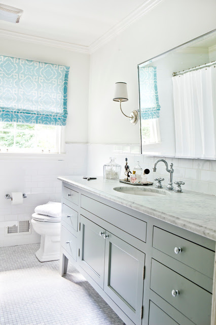 |
| The light blue roman shade on the window in the bathroom works so well with the subtly sink cabinet and the marble on the counters on the floors. (above) |
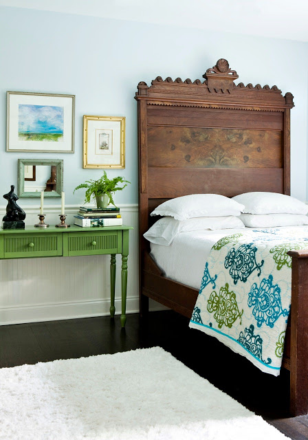 |
| The bedroom with a large wood bed and headboard and lovely green nightstand. (above) |
So dear readers…what do you think of this Atlanta family home? Anything you can see incorporating into your space? What is your favorite room and why? I like the family room the best I think…although I really love it all. Please weigh in.
Thank you Melanie Turner Interiors.
Happy Monday!
xo
Coco
P.S. Was so honored when a few weeks ago Starrett Z. and Arielle T., who are publicity gurus for my design crush and home furnishings maven Jonathan Adler (JA), asked me to contribute to the “I Want” section on the Jonathan Adler site. This is a place where “tastemakers” and friends of JA weigh in on three things they want from Jonathan Adler’s collection. The list of contributors includes celebrities (Iman), designers (Charlotte Moss, Trina Turk, Liz Lange and Todd Oldham) and then blogging big wigs (Grace Bonney of Decor 8 and Joy Cho of Oh Joy) – they have all put their two cents in on what they want from JA (Jonathan Adler)…and then there’s me. (This is not a paid endorsement or anything…it is just people who love JA getting a chance to shout out about what they love…I love to shout and I love JA so this was a perfect fit). If you want to see the things I love and get a little inspiration, click here.
P.P.S. Oh, I forgot…the big dilemma about being part of this JA I Want thing was what photo I would use. I decided to go artsy! Let me know what you think!
| A screen grab of my I Want list on the Jonathan Adler site…and there’s me! (above) |
P.P.P.S. Am off to work! Hope you have a nice day however you are planning to spend it!
P.P.P.P.S. Stay tuned tomorrow for my theory on Pinterest.
P.P.P.P.P.S. There are 18 words in the title of this post…I wonder if this hits a world record of any kind? Will try to be more succinct with post titles as the week moves on.
Photos: Melanie Turner Interiors






This is a beautiful home, I love the sophisticated but comfortable, family feel Melanie created. My favorite room is the bedroom in the last photo — Is there any chance you could find out what color Melanie put on the walls?
Lots of interesting details and the way green keeps showing up … here … in House Beautiful … on Tobi Fairley’s blog … I’d think it’s the color of the year!
It’s pretty and I love the combination of modern and antiques.
Smiles,
Lesli @ BeautifullyCoastal.com
What an incredible space…Total nod to designers who still decorate with classic styles in mind…love all the symmetry and repeating graphic motifs…pattern on pattern could definitely verge on chaotic but the green feels so soothing when it’s the dominant color in these rooms…thanks for sharing, awesome chance to tune into this first look!
xo-Julie
Peace. Love. LOL!
Haute Khuuture.com
WOW-so exciting to see more! I had just pinned the chairs in the living room which is by far my favorite! Also loving the lacquer cabinet with the large brass pulls..who am I kidding, loving all of it!!!
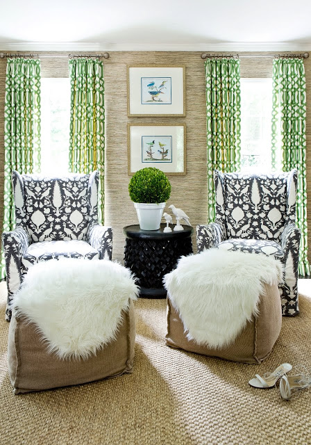
Stunning! I love the pops of green in the interior decorating. It makes the perfect statement, subtle and staying true to the neutral color palette…but a “fresh” spin as well1! Also, those fur throws in the first picture are just fabulous (one-of-a-kind for sure!) Happiest of Mondays.
Toodles,
Twirling Clare
twirlingclare.blogspot.com
Stunning! I love these interiors. The pop of green is so perfect. It definitely adds the perfect statement…blending well with the neutral palatte, but also taking on “fresh spin”. And the fur throws in the first photo are just one-of-a king! Wishing you the happiest of Mondays!!
Toodles,
Twirling Clare
twirlingclare.blogspot.com
It does look pretty cozy! and with splashes of color!
http://www.tatianadoria.blogpsot.com
No doubt it’s a lovely home with many gorgeous & stylish features. However I am not a fan of the printed chairs in front of the green curtains – makes my eyes hurt. I think it would be much more pleasing to see them swap places with the grey arm chairs as both are gorgeous, just not a fan of their current location – love the dining room, bathroom etc oh and I love your work!
Definitely a cheerful space and uplifting. I do agree with Kate and find the clash of the curtains and the chairs too much. I am not a fan of gray and green together. I like gray and blue or gray and coral better. I love the dining room!
I looooove this house!!! It looks incredible. I would love to relax in the living room, too! Beautiful job!
I styled this home for better homes and gardens last year, great family and it was a great feature in BHG. Interesting to see it featured again on your blog.
Beautiful home! Love the pop of green throughout, and those patterned curtains are great! Really like the log space in the white brick wall..really cool.
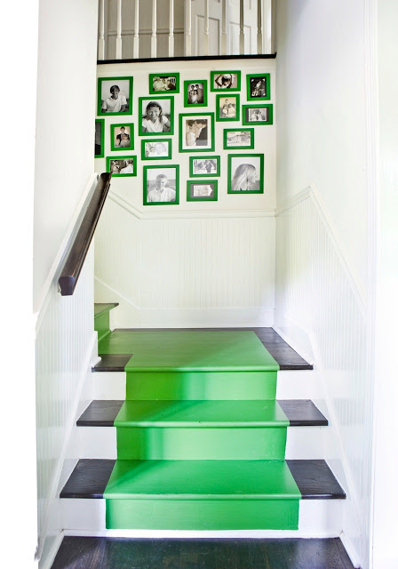
What a fun, bold statement the green stairs make! Beautiful work by Melanie Turner.
Some parts are really nice but the living room feels too overloaded for me with texture, for a room where the celings are not so high,I think a softer feel would have worked better. Other rooms are lovely though.
Love this decor. Texture overload, with the sisals, the crumpled linen, the grasscloth, the sheepskins and burlap…very cool.
Love the pops of kelly green.
Nancy
Powell Brower Home
This is outrageously good! I love, love, love every single inch of it!
Pinning…pinning….pinning…
Love all of it! Have been looking all over for that white lacquer cabinet!!
Where is the bed from? I have been looking for a bed for forever and I love this one.
I see someone else asked where the bed was from, but did not see a reply. Please help! Where was the bed from? Thanks so much!
Hi Diane! Sorry not sure where the bed is from. It is great though!