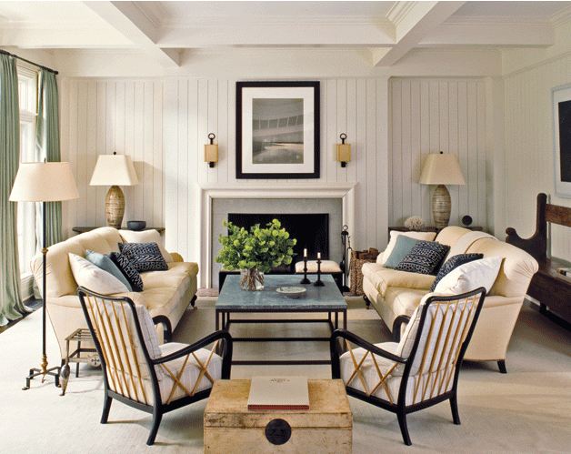
| Room 1 – very symmetrical beach house living room. (above) |
I couldn’t stop staring at this first beach house living room photo above…trying to figure out what I liked about this space. Is it the furniture, the coastal cottage design aesthetic, the color? Then I realized it was simple…the room was so symmetrical that it was easy on the eye. Two facing sofas, two matching arm chairs, two matching lamps on either side of the fireplace, the exact same throw pillows on each sofas…each side of this room is the exact mirror of the other.
Got me to thinking…would this room look better if something was taken away from one side…or is the charm that it is preppy, clean cut, sharp and balanced? Huh…I wonder…
Then I found this second photo below (same color palette/different style)…another beach town living room with the balance shifted here and there…not at all symmetrical…looks like an L shaped sofa, an interesting wood and leather strapped bench, a large over sized square wood coffee table and a floor lamp that is all about asymmetry…I
So my question to you today is…do you prefer clear symmetry in decor or for things to be just a bit off?
| Room 2 – a Venice Beach living room where asymmetry works. (above) |
Which of these two living rooms do you prefer? Which space plan works for you? I’m leaning towards the 2nd room but not sure…there is something I like about total order too. Can’t wait to hear what you think!
Happy Friday!
xo
Coco
Photos: Victoria Hagan; Katie Leede





A bit (or more 🙂 off 😉 The symmetry in the first picture actually bothered me 🙂
asymmetry! i think that’s because symmetry is a general sign of traditional style, where as i prefer modern and unconventional design. love the second image.
This sounds like a total cop out, but I honestly can’t decide. My preference of order vs. disorder is completely dictated by my mood. I love them both. I wish I had two separate living spaces in my house that I could design each way. 🙂
I like both rooms, but I could LIVE in the symetrical one — it is soothing to me, gives me comfort, and just has the right feel — plus I love the neutral colors (and I lean toward traditional 🙂
I too like both designs. Really love the color schemes. But with two children ages 5 and 3 I choose the symmetry….especially when I have the choice of bringing calm in my life!! Haha
Have a wonderful holiday weekend everyone!
AK
I like the second one better. Beach house to me says casual. The top picture is too formal.
Symmetry. I wish it wasn’t that way because I think it takes a more talented and creative person to think “outside the box” of symmetry. Unfortunately, I don’t have the skill.
nattybydesign.blogspot.com
This is so easy for me, the first one is exactly what I am working towards for my family room. I am so much a symmetry gal. I love Phoebe Howard’s designs and she is the queen of symmetry. I use to try and fight it and now I have given into it. If it isn’t orderly and symmetrical it does not feel right for me. Happy weekend,Kathysue
Symmetry for me. Like the artwork in #2 though.
I’m just a symmetrical kind of gal.
I’m a symmetrical kind of gal.
If I had the first one in my home I’d have to mess it up, all that order is just to rigid and uncomfortable for me.
The second one is better although I don’t care for the light fixture.
i love symmetrical designs…i love the first photo…happy weekend!
Hi !
First I thought I would say the room with symmetry, it’s often so with other things. But I must say No 2, it’s more nice and wonderful.
xx
Anci
it is the second room for me..it sure has more character and interest..though the first one may be more harmonious..it can get a little boring to have complete symmetry..thanks for sharing..have a lovely weekend..do visit my blog when you have a moment..xx meenal
Hi Coco
I definetely so prefer asymmetrical. The symmetrical seem unpersonal, and frankly – a bit too easy. Like a bought solution, with not as much persoality and that special je ne sais quoi.
A room with everything symmetrical, might be calm and soothing, but that is NOT what I want, I need my living space to be adapted to me, and the first room comes off – a tad boring. Sorry…
The asymmetrical room, with the more focal points gives my eye something to enjoy and wander about. I REALLY love the lamp.
And as another of our readers added, it has a lot more living space feel, with the casual sofa and inviting books.
I think I could actually go asymmetry. (strange, as I am quite a perfectionist and like everything in balance)
But I think with the windows in first picture on one side I would never get total symmetry, so I belive I could do the room asymmetrical. Hence the L sofa, or chaiselounge.
The second picture is a bit more fun to me. Yes, probably modern…
Then I thought the ¨bedroom¨ must always be symmetrical, is it? … as the bed is usually in the middle, 2 bedside tables, 2 bedside lamps etc etc
Hmmmm…off to take a look at some more pics….
I definitely like the asymmetrical loungeroom.
Symmetry:))
I guess it totally depends on the person(s) living in the space!
I find symmetry to be a bit more formal, and asymmetry, to me, a bit more interesting. A way to combine the two is different textures, and “mirrored” furniture, just not the exact same furniture!
Northern Light
My inclination is to arrange furniture asymmetrically, and them have touches of more symmetrical designs sprinkled in.
That way, the vibe is casual but there’s some structure. Also, it’s cheaper to buy matched sets of lamps, vases, and framed prints than it is to buy two matched upholstered chairs or couches.
I love both your photos, though!
A good sense of balance makes any room instantly likeable. Just like you loved the symmmetrical room but had to take a moment to figure out why…
But perfect symmetry is not always attainable. Not all rooms allow for it because of weird foorplans, small square footage, or off-center windows and fireplaces. Asymmetry is often inevitable.
However, asymmtery as an artistic statement can be interesting, if not jarring to the user of the room. I have been in rooms where the asymmetry – purposeful or not – makes the room feel like it’s about to tip over!
As a designer, I say asymmetry because its a challenge to keep it user-friendly. But as a human being with two eyes, I know symmetry just feels better.
What a fun dialogue – and two very good photgraphic examples. Thanks Coco!
I adore symmetry, and that preference is one of my biggest challenges in my asymmetrical house. The first photo appeals to me so much, but it also makes me feel that I’d have to sit up straight and be well behaved in that room. The second photo shows a space to curl up, relax and be oneself. Perhaps my asymmetrical home has finally influenced me enough that I can say that! 😉
I have a love/hate relationship with symmetry. I love the look of it, and when I have a very traditional client, it’s a great way to go, but I’m usually a little off center most of the time. Asymmetrical arrangements are more casual and usually more interesting. However, if you have great pieces in multiples, it can be quite dramatic….see, I can’t decide!
Oh I’m a advocate for symmetry.
All day!
Rashon aka Mr. Goodwill Hunting
I usually like synergy, but of these two I like the asymmetrical better
Stacy
I think I like asymmetrical decor better, so I’m going with the second room, which I have to say I LOVE!
Symmetry is too boring give me asymmetry any day
I like both and can agree with a lot of the ladies here. With that said I live in an large open floor plan home with two young children and three dogs – I YEARN for symmetry like you yearn for a yard. It’s bad. I also think it’s less chaotic to entertain couples in a symmetry setting. So when I saw the first one I’m all in, but the second is very cozy – and more for my pre-married lifestyle or a second home.
Room 1 Look uninviting. The center table is too high.
Getting seated to the couches looks too challenging.
The room is not symmetrical. There are windows to the left wall and none on the right.
There stands a tall lamp to the left and none to the right.
A church bench rests against the right wall and none exists on the left.
Have you never played one of those sheet games “Which picture is different?”
The symmetrical room is certainly pleasing to the eye, but I think I’d actually prefer to live in the other one. Does that make sense? Maybe not!
Oh man do I ever like the symmetry room better! I can deal with asymmetry on a small scale, but love when everything is EVEN on a larger scale!
I love the second room! I’d prefer that room 🙂
I prefer to have symmetry. That doesn’t have to be a cookie cutter traditional room, it just has to have the right balance and scale which make it feel finished. I think that asymmetry can become symmetrical simply by balancing out whatever you are working with. So I guess balance for me is key. As for your second picture unfortunately we can’t see whats on the other side of that sofa, however from the art, window coverings and that lamp there is some great balance in scale which make the room feel perfect and not in any way out of proportion.
This conversation is fascinating… for me it’s a no brainer: the second photo. my brain even goes “aaaahh” when I look at it! It feels much more warm and welcoming to me not only because of it’s asymmetry but also because of the elements in the room: the wood table, the atmospheric painting and the cozy looking rug. Although I do appreciate the first room, it feels so stoic and stiff like a hotel. And I just spent the long weekend in a hotel and it is so much more difficult to get completely comfortable even in a suite with a living room.
I love hearing what everyone else has to say!
I think that there is a difference between symmetry and duplicating. I see symmetry within the objects themselves; if you find the congruent line on any object, you have found symmetry think about leaves for instance or a face. In a room I prefer asymmetry with a sense of balance and it is doable. There aren’t two objects alike in my place but balance is required in order to make the space functionable.
simple, uncluttered, asymmetrical designs in rooms, a single tall flower in a vase or bunch of white wild flowers vs. roses on one side of a mantle seems to be leading the way here. The minimalists prefer asymmetry. And that is who is buying homes so that is what you’ll be seeing more of.