Hope you had a fabulous July 4th holiday! Now back to design!
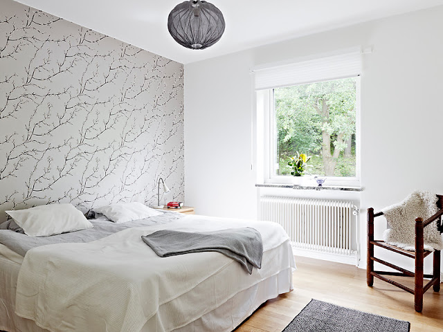
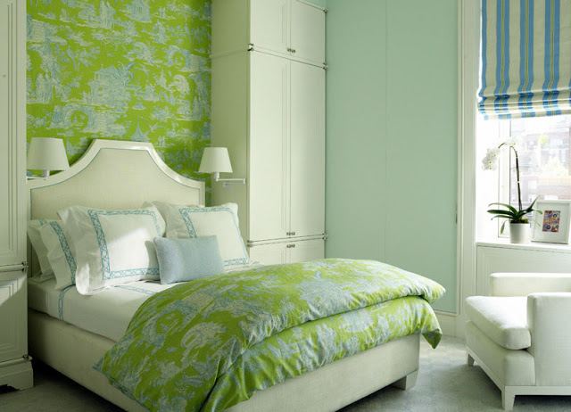
Two bedrooms with a little something in common. Wallpaper.
Wallpaper is used on a feature wall behind the bed in each of the rooms. The styles are very different…one room is modern and sparse with cool gray and white tones…while the other room is more traditional with the use of bright green and turquoise.
Do you like the way wallpaper is used in these sleeping spaces? If so, which one do you prefer? These are the questions in today’s THIS OR THAT!
I’m going to have to go with room #1. You?
Happy Thursday!
xo
Coco
P.S. Check out COCOCOZY Twitter to see where I spent the 4th.
P.P.S. Also, make sure to follow me on Instagram…you can see the vintage brass Stiffel lamps I just had rewired and that I think I will use at COCOCOZY HQ offices.
Photos: Stadshem; David Kleinberg



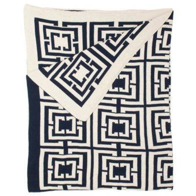



I’m going with room number 2 (although I had a hard time choosing!). I love how the paper is reiterated with the blanket — one of my favorite looks. 🙂
I have to agree with you, #1. It is just simple and clean to me. #2 is to loud for my liking!
(PS, just started following you via IG, thanks!)
LOVE both of these! I’m thinking of papering my living room. I don’t know a single soul who has wallpaper. It’s very rare nowadays! Do you think it’s easier than painting?
Although I liked the tranquility,
#1 looked bare, like someone just moved in. I think a great headboard
would pull the room together.
Both wallpapers are absolutely beautiful! I choose #2. The green is so calming….. But #1 is so winter-y and still.
I’m all about the first one. It’s almost like a painting, and for a bedroom I like something quieter. I do really like the lime wallpaper–it’s just that it’s so overwhelming covering a large area. I for one prefer wall art to wall paper since you can swap it out anytime you want. However, these gorgeous wallpapers make me wonder if I can have a little of each!
I love room number 2 – has more punch! I like rooms that jump out at you! take care Sharon x
Two very different looks. One contemporary and one traditional. I like both for different reasons. #1 is clean and minimal. #2 is more lush and rich. Tough choice, but personally in my current mindset, I’d go for #1.
I think #2 is a much better use of accent wallpaper. It’s so hard to pull off because of the transition of where the paper meets the wall. I always think it looks unfinished. But in #2, the built in cabinetry makes that odd corner go away! Well done.
I love room number 2. Those are colors that I LOOVE to see together
I’m with you Coco – definitely Room #1, subtle, gorgeous & stylish!
I am going with Room #2; love the cabinetry nestled around the bed. The creams and blues neutralize the lime green The combination of stripes and the oriental print works well!
xoxo
Karena
Art by Karena
I think I’m going with number 2 because it’s so fun, but I doubt I could live with it in my own home..
Tiffany
tiffanyleighinteriordesign.blogspot.com
I love the bright colors of the second room- a little like Lilly Pulitzer meets Pottery Barn!
Cheers, Elizabeth @ The Corner Apartments
The palette in room #1 is what does it for me. Super chic.
I’d rather prefer the first option…. very soothing and relaxing.
the second maybe for a vacation home.
Nice day!
laura from Rome
I love #2. The first one is nice, but I like more color.
I like the first one. The simplicity of the branches really speaks to me. And you could do a lot with it. A large mirror with a thick frame could really spice things up.
I want no. 1. because it is calm….and no. 2 is fun and preppy-
pve
Adorable bedrooms 🙂