Happy Halloween! No scary stuff this Halloween on COCOCOZY. Just another THIS OR THAT!
Two living rooms…reversed.
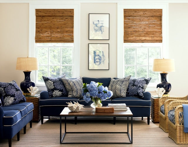
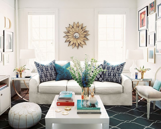
One classic cottage with more dark blue tones…the other a contemporary look with white being predominant.
Layouts are similar but rooms look very different. It is like they are the reverse of each other.
In the classic room, a navy sofa with contrast white piping is surrounded by wicker and rattan side chairs and side tables. Two matching prints decorate the wall between the natural blind covered windows and a jute rug covers the floor. This room feels cottage like and beachy to me.
In the contemporary room below, all of the accents have a little sparkle to them…instead of two framed prints, a sunburst mirror is in between the matching windows. A shiny white lacquer coffee table, mirrored side tables, and a white sofa all make for a modern space. The Moroccan inspired touches in the room like the white leather pouf and the trellis rug add some international flavor to the space.
Hmmm…which one do you prefer?
I think if I had to take one room as is, it would be the contemporary one. If I could make some changes, I think there elements in both rooms that really work. What do you think? THIS OR THAT? Which living room do you prefer?
Happy Monday!
xo
Coco
Photos: Lonny Magazine; Lynn Morgan Design






That..I’d change a few things too, but that for sure. Happy Halloween!
While I think the classic living room is great, it’s a little *too* put together for my taste…like it’s designed a magazine cover. I prefer the contemporary living room where it appears to have more randomly found furnishings.
Both are gorgeous rooms! I think the blue (classic) room would be my choice – because the white (contemporary) one looks a little busy and less like a designer high end space.
I love the lightness of the second one but the style/feel of the first one 🙂
I like both of them; but, the bottom photo speaks more to me. That’s the room I’d want to come to.
Hands down the contemporary!
both color palettes are pretty fabulous. i’m a sucker for a good sunburst…or pretty much anything shiny, so i would go with the contemporary room, but there are definitely aspects of both that i enjoy!
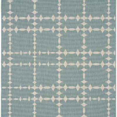
I’ve seen both of these rooms before, and think that the first one, while is nicely done, lacks something, but the second is outta the ballpark— gorge! I would’ve picked a sofa with a bit more shape in the arm, but i ADORE that Surya rug!!! This room is contemporary and ALSO, classic and has a surprise or two with the French side chair and really cool side tables. It has warmth and personality and at the same time, very chic and stylish. <3
My taste is definitely not “contemporary”. But I like the second photo a lot. However, to my eye (and I’m no expert), the first photo seems more traditional and the second more transitional than contemporary. I think both have classic elements to them. The light and airiness of the second one appeals to me but I don’t see it as “contemporary.” Both rooms are nice though!
I’ve no doubts, I prefer the contemporary one.
White….j’adore!
They don’t seem to be the same space. The classic room is bigger (wider) so everything doesn’t seem as tight. The contemporary room seems crowded to me and not as warm.
It’s gotta be the white one – fresh, clean, unusual mix. Though I would take out the pouf and turn the coffee table round. Probably find a neutral rug and definately put in all the coral from the traditional room. The coral on the mirrored furniture – lovely. From Fiona http://www.justpaintitwhite.blogspot.com
May I say both?
I like the classic! The contemporary looks really good but I prefer the classic because it creates mood, it’s bold and most of all fresh! Check out also 3D Rendering
Love, love, love the Classic! Hands down it’s my favorite. Less jumbled looking, more planned out!
I think I’d like the first room during the fall and winter months, and perhaps the second one during the spring and summer.
The second one – very fun.
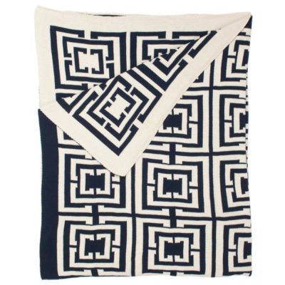
Overall I would take the contemporary room but I do love the zig zag throw pillows in the traditional room.
By a long shot, it’d have to be THAT (contemporary although I would argue it has touches of Hollywood Regency). The sunburst mirror, the side tables, the rug, the nailhead trim on the console… The only thing I’d probably change is the sofa (something with tufting and a more interesting shape) and I would probably change out the lamps to something a bit brighter.
The THIS room (classic) is just a bit too stuffy to me, like something my mother would love (my mom has good taste mind you). 😉
In terms of design… the Classic, for sure (maybe rough it up a bit for living). There’s something a little off-balance in the white contemporary setting design.