| Option 1 (above) |
So we are trying to figure out which of these images to use for marketing materials for the new COCOCOZY collection of pillows and textiles called COCOCOZY Light.
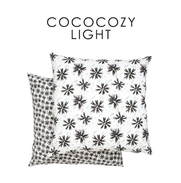
Oh and I guess I should say…here is a glimpse at the black and white portion of the COCOCOZY Light. We have other colors too.
Right now CM who runs all things operations at COCOCOZY is in Atlanta too showing this new line to buyers at market. We are located in Christian Mosso Associates Showroom in Building 1 on the 9th floor of the America’s Mart in Atlanta.
Unfortunately we didn’t have this print done in time for the show.
Well…we’re actually prepping all of this new…to launch at the New York International Gift Fair at the end of the month. We are unveiling some exciting partnerships in just over two weeks and I’ll start telling you about them on Monday!
In the meantime, help…which of these images do you like best for our hand out postcards?
Also, I am doing a focus group of sorts…please weigh in on the new designs…good, bad, like, dislike, I would like to hear it all. Might make a difference as to what I show at market in NYC. You get to help me decide.
| Option 2 (above) |
| Option 3 (above) |
Please let me know what you think. Which photo…and what you think of the collection.
Happy Friday again!
xo
Coco




Option two!
-Jenna
http://www.honeybeesandtealeaves.com
Option 2.
Love the graphic pattern and can’t wait to take a look at the black and white collection
http://www.mksquarestudioblog.com
Option two as well!
Without looking at the others (don’t want to be influenced..ha!) I vote for Option 2 – the first image. Love the look!
I like option 1 better! you should use the same background for the pillows so we could choose without any tendency, because of the chair or the sofa. Kisses from Brasil!
Hi Coco,
I like option 1 because there is no guessing what you’re selling. I also like option 3 because you get to see many patterns. (My ideal would be an option 1 look with a stack of diff pillow patterns).
Your Light collection looks great – timeless but original too!
Can’t wait to see what else is in the works.
Best,
mikky
http://www.todaloos.com
Option two
Option 2 all the way. Option 1 is a bit plain and I think the couch looks a little too stuffed in option 3. All are great but given the choice I would go 2.
Love both prints in option 2. 3 is my second choice because there are so many styles.
HI Coco!
Well I was leaning towards option 2 first but when I saw option 3 I perferred the white background because the pillows feel …”crisp” and “lighter”
BUT NOW after going back and forth for about two minutes I go with option 2!
Can’t wait to see your products in person!
Option 2!
I really like Option #3. Initially I was drawn to #1 but I like being able to see more fabric choices and seeing them set up. For some reason I don’t really like the pillows in #2 together as much as the others. I do like the styling though.
Great collection! I’d be most drawn to the two in the first photo if I had a room that black and white would work in or if I was redecorating. :o)
They are all lovely-the black & white is fantastic, but my favorite is #3. Congratulations on the new collection!
Option Two. One doesn’t have enough “oomph”, Three looks a little stodgy.
Stil wondering what the “Light” refers to. summer pillows? They are lovely
Definitely two. One is too much pillow, not enough where they might be found. Three is too much furniture and too many pillows. Two is just right. A bit of furniture and accessories with the pillows as the stars.
Immediately drawn to option 2, because of the pillows and staging. Don’t know if it is clear what you are selling on options 2 and 3,as someone else commented.
Like option 2 – seems you have used the white sofa before and like the white chair for the Coco Light line up.
I like option two better. The overall feeling of the layout is ‘lighter’ which is consistent with your ‘light’ positioning.
I vote for three! It seems more complete.
Love 2. Looks different (but similar) to the original line. Option 1 is my second choice. Beautiful, Coco! Can’t wait to see the rest.
is this photo for sales purposes? If so, then I say option 3 because you get a much better sense of size, and there are more options to choose from. Otherwise, I like option one, just because I think option 2 might make the pillows feel like they only work in contemporary settings, which isn’t really true.
I would say option 2! It is a great photo and representation of your new line!
xoxo
Karena
2013 Artists Series
I prefer Option 3. I feel the two pillows in option 2 are a bit disproportionate to the barcelona chair.
Option 2! The styling looks fresh and appealing. Also, I can barely notice this, but it looks as if the backs of the pillows are solid white. This detail is not noticeable in “option 1” and may seem picky to some, but I like knowing if the main fabric is on both sides.
From my day Job, I work in the design industry at a lighting manufacturer, and from a B2B marketing stand point, option 1 is best. It would be easy to remind a buyer or designer what Cococozy light, Cococozy is.
However, from the night job, as an artist, I prefer option 3. It shows the scale and variety.
On option 2, the pillows look HUGE, and too much for the chair.
That’s my two cents.
<3 the blog!
I would go with option 3, more display of patterns to choose from. That being said, I felt the little brown side table to small and a bit plain next to the beautifully displayed couch. Option 2 is beautiful and perfectly balanced! You will do well with new line.
I like Option 1 – your beautiful pillows speak for themselves! Also, unclear what the”Light ” means.
My vote goes to Option #3!!!
I love #2. One was a little plain for me and 3 was a little too much.
Option 2 :-). Good luck!
OMG! I just came across your blog
this weekend and I’m hooked! You
are living my dream life. I love sewing and upholstering and your fabric line if beautiful! I can’t waitto buy something. Keep up
the good work, you are very inspiring! Lori
Option #2. Beautilful and Simmply !!
Love it.
Thank you for all of your input! So many nice comments. I appreciate it!
#2 will definitely be used!
For those of you who liked 1 & 3. I will definitely try to incorporate them into some printed materials too!
Again, thank you so much for your fantastic comments.
xoxo
Coco