 |
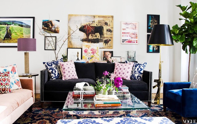
| Apartment 1 living room – The are and the charcoal velvet sofa with nailhead trim are the centerpiece of this New York City apartment. (above) |
Two very stylish apartments featured on Vogue.com – which do you prefer. Both have an eclectic vibe with a mix of styles and eras…creating two inviting spaces.
Would love to know which you like best! Pick and choose in today’s THIS OR THAT!
APARTMENT 1
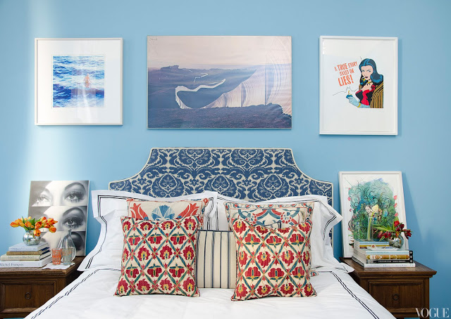 |
| Apartment 1 bedroom – The perfect shade of blue on the walls compliments the art and the ikat upholstered headboard in this bedroom. (above) |
APARTMENT 2
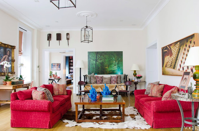 |
| Apartment 2 living room – Two red sofas face off in the second living room. (above) |
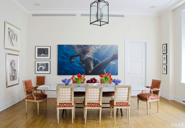 |
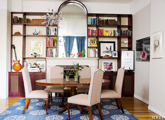
| Apartment 2 dining room – Love the chairs in this New York City dining room. (above) |
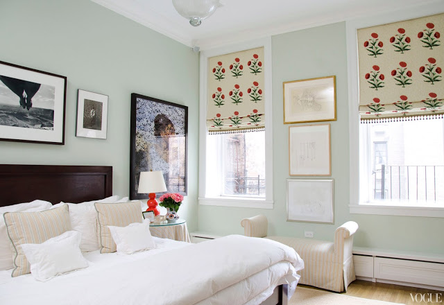 |
| Apartment 2 bedroom – Floral roman shads and mint green walls are the stars in this bedroom. (above) |
So which of these two apartments do you like best? Is there a room that stands out to you?
I’m picking and choosing from both…I like the living room from Apartment 1, the dining room from Apartment 2 and the bedrooms are a toss up!
Please vote! I’d love to hear what you think.
Happy Tuesday!
xo
Coco
Photos: Vogue





I agree with you, Coco! Actually really don’t care for dining room 1.
They both give me a headache…
I prefer all three rooms in Apt. 2.
#1 is just too busy for me.
BB
lol
definitely numer two!!! except for the swimmer’s bottom in your face while you eat……..
I love apartment one…although will again agree that the dining room doesn’t do it for me.(Can we switch dining room #1 with #2???) But the living space and bedroom are gorgeous, I love all the color.
I could definately move into apartment one, I not hhat crazy about the dining room, but the lounge is very me indeed. I love the bedroom in two, fresh and simple. I would love to meld the two.
I could definately move into apartment one, I not hhat crazy about the dining room, but the lounge is very me indeed. I love the bedroom in two, fresh and simple. I would love to meld the two.
apt. #2. it’s interesting, there’s a lot to see. i just reposted a pic from your blog on mine. check it out:
http://820am.blogspot.com/ love your blog! xo, annette
O PLEASE!! May I have Apartment Number One’s living room? LOVE IT!
Like Number 2’s dining room better but ditch the swimmer’s butt.
Neither one of the bedrooms do much for me but really not inspired by the Baby Boy Blue bedroom of Apartment #1.
BUT LOVE LOVE LOVE Number 1’s living area. Artwork, color, it speaks to me.
LOVE the first one! The layered patterns and prints feel so rich and luxe…like it was collected over the years and combined to create a complete life story…I’d move right in, it’s like she’s calling my name!!!
I’m hosting 5 days of GIVEAWAYS with 5 chances to WIN in honor of my blog’s 2year anniversary! Would love for you to stop by and check it out!
xo-Julie
Peace. Love. LOL!
Haute Khuuture.com
What I love about dining room # 2 is the big, out of place picture. I don’t really care for the subject, but really like the wow factor.
Living room one is perfect. It invites you in and makes you want to be there… If I have to pick one, I pick Living room #1.
xoxo Julie
http://www.burlapandcrystal.com/
I agree with you, living room #1, dining room #2, and bedrooms tie.. but I’d have to say apartment #2 overall as I really don’t like dining room #1 at all.
Living room #1. Dining room (minus the swimmer) and bedroom from #2.
Best…Victoria
the second one! i love the second house
Apartment 1 living room is divine, not sure about the rest, but it’s gorge.
Andrea June
Apartment #2 all the way for me. I am obsessing over red at the moment and those sofas sealed the deal! M.
Maybe I’ll choose apartment # 1, but only because I like the living room and bedroom
I love apartment #1. The collected look and all of the layers of patterns and colors are so stunning.
I love the living room in the 1st but am leaning overall to the second!! I really like the dining chairs in the second!!
The living room in apartment 1 had me at hello…and the Philippe Starck gun lamp sealed the deal! Bedroom in 1 would be my first choice, and the dining rooms are a bit of a toss up.
Am I the only one who likes LR 1? It’s brave!
Okay im obsessed!! I love #1s artwork! Looking at it just makes me want to have tea and read in that living room all day 🙂
I love apt. 1 living room, but all the rest on number 2. Love the swimmer painting!
Nancy
Powellbrowerhome.com
I really liked aparment number 1’s living room…but then the rest of the rooms were a downer. I felt like they were trying way too hard. So I would go with apartment number 2. All three rooms come together nicely