Photos: Lonny Magazine
For no apparent reason it is BATH WEEK on COCOCOZY (the second BATH WEEK ever)! Just woke up this morning and decided to feature beautiful baths and things that make baths beautiful for the next 5 days (or maybe 7 days if I can come up with enough photos that I like). This BATH WEEK is starting like the last BATH WEEK did…on a whim. So much for precise planning and organization…hmmm….
Normally, I like a clean white bath…simple…no frills…not a place to make a huge design statement but a place for rest, retreat and getting clean! This week, I’ll step a bit out of my comfort zone and show you some non-white spaces that have a sense of chic and elan.
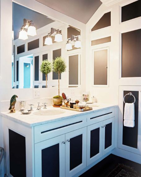
I like these two baths that I saw in this month’s Lonny Magazine even if they are not my classic neutral bath.
These baths belong to the same home owned by two writers who live part time in the Hamptons…they employed NYC designer David Cafiero to help decorate their whole home. I guess drama and films were the inspiration in this house. Drama even leaks over into the bathrooms…
The master bath is the one with the dark blue grey panels and white trim on on all the cabinetry and the walls. And it looks like the one covered in toile wallpaper is a powder room or a guest bath of some sort. I like these spaces. They have visual impact.
What do you think of these two bathrooms…would you like to wash up, bathe or shower here?
Happy Monday!
xo
Coco
P.S. If you have any great photos of a bath you remodeled…or some ideas for BATH WEEK, please write in NOW…please…don’t really have a direction this week except baths! Designers/architects please send in your best and maybe I’ll feature!!! Help!!!




I absolutely love the first image. My bathroom is navy and white (with tan walls), but would love it to be a bit more bold. I think the size of this space (and the height) really help here.
Thanks for sharing!!
i continue to see wallpaper in powder rooms and love it. you would think it would close in the tight space, but it does the opposite and i’m loving it. definitely on my to-do list.
I love bath week – wish my bath reno was done so I could share it with you but it’s not quite there yet!
Bath week is a great idea. I absolutely love photo #2. if I owned that room, I would spend entire days walking by and admiring it. So bold and lovely!
Carol
I love color and I love pattern, so these bathrooms are winners for me. I love the high contrast of the navy and white. Fun idea for a week of posts. I’ll be checking back in!
Love love love bathroom number two!
I would send in a pic of my renovated 1906 bathroom, which I am very proud of, but it pales after seeing this striking second bath! Plus, I would have to clean off my disasterous counter caused from flying to work late every morning.
You do find the most wonderful rooms to share with us, Coco, and I so look forward to seeing them thank you for your posts.
That brown and white bathroom is very chic. i really enjoy doing bathrooms, my last project had 9 bathrooms, including a huge custom carved stone tub that could not fit through any window. Framing had to come down, floors reinforced, tub rigged to the second floor master bath….each bathroom had a story and tale to tell…Looking forward to read more
I love the second for a powder room where I think you can add more drama!! Gorgeous!
Karena
Art by Karena
Love the wallpaper in the second one.
Lovin’ on both of these bathrooms! First one is very inspiring!