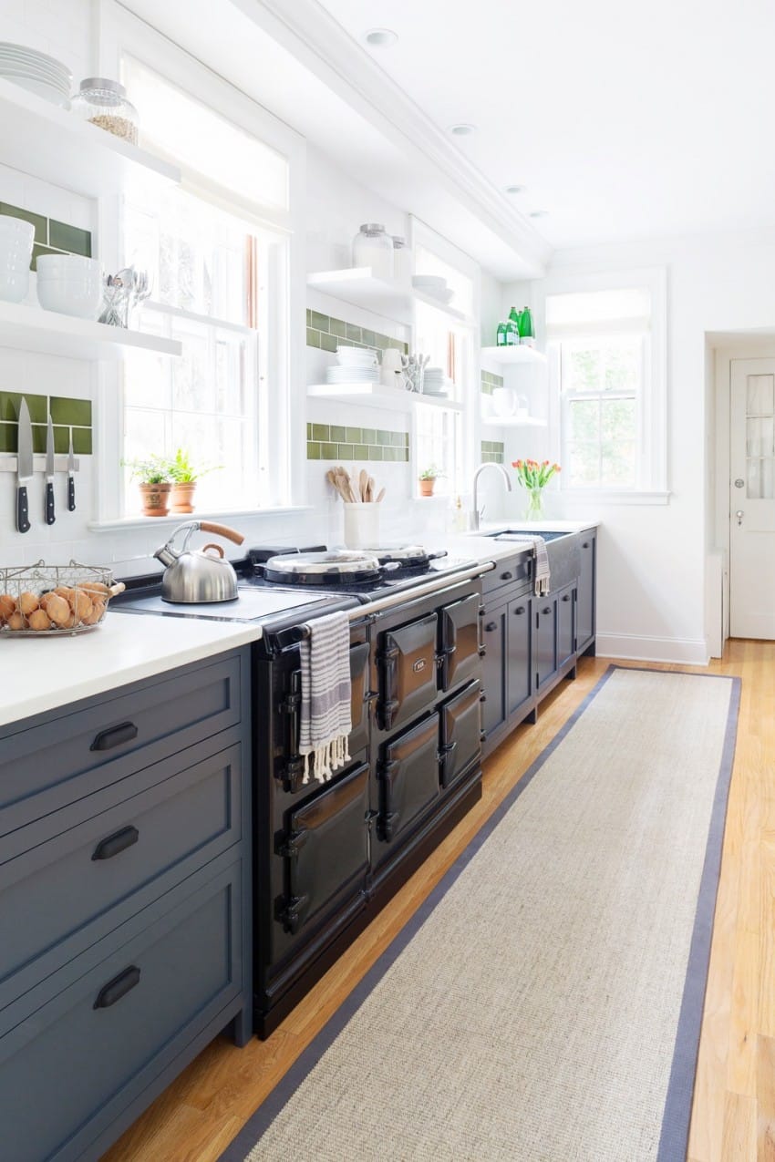
LOVE this kitchen remodel from interior designer Susana Simonpietri of Chango & Co. It is THE cutest kitchen remodel I’ve seen in 2016! LOL!
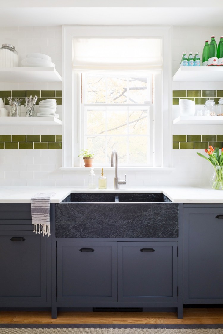
From the navy blue lower cabinets, to the striped green and white subway tile backsplash, to the soapstone farmhouse sink and finally the jet black stove and drawer pulls. LOVE LOVE LOVE. You can see here what the kitchen looked like before. It was rather regular with its dark walnut cabinets. The main counter layout was opened up by taking out a dividing wall. The kitchen sink and are next to each other on an impressively long counter. All framed by navy blue lower cabinets with recessed panel doors and striking striped backsplash. Also a custom kitchen island was added with a curved countertop to accommodate seating near the kitchen’s fireplace.
My favorite addition is the almost black (dark grey) soapstone farmhouse sink. I’ve always wanted soapstone counters. Know they are hard to keep up but soapstone is such an amazing looking rich stone.
Anyhooo…nice job by Susana Simonpietri. Well done.
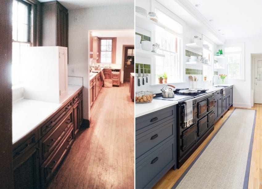
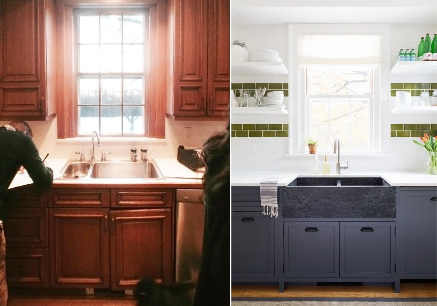
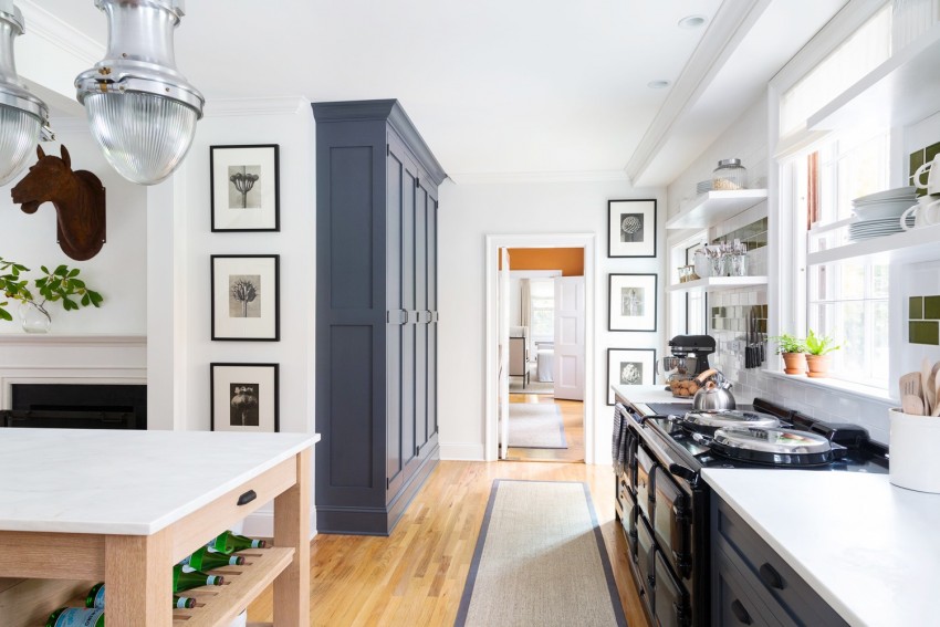
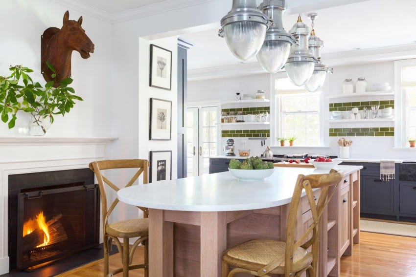
What do you think of the navy lower cabinets and the striped wall? Could you be so bold in your home?
xo
Coco




Totally agree. This kitchen is so well done, love those cabinets with the tile selection!
Ha!… Yes, the cutest kitchen remodel of 2016! Love the depth in color of the lower cabinets in this bright kitchen and also the use of the green subway tile to create a stripe. Don’t think I would do the stripe in my own home as I tend to change accent colors often. If it were a second home, I’d be more apt to do so.
Fun post!
Judy G.
So fresh and lovely kitchen!
I too love this kitchen! I’ve never seen navy blue used in cabinets and the touch of green in the tile is such a pleasing combination.
Very good Job! ????????????
Nice kitchen you got there plus the paint’s very relaxing!
Adorable! But not sure it would be enough storage for my pots and pans (and chocolate bars, if we’re being honest)
I always love seeing something new and fresh, but for me, I know myself too well and will have to stick with a white kitchen. I’m afraid I may tire of the green stripes or blue cabinets. At least with the white I can change up the accessories, rug etc. if I get bored. That being said, I love the design!
I love this look. I remodeled my own kitchen 3 years ago and designed a dark, Dutch blue cabinet for the island. My pops of spring green come from slipcovered benches, a Le Creuset 8 quart pot on the dark blue Blue Star range, and custom window treatments. All very easy to update. I am a tad jealous of the in room fireplace though… Great find to freshen up this wintery week.
Agreed that it is a stunning kitchen but want to also say that the green tile does not work for my eye. I would prefer to see a black subway (if that even exists) or a smokey gray. There are so many incredible tiles to choose from. A black or teal or gray tile would have worked beautifully with the Aga and other black accents. Hope I don’t offend but I appreciate discussion which seems to be encouraged here!