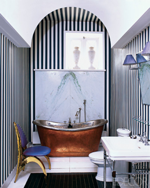
Photo: Elle Decor
Happy day! Another wonderful guest post from oh so chic Los Angeles interior designer Alison Blumenfeld of her eponymous Blumenfeld Interiors.
This time…Alison shows us how a very special shade of captivating blue can be used to add visual interest and liveliness to a space.
Here’s the latest Alison Blumenfeld guest post for COCOCOZY on Yves Klein blue!
I think wall color is situational. In Los Angeles, where the light is bright and sunny most of the year I love white, in San Francisco it needs to warm up to bone or color to contrast the grey fog, in London color, color everywhere! As most of my work is in Los Angeles I am forever looking for ways of introducing color even into the whitest rooms.
Many decorators suggest adding a hint of red or black to every room. I am a great lover of this idea…but in my collecting of inspirational images another accent color has caught my eye, Yves Klein blue (also known as International Klein Blue). French artist Yves Klein held the first private exhibition of his monochromes in 1950 using this color and ten years later patented the color.
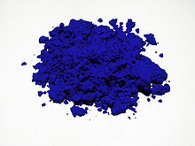
Yves Klein blue is a vibrant blue pigment first mixed and used by artist Klein in the 1950s (above)
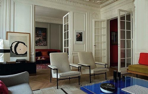
In the three images below, Yves Klein blue is introduced in the form of a coffee table in Yves Klein’s own ‘Table Bleue’ (blue table), ‘Table Rose’ (pink table) and ‘Table D’Or’ (gold table). These tables while covet worthy sell in the $20,000 range putting well beyond the reach of most people.
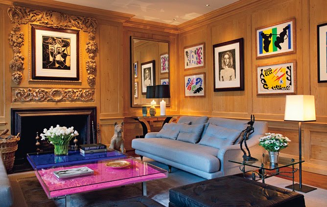
Photo: Architectural Digest
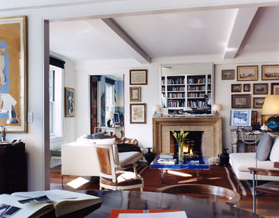
Photo: David Netto
But what is so wonderful about this color is even in the smallest amount it adds a vibrant energy to a room. Here, in the image below, socialite/magazine editor Fabiola Berecasa uses Yves Klein blue in their framing of art and photos.
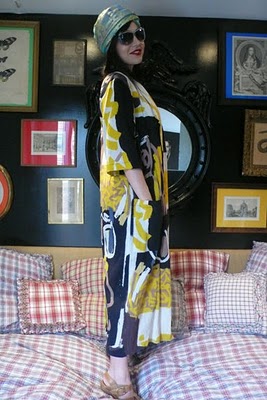
Photo: Vogue
Fabiola Beracasa in her bedroom with a hint of Yves Klein blue peeking through in the form of a picture frame(above)
Paint, fabric, art, books, ashtrays and vases are all other great vehicles for this vibrant blue color as you can see below.
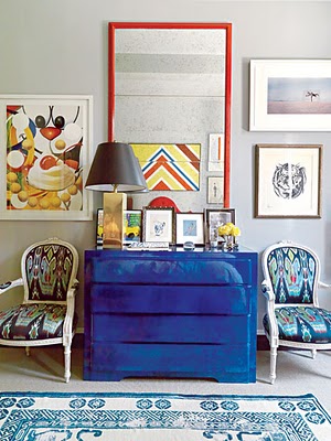
Photo: New York Magazine
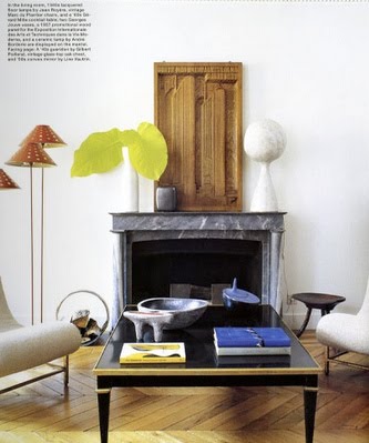
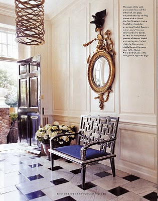
Photo: House & Garden
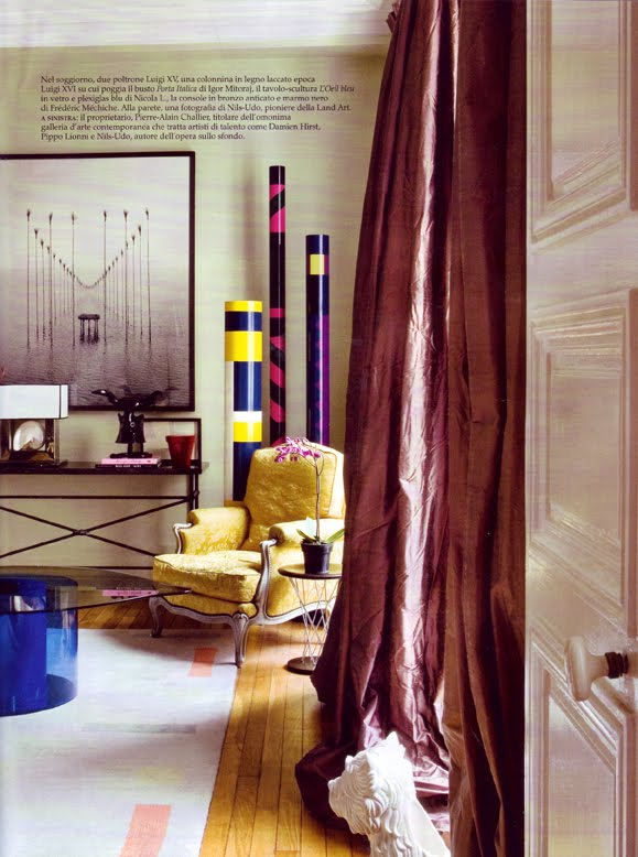
Photo: AD Italia
I think the idea is to add one bold element of Yves Klein blue into a space and see where it takes you….
Thank you Alison Blumenfeld for the wonderful post!
Readers, where might you use a pop of Yves Klein blue in your home? What accent color do you find yourself gravitating towards when you decorate? Please do tell!
Rushing off to work as usual…not a clue as to what I will wear. Oh dear. Not that it matters…I tend to “dress” very nicely for work but I wonder if anyone would notice if I wore my pjs to work. Should I give it a try…would make my life so much easier?
Happy Thursday!
xo
Coco
P.S. COCOCOZY Press: Repeat thank you! Another big thank you to the very nice Haskell Harris of Garden & Gun Magazine for the lovely blog post on the COCOCOZY collection launch on her blog for the magazine called Belle Decor. I know, I just mentioned this Garden & Gun post yesterday but I have good reason for mentioning it again: 1. I so loved her write up (self indulgent perhaps…LOL); 2. My friends FF and CF from New Orleans just emailed me (from a plane) saying they had just read it and how happy they were I mentioned NOLA. I had to mention it again you see…I just had to! Don’t worry…I’m not turning into a total narcissist (yet…hee hee)!
P.P.S. COCOCOZY Press Take II: New thank you! Also, just noticed another fab posting about the COCOCOZY collection from Nicole at So Haute blog. Had the pleasure of meeting Nicole in New York! She’s included COCOCOZY in her NYIGF round up! Thank you Nicole!






Wow – what a color! It’s so vibrant and alive.
FASCINATING!The use of vibrant blue in small and large doses, brings these lively rooms to even livelier levels. Great to look at.
i painted my coffee table this color a few years ago and it has been one of my favorite pieces ever since. the perfect pop of color.
i had the pleasure of visiting the yves klein exhibition at the walker art center recently and i have to say his blue is even more incredible in person. it literally vibrates off the wall.
fabulous post!!
Great post and great idea. I love this color as a small accent – actually goes with everything.
Energetic! I painted my first tiny kitchen this color (in a rental mind you) but loved it for many years.
This is a terrific post in concept as well as the fab interiors. I love the idea of playing “I spy” with a color like that. Very inspirational to your readers.
I’ve always been fascinated by that shade of blue on American naive furniture especially when there are only traces of milk paint left on mellowed wood surfaces…
I once had the walls of a client’s windowless foyer painted a vibrant cobalt blue like this. With white trim and fantastically grain painted mahogany doors, the blue picked up the color from the oriental rug and the gilt framed oil paintings. It put a fresh spin on an antique-filled Park Avenue apartment for a young couple with children.
Blue is my favorite color,I hope I get it for my new home along with my floors. Love reading your blog.
Coco- So wonderful meeting you at the Gift Show & congrats again on your launch! xo