
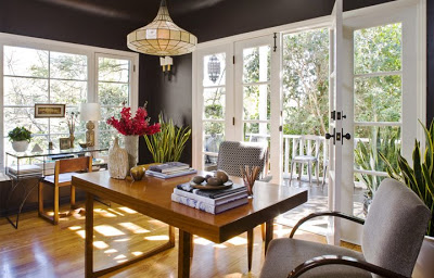
French doors, large windows, a mid century modern looking desk, a mid-century desk chair and arm chair. and an alabaster chandelier, shed good light on this Los Angeles home office. Design: Jeff Andrews. Photo courtesy of Jeff Andrews Design. (above)
A home office should be an aesthetically pleasing room that inspires contemplation, productivity and focus. A home office should also be a place of beauty and comfort.
While most people do not take the time to design and define the work space in their home (most people includes me), the owners and designers of the rooms featured in this post seem to have studied up on how to make smart spaces!
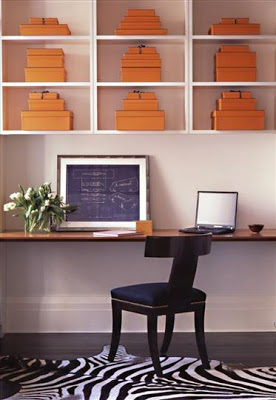
A large wood slab is attached to the wall making a long shelf which doubles as a space saving desk in this Grammercy Park apartment. A zebra rug, an empire style chair, Hermes orange storage boxes, and white open shelves complete the minimal but highly styled look which is perfectly New York City. Design: Sara Story. Photo courtesy of Sara Story Design. (above)
Does one of these home offices appeal to you? Which one and why?
Click on “COMMENTS” link right below and weigh in.

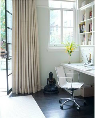




The zen room would be my pick. I think you need something grounding like that room to truly survive the stresses of work life.
I absolutely love the last one. Looks fantastic, make me wanna get some work done on it, which is a good thing !
Here’s a glimpse of mine : http://nocesdecoton.canalblog.com/archives/2009/10/06/15331883.html.
Hope U like it !