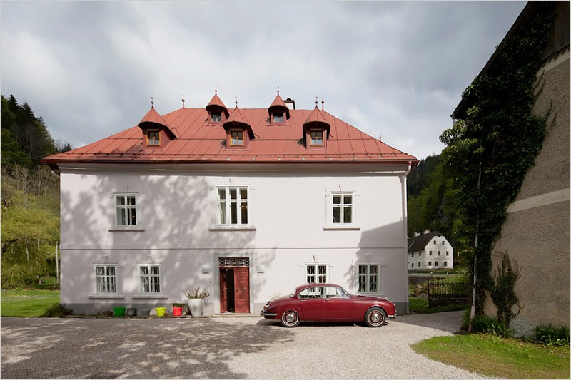
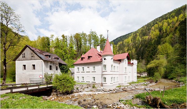
I like this castle. In fact, would be happy with this castle indeed. The castle is called The Hammerhaus. It is a 16 room mini castle two hours outside of Vienna built in 1400 on a 593 acre family estate. It is owned by a freelance art consultant Florian Staudinger…and the land and building have been in his family since the 1800s.
In 2003, Staudinger took on the daunting task of renovating this 5,380 square foot main building that had fallen into total disrepair. According to the New York Times article on the home, so far Staudinger and his parents have spent the equivalent of a little more than $740,000 restoring the property to date. I don’t think this is too much to renovate a historic home that has been around for over 600 years! Do you?
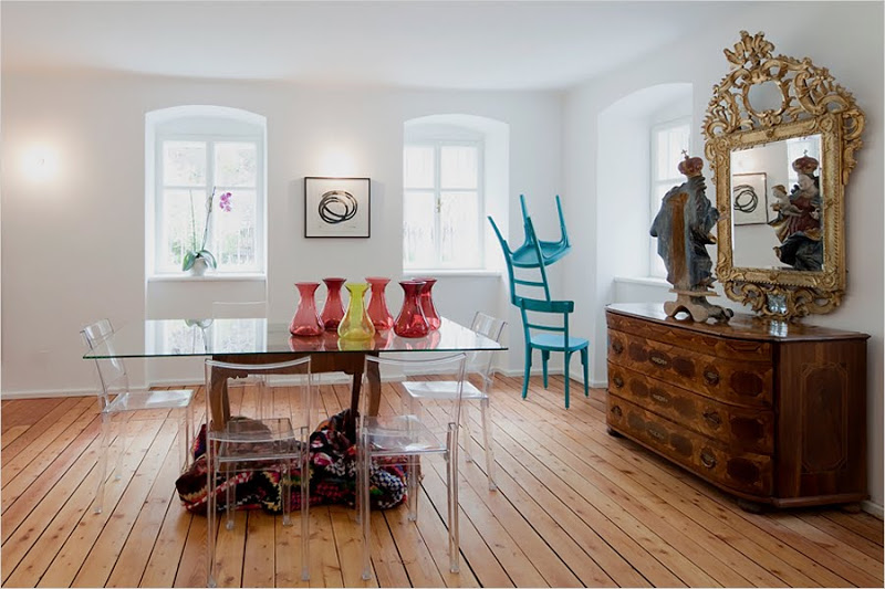
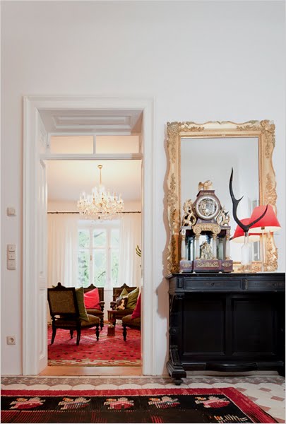
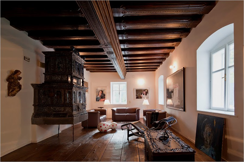
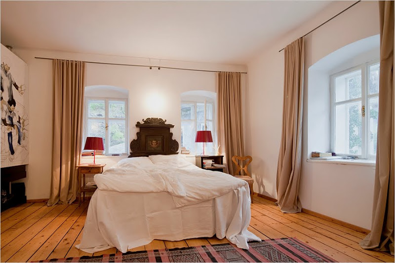
Today, this mini castle is looking great and it houses some wonderful antiques, modern art, signature furnishings and more. It is the true combination of old meets new.
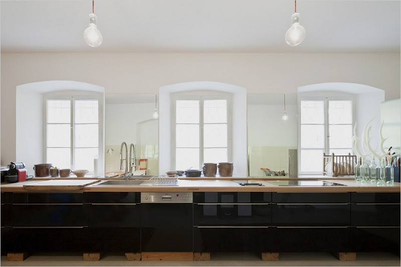 |
| Glossy black cabinets make a mega modern statement in the castle’s kitchen. The wood countertop is made from a fallen tree from the castle’s grounds. (above) |
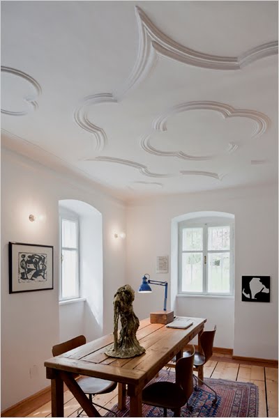 |
| The office features baroque detailing on the ceiling, a large wood table once used to clean game, and a Christina Zurfluh sculpture. (above) |
What do you think of this Austrian mini castle – take it or leave it? Do you like the mix of modern and antique furnishings?
I would take it…make some tweaks on the decor…but I would be 100% okay with this!
Happy Thursday!
xo
Coco
P.S. If you are at all interested…I am in the middle of getting all details together for updating the COCOCOZY shop and the COCOCOZY collection with new designs and a few new products in time for the summer trade shows…so hope you don’t mind if I share the process with you a bit. It will be more in the form of to do lists with a sneak peek here and there…interesting or not interesting to you? Let me know!
Photos: New York Times





I love everything about it! A great home!
Gorgeous! I love all the intricate ceilings. Preserving history is always worth the cost.
I love the history that comes with this great place. I could do some major cooking in the kitchen, it’s gorgeous! WoW…
Its a love for me! I love the mix, its a great mix of the old and new….it doesn’t feel stale and musty…whatever it costs its so worth it, (well within reason of course) first because they DO NOT build them like they used to, and because there is history in them walls and that right there is worth something! Just beautiful……has me dreaming….
Ok, I am the only one who is not a fan. What does that say about me, lol? I just think it’s weird. I do like the one white baroque ceiling but that’s about it. Is it a cabin-castle, am I hunting in a modern museum? Is someone going to kill me when I go to sleep???? I feel confused about the owner’s vision. I love your blog and all your posts 😉 Tanks for sharing this one!
I truly think the diningroom ceiling is spectacular! I think there are other homes you have showcased that need “more” renovation. I could make this one work! Someone let me try!!
Stop the freaken insanity! That is amazing! I love everything about it. Love the modern with the antique. A-mazing!
I think the interior looks clean and comfortable but not cosy. In Vienna it can get pretty cold, I wonder how all those white walls and curtain-less windows will feel then?!
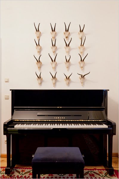
Love the symmetrical deer horns above the piano, and love the ceiling in the bureau.
Thanks for the pics
Sharon
Love the antique and modern working together. I adore the kitchen, and the fact that the countertop is made from a fallen tree. But oh my goodness, a Yamaha upright?? This would be the first thing to change. Of course I would change it to a Bösendorfer, since it’s Austria. And the sooner the better.
I really love the baroque detailing on the office ceiling!
I love everything about that castle, especially the ceiling detail. I adore old buildings, but obviously they’re hard to find here in TX 🙂
Haley @ Cardigan Junkie
Stunning! I love it. I love the mix of old world meets modern. Can’t say enough, each room feels very special and unique but fresh. Great post
Nice house. Like the mix and location but it doesn’t seem like a castle…I guess each person’s home is their castle 🙂
Absolutely love the whole crazy castle. Details like the religious figure facing the mirror in the dining room instead of facing out just cracks me up! This place is such a good example of how well-designed spaces can transcend place and time–the whole place is so singular and original. Love it, love it! But yes, it’s probably not a place you’d want to hang out in on a cold winter’s night…
Feel free to torture us with every detail involving your lovely product line, it’s so much fun! 🙂
I love it!
It is so airy and delicious… the historic details mixed in with the playful color.
I love the bold design statement that is clearly a personal reflection of the owner! Even though the style is not one that I, personally, would ever put together, I can certainly appreciate the perspective. I DO love the ceilings, and I also think it’s fabulous that they used a tree from the yard to make the kitchen countertops… GREAT “green” idea!