Long story short…well at least I will attempt to make one of my long rambling stories less long…or at least I will try to not make what could be a cute short story into one as long as possible…self editing is key here and clearly I already have not taken that to heart…anyhooo…back to the “long story short” promise…
The other night I was at an event and I met amazing interiors photographer Jean Randazzo. We exchanged information and once I got home I looked up her portfolio and realized I had stalked it many times before. So of course I immediately emailed her begging and pleading for more photos…let me tell you…groveling works! Jean kindly sent me some of these fantastic interiors photos she had just lying on her desktop…bingo…hence this post.
Well here’s where the story gets long…I recognized some of these photos as the decorating work of interior designer Kishani Perara whose site I also perused after seeing her name in Town & Country as one of Los Angeles’ young designers to watch. So I went back to her site and found even more Jean Randazzo photos. They are here too.
So today this post showcases the work of two talented women…photographer Jean Randazzo and interior designer Kishani Perara.
Hope you enjoy!
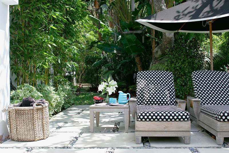
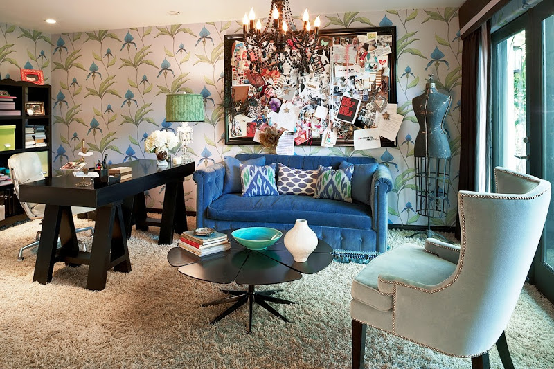
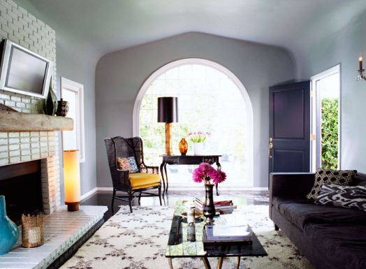
I am loving the polka dot fabric on those teak outdoor chaise lounges! Also adore that grey living room with the arched doorways and windows.
Thank you Jean for sharing these photos! Can’t wait for even more (hint hint)! Also, thank you to Kishani for all of this fab design!
Which room do you fancy readers? Please do comment and let me know!
Happy Monday!
xo
Coco
P.S. Please remember to follow along the COCOCOZY FACEBOOK PAGE…hit “like” at the top of the page and the hit “Suggest to friends” on the left and tell your friends too. Lots of fun design extras there and daily updates. I will post some fun new reader submissions later tonight!
Photos: Jean Randazzo




I don’t like any of them.-very messy looking and unbalanced– I do love the curved arches in any room. I just don’t care for “Eclectic” in general…
Unlik Anonymous, I am crazy in love with ALL of thm- I guess this means I like eclectic:) Love the blue, pink and yellow of the first two most of all. Also adore the C&S wallpaper- beautiful post!
Would love to know what tile that is in the bathroom!
My favorite is the living room. Never thought a flat screen over the fireplace could look good. But it does on the white brick. I love this home. Very bright and cheerful. I must REALLY be eclectic because this place looks very put together compared to mine.
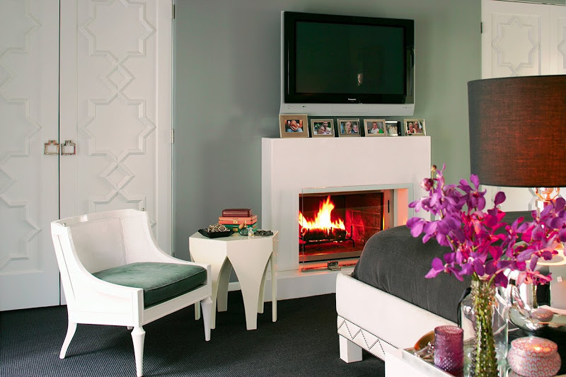
LOVE LOVE LOVE. Especially the wallpaper in the bath and the bedroom, fabulous doors!
I want the office! Love the mid-century coffee table! Very cool! Could the “tile” walls in the bathroom be wallpaper? And how about the polka dot chaise lounge fabric! Perfect and unexpected!
It’s got a quirky and UN-decorated look, which I like. That said… it is not my taste.
I love that the carpet is laying all over the floor…!It makes the room warm and friendly!
I love a lot of the pieces, but it feels cluttered and unfocused to me. Just needs a little editing…not feeling the mantel photos under the flatscreen or all the accessories on the tables, that said, it looks very cozy, lived-in and personal…not a bad thing!
Love the bathroom! Thanks for sharing!
Love them all! But love pictures of outdoor spaces! The Topical look with the fun of Polka Dots so pretty without being to serious! Would love to have seen more of it. Ty for sharing!
I adore everything about the outdoor space…can’t imagine not loving something in every room. Eclectic and interesting!!
I love the fact that you are not a professional but you enjoy there work. To be able to appreciate interior design and share the work of these talented photographers is a blessing.
OK…I can not stand shag rug..because
if something falls into the rug it never comes out..bad on me! xx peggybraswelldesign.com
I could certainly use that lampshade. I have a thing for black lampshades.
Mr. Goodwil Hunting
Love all your posts. I always tweet them! You post the best interiors!!
I just love when this happens – when one thing leads to another and circles ’round. As you said, two very talented women. Love the outdoor chaises against the next post with the David Hicks paper – and the doors in the last photo!!
Any idea where the lounge chairs are from? I love the polka dots!
Wellness,
The teak lounge chairs look like they are Brown & Jordan’s Canyon collection.
I have these on my patio but I haven’t allowed them to grey and weather. After seeing these photos…I just may have to reconsider treating them in the future. I love the way they look with the polka dots
That bathroom is a revelation! A lot of older homes have that layout… I’ve been wondering how you would get around the problem of a tub enclosure being in that spot and how small it makes the room look. The shower tray and clear glass enclosure… WOW! The wallpaper and vanity are totally fabulous icing! Thanks for posting that bathroom! 🙂
Never underestimate the importance of a professionally photographed room. It makes all the difference, weather you like the interior or not. It always looks better lit! Can’t take my eyes off the doors in the last picture, anyhoo (cracks me up that you always say that)… enjoy your blog.
I am in LOVE with that very imposing trestle desk…That’s my new “thing”….the trestle.