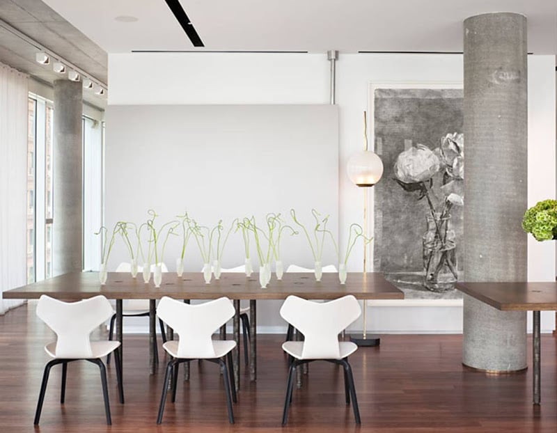
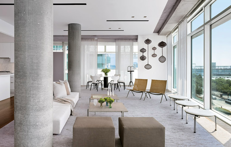
I really like this NYC apartment…kind of an industrial loft space overlooking the Hudson River. This apartment is in a Richard Meier designed building in the city…the space is open, bright with floor to ceiling windows, and loaded with structural cement pillars.
The cement pillars might throw some off if they had to design this space…but I like the way the grey pillars blend right in and help give a little character to the space by setting a modern urban tone.
The pillars are what they are and they work in my humble opinion.
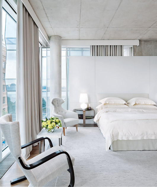
The cement columns meld in perfectly in the bedroom with its wrap around windows and floating wall behind the bed. (above)
Happy Friday!
xo
Coco
P.S. Good news…my store website will be up and running very soon (I hope)…the COCOCOZY collection will be available here online. Meanwhile, I am sooooo busy as I put the finishing touches on all for the debut of the COCOCOZY Spring/Summer 2011 home furnishings collection at the NYIGF! Can someone age 10 years in 3 weeks due to stress? I think I know the answer unfortunately. Will need to add extra sparkle to wardrobe to distract people from the bags under my eyes! LOL! Off to buy an iPad.







I love the columns+congratulations on your store website!you go girl!xxpeggybraswelldesign.com
The pillars work well in the space and exposed concrete is a brave move. Absolutely loving the recessed lighting slots in the ceiling. Good to see some contemporary stylish interiors treated in a subtle and softer manner than just plain stark minimalism. The light in the apartment is superb.
I love it!!!!!!
You can’t argue with Richard Meier.
He knows just where to put things!
Dear Coco,
First of all, one has to respect those pillars as they are there for a function of support! So that put aside, they are not even obtrusive as the entire apartment is so airy and so light. There is actually far less obstruction than any given apartment or other dwelling. Looks very clean and very bright!
Great posting!
Mariette
OMG!! This is breathtaking! I love the pillars… gives this space so much character! In another life, this would be my place 🙂 Thanks for all the inspirations!
I am working on 2 new York lofts at the moment, one in Tribeca and another one on the West side highway, designed by Jean Nouvel (one of the most controversial and talked about building in New York) Both have concrete and cast iron pillars which make the space so much more interesting. It is at times challenging as the pillars are in awkward location, but it gives strength and character to the design
What a beautiful space! I love how the pillars give the open spaces some definition without making it claustrophobic. Wonderful post!
~SW
http://wellsinteriors.blogspot.com/
Using the white/neutral decor really made the pillars just another textural/architectural element in the rooms—they almost look as if they were “put” there as part of the design! It reminds me of a basement remodel I did where the client’s guests thought the soffits that hid the venting in the ceiling were added features of the space! Great post!
I agree that pillars can add a lot to the character of an area. They can blend into the room like the example you show or be used to accent by being covered with simulated stonework or tiles.