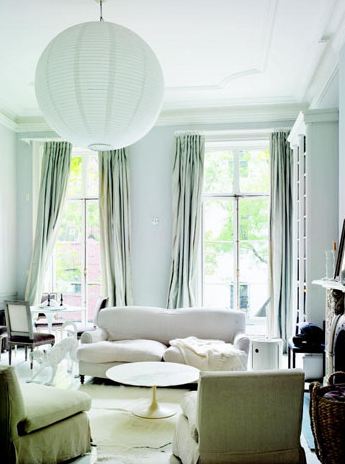
Late last year, when designing new offerings for the 2012 COCOCOZY textiles collection, I wanted to go with some soothing colorways for my fabric patterns. I was browsing the web a few days ago and came across this picture of this lovely soothing city living room and it reminded me of the colors I chose for this year’s pillow collection.
So, during my so called design process (which is more of a race to finish everything in time for market), I decided on a pale green blue for one of my main colors. I called it Sea Foam because it reminded me of that froth that sits on top of the water after a wave crashes onto shore. I was so sure of my color name choice. So sure, I pronounced, “I now name you SEA FOAM!” and then the audience roared. I went forward with this name with a strong conviction. I put it in the new 2012 COCOCOZY catalog and called it Sea Foam, I went to market in January/February with it and described it as Sea Foam…and so on and so on.
After, I made this definitive decision on naming the color Sea Foam, of course being the person I am…I am now waffling. I realized my new pale silvery green might be considered to the trained eye a totally different color…maybe Mint. I started seeing all of these stories in online magazines this month about mint and celadon and pale green…hmmmm…oy va voy.
Only after the fact, like now, did I go online and look at what people were calling Sea Foam…and for some reason I don’t think the online Sea Foam matches the COCOCOZY vision of Sea Foam.
So is my Sea Foam not Sea Foam…if not, what would you call it?
My Sea Foam (or Mint) Collection
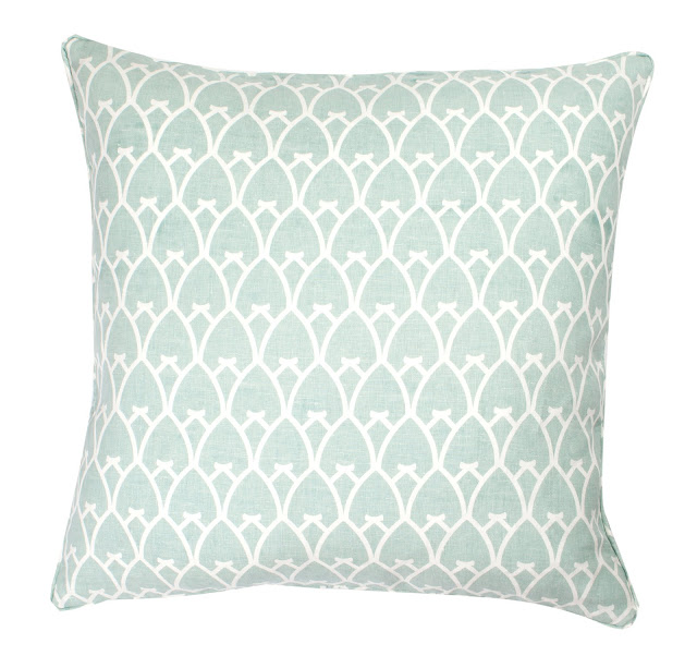
COCOCOZY Arch Linen Pillow in Sea Foam (above)
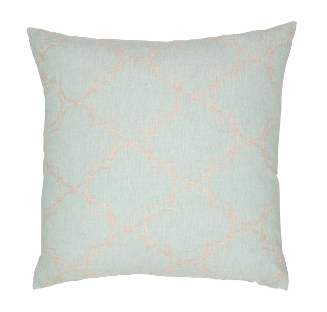
COCOCOZY Quatrefoil Reverse Natural Linen Pillow Cover in Sea Foam. (above)
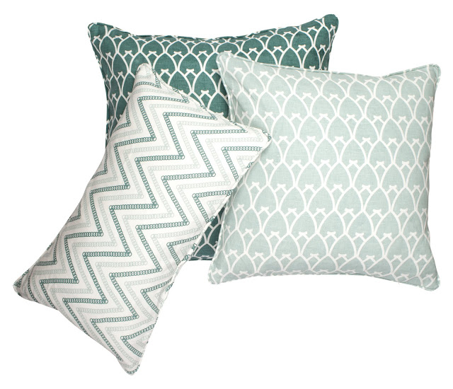
COCOCOZY Circle Chevron and COCOCOZY Arch Linen Pillows in Sea Foam and Sea Green (above)
It is too late for me to change the color name…but am curious as to how off I am with the nomenclature here! So please do weigh in! Do you see Sea Foam, Mint or something else when you look at my new colorway? Where might you include a color like this in your home?
Happy Friday!
xo
Coco
Update
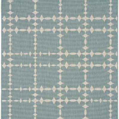
Isn’t it funny how sea foam, once seen everywhere from pillows to nail polish, has seemingly been forgotten about? I still think that the color is beautiful and definitely has its place in a modern 2023 home. With earth tones being all the rage now, sea foam is perfect for adding a light wash of complementary color. These soft shades of blue-green can complement almost any color, making them perfect for accent pieces. I especially like a sea foam and ecru/linen color combo to create a nice beachy feel in the home. Probably their best feature, these colors are actually soothing to be around, like the ocean. Maybe try putting out some mint throw pillows or laying down a plush sea foam rug.
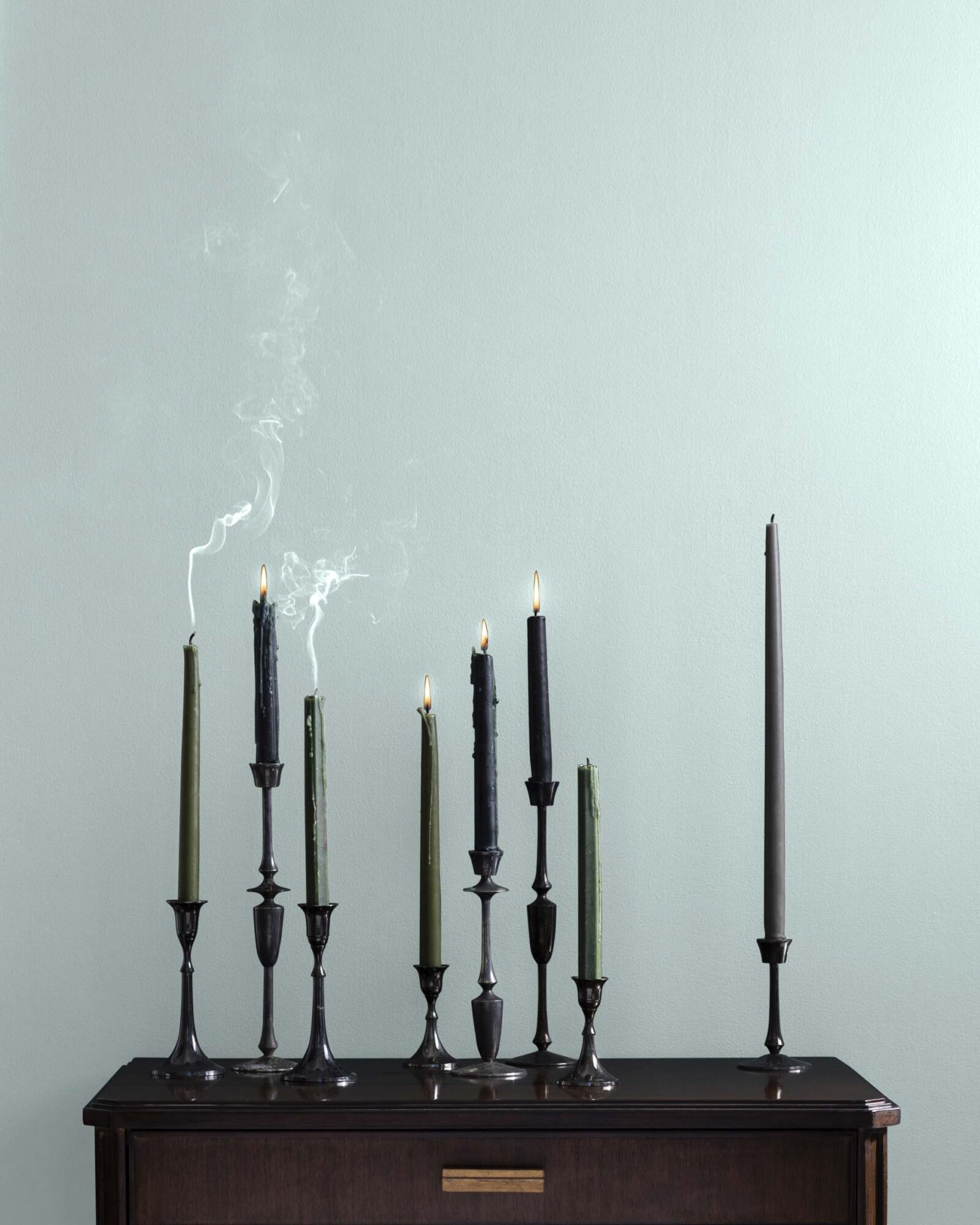
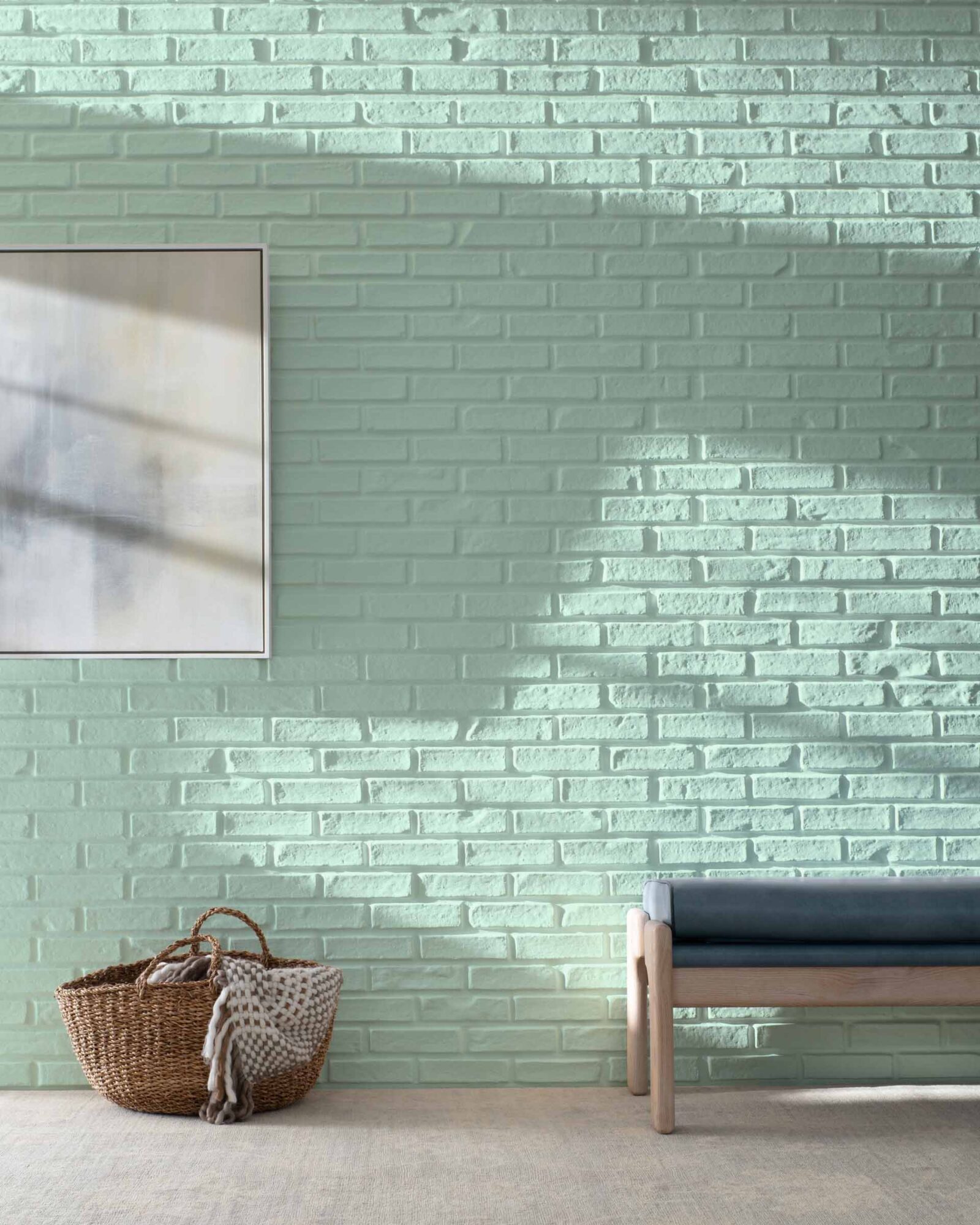
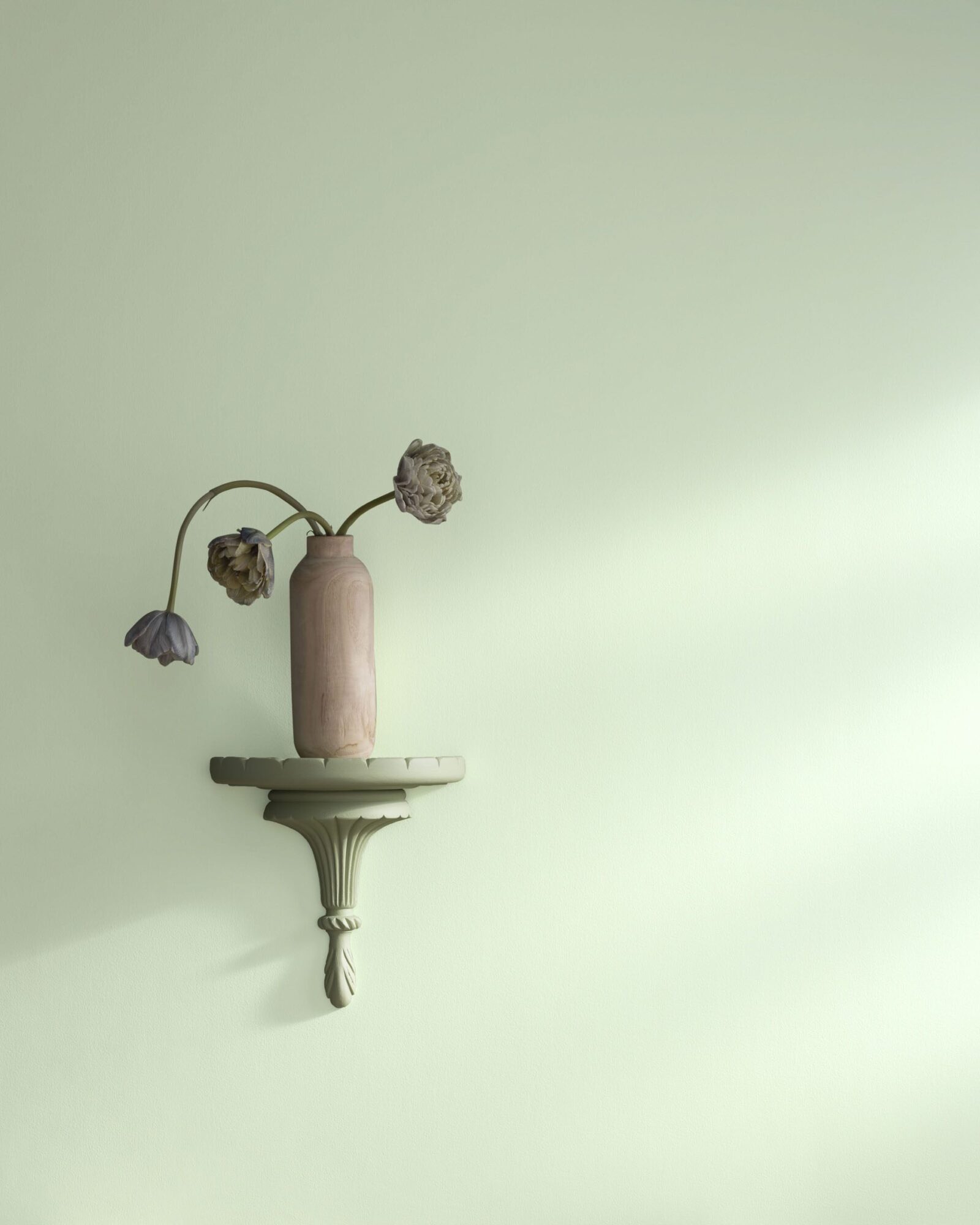
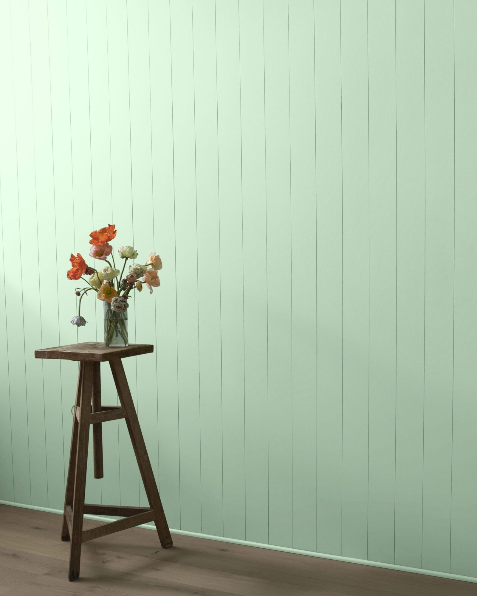
Although it might not be a great topic of conversation like it was ten years ago, I have noticed sea foam and mint creeping their way back into the world of design. But then, did it ever really leave? Pistachio (both the color and the nut) have been very popular lately and I think it would look stunning as a wall color. Check out some of these sea foam and mint paint colors from Benjamin Moore (click on the links to earn 6% cash-back with Chirpyest):





It definetly isn’t mint. Too me it looks more blue than green. Maybe sky blue.
100% Seafoam. Seriously. If I saw your pillow that is exactly what comes to mind. Never questioned it. Until you did… 😉
I think you were absolutely right!
I could use your Sea Foam in many rooms of my house. My wall colors are watery and murky; they range from gray-green-aqua-teal-blue, with touches of tan and espresso. I did exactly as you, I looked up sea foam on the internet. I found everything from actual ocean sea foam to various colors people call sea foam. I found an image of ocean sea foam that matches your color. I’m sure you have seen the crazy things people name paint colors. Naming you color Sea Foam is perfectly acceptable.
I think it looks like Seafoam..btw it’s gorgeous.
Would use this color in a guest suite..it has the feeling of vacation.
Since pigments and pixels never translate perfectly….from what I can see on my computer, it looks like a tinted and toned blue-green. How about a compromise? Sea-mint or Mint-foam! 🙂 Kidding!
Yes I agree, I think you’re on the money, not sky blue – that’s brighter, if it wasn’t sea foam, maybe… just a little maybe it could be pale blue, but really it’s on the edge, so I think you’ve gone with the right terminology 😀 Looks gorgeous by the way and I love the darker green colour too!
I think SEA FOAM is dead on! That is a perfect description of your colorway!
Aww, I feel for you waffling over the name. I am also second guessing something I put in writing!
For the record, and not because I sympathize, I would definitely call that color seafoam. Mint is a bit more green, and those are the perfect balance between blue and green. Not an aqua, but a seafoam.
I need to snag one of these seafoam pillows to add some depth to my mint living room 🙂
Bethany
http://www.PowellBrowerHome.com
The color of the seafoam comes from whatever the ocean happens to be churning up on a given day. On a pretty day it churns your COCOCOZY seafoam..and on an ugly day brown. I also searched for seafoam and received tons of WRONG colors (since when did lime green become seafoam? would not go swimming in that water..just saying). Your seafoam is the real seafoam.
Forgot to add where I’d use it: anywhere. Beautiful calming color that works with any neutral-ivory, gray, etc. I would pair your arch linen sea foam pillow with green in a preppy bedroom.
crest toothpaste green haha! by any other name would still be seafoam, mint, aqua, gray-green-blue-grey, and lovely, no matter what! best ~ L
A rose is a rose, as beautiful by any other name. It’s seafoam. If you were to change it then you might appear unsure of yourself…causing someone else to worry if they should choose anything you design. Seafoam it stays. The room is absolutely beautiful and has 2-3 different shades, which I love. Big hug….
I’d call it gorgeous. And let people figure it out.
Love it by the way.
Sea foam works for me. It’s definitely what I’m painting the master bedroom. Mint green is much, much more light green. I know because my Easter dress in 1959 was mint green. My mother made it for me, finishing it in just the knick of time. In fact, she may have cheated with a pin or two to get me out the door. All 10 years old of me. Memories…
I would just call it “perfect”
Beautiful color…Sea Foam…Eucalyptus…Celadon..
Oh…. It is seafoam. I have seen enough 1980’s Boca Raton to know:)
LOVE it!
I have yet found the need to BLOG a response yet this may be the moment – I really DIG your sensiabilities COCO, so I am throwing you a life raft. You are so CREATIVE, you see the world thru color, texture and the relationship it has to creating comfort to living in the present.
Saying that – I know you have emotional access to another WORD to distinguish that green……anything but Sea Foam. I think your other bloggers encouraged you as well. You are a mouth piece for visual inspiriation. Look in your cupboards, in your fields and in your apothacary items – there are fields of Green words for you to unleash into the cyber universe! You’re a fire fly ~ Symphony
It’s beautiful, whatever you call it! But I think SeaFoam is a great name for a beautiful color that is supposed to remind us of the ocean.
Kim @ http://www.mylifeincolorblog.com
Definately not mint or celadon or aqua. The first could be a light jade but the second is certainly more blue – maybe iced teal.
Totally sea foam!
Definitely sea foam, you’re right in every way. Lovely btw
Sonya @ http://www.sosimplerooms.blogspot.com
I don’t care for ‘mint’ – reminds me of toothpaste and institutional walls.
SeaFoam is a good name, tho yours might be a little bluer, but hey, there are no rules! I like the suggestion of eucalyptus too.
It’s Sea Foam and it’s beautiful!
Sea Foam it is! Beautiful color. Don’t doubt yourself.
Franci
According to the color guru, Pantone, 14-6007 TCX, you are right on. In the 50’s Seaform was popular, but was a darker hue. P.S. If I was asked to describe this color, it would be, Silvered Seaform or Silvery Seaform.
It’s definitely sea foam…which I love.
Yikes this is not so easy. Though I don’t think this color is mint at all, I think it would need to be a brighter shade to be called mint. I find the green in your second pillow almost looks grey light green. Can you post a photo of the other sea foam greens you saw so we can compare the two. Your green does remind me of the glass you find on the beach. Maybe pale sea glass green?
Btw I saw the end of your friends show today, I liked it, please tell him nice job!
🙂
mikky
http://www.todaloos.com
I wouldn’t worry about the name too much. Having bought from many companies the past 20 years, the one thing that I know for sure is that every company has their name for colors and it varies from company to company. what one company calls sea foam another calls mint. i think it is your right to name the color whatever you want. no worries…btw i think it looks sea foam anyway…if it bothers you too much just call it cozy green…for Coco cozy…
My first thought was Aquamarine, like my grandmother’s ring. Sea Foam works but conjures up a more tropical aqua tint to me than what your’s is. I love your color whatever you wind up calling it; it seems so current and timeless all at once, especially paired with the Sea Green.
Seafoam is right. Light, airy, wispy. Mint is heavy and much greener. You nailed it. Plus Seafoam sounds more poetic. Love it. Thinking of that color for my kitchen.
You should call it SEAGLASS
I work with paint colors every day. I understand being on the fence about a name, but for me Seaglass came to me instantly.
StudioMarlene
ETSY
Sea foam! Love the look, love the name. Now only if you post the paint color and vendor!
Seafoam is perfect, can just imagine the bubbling after the water glides back after a wave. Good luck with your new line! Send me info so I can showcase it in my blog if you want!
i probably would’ve said pale mint, but that doesn’t sound pretty. always trust your gut, seafoam it is. doesn’t matter what is trending now.
The the interior designer is Jonh Delavan and the photo is by Annie Schlechter.
I made the change on the credits! Thank you. Very helpful!
*Correction TOM Delavan is the interior designer. The photographer is Annie Schlechter. The color might be Farrow and Ball Skylight.
Thank you!!!