Happy Monday!
A mansion in San Francisco…who wouldn’t want this neo classical revival home right in the heart of San Francisco…with views of the bay and the Golden Gate bridge? If you don’t want it, I’ll take it!
Being offered for $32 million dollars by McGuire Real Estate, the house is in the Gold Coast of the tony Pacific Heights area of town.
The mansion was built in 1910 but has clearly been upgraded with all modern amenities. Just a meager 16,000 square feet houses 7 bedrooms, 11 baths, several dining rooms, 2 kitchens, 2 family rooms, 2 offices, a basketball court, roof level deck and more!
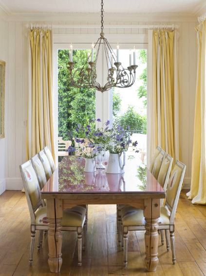
For some reason, even though the house is extremely large it doesn’t feel too pretentious in its decor. Not too ornate, not too over done, not too ostentatious…well played.
Here are just a few images of this mansion…
To see even more of this house…I’ve only shown you about 1/5th of it…you can go to the official website at 2701 Broadway Street.
What do you think of this multi million dollar listing? Take or leave? If you would take it, anything you might re-do? If you are leaving it, do tell why?
Happy Monday!
xo
Coco






Lovely house! Indeed not overdone. Great views and the oranges, yellows with that beautiful wood and that pop of blue work well together!
Absolutely beautiful! I think i could force myself to live there!
It’s okay, I guess.
All right, it’s pretty darn nice.
Especially the view of the ocean.
Wow…this house is perfection. Love the decor, feels cozy with a lot of unique elements that give the wow factor. LOVE the kitchen and breakfast area…its perfect in every way. So why would I leave it? Because for 32 mill I dont want neighbors that close haha
Take it!! Those floors are something to die for!! Wide wood.. ahhh!! A dream!! And the view from that… what… family? garden room? never mind, I’ll take it!! In San Francisco?? PERFECT!!
Seeing the interior shots, I think…nice house. Seeing the airial shot, I think…..is that it!? 32 mil and almost NO garden, no pool. Love the house, not the pricetag.
Ron ( empel collections)
Off The Hook Amazing!! I love it and if I had the $$$ I would dive in. If I were to change anything it would be from yellow paint to a soft, warm grey tone. Everything pops from grey – but that’s it. I used to live up there and miss it – the view is breathtaking 🙂
I love that kitchen! The island, all the white, all the fabulous accessories!
Holy Moly! What a fantastic house, but who the hell needs that much space? It’s beautifully decorated, though; not fussy,just comfy.
Coco,
Thanks for sharing this post! I love San Francisco. I suppose I romanticize San Fran, probably because I live out east? I visited the website to see the house in it’s entirety. The house is quite lovely and it appears to serve multiple purposes. The architecture, trim work details, and materials used on the main floor are an interesting mix of formal and country. The top floor says ‘casual cottage living’. Then of course, I was wowed by the basketball court and art room found in the home’s lower level. The decor is livable and not over the top. This is a home that speaks to a lot of needs.
Keita
http://www.keitaturner.com
Toss you for it!! xv
This is probably my favorite block in San Francisco.
The interiors are beautiful I haven’t had time to study them yet but at first glance I was blown away …
Lovely home! My favorite room was the kitchen. I love the lighting and the oval island. I would probably repaint some of the rooms to tone down the color a bit. And gosh I wish it had a yard and a pool!
That house had me at the large and bright hallway, but then I nearly fainted when I saw the dining chairs! Mixing orange and yellow velvet chairs: it doesn’t get much better does it! And that view! Oh my…
Absolutely lovely and livable as well. Thank you for sharing.
Rick Shave, PleasantLivingHome
Yeah, I would want to live here!! Are you kidding? I love the bright colors and sense of fun. You don’t see that very often at homes at this price point. Why are they selling? It looks like a happy home.
I would like to see a wider dining room table. Finally a room that can TAKE a nice wide table… and the guests are going to be hitting their heads on those ginormous chandeliers! But over-all… very nicely not over-done and pretty! love SF. Thanks for posting!
32 Mil certainly doesn’t buy as much as it used to. Makes me wonder, why??? Is it filled with big names with no quality behind them? I t hink I would prefer a smaller home with lots of quality rather then a big home that looks just sort of average. My pet peeve: the light fixtures are so standard looking… It seems to me that home owners have no clue about quality and are just getting fed what ever is out there at the time.. I certainly hope that these owners are blessedly clueless and loving everything.
Hi Coco. Pretty sure that’s SF designer Stephen Shubel. If you go back to 10/25/09 on my blog (or search “pumpkin”) you’ll find a few photos from HG ’04. MUCH more intense color. Gorgeous and dramatic use of orange and yellow. One of my favorite designers. Trish
I love this house! The colors are spread throughout, I like the different color dining chairs, the set off but open library, and the serving hole in the wall in the kitchen.