I like this little tiny small apartment. 830 square feet to be exact. It feels light, bright and airy. No frills really as far as decor…but it hits the nail on the head on making a small space feel as large as possible.
Some tips…
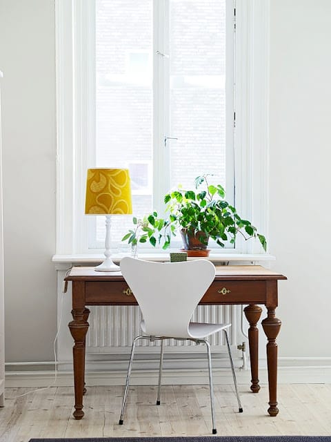
1. Less is more – A little furniture goes a long way in small space. In a living room, a sofa, a side chair, storage armoire, a coffee table and a credenza for the t.v. – that’s it. In the bedroom, a desk, two chairs and a bed…done. Functional and it looks good too because there is not a lot of furniture piled on top of furniture. I might suggest adding one extra comfortable chair in the living room as the space should be comfy and inviting for guests!
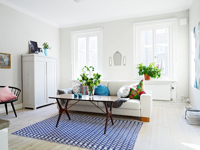 |
| Light wood floors, neutral light gray walls, and white furnishings help keep this space feeling clean and organized. (above and below) |
2. Peek-a-boo – I think drapery and curtains are a must in most spaces…but if for some reason your view allows privacy and a curtain-less window can provide the maximum light…then I say go for a bare windows look! Eliminates visual clutter and no drapery to obstruct light. More light means a more cheerful space. I know…this is considered a no no no to the interior design world. A window without shades or drapes? Who would ever suggest that? Uh…me.
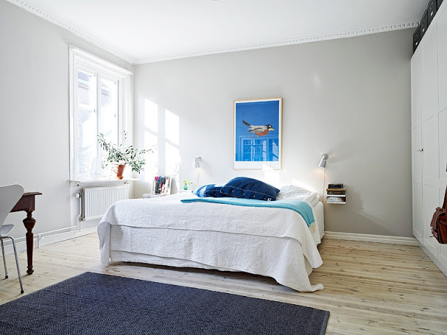 |
| A floating nightstand and wall mounted reading lights means allows more room for a large bed. (above) |
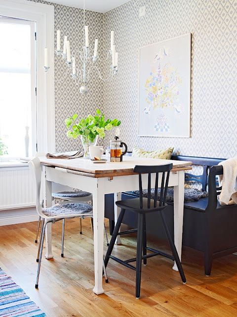
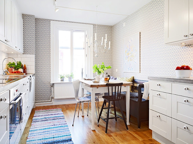
3. Go big or go home in one room – Most people are afraid of wallpaper…I am. I think though in a small house or apartment it is imperative to have a little fun in one room with wall coverings or wallpaper. This Swedish inspired geometric print works in this kitchen I think…adds some texture and pattern to an otherwise simple space. Definitely conversation starter around the eat-in kitchen dining table. Yes?
What do you think of this small apartment? What do you think of these tips…any you just absolutely object to with every fiber in your body…LOL!? Please do tell. Anything you might add or subtract to make this space work?
Happy Monday!
xo
Coco
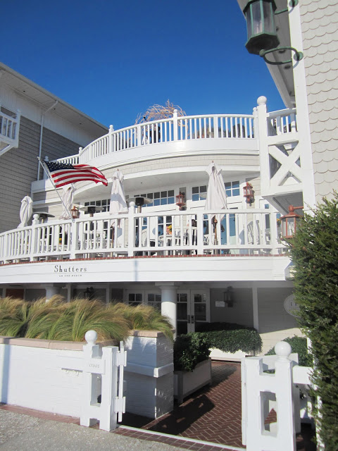
P.S. Had a fabulous family brunch at Shutters yesterday right ….then sis DS and I took a nice little walk along the beach…crisp and clear…a perfect California fall afternoon…see below.
 |
| Santa Monica beach on a sunny Southern California Sunday afternoon! (above) |
P.P.S. Forgot to mention the fun dinner I went to last week (see below). A girls dinner it was called. Well considering I was the only girl there who is not married…it was a regular dinner for me and a girls dinner for everyone else. Hmmmmm…need a cute boyfriend so I can attend a girls dinner and call it a girls dinner! Anyhoooooo…after attending a live recording of the X Factor over on the CBS lot – this is my favorite show in the entire world (although last night, while working on my laptop, I was watching something called Ice Road Truckers Dangerous Roads for no reason and was riveted…these truckers driving on treacherous roads in Bolivia and every minute their trucks are about to tumble off of cliff…totally not my thing and on History Channel (oy) but I was glued to the t.v. nonetheless…), I headed over to a dinner with friends Alison Blumenfeld of Blumenfeld Interiors and Kristi Bender partner at Wendy Schwartz Design and new friend AK (I only use initials because I don’t know if AK would want me to use her full name). anyhooo…AK was carrying the most to-die for quilted Chanel bag…must have this purse…AK says she got it years ago…uh oh…just talking about the purse is making me anxious…I need that purse…it is too cute…ahhhhhh….I NEED that purse…inhale…exhale…breathe…think big picture…calm…okay.
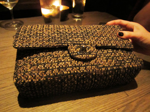 |
| AK’s Chanel purse…love this (I think Kristi B is doing the Vanna White honors here…nice nail polish!)! (above) |
P.P.P.S. Just talked to best of guy friend BN…he just told me that all of my friends were at a party this weekend but no one invited me along…hmmmm…nice…:-(…he said when he was talking to all of our mutual friends he thought “This might have been a fun party for Coco…”…well at least he thought of me…trying to look on the bright side of things here and not get huffy at all of the friends who didn’t invite me along or think of me. Props to you BN for at least having a passing thought about me…hmmm….need higher standards perhaps if this is what I am giving props for! LOL!
P.P.P.P.S. Need to shower…will be late to work…have very nice boss though so maybe he’ll overlook me being a few minutes behind. 🙂 Maybe…? I hope.
Photo: Stadshem

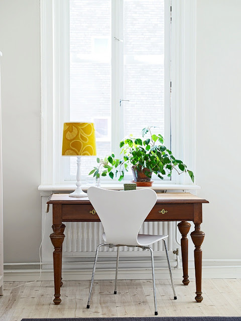
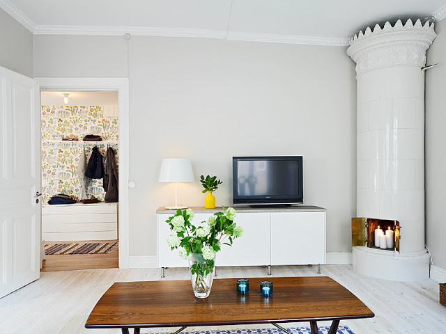
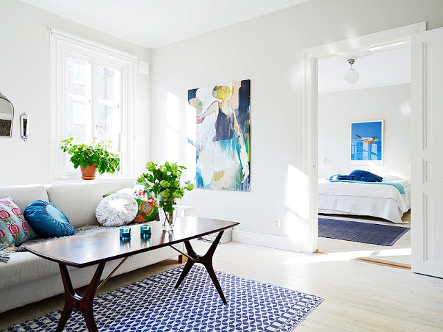
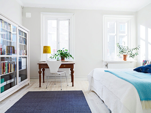



I love this space. It is beautiful. But it cracks me up that in most of America (outside of NYC and SF, 830 sq feet is considered “teeny tiny.” If that space is well-designed, one or two people don’t really need more than that.
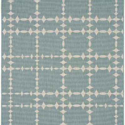
Do you know where the blue & white rug in the small living room picture is from??
Looks so much bigger! Very well designed and the furniture placement is right on.
Jamie Herzlinger
Must be a Swedish space!! Love it.
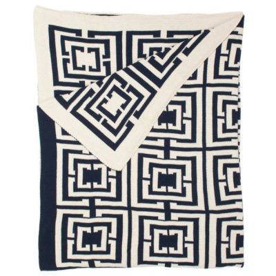
please…do tel…where are the two navy rugs from??
I was really excited to read this post, but was disappointed when scrolling through the pictures. This apartment is far from tiny. If you want to provide tips to help “tiny space” dwellers, please use a space that fits the description. That living room is the size of many people’s studio apartments.
I love that apartment! So clean and bright.
I love this apartment, its perfect I wouldn’t change a thing…maybe sheer curtains, but I don’t think the space needs any – lovely, thanks for sharing! ;–))
This little apartment is perfection! And just so you feel better, I took down all the blinds/window treatments on our breakfast room bay window because we look out into the woods. Love it ~ made the whole room feel bigger and it’s like being in a tree house. 🙂
Happy Monday!
I really like the graphic wallpaper, and I think you’re right, that it’s important to make some big statements whether your space is big or small. I think the wallpaper actual HELPS the room look bigger because the scale is so small. I’m not sure it would be as successful with a really large scale print. Great house tour!
heyhomeslice.blogspot.com
I am an interior decorator and I agree with you that not every room needs curtains. ‘Less is more’ and letting in the sunlight are both good Feng Shui practices. I am glad o have seen this post as my next blog post is going to be on letting in the sunlight and why it’s good for you!
What I love most in this apartment is that it’s bathed in clean, bright white with bold, happy-colored accents splashed around. If the walls were painted dark charcoal gray, or navy, instead of white, and everything else stayed the same, you’d feel like you were in a claustrophobic little cave no matter how spot-on the furniture scheme is.
Looks Scandinavian to me! Swedish actually… the tall “Kekkelovn” gave it away 🙂
Great light, huh?
I would love to know what that paint color is…any ideas?
i so love all that is this apartment…wonderful! i might make a little room for a few more chairs though myself. we like to entertain and it’s always nice to put people somewhere when they’re tired of standing. 😉
love, love, love
It was the Chanel bag at the bottom that got me loving this page!!! As for the space…light, airy, a bit conservative in its styling. http://inmycabinet.blogspot.com
I love the bold color statements. We are currently changing our look and trying to get away from the safety colors like grays and browns. It can be kinda shocking when you first introduce bold colors, but it really can make a room stand out.
Hi, I am a new fan of the blog and this is my first post although I have been secretly stalking CocoCozy for some months. Anyways, everyone pretty much summed it up -awesome apartment! But I felt a bond when I read you are scared of wallpaper (ref. to the kitchen). I was too. I got over it and did two accent walls in my house (love!) but now what I am struggling with is putting art on TOP of the wallpaper like is done in your pic. I think the paper should stand alone, others disagree. Thoughts, cococozy fans!??
Wonder full! And I love the minimal look of no curtains!