logo
inline logo
  • Blog
  • Design
    • Kitchen
    • Bath
    • Bedroom
    • Living Room
    • Outdoor Living
  • Style
    • Fashion
    • Best of
    • Design On Sale
  • Projects
  • Travel
  • Shopping Guides
    • Gift Guides
    • Resources
    • Wishlist
  • About Coco
    • Meet Coco
    • Press
    • Contact
main logo
  • Blog
  • Design
    • Kitchen
    • Bath
    • Bedroom
    • Living Room
    • Outdoor Living
  • Style
    • Fashion
    • Best of
    • Design On Sale
  • Projects
  • Travel
  • Shopping Guides
    • Gift Guides
    • Resources
    • Wishlist
  • About Coco
    • Meet Coco
    • Press
    • Contact
imagestyle
share
home design ideas

SNEAK PEEK – COCOCOZY 2012!

January 19, 2012
  • Share
Assortment of navy pillows and throw on sofa with green hydrangea flower arrangement.
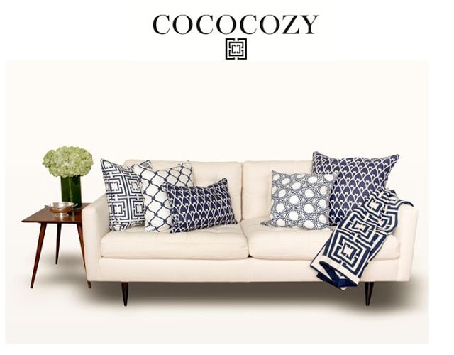
Catalog Cover Option 1 – Assortment of navy pillows and throw on sofa with green hydrangea flower arrangement. (above)

So remember I mentioned that fab operations manager KS (who loves the color pink) and fab photographer Hugh Hamilton and I were up until the wee hours doing a photo shoot on Tuesday night (just two days ago…I thought the shoot would take 3 hours…we were there until 1:30a and I didn’t get home until after 2am)?  Well…we were shooting the new cover for the COCOCOZY 2012 catalog…!  We’re introducing the new catalog and new collection on January 29th at our booth at the New York International Gift Fair!
Well here is a sneak peek of what’s to come from the COCOCOZY collection!  Some new designs that I cooked up and a whole collection on a new natural linen base fabric.  We have a few new throws too, some table top, lacquer boxes, hand towels and maybe a bit more!

Oh and I need a bit of help figuring out the cover of the catalog.  Fab graphics designer EF is working down to the wire to finish it all up in time for the big launch at the New York International Gift Fair a week from Sunday.

I have of course already canvased all of my friends…with FF, JLF, KB and SN weighing in so far…each of them liked something different.  Help! Need your help readers!

Which of these photos do you like best for a possible cover shot?  Do tell?

Chair shot with new natural linen pillow and tulips
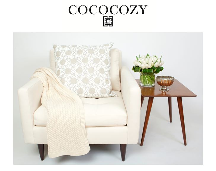
Catalog Cover Option 2 – Chair shot with new natural linen pillow and tulips. (above)
Close up of two new styles in the Classic Linen pillow group
Catalog Cover Option 3 – Close up of two new styles in the Classic Linen pillow group. (above)
Sofa with gray and sea green pillows and roses
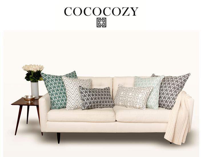
Catalog Cover Option 4 – Sofa with gray and sea green pillows and roses. (above)

All of these were shot at my wonderful sis DS’s house using her furniture (the tables a classic Paul McCobb side tables btw).  DS went and got a hotel room for the night of our photo shoot because she knew we’d be there all night and we were!

KS and I have turned into stylists…Hugh had to get us to stop laughing though as pillows kept tumbling everywhere and we were tripping over piles of inserts…but between the laughing, lots of snacks, lots of moving furniture and placing and re-placing stuff…we got it all done…woo hoo…yippeee…uh huh uh huh…woot woot…yahoooooo!

There is still so much more to do so I probably should stop with all of the premature celebrating!

Please let me know which of these you like best for a possible COCOCOZY catalog cover.  If you don’t like any…we have so many more to chose from too.  Would so appreciate your help.

Happy Thursday!

xo
Coco

P.S.  Thanks ST for the advice on posting. 🙂

P.P.S.  Here’s a shot of Hugh snapping photos at sis DS’s house.  I took this with his extra camera…he says I need lessons on focusing!

COCOCOZY catalog shoot

P.P.P.S.  Need to take photography lessons…LOL!

image
DISCLOSURE: This post may contain affiliate links, meaning when you click the links and make a purchase, we receive a commission.
previous
next

related posts

anchor text
anchor text

My Spring Favorites

imageanchor text
imageanchor text
Meet Coco - Bring Style Home

Meet Coco - Bring Style Home

A Los Angeles native, Colette Shelton, also known as “Coco”, is an entrepreneur, design blogger and home furnishings designer.

Read More   read more

Looking for Something?

View All Posts
image

Earn Cash Back While Shopping For Fall

Chirpyest is the shopping platform I created. Using Chirpyest, anyone can earn money by shopping AND for sharing from over 800+ online retailers! Sign up for free! :)

Tap the "join Chirpyest now" link below or the image above to get started making money while you shop!

Join Chirpyest Now
Elegant Sideboard Table
image

Use Chirpyest to get 5% cash back from Lulu & Georgia!
Join our mailing list
Sign Up Now

Recently Pinned

Recently Pinned

Resources

My list of favorite brands and retailers to shop.   Resources
image
write a comment
  • Share

62 responses to “SNEAK PEEK – COCOCOZY 2012!”

  1. Julie says:
    January 19, 2012 at 12:40 PM

    I love Option 1 with the blue tones. Amazing products and congrats on the catalog.

    Reply
  2. Candice says:
    January 19, 2012 at 12:56 PM

    #1 and 3!

    Reply
  3. Calypso In The Country says:
    January 19, 2012 at 1:02 PM

    They are all beautiful but Option 1 is my favorite!

    Reply
  4. Anonymous says:
    January 19, 2012 at 1:07 PM

    I love them all. I would go with number 3.

    Reply
  5. Laur322 says:
    January 19, 2012 at 1:09 PM

    My personal favorite is # 2 BUT the cover should be #1 because it is most representational of who you are

    Reply
  6. The Pink Pagoda says:
    January 19, 2012 at 1:10 PM

    Everything looks amazing! I like #1 the best and I’d love to see a tiny bit more saturation put into the hydrangeas. Yes, OCD.

    Reply
  7. Carol says:
    January 19, 2012 at 1:11 PM

    All are nice. But #1 really grabs my attention.

    Reply
  8. Sue M. says:
    January 19, 2012 at 1:12 PM

    I like option #1 then #3. I might also suggest, if you can “photoshop” the hydrangea arrangement to be a little lower it would be perfect! Sue

    Reply
  9. Anonymous says:
    January 19, 2012 at 1:14 PM

    I like Catalog Cover Option 1!!

    Reply
  10. Sherrie Rashid says:
    January 19, 2012 at 1:15 PM

    I am split between options 1 and 4. I love them both!

    Reply
  11. Upscale Downhome says:
    January 19, 2012 at 1:15 PM

    Love your work and your blog. You inspire me. I love the picture of the sofa with all the pillows. Gorgeous!

    Reply
  12. Anonymous says:
    January 19, 2012 at 1:18 PM

    #1 is the clear winner because it looks the most cozy! Agree that the green could be a bit more saturated.

    Reply
  13. Kristina Gulino says:
    January 19, 2012 at 1:20 PM

    Yup, #1 is it!

    Kristina
    Something 2 Write About

    Reply
  14. Tiffany Leigh {designer lifestyle} says:
    January 19, 2012 at 1:22 PM

    I love them all! But..that’s not very helpful, so I’ll cast my vote with number three. It’s a clean and simple design that makes me want to open to the next page. You can’t go wrong with any of them though! Can’t wait to see what you end up with!
    Tiffany
    designer-lifestyle.blogspot.com

    Reply
  15. rubi says:
    January 19, 2012 at 1:22 PM

    No: 2

    Reply
  16. Laura says:
    January 19, 2012 at 1:23 PM

    Option One!

    Reply
  17. Kate says:
    January 19, 2012 at 1:24 PM

    Definitely #1!! It is visually appealing, interesting, and it makes me think…I want all of that!

    Reply
  18. Denise Earles says:
    January 19, 2012 at 1:26 PM

    Option one!!! The color combo and framing of the corners captures the whole photo best!!

    Reply
  19. Jalon Burton says:
    January 19, 2012 at 1:28 PM

    Option 1 dawling… Option 1!!!
    Thanks for sharing – can’t wait to see the catalog!
    Retail or wholesale?

    Reply
  20. Clementine & Olive says:
    January 19, 2012 at 1:44 PM

    option 4

    Reply
  21. Anonymous says:
    January 19, 2012 at 1:54 PM

    Like them all… I would not pick 2, and like 3 or 4 best.

    Reply
  22. Karena says:
    January 19, 2012 at 2:05 PM

    Quite a consensus here. Option one really focuses on your great merchandise! It is a nice selection of my favorites for sure!

    xoxo
    Karena
    Art by Karena

    Reply
  23. Anonymous says:
    January 19, 2012 at 2:19 PM

    Option number 2 definitely.

    Reply
  24. Anonymous says:
    January 19, 2012 at 2:20 PM

    Option 4, I love the colour!

    Reply
  25. Sudha says:
    January 19, 2012 at 2:34 PM

    i would say #4 as it showcases ur variety offerings in a single frame

    Reply
  26. Debra says:
    January 19, 2012 at 3:03 PM

    Option 4 gets my vote!

    Beautiful.

    xoxo
    Debra

    honestlydebra.blogspot.com

    Reply
  27. jamie @ [kreyv] says:
    January 19, 2012 at 3:34 PM

    I love number one the best. It really jumped out at me with the contrast of the navy against the sofa and the green flowers. LOVE your products!

    Reply
  28. Frances Herrera says:
    January 19, 2012 at 3:51 PM

    I love # 4…. It shows how gorgeous your pillows look as a grouping!

    Congrats on all your success. I’ll stop by your booth at NYIGF and introduce myself. Looking forward to meeting you!

    Reply
  29. Jamie says:
    January 19, 2012 at 3:57 PM

    Number 1! Love the colours and set up!

    Reply
  30. Anonymous says:
    January 19, 2012 at 4:09 PM

    Love number 1–but I truthfully am not crazy about the table! so sorry— I usually love everything you say! love your blog!

    Reply
  31. Instant Interiors says:
    January 19, 2012 at 4:17 PM

    Congratulations! I pick number one for the cover. I like seeing the variety and makes me think…..mmmh wonder if there are more colors in the catalogue, let’s look inside!

    Reply
  32. baebe says:
    January 19, 2012 at 4:34 PM

    Was rooting for #1 till I scrolled down to #4 – 4, definitely!! Love both groups of pillows, but I think the mixture of colors on #4 will stand out on a cover more and catch more attention.

    Reply
  33. Keita Turner says:
    January 19, 2012 at 4:59 PM

    Coco,

    I like #3 and #1. One is strong in terms of showing a collection of your goods in a mini (retro) furniture vignette. Plus, the contrast of the blue and white is strong. But, for some reason I think #3 is the strongest as a cover because it is a large simple, clean, bold, and graphic image that offers mystique. It leaves the imagination open to using your wares in many different types of environments. It doesn’t tell too much, but just enough to draw one in and want to flip through your catalog. Option #1 seems like the obvious choice, but sometimes the obvious is not the best. Congrats!!!

    Reply
  34. mkcp007 says:
    January 19, 2012 at 5:32 PM

    My first pick is option 4 but also really love #1.

    Reply
  35. New Leaf says:
    January 19, 2012 at 5:44 PM

    #4, with #1 as second choice 🙂

    Reply
  36. Anonymous says:
    January 19, 2012 at 5:58 PM

    Option1!

    Reply
  37. Miriam-NEMM Design says:
    January 19, 2012 at 6:04 PM

    Definitely Option 1! Best of luck!

    Reply
  38. Janelle McCulloch says:
    January 19, 2012 at 6:17 PM

    Number One is the most vibrant, perhaps because it has more cushions/pillows to catch the eye! Looks lovely. Janelle McCulloch

    Reply
  39. Julia says:
    January 19, 2012 at 6:44 PM

    Yeah, Option 1!

    Reply
  40. Jenn says:
    January 19, 2012 at 7:05 PM

    I think the color play in option 4 works best.

    2 is my fav, but it’s not dynamic enough (but looks oh, so cozy!)

    If you take the table and accessories away from 1, then that becomes my fav. Love the cobalt.

    Reply
  41. Kate says:
    January 19, 2012 at 8:44 PM

    definitely the first one, you can’t go wrong with navy and cream, love it!!!

    Reply
  42. asteffan says:
    January 19, 2012 at 9:13 PM

    Option 3 is clean, modern, and interesting – never telling the whole story on a cover creates interest.

    Reply
  43. Stephanie says:
    January 19, 2012 at 9:25 PM

    #1 Coco!!!! And congratulations!

    Reply
  44. Anonymous says:
    January 19, 2012 at 9:27 PM

    1 or 4 would both grab my attention
    not a big fan of 2 or 3-those likely wouldn’t draw me in if on the cover

    Reply
  45. Anonymous says:
    January 19, 2012 at 9:33 PM

    Option 3

    Reply
  46. Ruth says:
    January 20, 2012 at 2:21 AM

    LOVE #2! So perfect for a little reading nook…

    http://www.flossyblossom.blogspot.com

    Reply
  47. Anonymous says:
    January 20, 2012 at 5:07 AM

    Love number 1!! Think it makes the best impact!!

    Reply
  48. Bethany says:
    January 20, 2012 at 5:53 AM

    I need photog lessons too!!! Like stat. All of my pics on my blog are iPhone or Pinterest. Maybe I should just invest in a course or something.

    PS – i think the gray set-up is really cool. when i think of your stuff, i think more contrasty and bold, and the gray looks like its the 2.0 version. something different.

    Bethany

    http://www.powellbrower.com

    Powell Brower Home

    Reply
  49. [email protected] says:
    January 20, 2012 at 6:16 AM

    They are all beautiful, but I say number 4.

    Reply
  50. Lisa Mende Design says:
    January 20, 2012 at 6:28 AM

    I love Option #1. It show your beautiful pillows and gives the viewer an idea of use. Perfect! Wouldn’t it be cool to use that on your website and have it interactive so the user could change the pillows and create their perfect pairings…

    Reply
  51. Stephanie says:
    January 20, 2012 at 6:57 AM

    love option 1

    Reply
  52. Carey says:
    January 20, 2012 at 6:59 AM

    No. 1 for sure.

    Reply
  53. effie's paper says:
    January 20, 2012 at 7:01 AM

    I love no. 3. I agree with Keita – it’s a clean beautiful shot and it leaves a lot to the imagination in terms of how your pillows can be used … Perhaps on a bed, screen in patio, the options are endless. All of the shots are beautiful. Have fun putting the catalogue together.

    Stylishly yours,
    Kalyn

    Reply
  54. coby kutcher says:
    January 20, 2012 at 7:31 AM

    #2 is visually stunning but does not show off your product as well as #1..which is also gorgeous! #1!

    Reply
  55. Mo says:
    January 20, 2012 at 8:06 AM

    The first is definitely my favorite! I love the contrast of black and white; your prints pop the most in this photo and it is graphically appealing. Also I love the clean lines of the modern couch and side table! The couch is way more inviting than the chair, and the contrast of dark on white is much brighter than the tan and pale blue in option 3- and believe me those are my favorite colors- but I love photo 1 the most as a cover piece!

    Reply
  56. Emma Fox says:
    January 20, 2012 at 8:06 AM

    #1 or #4 are the best! Always read your blog, so lovely – my nan loves inteior design and I always show her this blog!

    http://www.foxtrotbravo.blogspot.com ~ fashion blog

    Reply
  57. Sarah Morris says:
    January 20, 2012 at 9:31 AM

    #2 or #4 are my favorites!! I’m a big fan of muted cool colors (4) but also simplicity and whites (2). This is my first comment to you CoCo, I read your blog DAILY and cannot wait for the day when I’m no longer an optometry student and can afford your beautiful products! You have truly inspired my design taste! Thanks for all you do!

    Reply
  58. Nancy says:
    January 20, 2012 at 10:09 AM

    I like Option 1!!! and I love your line !
    Nancy
    http://www.powellbrower.com/2012/01/score-home-goods-nails-it.html

    Reply
  59. Donna says:
    January 20, 2012 at 10:41 AM

    I love the first one! The second is too simple. The third is my backup choice!

    Reply
  60. ZéPedroRodrigues says:
    January 20, 2012 at 11:12 AM

    Hello,
    I loved the different textures of fabrics and patterns!
    The pads are beautiful!
    kisses
    Zé Pedro Rodrigues
    http://zepedrorodrigues.blogspot.com/

    Reply
  61. Chelsea says:
    January 20, 2012 at 12:38 PM

    Love them all! Hard decision.. I’d say either #2 or #4

    Reply
  62. Anonymous says:
    January 20, 2012 at 1:23 PM

    Of the three options, # 1 is definitely cover worthy!! :))
    It caught my eye right away, the contrast works… The only suggestion would be to change the flower arrangement, something bugs me about it, but not sure what… the colour? the vase? the height?
    MB
    p.s. I truly enjoy your blog!! :))

    Reply

Leave a Reply Cancel reply

Your email address will not be published. Required fields are marked *

This site uses Akismet to reduce spam. Learn how your comment data is processed.

Instagram

Your path doesn’t have to make sense to anyone bYour path doesn’t have to make sense to anyone but you. My career path is proof...
Law school grad ➡️ TV reporter ➡️ TV Exec ➡️ Design influencer ➡️ Home textiles designer and creator ➡️ Tech founder.
Unconventional? Absolutely.
But I’m exactly where I’m meant to be.
And so are you.✨
#TuesdayMotivation #CareerJourney #WomenWhoLead #FemaleEntrepreneur #DesignInspo #BossMoves #InteriorDesignCommunity #TechFounder #CreativeLife #LifeByDesign #InspoDaily #MakeItHappen #ThisIsYourSign #WomenInTech #interiordesign #blogger #lawyer #techfounder #happy
Sound on. Birds. Breeze. Afternoon light. Hot pinkSound on. Birds. Breeze. Afternoon light. Hot pink bougainvillea. Home sweet home. 🌺🌺🌺
#homedecor #bougainvillea #california #outdoorfurniture #courtyard #vintagefurniture #spanishstylehome #losangeles #goldenhourglow #palmtrees
Behind-the-scenes: Fun work trip to visit the COCOBehind-the-scenes: Fun work trip to visit the COCOCOZY bedding collection at the Welspun showroom in New York. Met with some buyers, had a fun time with the Welspun team, then capped off the weekend with a visit with friends. It is a long process to get bedding in stores across the country...showing the collections at textiles market is one of the first steps!
If you're interested in learning how I have gotten @cococozy products into stores around the country over the years including in major retailers...follow along...just one entrepreneur's journey. :)
#interiordesign #homedecor #welspun #cococozy #bringstylehome #bedding #comforter #decor #entrepreneur #hustle @welspungroup @welspotted @mywelspunhome
Designed to be a peaceful retreat—this balcony iDesigned to be a peaceful retreat—this balcony is my favorite project yet. 🌿✨ What does your perfect escape look like? Tag someone who needs a moment of calm.
Design: cococozy
🎥: cococozy
Follow @cococozy for more home design inspo
#BalconyDesign #OutdoorSpaces #cococozy #LosAngeles #CaliforniaVibes #OutdoorOasis #DesignDetails #TileFloor #spanishstylehome #BalconyGoals #HomeInspo #ElevatedLiving #InteriorStyling #ltkhome #smmakelifebeautiful #houseandgarden #currentdesignsituation #howyouhome #interior4inspo #interiorandliving #howihaven #mybhg #finditstyleit #sharemystyle #myoklstyle #loveyourhabitat #interiordesign #apartmenttherapy #exteriordesign #exteriorstyle
Bought a new bed for 2025... but the universe’s Bought a new bed for 2025... but the universe’s idea of a ‘fresh start’ is a whole different vibe... Can we fast forward a few years and start over?
Design: @cococozy
#AtLeastMyBedIsCute
#luxeathome #smmakelifebeautiful #houseandgarden #homesandgardens #ambularinteriorsaintgotnothingonme #beckiowensfeature #currentdesignsituation #howyouhome #interior4inspo #interiorandliving #howihaven #mybhg #finditstyleit #rusticdecor #inspiration #sharemystyle #loveyourhabitat #interiordesign #apartmenttherapy #inmydomaine #rueday #kmidesignstyle #mydomaine #wearevivir #exteriordesign #exteriorstyle
Follow on Instagram
footer logo

Interiors

  • Kitchen
  • Bath
  • Bedroom
  • Living Room
  • House Tours
  • Outdoor

Style

  • Fashion
  • Best of
  • Travel
  • Design on Sale
  • Coco's Projects

About

  • About Coco
  • Press
  • Contact
  • View All Posts

Join our mailing list

Sign Up Now
© 2025 Cococozy | Terms & Conditions