Total design non sequitur but I must share…
So was out to dinner at Eveleigh on Sunset last night…it is the latest “in” restaurant in Los Angeles. It has a covered outdoor patio with a huge skylight and for some reason my seat was conveniently placed right under a huge ominous billboard of Paris Hilton (see COCOCOZY Twitter to see what my view was all night!).
Anyhooo…was with a fun group of girlfriends at this Eveleigh establishment; two of whom are visiting from San Francisco. We were seated at a communal table at the center of the restaurant. We ordered few little starters (including a to-die-for quinoa salad) and then we ordered some main courses to share. When our main dishes arrived, there were no side dishes…only protein on the plates (no veggies no starch…just a small entire sea bass (bones and all), a plate with 4 huge shrimp on it. and a tiny little steak…there were five of us). We asked the waiter if he had any side dishes for us to chose from (namely carbs) and he looked at us as if we were bonkers…he said “Well we had one pasta dish but we don’t have that anymore, a few months ago we used to have macaroni and cheese on the menu but the chef took that off, oh yes we do have some roasted potatoes maybe…maybe…would that work?” Then he went onto add as he looked at us like we were aliens, “Sorry, we don’t have any carbohydrate type food really because no one here in L.A. really orders that kind of stuff”. Well I’m in L.A….I order that “kind of stuff”. (Btw, after much prodding and begging…we managed to get him to find some french fries somewhere in the back not necessarily on their seemingly carb free menu!). Everyone at the table in our group was relatively small (ranging from a size 0 (and she is a mom) to maybe a size 4 (or max 6))…no one was obese…but the waiter certainly made us feel like food criminals for even asking – the look on his face was one of total confusion (“what is a carb?”) and horror (with a little disgust and disappointment thrown in)… Oh life in Los Angeles. Totally surreal.
Anyhoooo…onto design…
I love collections of art. A mix or grouping of paintings, photographs and/or prints. Love the visual interest that the arrangement alone can add to the space not to mention the art itself.
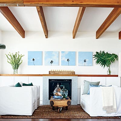
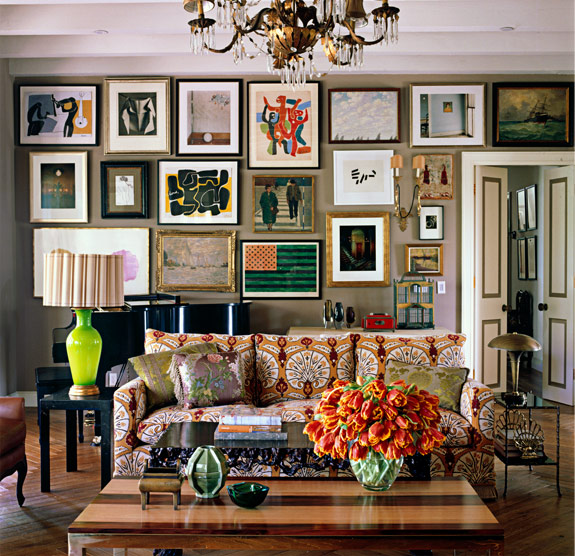
Here are two rooms…with collections of art…very different in feel. The first room is white and clean and the art (a series of four photos or paintings of palm trees against a blue sky) is symmetrically arranged in a row above the fireplace. I love this room and the look. Then there is the living room below where the collection of art covers the wall and comes in a variety of shapes and sizes and formats…it creates an eclectic warm artsy vibe in the space.
So in today’s THIS OR THAT I ask you which one do you like better…this one or that one?
Okay, if you read COCOCOZY regularly, you can probably guess which room I gravitate towards (the first one)….but please please please I want to hear what you like best and why! Do weigh in please.
Happy Friday!
xo
Coco






I like the first image, its crisp & clean, rather feng shui.. However being the artist I am I do love color, so I would need to add a splash of color…The second image is also great, just a little too busy for me..
Have a beautiful week-end..!
The first one! I know people like to attempt a “gallery effect” with a ton of art on one wall, but I feel like there’s no focus. When you only have one painting or a small collection to look at, each piece seems more important.
Both gorgeous rooms and really different. I love the second room because of the eclectic feeling…like the pieces have been collected over a period of time. It looks really warm and those wood floors are amazing !!
xxLily
goldandgray.com
I am with you on the first one. I would have killed that waiter… NYC is full of skinny people who love carbs, mac n cheese on many menus!
I like them both, but I’m going for #1 too. I’m such a neutral girl!
ps- I posted our living room makeover today. Would love for you to check it out! It was a very drab before…!
http://www.justatouchofgray.blogspot.com
Hope you have a great weekend!
Oh…dont make me choose. I gravitate towards the cleanliness of the first one but love the colors in the second one…just dont like all that fussy furniture. Maybe take the two white couches from the first and place under all that colorful are in the second….Perfecto!
(btw…I am so glad you guys stuck to your guns and got fries…LA is quite a place!)
#1 For sure!!!
Not a fan of that old English hodge podge look for living in.
That was funny about the restaurant 🙂
the second is my fave. My eyes are drawn to the wall and don’t want to depart. Love it. xoxo michele
Whooo! Of course the first one. Just too much going on. The art on the walls may be okay if the couch and lamps and even the coffee table were toned down. I think if you eliminate one or two large frames and replace with a small one here and there, it would feel more organized and less cluttered. Put the colorful Matisse (I think) in the middle and build around it….not a straight line.
While I love love love the quirkiness and whimsy of the second look, if it came to arranging art in my own home I would go with the first! Clean, structured lines are always in style!
I like a full wall of a mix of art, but I don’t like the mix of art in the second. You have to be very careful when you’re doing this or it won’t work. The art collection in the secong picture competes too much with the entire room, which is already competing with itself. I am drawn to the simplicity of the first. However I see the art as more of one peice than a collection. When it’s a similar repeated image like this it’s more one peice of art to me. Regardless…I feel, less is More.
I like #2. The salon style installation is much loser and fun. #1 seems uptight and stringent.
Also, I love the sofa fabric in #2. J’adore!!!
I love the second one and would feel instantly at home in such a room. Having said that, however, I am attempting to pare down the art in my home. With my renovation complete (as of yesterday), I am now faced with placing strategic pieces. So difficult. I’m thinking carefully about every piece I allow back into the living space, and have managed to leave a lot of it (does one really need two large china swans? does one really need even one?) wrapped up in boxes marked “grandmother’s treasures.” They worked in her home, and I’m not ready to sell or toss, but I don’t have to feel obligated to display them.
Anyway, I love #2, but am trying to move myself more towards #1. 🙂
Prefer the second photo. What matters to me is that I LOVE and am attached to whatever is on my walls. That could be streamlined, if that serves the art better, or it could be a collage wall. Not sure if it’s a reaction to the clean, modern look or what because I leaned in that direction for quite some time. But now I’m needing a more updated traditional design.
So hard to choose! The top feels so free and clean, the bottom so sentimental and inviting. I think my choice would be based on whether the space I am decorating has great architecture or not. My house would work better with the one on the bottom, and it’s something i’ve been meaning to try in my dining room. Thanks for sharing.
Ditto on the restaurant anecdote.
I’m with you, Coco! #1 with it’s clarity and strong lines, plus mod photography wins.
LOVE the second! Fascinating room…..warmth with colors, designs, textures……all one’s senses are aroused in this terrific room
LOVE the second!! So much warmth in the colors, designs, textures……all senses are aroused viewing this room.
I love both rooms for different reasons, but #2 is my pick. #1 could be my vacation home, but #2 would be my choice for every day, comfortable yet beautiful living.
I love both! The first for it’s total design focus and the second for it’s collected nature. You get the sense there’s a story in every object.
OK – Room number 1 is lovely & calm, uncluttered and I find it a bit boring. The white slipcovers and the coffee table are fantastic.
Room number 2 is exquisite, but I’d like it to belong to a dear friend or relative, so I could drop in and enjoy all the decorations, art and style. I could see myself sitting in that room, enjoying a glass of wine and a great conversation. Afterwards, I could leave and head to my own home which would be somewhere between the two.
I love the art arrangement of the second room, but could do without all of the busy patterns on the sofa, etc. I think the art would have bigger impact……..My vote is art arrang. and wall color of 2nd room replacing the 4 pictures of the 1st.
Loving room # 2. It reminds me of a blog post I once saw on Kate Spade’s home. Glam, comfy living at it’s finest.
I so love the second room. I like to hang all kinds of random things and have all kinds of crazy patterns. I can totally get the aesthetic of the more simple look, but I could never live that way. I need the craziness, or I go crazy.
🙂
#1 is a look I love, but it’s not the way I live or decorate. While not quite as busy as #2, my house definitely falls more in line with that style–lots of warm color and textures, collections of art on the walls, interesting objects that have been gifted or collected over the years…
I’d pick # 1..so cool and crisp..though do admire the eclectic bohemian vibe of the second! xx meenal
LOL about the LA dining experience. I live in L.A. too and that’s just hilarious. Of course people order carbs. And even if they don’t, uh, could I have a salad or some green veggie with that? I mean, who just eats a slab of protein? I have never seen that in all my years in L.A., which is filled with great chef-owned restaurants where they do give you carbs with that. And not only carbs, dessert (egads)!
As for the this or that that you actually asked about, I say both! The top one for my main open design living room/dining room in the Los Angeles house (or the Key Biscayne beachfront house that I own in my future life), and the bottom one for the drawing room in my New York house in the fall and winter (hahaha, don’t have a New York house, either, but I did used to live in a Brooklyn Brownstone that could have rocked a great layered room like this. It also had an amazing wildflower garden).
Love the second one!
Love the post
Have a great weekend
Jamie Herzlinger
I usually like crisp and clean, but #1 is feeling too stiff for me. I like the motion of the #2 room.
Thanks for this: BEAUTIFUL!
Love,
ME
Hello!
Both are really nice and very different!
The first one, because of the perfect symetrie, gives a great sense of harmony to the space, added to the very fresh colors used for the decoration.
The second one, because of all the mismatching furniture doesn´t give all the quiet impression but it has a lot of personality and good taste.
Thanks for having such a nice blog, which I follow and have in my blogroll!
I would love for you to check mine and give me your opinion.
Thank you
I can find an emotion I like in both rooms but there is no one special stand alone item in either for me. #2 is too taken over with random stuff and patterns and I’m not a huge fan of a mixed media wall. With that said I don’t think the artwork in #1 is special enough to be a focal but I’d have to choose that room between the two. Thanks for sharing.
OOOH! How could I not comment?! As much as I love the symmetry and decor of #1, the collection in the 2nd is so much more interesting. I just wouldn’t have hung the top pieces so high. Something isn’t right about the works flush against the ceiling. Great post Coco.
KRISTEN BUCKINGHAM’S ROOM. I ONLY LOVE ROOMS THAT LOOK LIKE PEOPLE ACTUALLY LIVE IN THEM. SHE IS A MASTER AT THAT.
I love the second, I love the turkish inspired fabric of the sofa, the pictures on the wall, this room looks like it’s been here for sixty years, and was a collection of pieces that took decades to make.
I agree with Studio Soule–I’ve seen #2 before and it’s a favorite of mine. The first one leaves me feeling cold–no personality, no warmth. Just looks very generic to me.
It’s a “small plates” type of spot, my dear Coco–and I always get their fries, how strange. I can picture this exchange as if I were there. haha. As for the rooms, I am with a fellow commenter who suggested replacing the furniture in the 2nd room with the items in the 1st because I love the color on the walls only in #2.
Oh, Number 2, Number 2. It’s so quirky and interesting. I want to spend 30 mins in front of the wall and check out everything up close.
As a fine arts consultant, I think I’ve seen both types of placements done better. The first one uses four pieces, an even number, and I prefer odds numbers with this sort of group. It creates better balance and synergy with the architecture, which is something I always strive for with placement. In addition while the first arrangement is open and fresh, it’s a bit trite. The second salon style arrangement needs to be done very very skillfully to work. Much of the art featured here is wonderful, but there needs to be some focus established to help lead the eye.
BeckerFineArts.com
I have to admit..I’m not a fan of the second one at all. It’s way to busy for my taste and makes the room feel filled.
A wonderfully composed room ……the first word that comes to mind is “Eclectic”…..I love the splashes of color and the different textures blended together. My favorite part that actually brought a smile to my face is your choice of two different styles of lamps that bookend your wonderful couch. I’m not a fan of a room having to look perfect and you hit the mark with the lamps….I would almost expect this room to have a window seat with overstuffed pillows….great design…
I am feeling this! It has a cozy vibe but still gives off an edge! There are many accessories in the room yet it does not overwhelm me. Instead, I feel like I want to sit on the sofa relax and admire the eccentricity of it all.
Great images, both! The second image would be more successful if they had used a variety of sizes for the art. Seasonally speaking, I like the first image for summer and the second room for winter by the fire. There’s something about simplicity that calls for summer. Being surrounded by all that you love (the second image) is for nesting. Thanks for sharing!