logo
inline logo
  • Blog
  • Design
    • Kitchen
    • Bath
    • Bedroom
    • Living Room
    • Outdoor Living
  • Style
    • Fashion
    • Best of
    • Design On Sale
  • Projects
  • Travel
  • Shopping Guides
    • Gift Guides
    • Resources
    • Wishlist
  • About Coco
    • Meet Coco
    • Press
    • Contact

What are you looking for?

main logo
  • Blog
  • Design
    • Kitchen
    • Bath
    • Bedroom
    • Living Room
    • Outdoor Living
  • Style
    • Fashion
    • Best of
    • Design On Sale
  • Projects
  • Travel
  • Shopping Guides
    • Gift Guides
    • Resources
    • Wishlist
  • About Coco
    • Meet Coco
    • Press
    • Contact
imagehome
share
Bath

THIS OR THAT: THE BLACK & WHITE BATHROOM!

November 26, 2012
  • Share
Jessica Lagrange's black and white tiled bath tub and white towel holder stand
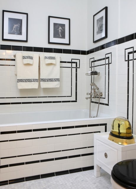
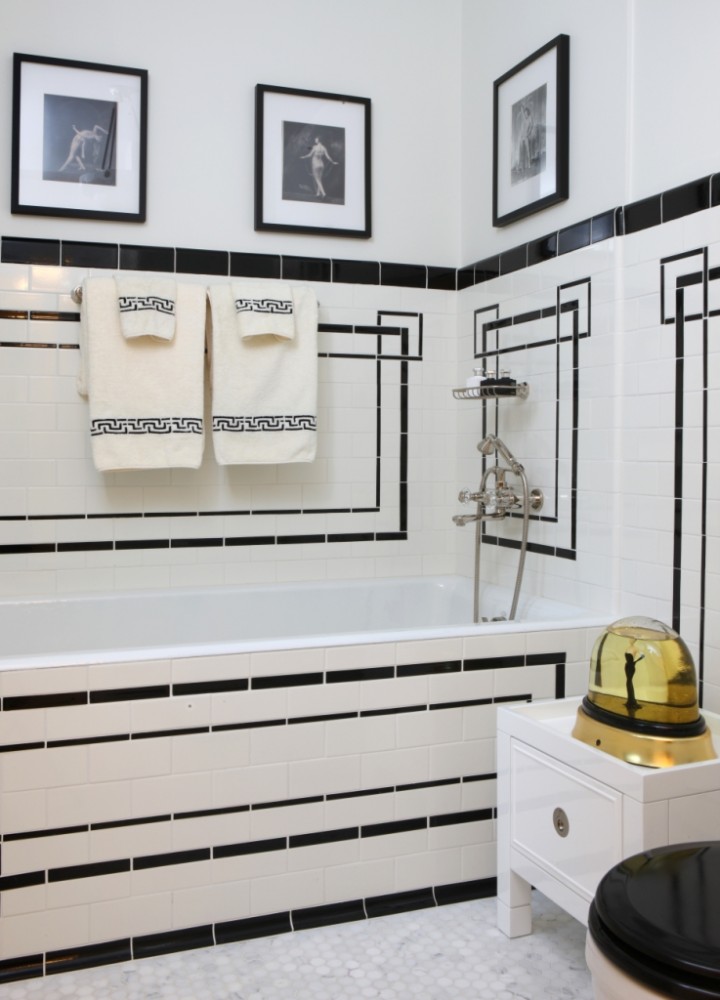
Bath 1 – Love the use of black accent tile laid in a graphic pattern in this small white bath. (above)

I am obsessed with all things black and white lately. Don’t know why…but I am. I love the idea of using the color combination in a bathroom. A predominately white bath using with touches of black.  Perfection.  Clean. Simple. Stylish.

So today I bring you the black & white bath…and you decide which one you like best…THIS OR THAT?

russell groves's black and white bathroom with black and white striped tile floor, two pedestal sinks and long mirror with white paneled wall with black dividers
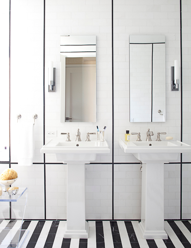
Bath 2 – Love the stripe black and white marble floor and the narrow pencil black highlight tiles used on the wall in this modern bath (above and below)
white freestanding tube in russell groves's black and white bathroom
michael mundy's black and white bathroom with white freestanding tub, black lacquer trimed door, glossy brass faucet pulls, and carrara marble floors, walls and counters
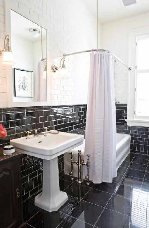
Bath 3 – High gloss black paint is used on doors and window trim to contrast against the elegant white marble in this classic bath. (above)
mcintyre bills' black white bathroom bath with black tiles on the floor, black and white subway tiles on the walls, a white freestanding tub with white shower curtain and a white pedestal sink
Bath 4 – Half black, half white…polished subway tiles create a two toned look here. (above)

So which of these baths do you like best?  I am gravitating towards Bath 3.  Which do you prefer?  Please weigh in on the comments below!

Happy Monday!

xo
Coco

P.S. Hope you had a fantastic long weekend.  I did. Thanksgiving was great.  Loved seeing family.  Then I managed to get a little COCOCOZY work done too (had to apply for a patent and register several copyrights for my new 2013 designs…I know…the lawyer in me came out this weekend).  I saw some friends. And, I also got some rest and relaxation in too.  A great weekend really!

P.P.S.  Now the countdown begins…Christmas is right around the corner!!!

Photos: Jessica La Grange; Veranda; Michael Mundy; McIntyre Bills

image
DISCLOSURE: This post may contain affiliate links, meaning when you click the links and make a purchase, we receive a commission.
previous
next

related posts

anchor text
anchor text

My Spring Favorites

imageanchor text
imageanchor text
Meet Coco - Bring Style Home

Meet Coco - Bring Style Home

A Los Angeles native, Colette Shelton, also known as “Coco”, is an entrepreneur, design blogger and home furnishings designer.

Read More   read more

Looking for Something?

View All Posts
image

Earn Cash Back While Shopping For Fall

Chirpyest is the shopping platform I created. Using Chirpyest, anyone can earn money by shopping AND for sharing from over 800+ online retailers! Sign up for free! :)

Tap the "join Chirpyest now" link below or the image above to get started making money while you shop!

Join Chirpyest Now
Elegant Sideboard Table

image

Use Chirpyest to get 5% cash back from Lulu & Georgia!
Join our mailing list
Sign Up Now

Recently Pinned

Recently Pinned

Resources

My list of favorite brands and retailers to shop.   Resources
image
write a comment
  • Share

11 responses to “THIS OR THAT: THE BLACK & WHITE BATHROOM!”

  1. coby kutcher says:
    November 26, 2012 at 8:54 AM

    I actually love it all! It’s really hard to screw up a black and white tiled bathroom in my opinion…some things just work!

    Reply
  2. The View from The Back says:
    November 26, 2012 at 10:09 AM

    I love #3! Truly an elegant design.

    Reply
  3. Carol says:
    November 26, 2012 at 10:45 AM

    All but the second bathroom for me. I love vintage style baths so the others are more my kind.

    Reply
  4. Anonymous says:
    November 26, 2012 at 1:37 PM

    Love them all, but prefer the subtle touch of black over the all the black (not the rugby team)look. I just did my WIR all black and I love it, but no one else sees it, so it’s a little OTT just for me. I think if you are renovating you should do what you love, and if other people hate it – oh well. Kx (The Blog a House Built)

    Reply
  5. Stephanie says:
    November 26, 2012 at 8:54 PM

    Definitely number 3. It’s the least sterile looking one, and it’s classic, cozy and elegant.

    Reply
  6. marie bourlet says:
    November 27, 2012 at 12:50 AM

    I prefer #1!

    Reply
  7. Jessica says:
    November 27, 2012 at 6:57 PM

    Pic #4 is amazing!

    Reply
  8. Natalie Thiele says:
    November 27, 2012 at 7:59 PM

    Number three is absolutely stunning!

    Reply
  9. Neha Mishra says:
    November 27, 2012 at 11:25 PM

    I came across your post this afternoon while browsing interior design blogs and the topic of bathroom designs was very interesting to me.Thank you for writing and a special thanks to you and your readers.

    Reply
  10. designchic says:
    November 28, 2012 at 5:49 AM

    I love black and white for bathrooms – the image with the marble and black trim and doors is stunning!

    Reply
  11. Amy Peltier says:
    November 30, 2012 at 10:04 AM

    I am pining every one of these photos. These are AMAZING bathrooms!

    Reply

Leave a Reply Cancel reply

Your email address will not be published. Required fields are marked *

This site uses Akismet to reduce spam. Learn how your comment data is processed.

Instagram

A soft touch of pink, layered into the space. Not A soft touch of pink, layered into the space. Not overpowering, just enough to warm everything up, walls, upholstery, even the smallest details.
It shifts the mood completely. Calmer, softer, and a little more lived in.
Save this if you’re leaning toward softer, warmer spaces. 🌸
1. Design: @brianwoulfe 📸 @benandersphotographer
2. @eadieandcrole 📸 @boz_gagovski
3. @amyastley
4. Design: @katie_harbison 📸@helencathcart
5. @carlgergesarchitects
6. Design: @lindsayrhodesinteriors
📸@lelanief⁠
7. Design: @mintysynthinteriors
📸 @lacey_land
#pink #interiordesign #paris #viral
What makes the Saint-Martin Apartment in Paris so What makes the Saint-Martin Apartment in Paris so hard to look away from is the deliberate clash Sophie Dries @sophiedries_ created and didn’t try to resolve.
The bones of the apartment are pure Haussmann: ornate cornicing, carved boiserie, a marble fireplace with a gilded mirror. Everything a 19th-century Parisian apartment should be. Then she placed a near-black dining table with brass-legged stools into the middle of it. A raw concrete-look bathroom behind the grandeur. Dark, sculptural objects on surfaces that were built for delicate things.
It works because she didn’t try to blend the two, she let them sit in contrast. The apartment feels lived-in and specific because of it.
→ Save this if you’re mixing old architecture with contemporary furniture.
📸 @stephanjulliard
#interiordesign #parisapartmenttour #parisianstyle #contemporarydesign #interiorarchitecture
From classic to modern, rustic to minimal, the pap From classic to modern, rustic to minimal, the paper lantern just fits. It softens the room, diffuses the light, and rounds out even the sharpest architectural edges without demanding any attention. 🏮
Are you into paper lanterns, or do you prefer a more structured statement light? 🧐
1. Design: @brownstoneboys Photography: @frankfrancesstudio
2. Design: @calicowallpaper Photography: @william.jess.laird
3. @alexanderdesignbuild
4. Design: @emmanuelle_simon Photography: @damiendemedeiros
5. Design: @katie_sargent_design Photography: @gemmola @living_inside_agency
6. Interior Design: @jesseparrislamb
Photography: @katesjordan
7. @christinacolestudio
8. Photography: @annastathakiphoto Design: @anewday_interiordesign
9. Design: brownstoneboys
Photos: @nickglimenakis
#parisjetaime #paris #lantern #interiordesign #decor
Streets of #Paris. 📍 Rue de Castiglione — Laid ouStreets of #Paris. 📍
Rue de Castiglione — Laid out under Napoleon in the early 1800s, this neoclassical street connects Place Vendôme to the Tuileries Garden in one clean, symmetrical line.
Place de Furstenberg — A tucked-away square in Saint-Germain-des-Prés that was once home to the painter Eugène Delacroix, and still feels like little has changed.
Les Antiquaires on Rue du Bac — A street with centuries of history, now best known for its cluster of antique dealers trading in furniture, paintings, and curiosities and home to @les_antiquaires_paris bistro which is an easy spot to grab a bite near the Seine.
Musée du Louvre — Built as a medieval fortress in the 12th century, it became a royal palace, then the world’s most visited museum, home to the Mona Lisa and tens of thousands of other works.
Église Saint-Sulpice — Paris’s second-largest church, with a gnomon installed inside to track the sun’s position and help calculate the liturgical calendar.
Les Deux Magots — The Saint-Germain café where Simone de Beauvoir, Sartre, and Hemingway once gathered, and a lasting symbol of Paris’s literary culture.
Place Vendôme — Commissioned under Louis XIV, this octagonal square is anchored by the Vendôme Column, cast from cannons captured at the Battle of Austerlitz.
Shops, people, and buildings that make you stop for a second and look up. Every corner feels different. Old, detailed, and full of life. Sometimes this is the best part. Just being here. ❤️
#parisjetaime #parisfrance #parisianlife #streetsofparis
Nour Arida’s (@nouraridaofficial) Paris apartment Nour Arida’s (@nouraridaofficial) Paris apartment was designed to feel like a little piece of Beirut — a pied-à-terre that keeps her connected to Lebanon while living in France.
Architect Carl Gerges @carlgergesarchitects built the whole interior around warmth and softness: a caramel sofa, a pink kitchen, milky whites throughout. Nothing sharp, nothing cold. The palette reads as indulgent without trying. It’s the kind of space that feels like it was chosen for comfort first and aesthetics second, even though both are clearly considered.
What’s easy to miss is the restraint underneath it all. The softness works because it’s disciplined. Every piece earns its place in the same tonal story.
→ Save this if you’re building a warm, tonal interior from scratch.
📷 Photography: @ambroisetezenas
🏛 Architecture: @carlgergesarchitects
🪴 Interior styling: @sarahvonsaurma
#paris #interiordesign #apartmenttour #parisianstyle #parisapartments
Follow on Instagram
footer logo

Interiors

  • Kitchen
  • Bath
  • Bedroom
  • Living Room
  • House Tours
  • Outdoor

Style

  • Fashion
  • Best of
  • Travel
  • Design on Sale
  • Coco's Projects

About

  • About Coco
  • Press
  • Contact
  • View All Posts

Join our mailing list

Sign Up Now
© 2026 Cococozy | Terms & Conditions