Two well designed small kitchens from one interior designer. Here I bring you two kitchens from talented Australian designer Greg Natale. Both kitchens are making bold design statements in relatively small footprints.
Would like to know which of these kitchens you prefer in today’s THIS OR THAT!
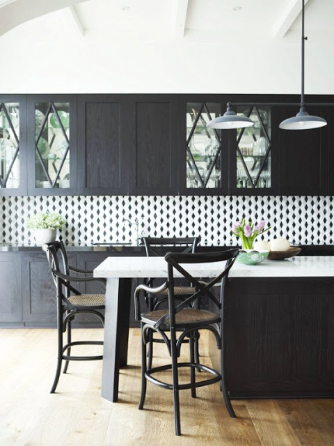
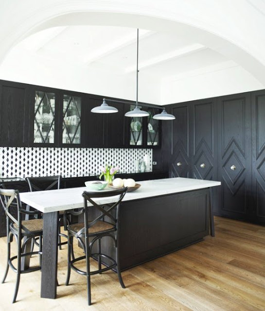
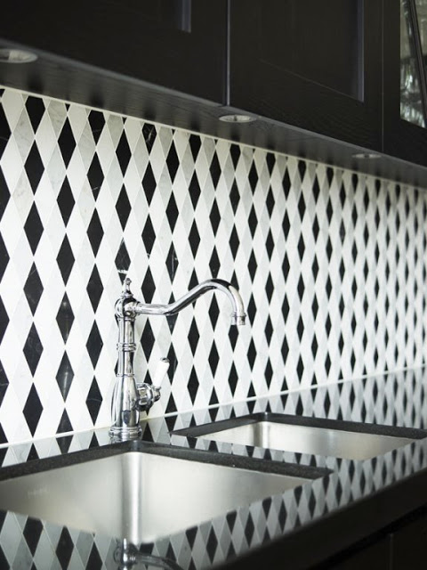
KITCHEN 1 (below) – A moody open kitchen with dark cabinets with diamond shaped molding details, light rustic looking floors, a very bold trellis pattern black and white backsplash and glossy black counters.
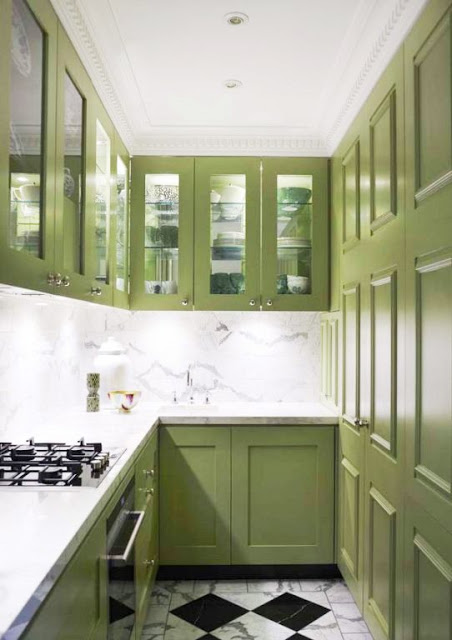
KITCHEN 2 (below) – A tiny galley kitchen with avocado green cabinets. This kitchen features a marble slab backsplash and marble checkered tile floors.
So which of these do you prefer – Kitchen 1 or Kitchen 2? If you were going be daring in your own kitchen design and you had to pick one of these two, which of these kitchens would you chose? Is there one you like more? Do tell…would love to hear what you have to say on this one. I am on the fence. I would most likely go with a white kitchen but can certainly appreciate the cool eclectic design in these. Weigh in please!
Happy Friday!
xo
Coco
P.S. Had a great talk with colleague and friend Kimberly yesterday. She is a pro in “the business” and she gave me some great advice. She also turned me onto a cool company that makes bracelets primarily for men but they are great for girls too! Follow along on COCOCOZY Pinterest to see the latest that I’m loving from this company and more. Thank you Kimberly!
P.P.S. Also on COCOCOZY Pinterest, I pinned a gorgeous wedding from my archives last night. A friend of mine had planned the wedding years ago…it is a rustic chic event that took place in the hills of Los Angeles…complete with bales of hay as seating!


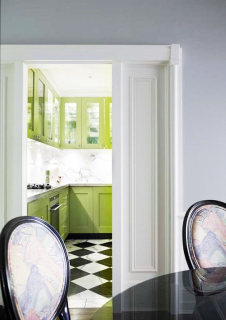



I like both kitchens but would probably prefer the first just because it seems more open. Don’t like the backsplash though. The second kitchen looks like a more inviting place to be to work in – lots of light and the soft green-yellow on the cabinets. I love the pocket door too.
I would def go with kitchen #1 🙂 Not a huge fan of green and the green kitchen looks so small to me.
black and white with lime green, so fresh and elegant. great finds:)
like the tile in the kitchen
i definitely vote for kitchen one! i love black and white because you can always add in bright pops of color with small accents 🙂
xoamy
http://www.cupcakesncouture.com
The 1st, black & white kitchen w/o a doubt. Don’t like the green, and the B&W looks more spacious.
My sister and law would go nuts for that green kitchen! She loves green. I think the black and white is definitely more classic though.
http://tiffanyleighinteriordesign.blogspot.ca/
I love #2 yes its smaller but feels way more inviting!! #1 is bigger but doesn’t feel like you should do anything in there but stand and not touch anything. I will take a small kitchen over a bigger one any day just on the warm feeling from it. I also love the see-thru cabinets and that hue of green color goes with a lot of other colors/prints. I feel like in #1 your limited to just one solid color or a black and white print.
Too hard to decide…love both.
I like could live, cook, eat in both! But #1 is my fav!
LBDH
I love both of them, but would have to go with Kitchen 1 because it’s so open. LOVE the green, though, in Kitchen 2. Can we mash the two kitchens together? Also love the mirror effect of the countertops and backsplash in K1. Beautiful coolness.
I also agree about the kitchen size. I would never want one of those really huge McKitchens. They never feel very inviting or cozy. A butler’s pantry, however appeals to me. best ~ Laurel
The black kitchen is gorgeous, the green too, but it makes the space so small, they would have been better of putting in draws to maximise space and not have any over head cupboards to give a better feeling of space.
I love the little green kitchen. The marble slab back splash and glass cabs help turn a small space into a really elegant small kitchen. Thanks for sharing.
Jennifer
I really really like the green kitchen, I just wish it was more open like the first one. The bright doors and checkerboard floor feels pretty fifties to me and it just feels so inviting. Me and my boyfriend are going to be buying our first house together in the next year year so and I really want to do this kitchen. I like the idea of a pantry but still keeping it open to the dining/living room and I like the idea of putting a peninsula on the end with a couple white and crome bar-stools.