I like a good classic penny round tile…on a floor or backsplash.
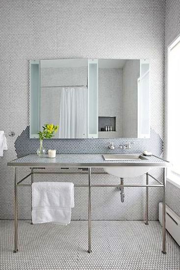
In this bath, the use of the penny round to a whole new level – all over! Floor to ceiling penny round mosaic tiles!
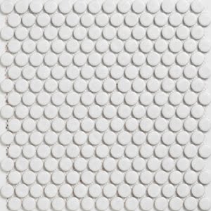
ModWalls – ModDotz – $9.95 per approx. square foot(Marshmallow white matte finish. Porcelain glazed penny round tile mosaic on mesh backing. 3/4″ diameter)(above)
What do you think of this tile job? What might you use penny rounds for…or what do they remind you of?
Happy Wednesday! (I think)
xo
Coco
Photo: Selldorf Architects





LOOKS fabulous but can’t imagine cleaning it!
Love them! they remind me of my grandmother`s pool 🙂
This is beautiful! The price, though, is per square foot, not per square yard! (It would be a STEAL per square yard!)
Love this look all over!
that’s kind of a lot for my eyes. i love the blue on the floor, but maybe just one wall of the white ones would suit me. plus, they seem like they’d be hard to clean with all the grooves.
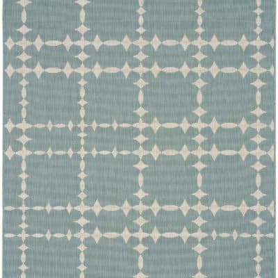
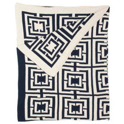
I love the look, quite honestly reminds me of the Hable Construction patterned fabric but in tiles! Love the blue. – Pam Freeman/www.ainsleyandchase.com
and I always thought this was pretty stunning:
http://rockhouseremodel.com/2008/04/08/alis-penny-round-bathroom-remodel/
Bad installation job – you can see the grids from the 12 x 12 sheets on the wall in the first photo. Plus very poor transition along the tub.
Nice concept, poor execution.
If done right, it is fabulous!! We did black penny round tiles in our tiny half bathroom on the floor and half way up the walls, it’s pretty sweet! We wanted it to be low maintenance so we used grey grout.
I have always liked the vintage look of these tiles but cannot imagine cleaning them if they are used in the shower!! They do also remind me of bubble wrap.
These would definitely give texture to an all-white bathroom. I really like it.
Candylei
I think it is a little much. They remind me of the plastic sheets of packing material that you pop, pop, pop. Overall, a little busy for me…but interesting.
I’m with the 1st comment! How do you clean it?? Am I sounding too housewife-ish? lol Well.. doesn’t matter.. I am one, anyways! 🙂
But this soooo beautiful!
xo
Luciane at HomeBunch.com
Cute, but I would think the grooves attract dirt and would be difficult to clean. Also, it seems like a little too much decoration to me: do we need tile and lighting and fixtures and etc. ad nauseum? One or two well-placed details, and a bath can be gorgeous, as Coco has shown us many times.
i like it in moderation
i immediately thought of the standard hotel in nyc’s penny tiled floors
apartment therapy has an article about it here: http://www.apartmenttherapy.com/ny/tile-stone-countertops/penny-tile-floor-at-the-standard-hotel-notcotcom-088953
not a love, but definitely a like
-kristin
http://styleitgreen.blogspot.com
I agree with a previous comment, the very first thing I noticed was the installation job, the grid lines should not be that noticeable. Again, in moderation, say a small childrens bathroom on the floor only then it will work beautiful, this is a little much for me though.
No not really. More than a bit cheapy looking.
No not really. More than a bit cheapy looking.
Interesting, but a bit over-the-top…not sure about the somewhat deconstructed look of the blue backsplash. Maybe, maybe not. Still fun to see this level of commitment to anything!
They are beautiful but I think a whole bathroom is a little to much. I like a combination of all kinds of different materials and shapes.
Reminds me of my grandma’s kitchen, she had a floor like that but red and white.
Franziska
@FlavorDesigns
mmmm…I can just imagine the feeling against my bare feet!
xoxo
Lila Ferraro
I am not going to critique the installation job as I know next to nothing about installs but I do love the vintage look. Its very old fashioned yet modern and fresh. I had used it in my sons old bathroom and always loved it when I walked in that room (normally to put the toilet seat down) lol.
Great blog…please check out my 10 day old blog about the building of our new home and my love for decor and lifes pretty things! Thanks….
http://www.theenchantedhome.blogspot.com
Love the repetition – I think its a timeless tile when done correctly. I prefer the octagon mosaic in a larger tile better – as a floor or feature wall with a free standing bath underneath? Delicious!
Sarah
http://thestyleencyclopaedia.blogspot.com/
Love the simple organic movement with the subtle value changes, however I feel this is where form and function do not work together.