 |
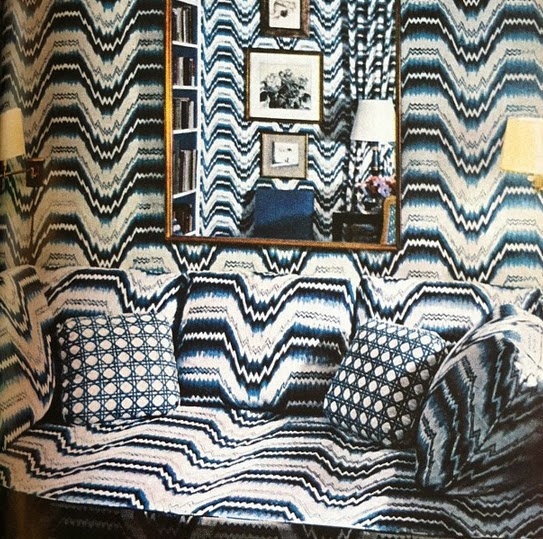
| A 1966 room with boldly upholstered walls. (above) |
So intrigued by the idea of making a daring no-holds-barred pattern-on-pattern wall-to-wall interior decorating statement in a room. Came across the photo above…a blue and white room where the walls and sofa are upholstered in a bargello (flame stitch) pattern…the room was featured in the April 1966 House Beautiful issue.
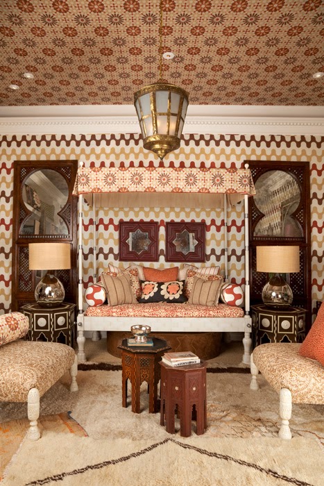
Then there is the current day seemingly Moroccan inspired room from uber designer Martyn Lawrence Bullard. In lieu of wallpaper or paint, graphic patterned fabric in rust burgundy and brown is used to upholster the walls and ceiling. (above)
Which of these two rooms do you like best? THIS OR THAT?
I like both spaces but I think I would pick the first picture if I was going to take a risk in a small space…love the color palette.
Which would you pick? Would you every dare to be fearless in decorating a room? If so, what might you do?
Happy Tuesday!
xo
Coco





I prefer the second one. The first makes my eyes hurt! Plus I love the Morrocan Vibe of the 2nd.
I would never be this fearless. So many patterns in a room almost make me dizzy. I am not a risk taker that way!
I find an overall neutral palette soothing, with just pops of color on the accent pillows or on the curtains.
Once again, it all comes down to what somebody loves individually. There really is no right or wrong, there is just preference.
Oh dear… I couldn’t live with either one of them and its not about being daring or not. Its about keeping my food down– particularly the first one.
ps: tried to put in my name url and it wouldn’t let me, so I had to put in anonymous. Anyway, its Laurel from laurelberninteriors.com
seems to be a bug which is why I couldn’t post. the comment box goes over the comment, but there’s a way around it… but its me, not you. blogger hates wordpress! oh well.