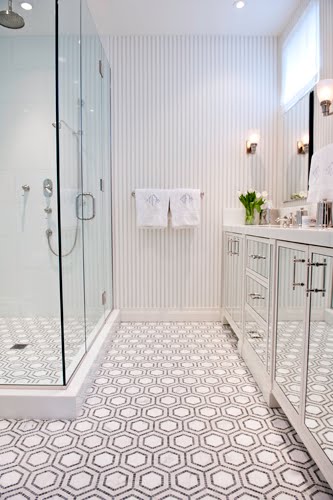
Genius! Penny round mosaic tiles in black and white are used to make a hexagon pattern on the floor of a small New York bath. Details like mirrored cabinet doors and a delicate striped wallpaper make this bath a delightfully fresh. (above)
These three baths designed by Christina are just lovely.
My favorite being the first one above…that hexagon mosaic tile floor is just AMAZING.
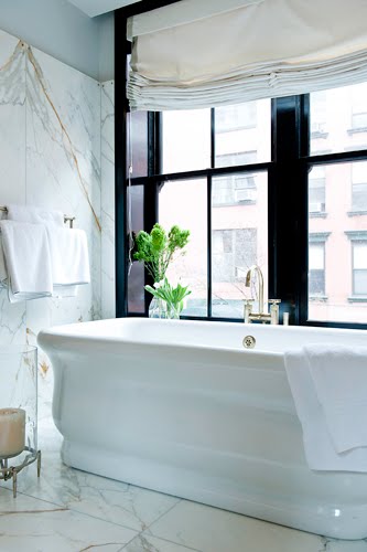
Love the elegance of the second bath – it was featured in this month’s Lonny Magazine (love Lonny btw…have met Michelle Adams a few times…so impressed by all she’s done). Large white veiny marble slabs (probably a Calacatta gold marble), a stand alone porcelain tub, and glossy black trim windows to add even more elegance to this already sophisticated bathroom retreat.
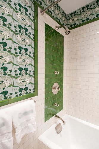
Lastly, love the way green is perfectly introduced into the third bath…in the tile work and on the walls. Very cute. I imagine this would work well for children or teens…a pop of color to brighten up their day perhaps.
Which of these three baths do you like most…and why?
Busy day as usual for me…have a lots of work stuff, a meeting after hours to show someone the COCOCOZY collection and I just got a dinner invitation from an out of town guest that I am going to have to decline because of my meeting (bummer)…need three of me to get it all done (I’m sure we all feel that way).
Happy Monday! Hope you have a fabulous week. Did I mention I’m doing my first 5K on Saturday?
xo
Coco
Photos: Christina Murphy Interiors





marble slabs as a backdrop to the beautiful stand alone porcelain tub is stunning. Framing it with that incredible black window is genius. But most of all, I love the simplicity of the roman shade. This is the bath of my dreams.
While all of these baths are lovely and I could find myself easily enjoying any of them, I have to say that my favorite is the second one. The simple elegance, and beautiful deep soaking tub just make me exhale a deep sigh whenever I look at it. I can feel the warmth of the water now. I love the roman shade as well for that added privacy. Somehow I wouldn’t want my neighbors to be treated to a “full moon” every night. 😉
Coco I adore the second the best the windows and treatment are fab!!
xoxo
Karena
Art by Karena
Thank you for sharing these! All 3are equally WONDERFUL in their own way!
Each anchors their respective looks completely through consistent details.
Bath 1: Trendy n’now with the mirrored cabinetry, however w/a simple change of wallpaper yrs down the road, that floor bridges the bath into timeless. Feels crispy.
Bath 2: This bath can transition from modern, to classic, to ….etc. Excudes quality and relaxation. Love it!
Bath 3: A true restoration of a bathroom! For the intended age of this bath, the wallpaper and the non-bevled edge tile are perfectly period accurate. Kudos to the decorator!
Hi Coco! I died when I saw the second bath in Lonny. It’s just very calm and serene- totally my style. Hope you had a great weekend!
I love the green because it is so unexpected. There are lots of white marble bathrooms, but when someone goes out of the typical design it is very impressive.
The second is definitely my favorite! So fresh…it doesn’t feel like it’s in the middle of the city. Gorgeous!
Wow. A+. I’m moving in and setting up camp in no. 1.
Bathroom #2! I love the marble and the black window as the backdrop to the beautiful tub.
Have a great week!
Heather
Definitely love number 2 ! Marble, black windows, perfect shaped tub. For me the first picture is unwelcoming and the green in the third makes me feel uncomfortable.
Sharon
The second is simply elegant and beautifully timeless!
I love the second bath- so elegant and luxurious. And I love the idea of taking a bath with the sunlight pouring in- or alternatively a really hot bath on a rainy day.
http://www.thegirlwriter.blogspot.com
My favourite is the second bath…a perfect master bath…elegant, non-fussy…a true classic…the third one would make a very elegant bath for a kid or even a teenager…i love that particular shade of green!! lovely post, Coco..see you on my blog someday soon!! xx meenal
I love the first one…so clever to use the mirrored cabinets in a small space and such a great statement floor! Beautiful.
http://bjdhausdesign.blogspot.com/
Love them all! The green panel in the last bath is particularly innovative. Lynn from Decor Arts Now.
Thank you for sharing all of these! The second photo is to die for!! I love the clean marble floors and fall with the black windows!! I wish I could hope in that bath right now!
http://www.lovelyinfluence.com
These are pristine! Loving the first bath! Have a delightful day, Kellie xx
Luxurious! I love the elegance. For some reason, anything white and with marble causes me to go into a catatonic state. I just keep staring!
xoxo
Lila Ferraro
I love all three of these but I think the 2nd is my favorite – there’s something timeless about it that can’t be pinned down – it’s elegant and romantic but yet modern and chic! I love Christina’s work as well!
I love them all, but number one is my favorite classic with a twist!
wonderful bathrooms! i love playing with tile patterns like in the first pictures.
Wow, what inspiring images! I have an obsession with mosaic tiles on a bathroom floor-gorgeous!
Love the marble walls and floor! so classy!
I love the first image with the Hexagonal tiles. They add interest and depth to a very clean and simplistic bathroom.
http://id-homes.co.uk/
http://bathinteriordesign.blogspot.com
I LOVE the first picture. Do you know where the tiles are from?