logo
inline logo
  • Blog
  • Design
    • Kitchen
    • Bath
    • Bedroom
    • Living Room
    • Outdoor Living
  • Style
    • Fashion
    • Best of
    • Design On Sale
  • Projects
  • Travel
  • Shopping Guides
    • Gift Guides
    • Resources
    • Wishlist
  • About Coco
    • Meet Coco
    • Press
    • Contact

What are you looking for?

main logo
  • Blog
  • Design
    • Kitchen
    • Bath
    • Bedroom
    • Living Room
    • Outdoor Living
  • Style
    • Fashion
    • Best of
    • Design On Sale
  • Projects
  • Travel
  • Shopping Guides
    • Gift Guides
    • Resources
    • Wishlist
  • About Coco
    • Meet Coco
    • Press
    • Contact
imagehome
share
Kitchen

ALL THE ESSENTIALS IN A SMALL EAT-IN KITCHEN!

January 19, 2011
  • Share

Kitchen with black and white checker floor, beadboard walls, open shelving, and white pendant light over a table surrounded by white chairs

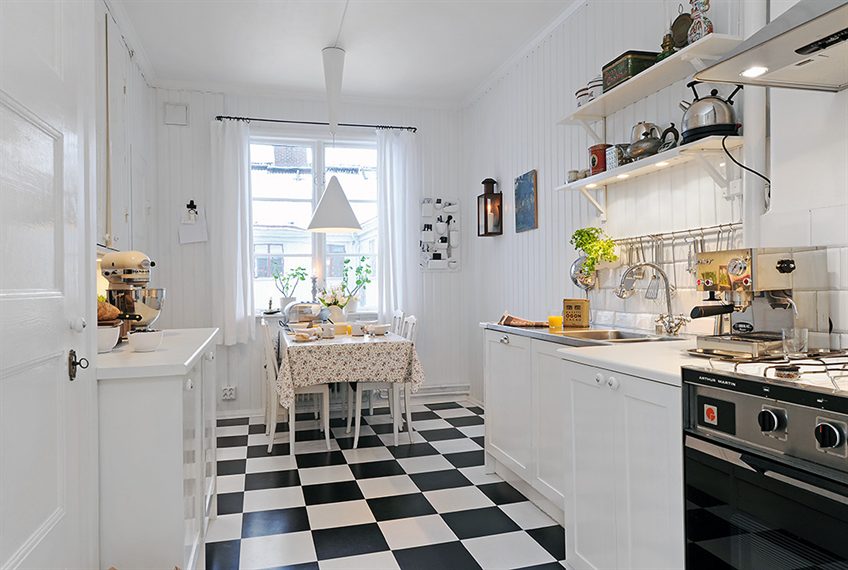
Loving this small eat-in kitchen with its checkered black and white floor, beadboard walls, open shelving, room for a table and chairs, and an oh-so-necessary kitchen chalkboard.

Very cute. Very inviting. Makes you realize how much all can happen in a really small space!

Pantry with beadboard walls and white shelves

Kitchen with black and white checker floor, beadboard walls, open shelving, white pendant light over a table surrounded by white chairs and a chalkboard

Kitchen with black and white checker floor, beadboard walls, a table surrounded by white chairs, and chalkboard

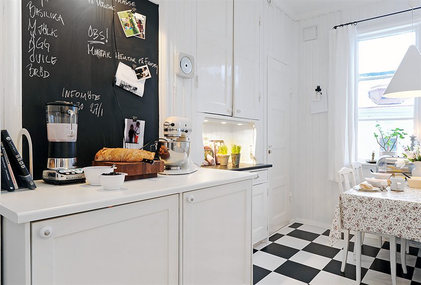
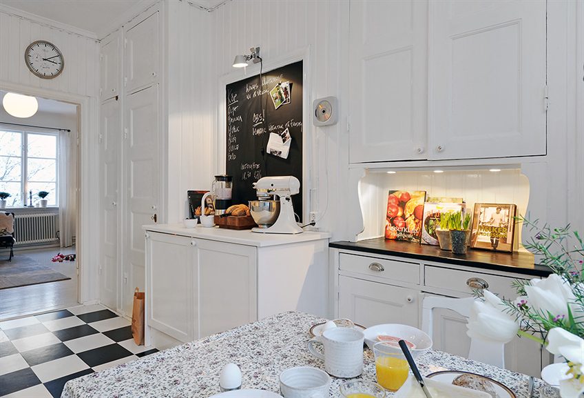
In the case of an eat-in kitchen, shelves, and cabinetry are integrated for bonus storage. Consider an open-base kitchen island for a lighter appearance and visual access to kitchen supplies and gadgets.

Could a small kitchen like this work for you?

Happy Wednesday!

xo
Coco

Photos: Alvhem

image
DISCLOSURE: This post may contain affiliate links, meaning when you click the links and make a purchase, we receive a commission.
previous
next

related posts

anchor text
anchor text

My Spring Favorites

imageanchor text
imageanchor text
Meet Coco - Bring Style Home

Meet Coco - Bring Style Home

A Los Angeles native, Colette Shelton, also known as “Coco”, is an entrepreneur, design blogger and home furnishings designer.

Read More   read more

Looking for Something?

View All Posts
image

Earn Cash Back While Shopping For Fall

Chirpyest is the shopping platform I created. Using Chirpyest, anyone can earn money by shopping AND for sharing from over 800+ online retailers! Sign up for free! :)

Tap the "join Chirpyest now" link below or the image above to get started making money while you shop!

Join Chirpyest Now
Elegant Sideboard Table

image

Use Chirpyest to get 5% cash back from Lulu & Georgia!
Join our mailing list
Sign Up Now

Recently Pinned

Recently Pinned

Resources

My list of favorite brands and retailers to shop.   Resources
image
write a comment
  • Share

17 responses to “ALL THE ESSENTIALS IN A SMALL EAT-IN KITCHEN!”

  1. Jennifer says:
    January 19, 2011 at 10:22 AM

    This kitchen is very cute, but isn’t even CLOSE to being small!! Visit my 300SQ ft Studio in NYC’s Hell’s Kitchen, and then we’ll talk.

    Reply
  2. Jo says:
    January 19, 2011 at 11:03 AM

    That is a totally cute kitchen… but I’ve seen tinker. I love the white on white and the checkerboard floor. AND it is super light and bright – ALWAYS a plus!

    Reply
  3. Lucie says:
    January 19, 2011 at 11:06 AM

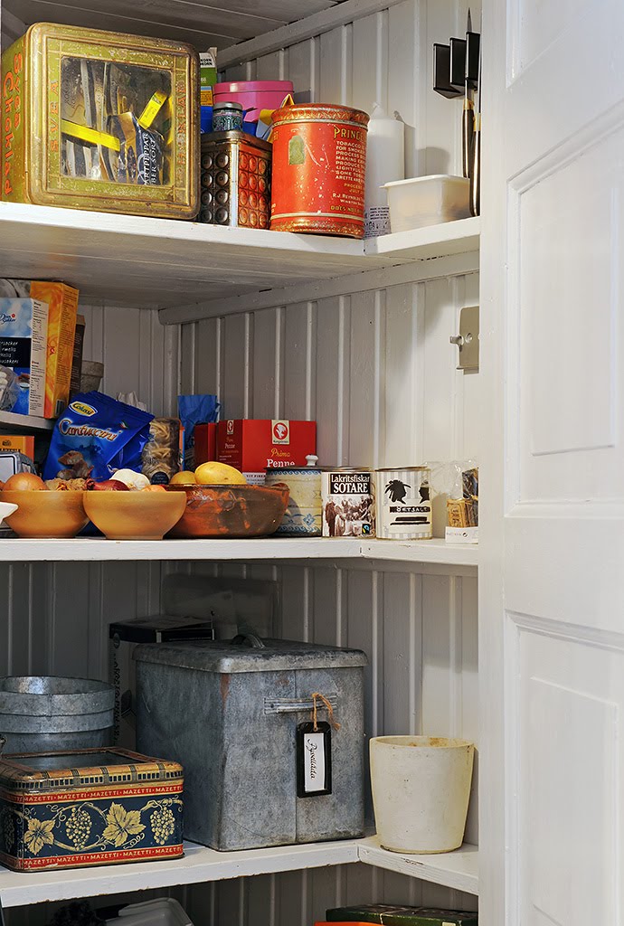
    Wow, I love this space, although you have to make extra effort to have pretty food pantry containers and orderly stacking (yikes for me!).
    I love how airy it feels! Great choice!

    Reply
  4. Katie @ Noodle and Boof says:
    January 19, 2011 at 11:37 AM

    I love it! I love the black and white and all the light! Sure doesn’t seem small.

    Reply
  5. a designer + a contractor says:
    January 19, 2011 at 12:13 PM

    very charming : ) great usage of white as it makes the room look much larger, as opposed to a darker color. and yes, this could totally work for me!

    lisa
    adesignerandacontractor.blogspot.com

    Reply
  6. E. K. Dunton says:
    January 19, 2011 at 12:21 PM

    Love it! I’m in a historical cottage and this would look great (instead of the faux contemporary stuff that’s in there now.)

    Reply
  7. K says:
    January 19, 2011 at 1:19 PM

    This is just the kind of kitchen I would love to have- small, cozy and white with small splashes of color. Perfect!

    Reply
  8. Anonymous says:
    January 19, 2011 at 2:22 PM

    And of course – it’s Scandinavian! This is like walking in to my neighbours kitchen. A completely normal kitchen in a normal apartment. I love it in the sense that it could be perfect for 2 people living together. When kids come in the picture, though.. it would be a little too small.

    These pictures actually really represents the essential differences in Swedish/Scandinavian design versus American design. I would love your regular white kitchen with steel appliances and white subway tiles.. NOT the type of kitchen you would find here in Scandinavia, but I loooove those!

    Interesting to see that it works the other way around as well 🙂

    Reply
  9. heysaylavie says:
    January 19, 2011 at 4:11 PM

    It also looks like this space was renovated without spending a ton of money, which is great to see. Kitchens seem to need updating too often, so even though they’re a great selling point for a home and you tend to get your money back if the kitchen is relatively new when you sell, it’s still easy to spend too much on a space that needs updating every 6-8 years…keeping it classic like this kitchen helps, as well.

    Reply
  10. EFT Manual says:
    January 19, 2011 at 4:47 PM

    The checkered tiles really works for me! This is such a lovely kitchen.

    Reply
  11. Beautiful Habitat says:
    January 19, 2011 at 4:57 PM

    I love small kitchens, it makes you pare down to the essentials and get creative with what you keep. Although I agree with some others, that I don’t consider this kitchen”small”. My London flat had a kitchen about 1/2 the size of this one and about 1/8 of the cupboard space.
    LOVE the black/white floor – makes the whole room!

    Reply
  12. Kimberly Moore says:
    January 19, 2011 at 5:08 PM

    The open shelves and all of the white definitely open it up! I love it! Ok, and the checkered floor…a win.

    Reply
  13. Linda says:
    January 19, 2011 at 6:14 PM

    two thumbs up 🙂

    i love love love plenty of light and a black/white checked floor in the kitchen!!

    Reply
  14. elizabeth@themustardceiling says:
    January 20, 2011 at 7:56 AM

    I love this kitchen! I have been debating an all white kitchen with black and white tile, this has inspired me. Thank you.

    Reply
  15. alice simpson says:
    January 20, 2011 at 12:39 PM

    Have always longed for that floor (which would match my signature eyeglasses), but have been warned it needs a DAILY washing.
    Not in my skill set!

    Reply
  16. andrea of ffft says:
    January 23, 2011 at 11:59 PM

    LOL… Love how you think this is small… but it’s all relative. It is adorable. So here is my question, do people with fancy canisters and storage purchase items based on such? I understand many of these are vintage, but does this mean that they decant EVERYTHING they buy? Hmmm… Or perhaps my grocer doesn’t stock things that are pretty enough. I might have to speak with them. I am a sucker for great packaging…

    Reply
  17. Casa e Cose says:
    January 27, 2011 at 3:59 AM

    Ha i knew it was swedish when i saw it and then I read the words on the chalk board. Cant miss it.
    Love the floor and that kitchen could absolutly work for me.

    Reply

Leave a Reply Cancel reply

Your email address will not be published. Required fields are marked *

This site uses Akismet to reduce spam. Learn how your comment data is processed.

Instagram

A soft touch of pink, layered into the space. Not A soft touch of pink, layered into the space. Not overpowering, just enough to warm everything up, walls, upholstery, even the smallest details.
It shifts the mood completely. Calmer, softer, and a little more lived in.
Save this if you’re leaning toward softer, warmer spaces. 🌸
1. Design: @brianwoulfe 📸 @benandersphotographer
2. @eadieandcrole 📸 @boz_gagovski
3. @amyastley
4. Design: @katie_harbison 📸@helencathcart
5. @carlgergesarchitects
6. Design: @lindsayrhodesinteriors
📸@lelanief⁠
7. Design: @mintysynthinteriors
📸 @lacey_land
What makes the Saint-Martin Apartment in Paris so What makes the Saint-Martin Apartment in Paris so hard to look away from is the deliberate clash Sophie Dries @sophiedries_ created and didn’t try to resolve.
The bones of the apartment are pure Haussmann: ornate cornicing, carved boiserie, a marble fireplace with a gilded mirror. Everything a 19th-century Parisian apartment should be. Then she placed a near-black dining table with brass-legged stools into the middle of it. A raw concrete-look bathroom behind the grandeur. Dark, sculptural objects on surfaces that were built for delicate things.
It works because she didn’t try to blend the two, she let them sit in contrast. The apartment feels lived-in and specific because of it.
→ Save this if you’re mixing old architecture with contemporary furniture.
📸 @stephanjulliard
#interiordesign #parisapartmenttour #parisianstyle #contemporarydesign #interiorarchitecture
From classic to modern, rustic to minimal, the pap From classic to modern, rustic to minimal, the paper lantern just fits. It softens the room, diffuses the light, and rounds out even the sharpest architectural edges without demanding any attention. 🏮
Are you into paper lanterns, or do you prefer a more structured statement light? 🧐
1. Design: @brownstoneboys Photography: @frankfrancesstudio
2. Design: @calicowallpaper Photography: @william.jess.laird
3. @alexanderdesignbuild
4. Design: @emmanuelle_simon Photography: @damiendemedeiros
5. Design: @katie_sargent_design Photography: @gemmola @living_inside_agency
6. Interior Design: @jesseparrislamb
Photography: @katesjordan
7. @christinacolestudio
8. Photography: @annastathakiphoto Design: @anewday_interiordesign
9. Design: brownstoneboys
Photos: @nickglimenakis
Streets of #Paris. 📍 Rue de Castiglione — Laid ouStreets of #Paris. 📍
Rue de Castiglione — Laid out under Napoleon in the early 1800s, this neoclassical street connects Place Vendôme to the Tuileries Garden in one clean, symmetrical line.
Place de Furstenberg — A tucked-away square in Saint-Germain-des-Prés that was once home to the painter Eugène Delacroix, and still feels like little has changed.
Les Antiquaires on Rue du Bac — A street with centuries of history, now best known for its cluster of antique dealers trading in furniture, paintings, and curiosities and home to @les_antiquaires_paris bistro which is an easy spot to grab a bite near the Seine.
Musée du Louvre — Built as a medieval fortress in the 12th century, it became a royal palace, then the world’s most visited museum, home to the Mona Lisa and tens of thousands of other works.
Église Saint-Sulpice — Paris’s second-largest church, with a gnomon installed inside to track the sun’s position and help calculate the liturgical calendar.
Les Deux Magots — The Saint-Germain café where Simone de Beauvoir, Sartre, and Hemingway once gathered, and a lasting symbol of Paris’s literary culture.
Place Vendôme — Commissioned under Louis XIV, this octagonal square is anchored by the Vendôme Column, cast from cannons captured at the Battle of Austerlitz.
Shops, people, and buildings that make you stop for a second and look up. Every corner feels different. Old, detailed, and full of life. Sometimes this is the best part. Just being here. ❤️
#parisjetaime #parisfrance #parisianlife #streetsofparis
Nour Arida’s (@nouraridaofficial) Paris apartment Nour Arida’s (@nouraridaofficial) Paris apartment was designed to feel like a little piece of Beirut — a pied-à-terre that keeps her connected to Lebanon while living in France.
Architect Carl Gerges @carlgergesarchitects built the whole interior around warmth and softness: a caramel sofa, a pink kitchen, milky whites throughout. Nothing sharp, nothing cold. The palette reads as indulgent without trying. It’s the kind of space that feels like it was chosen for comfort first and aesthetics second, even though both are clearly considered.
What’s easy to miss is the restraint underneath it all. The softness works because it’s disciplined. Every piece earns its place in the same tonal story.
→ Save this if you’re building a warm, tonal interior from scratch.
📷 Photography: @ambroisetezenas
🏛 Architecture: @carlgergesarchitects
🪴 Interior styling: @sarahvonsaurma
#paris #interiordesign #apartmenttour #parisianstyle #parisapartments
Follow on Instagram
footer logo

Interiors

  • Kitchen
  • Bath
  • Bedroom
  • Living Room
  • House Tours
  • Outdoor

Style

  • Fashion
  • Best of
  • Travel
  • Design on Sale
  • Coco's Projects

About

  • About Coco
  • Press
  • Contact
  • View All Posts

Join our mailing list

Sign Up Now
© 2026 Cococozy | Terms & Conditions