All photos in this post courtesy of Kevin Oreck Architect, Inc.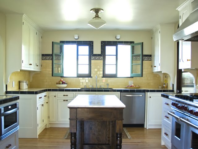
A completely remodeled Deco kitchen in a Los Angeles home features butter yellow color tiled counter tops and period accents. (above)
Another late night and another new franchise for COCOCOZY! So here goes…
Welcome to the first ARCHITECT-TOUR…a segment in which I will highlight the works of fab architects.
Today’s (or should I say “tonight’s” as I sit here at 1am typing this post while most normal people are sound asleep getting a normal 8 hours of rest…) featured architect is Los Angeles based Kevin Oreck.
You’ll be seeing a lot of Kevin in this segment as he is the inspiration behind it. After Kevin sent me some fantastic photos of kitchens and homes he has designed, I decided I should do an architect’s segment (and then did my usual silly game of naming things … hmmmmmm… where to start…architactile?…nope sounds like a reptile segment of some sorts or something to do with massage therapy…architectype?…no sounds like something to do with psychiatry…architectcool?…no, very dumb…architactful?…no, although might be a great etiquette segment…architectool?…not even…architect segment?…no, way too boring…and then in the vein of keeping things simple…ARCHITECT-TOUR…yes!) and then this segment was born!
So here is a quick Q&A with Kevin on this cool kitchen.
COCO: What style house is this kitchen in and what style is this kitchen?
KEVIN ORECK: Deco-influenced Spanish. There are a number of these in LA, especially in the Carthay Circle neighborhood. I think it’s really unique and interesting.
COCO: This is a cool kitchen. Is this a total remodel?
KEVIN: The kitchen was totally remodeled and expanded by taking over a hallway at the other end. Everything is new, including the tile.
COCO: Please describe the tile…is it original.
KEVIN: The decorative tile is custom, by Revival. The field tile is by Pratt & Larson. We used tile on the countertops for authenticity.
COCO: You went with tile on the countertops…why?
KEVIN: The house is Spanish, but with a Deco influence (built in the 30’s). We really wanted to play that up with the decorative tiles and the color scheme, esp. the black borders.
Before, kitchen was run down and dingy. (above)
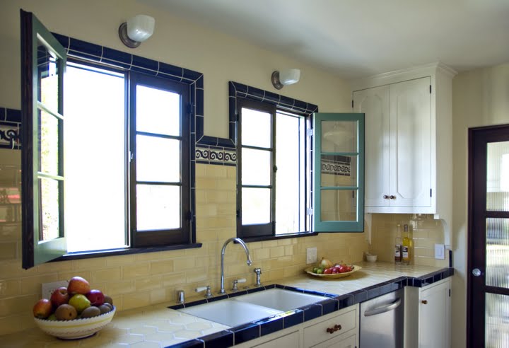
After, the kitchen is bright and clean with new tile countertops and custom cabinetry that pay homage to the home’s Deco roots. (above)
COCO: Love the tile window casings and the colors…please talk about inspiration for this.
KEVIN: We bordered the windows with tile to really make that end of the kitchen, which is the focal point, dramatic.
COCO: Is cabinetry custom? Please describe.
KEVIN: The cabinetry is all custom. I designed it in the style of typical cabinetry from that period, but the upper cabinets, with the chamfered corners on the panels is more unusual. I did that to make them feel more Deco.
Architect Keven Oreck (above)
Thanks Kevin! This kitchen is fab.
Readers stay tuned for a Hollywood Regency kitchen makeover and home remodel from Kevin…coming soon!
Other architects…please send in your photos…would love to feature!






Thanks for sharing the beautiful deco kitchen.
What a lovely, cheery space. It’s interesting how the pervasive trend of carrara-topped, greige spaces lends this period reno a certain air of modernity, with tile countertops going against the grain and yet working wonderfully.
Really great-looking makeover – thanks for sharing 🙂
Love the windows in this space!