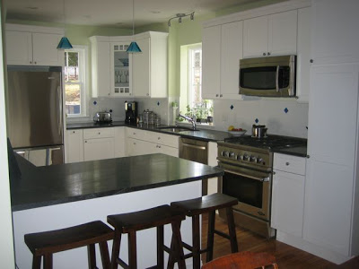
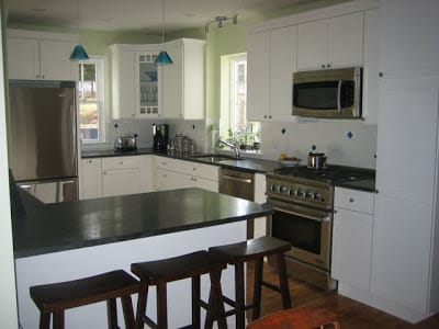
Katie and Cooper’s fantastic kitchen remodel! (above)
Usually I try to hold onto really good pictures…saving them for “the day”. I have no idea why I hang onto really wonderful interior design and decor photos…waiting for the right time to post. I like to pace myself too…if one person sends really good pictures of their house or home or a piece of furniture or a project they are working on…my normal practice is to space them out over a few days.
Well this before and after story was too good to be true…just a day after their first design project email…another FANTASTIC design dispatch from my good friends Katie and Cooper who live outside of Boston – their total amazing kitchen remodel!
Katie and Cooper took a dull space from a different era and impeccably transformed it into a modern yet classic space. A truly well designed kitchen with all of the bells and whistles…a wonderful place where they can spend many years enjoying their kitchen with their two adorable kids! Makes me want to fly to Boston and sit at the counter bar, snack, chat and catch up with my good friends!
These pictures and story were just too exciting to hoard…it seems that good home decor photos can break me of bad habits. Anyway enough of my babble! Here is an excerpt from the email I received from Katie just yesterday:
KATIE’S EMAIL – BEGIN…
“Hi [Coco]. Here is some more stuff for your blog — only use it if you want to.
BEFORE (below): Our old kitchen needed a lift, in a big way! We’re talking formica, 1980s cabinets, the doors didn’t quite close all the way on some cabinets, our dishwasher sounded like a rocket launching every time we ran it, only 2 burners worked on our old gas cooktop (original to our 1929 home), it was hurting!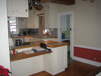
AFTER (below): The new digs — we love the fresh white shaker style cabinets, the clean look of stainless appliances and we chose a honed jet mist granite countertop that has a really nice soapstone look.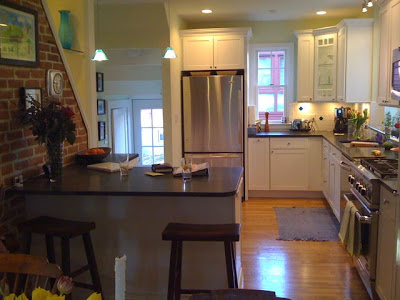
BEFORE (below): In the old kitchen, we had no tile backsplash, one of those horrible metal plant windows and a dreadful florescent light fixture above the sink. This corner was screaming out for help.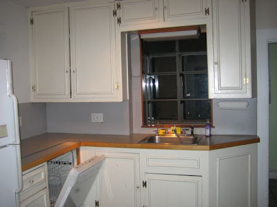
AFTER(below): We brightened this corner with an illuminated corner cabinet with a glass door and glass shelves. Adding the puck light to the interior cabinet brings alive a previously dark corner of the kitchen. The under cabinet halogens allow light to splash on the white subway tile and blue recycled glass backsplash. We replaced the florescent fixture with a modern halogen track light from Ikea.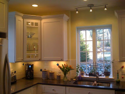
BEFORE(below): We had a lot of “things” hanging down from the ceiling. This made everything seemed smaller and more cluttered.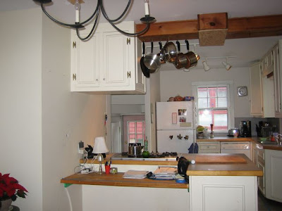
AFTER (below): By removing all those “things” and recessing everything except for the two Pyramid Pendant lights, we added miles of height to our kitchen.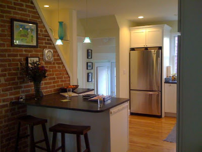
….With a lot of blood, sweat and tears, we exposed the original brick and created an interesting little nook of light in this accent wall. (below)”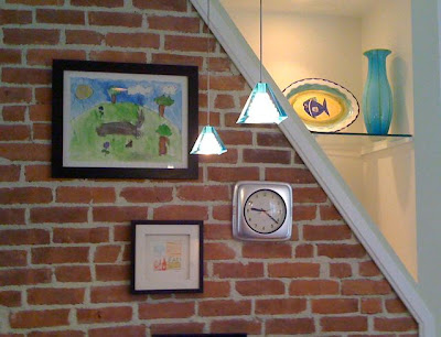

…KATIE’S EMAIL – END.
There is no question in my mind…this high style kitchen makeover will definitely be a source of good inspiration and information for everyone who sees.
KATIE AND COOPER…THANK YOU AGAIN! xo
P.S. If you have a kitchen remodel you’d like to share…please email me at [email protected].






Good before and after.
WOW! It looks beautiful!
I wonder how the counter tops are holding up? I’m thinking of honed jet mist in my own kitchen remodel but am worried about maintenance. I love to cook and it can get really messy in there sometimes.