
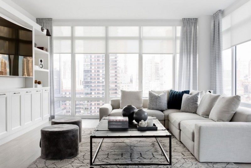
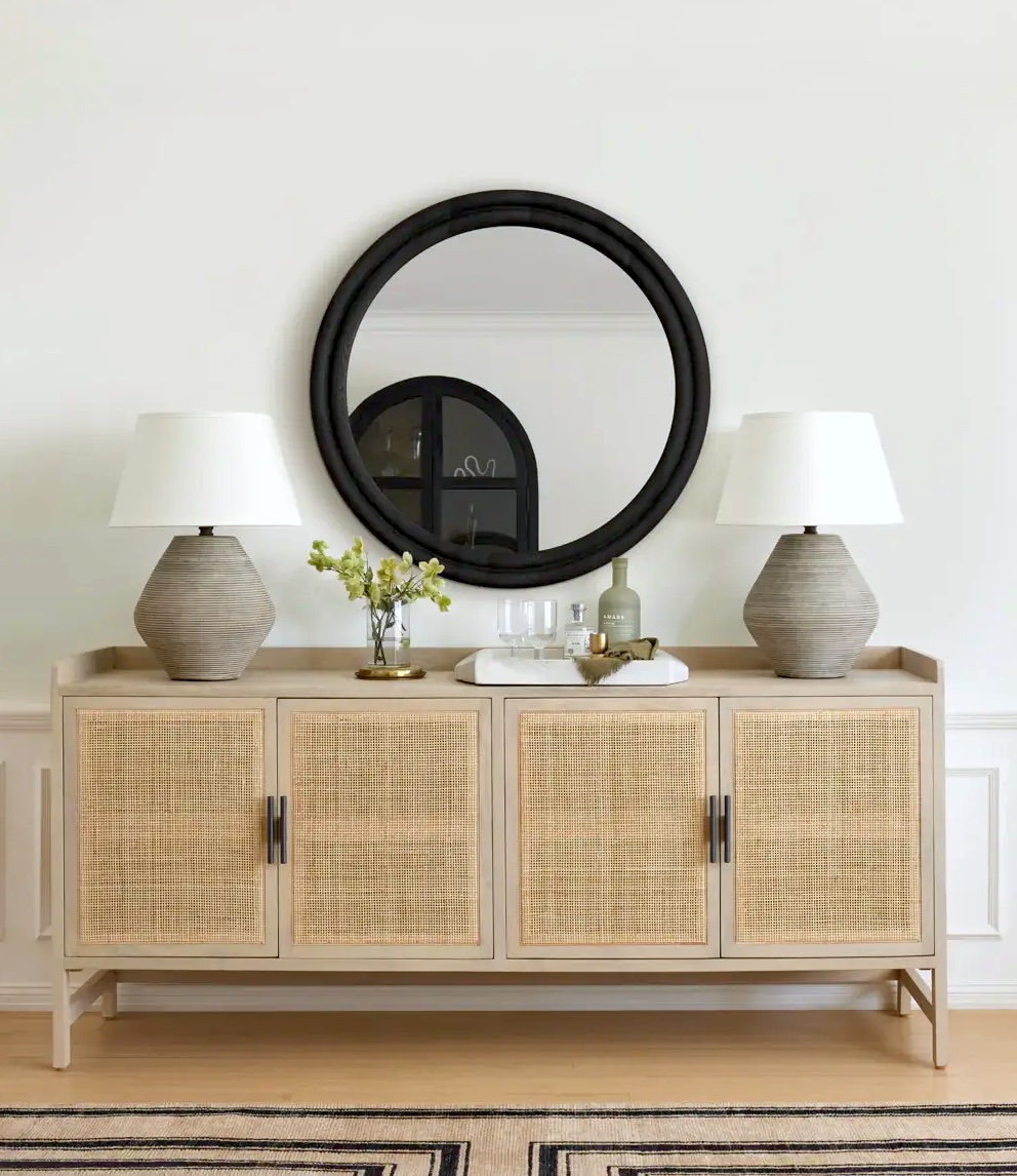
Bright modern rooms are in order today in my quest to find the brightest spaces this first week of the New Year. All of these rooms here were created by interior designer Tamara Magel. All from different homes but all decorated with a cool bright happy modern vibe. I like these. They all made me smile.
Just the other day, best of friend AM asked me, “Do you ever get bored of interior design?” My immediate answer was, “No.”. Later that day, I wondered why she asked…so this morning I asked her. She said the reason she asked is that after she finished decorating her adorable house in East Hampton, she got a little fatigued on the decorating front and she wondered whether I ever got a little tired of it. My answer to her again was “No. I am not tired of design. I still love it and seem to have a passion for it.”.
Anyhooo…happening upon all of these rooms by this designer got me excited AGAIN. For me it is fun to look at spaces and create spaces. I like seeing and figuring out good proportion, scale, colors, furnishings and design details. Crazy that after all of this time blogging and designing that I still love design…but I do.
Here are 9 rooms, from different homes, all by Tamara Magel. Not super duper modern but just modern enough for me. And just the right amount of bright!
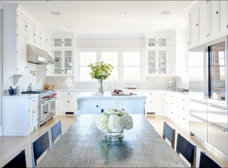
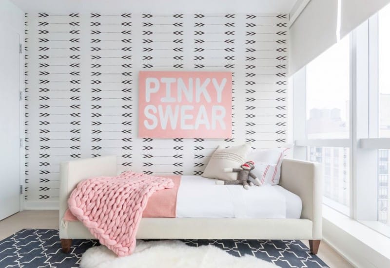
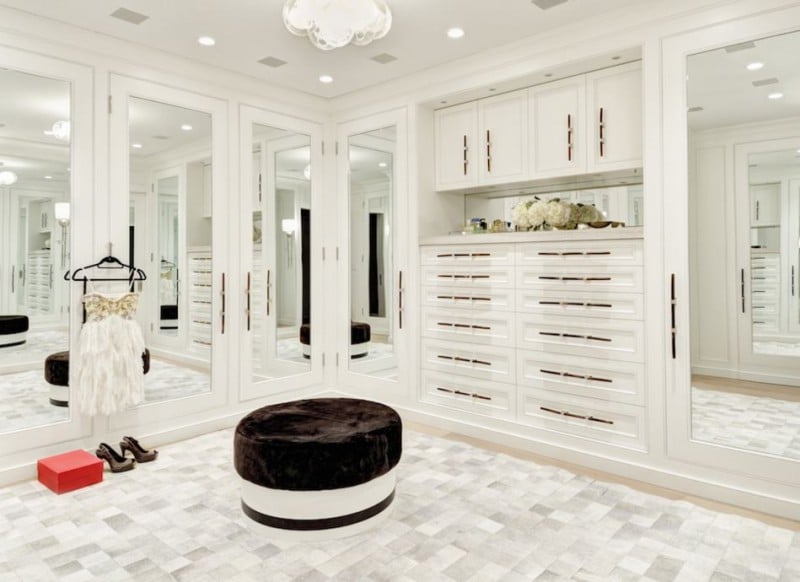
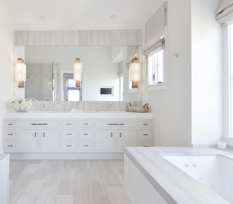
What do you think of these bright modern rooms? Are they bright enough? Are they modern enough? Please let me know. My favorite is the little girls room if you can believe it!
xo
Coco
P.S. Snapchat – Have been snapping a little more lately! Please make sure to follow me @cococozyblog on Snapchat. Would love to see you there too!





Super chic homes. Great inspo
Kisses from http://poshnessary.com ❤
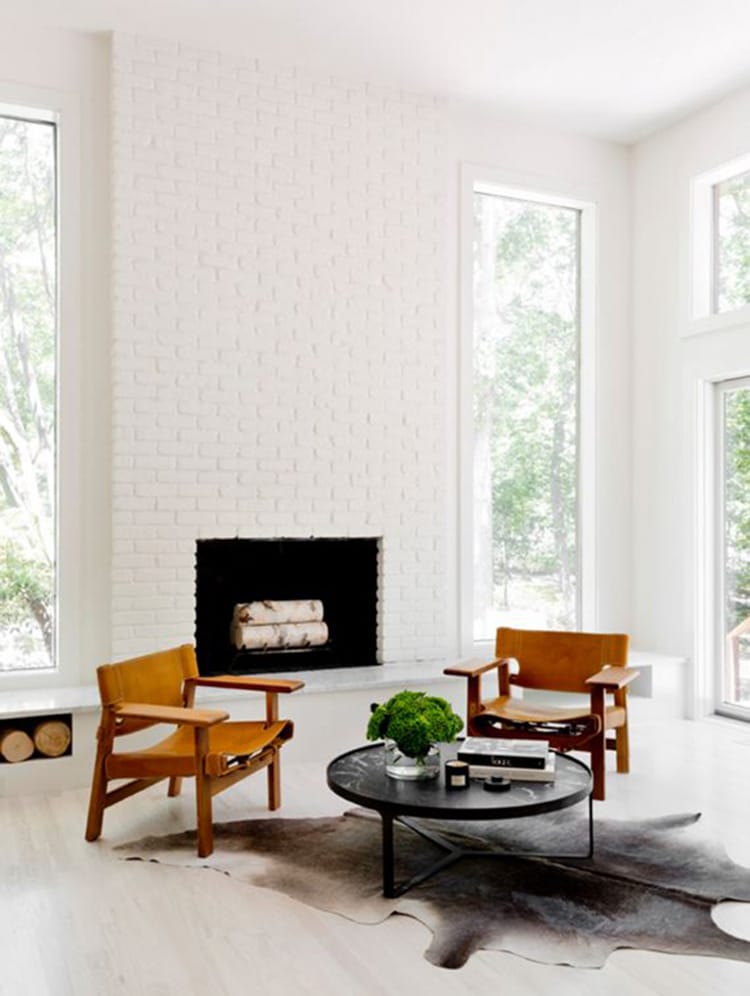
Love these spaces! The first image is my favorite….the white brick and the leather chairs are perfection. When a space has a lot of natural light, you already have a great head start!
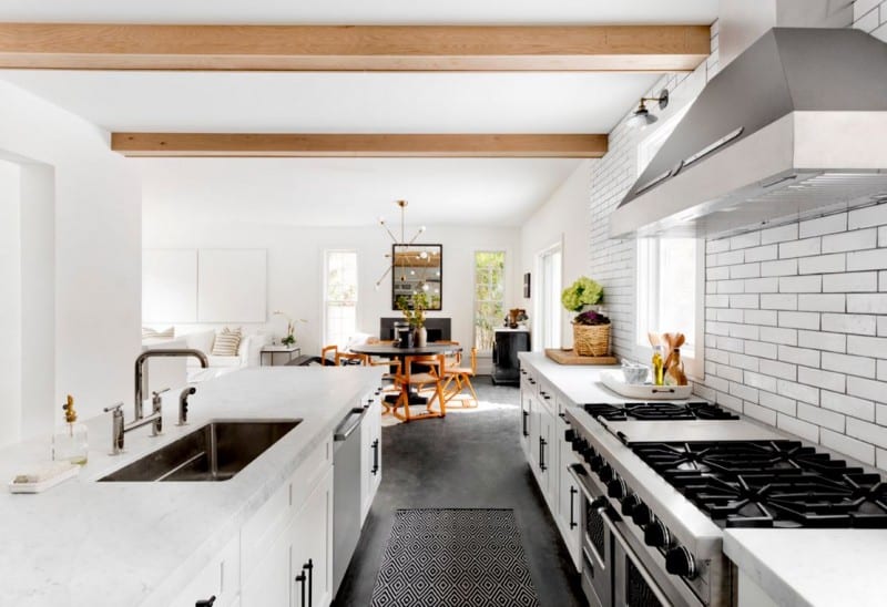
My favorite is the first kitchen and the dressing room.
Even the most dully decorated room will look pretty nice with a nice splash of sunlight. I just love brightly lit rooms with lots of windows – it’s one of the reasons I sort of want one of those high rise apartments in the big cities, except for the fact that they’re so expensive and I would have to live in a big city!
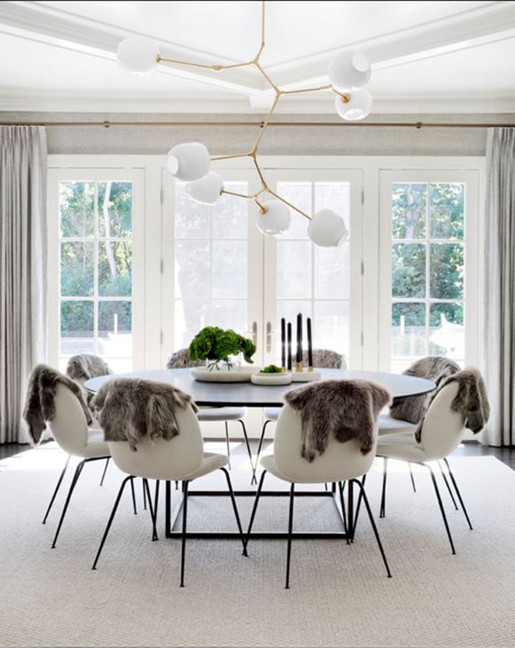
Love the light and clean look in all of the rooms. Don’t love the animal skins on the back of the dining chairs. Leather is one thing, skins on the floor is another. These skins just look, to me, like dead bodies draped over the chairs for drying after a hunt—not especially appetizing for a backdrop to a meal, and really superfluous to the design. The tabletop items, rug and art work can likely provide the texture represented by the skins.
And being a fellow shoe fan, I smiled to see your reference to Tamara Mellon in the last paragraph, in lieu of the featured room designer. Her shoes go with every room!
Thanks for the great postings, and wishing you the best in your personal and professional life in the coming year.
The “little cottage in the Hollywood Hills” is a wonderful place for you to enjoy and to be proud of as your home. You have left conveniently placed subtle and not-so-subtle design features in Malibu, providing the gift that keeps on giving long after you have moved on with a new life. You go, Girlfriend!
The effect that the ottoman and objects all seem to be floating in the full white wardrobe is just delicious!!! Love it!!