Perfect little cozy living room. Clean-line modern furniture and accessories in grey and white with a bit of Missoni like zig zag thrown into the mix. Quite charming and easy to understand from a decorating perspective! No design bells and whistles…but it totally works. Cohesive, inviting and comfy. Lesson: keeping things simple in design can be just as effective as doing it up.
I might increase the scale of the painting/art hanging over the sofa…it feels a little small to me. Other than that…this is a nice little space!
What do you think…too simple or just right? What might you add or change out?
Happy Saturday!
xo
Coco
P.S. GOOD SHOPPING NEWS: The COCOCOZY Shop promotion continues…a little gift from me to you when you purchase any COCOCOZY textiles (pillows, throws, drapery) from the COCOCOZY Shop this weekend…a free wonderfully scented COCOCOZY Flower Candle.
Photo: Kelly Deck Design

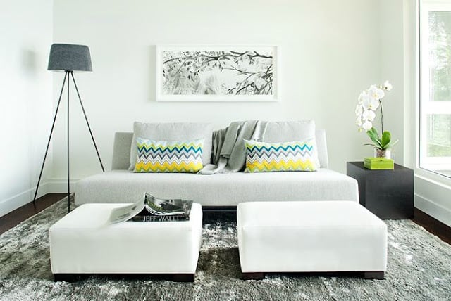




Yes it works because the sofa is balanced by the floor lamp and the plant, but I agree the painting needs to be MUCH BIGGER. Otherwise a great space and in this case, less is more.
Definitely agree about the painting.
Nice, but just doesn’t do it for me. It seems too sterile.
I love the pillows, they pop like crazy because everything else is so muted and monotone. Great statement!
where is this picture from? love the sofa and pillows. do you have the sources? totally agree about the art!
Looks great…I agree with the art…bigger!
It is a beautiful room.
XOXO
LOVE everything you do – have been following you for quite some time and happy to finally be an official follower 🙂
PS just read through your ‘about’ section and know you’re an inspiration to me and so many others in our shoes – making ends meet at our jobs and following our dreams on the side!
What a great photo, love the hint of yellow and green amongst all the grey and white, just lovely!
x katrina
Love the grey/white interior with the pop of color…very sophisticated. The texture of the carpet is great with the rest of the materials being quite simple and refined.
I agree about the scale of the art. It would be nice for it to be larger and perhaps in a darker frame.
Thanks for posting!
I was thinking the same thing… I’d go for 1 super-sized piece of art on the wall… That, or either 2 medium sized ones that take up almost the whole wall.
I love the “less is more” mantra- especially for my home. With so much going through my brain, I need a simple, clean environment to unwind in…
nice post, thanks for sharing!
Where ca we get the carpet!?! Love it!:D