logo
inline logo
  • Blog
  • Design
    • Kitchen
    • Bath
    • Bedroom
    • Living Room
    • Outdoor Living
  • Style
    • Fashion
    • Best of
    • Design On Sale
  • Projects
  • Travel
  • Shopping Guides
    • Gift Guides
    • Resources
    • Wishlist
  • About Coco
    • Meet Coco
    • Press
    • Contact

What are you looking for?

main logo
  • Blog
  • Design
    • Kitchen
    • Bath
    • Bedroom
    • Living Room
    • Outdoor Living
  • Style
    • Fashion
    • Best of
    • Design On Sale
  • Projects
  • Travel
  • Shopping Guides
    • Gift Guides
    • Resources
    • Wishlist
  • About Coco
    • Meet Coco
    • Press
    • Contact
imagehome
share
Kitchen

COLOR WATCH: PURPLE REIGNS SUPREME IN THREE STYLISH SPACES!

April 8, 2010
  • Share

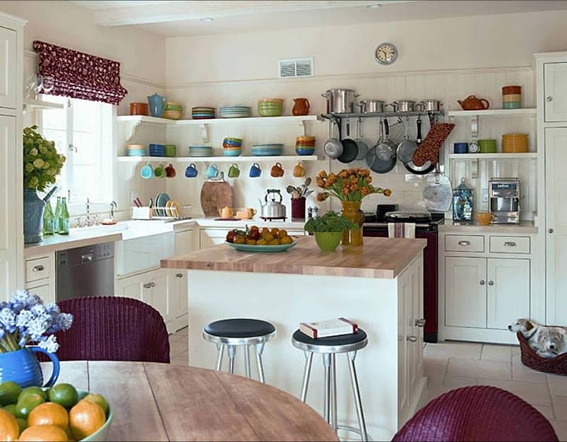
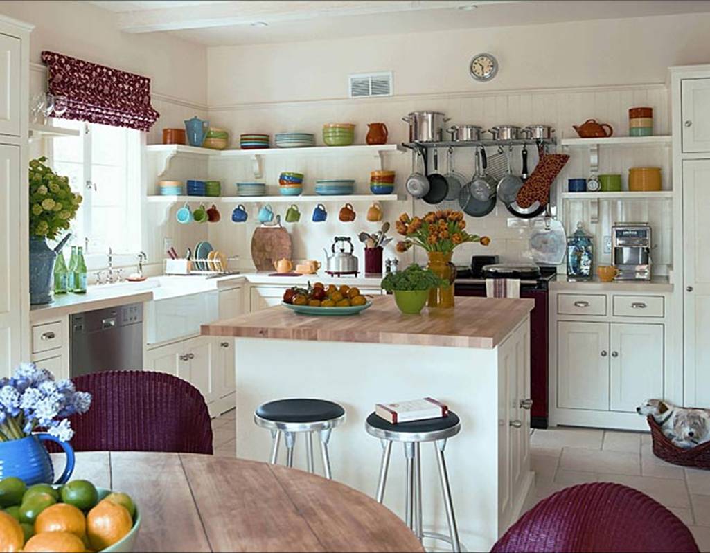
Kitchen with butcher block countertops, open shelving, white cabinets and purple Roman shades and wicker dining chairs
Photo courtesy of Kathryn N. Ireland
A kitchen with butcher block countertops, open display shelving, white cabinets…purple is perfectly added into the decor in the roman shade above the kitchen sink and the purple wicker dining chairs.(above)

Hmmm….this week seems to be about color for me… This is the second COLOR WATCH of the week. Not planned of course. Hard for me to plan anything these days for some reason but it coincidentally happened nonetheless. I shall embrace color again today!!

I did a little browsing around and happened upon lots of spaces with purple accents so I thought I would share.

My grandmother loved purple. It was her favorite color. She had purple shirts, purple pins, cute purple dresses, purple aprons…whenever I see this color, associated with royalty and nobility, I think of my grandmother DS!

Anyhooo…here is some posh purple for you on this Thursday!
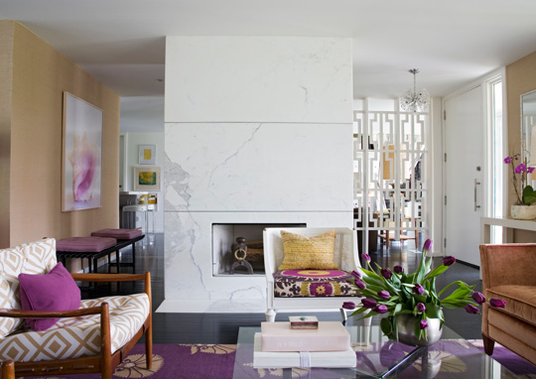
Modern living room with white marble fireplace and purple rugs, accent pillows, flowers and art
Photo courtesy of Angie Hranowsky
Love this living room. Modern and clean. A simple white marble fireplace with no mantel is center stage. Purple gets the best supporting role here in the rug, pillows, flowers and art. (above)
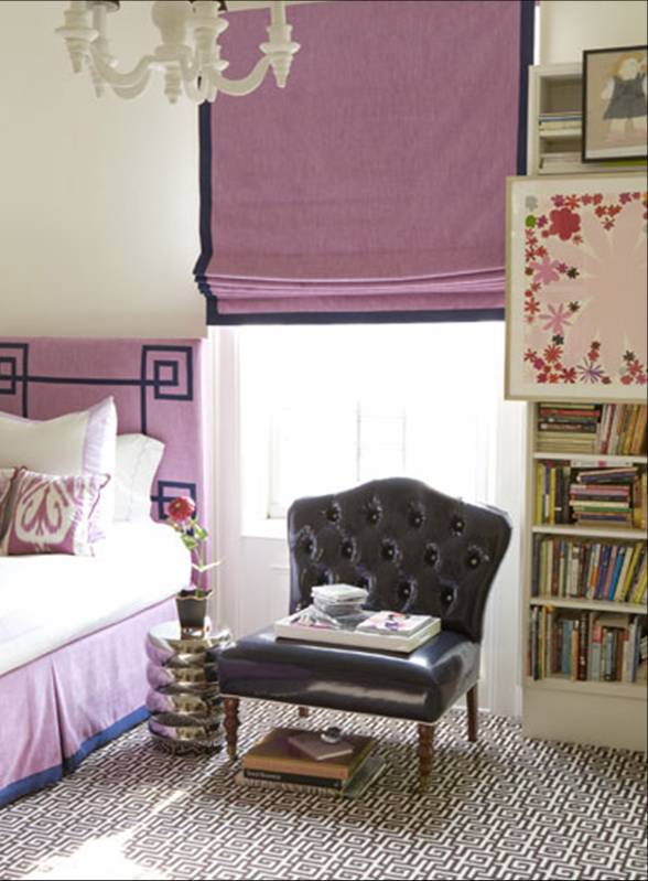
Posh bedroom with purple headboard and Roman shades with a dark ribbon trim
Photo courtesy of Amanda Nisbet
A posh purple bedroom features a headboard and roman shade in a lovely color of violet with dark ribbon accent trim. (above)

Have you or would you use purple to decorate in your home? If so, where? If not, why not?

xo
Coco

P.S. Please become a fan of the COCOCOZY FACEBOOK page AND suggest the page to as many of your Facebook friends. When there are 1000 fans, I will do a special giveaway just for Cococozy Facebook fans!

image
DISCLOSURE: This post may contain affiliate links, meaning when you click the links and make a purchase, we receive a commission.
previous
next

related posts

anchor text
anchor text

My Spring Favorites

imageanchor text
imageanchor text
Meet Coco - Bring Style Home

Meet Coco - Bring Style Home

A Los Angeles native, Colette Shelton, also known as “Coco”, is an entrepreneur, design blogger and home furnishings designer.

Read More   read more

Looking for Something?

View All Posts
image

Earn Cash Back While Shopping For Fall

Chirpyest is the shopping platform I created. Using Chirpyest, anyone can earn money by shopping AND for sharing from over 800+ online retailers! Sign up for free! :)

Tap the "join Chirpyest now" link below or the image above to get started making money while you shop!

Join Chirpyest Now
Elegant Sideboard Table

image

Use Chirpyest to get 5% cash back from Lulu & Georgia!
Join our mailing list
Sign Up Now

Recently Pinned

Recently Pinned

Resources

My list of favorite brands and retailers to shop.   Resources
image
write a comment
  • Share

15 responses to “COLOR WATCH: PURPLE REIGNS SUPREME IN THREE STYLISH SPACES!”

  1. Ludmila {CreamyLife.com} says:
    April 8, 2010 at 7:23 AM

    Just love purple! So nice pictures!

    Reply
  2. Sally@DivineDistractions says:
    April 8, 2010 at 7:25 AM

    I’ve used purple with a few clients….mostly darker, more aubergine than lavender. We did a nursery in lavender, gray and green with white that turned out really well. It takes a bold, out of the box client to go the lighter version, I think

    Reply
  3. Jürgen says:
    April 8, 2010 at 7:30 AM

    The living room are great with the Denmark Furniture.Love he pictures regards

    Reply
  4. Margarita says:
    April 8, 2010 at 7:47 AM

    So gorgeous. I would definitely use purple in my decor!

    http://www.margaritareczek.com

    Reply
  5. Júlia says:
    April 8, 2010 at 8:57 AM

    I loved all images, but the first is fantastic!

    Sorry, my english is horrible!

    XOxo our beijos in portuguese =)

    Reply
  6. KristenB says:
    April 8, 2010 at 11:59 AM

    Gorgeous! My favorite color. =)

    Reply
  7. Herself says:
    April 8, 2010 at 12:10 PM

    Purple can be tricky, but oh how scrumptious when it’s done right! By the by, I love butcher block. I’m very done with granite!

    Reply
  8. Emom says:
    April 8, 2010 at 12:18 PM

    Lovely….isn’t it funny, you are one of many people I have heard that remember their grandmother’s favorite color….my grandmother’s was RED! smiles.

    Reply
  9. Andrea says:
    April 8, 2010 at 1:25 PM

    I used a dark purple from Martha Stewart’s paint line called mollusk on my guest room accent wall. Everyone thinks it’s black! Wish I had gone a bit lighter, but I still love it!

    Reply
  10. Lulu LaRock Jewelry says:
    April 8, 2010 at 3:02 PM

    Very pretty! I was given a design project in a class with just that color (as in pic 2&3). I was a little worried at first. I chose a beach house theme and used the lavender with pretty shades of green, yellow and white, with cane furniture, barkcloth, ticking stripe, etc. Came out great!

    Reply
  11. twin xl says:
    April 8, 2010 at 9:05 PM

    Totally love the second photo – such a great room!

    Reply
  12. barbara says:
    April 9, 2010 at 8:46 AM

    2 years ago, I had a 76 yr. old client, he was down sizing from a home to a condo, and I gave him a shelter mag. to peruse. Well, we went from browns & reds to PURPLE. He noticed the trend in advertising, so we used Phillip Gorivan’s collection for Duralee, and even painted 2 walls n a lavender with a linen texture on the walls. The neutral that we used with it was grey. You might be able to see the finished rooms at the Amelia Islander magazine Aug 2009 edition. It is very smart & forward , especially for a gentleman his age.

    Reply
  13. Alyssa T says:
    April 9, 2010 at 8:17 PM

    already decided my next bedroom will somehow feature this color! got the initial inspiration from this west elm bed: http://www.westelm.com/products/b340/popup/more-views.html?active=2

    this post def confirms that purple does indeed reign! xo-a

    Reply
  14. Jill says:
    April 10, 2010 at 4:31 AM

    Love the 2nd picture – that woman has a great color sense!

    Reply
  15. Aron says:
    April 2, 2011 at 8:20 AM

    Just finished painting my dining room a deep chocolate brown purple. I never liked purple until I saw that color… I don’t kmow what came over me but it is now my favorite room 🙂

    Reply

Leave a Reply Cancel reply

Your email address will not be published. Required fields are marked *

This site uses Akismet to reduce spam. Learn how your comment data is processed.

Instagram

Tile does all the talking in these rooms, and we a Tile does all the talking in these rooms, and we are obsessed.
From zellige to checker to floor-to-ceiling commitment, swipe through our favorite spaces where one material changes everything. Which one would you live in? 👇
Save this for your next renovation.
1. @lindaboronkay
2. Design: @studio.bosko Photography: @giuliamaretti_studio
3. @helenio_barbetta
4. @studioduggan
5. @studioashby
6. @maisonbalinteriors
7. @omerozturkinteriors
8. @omerozturkinteriors
9. Design: @designbuildmade Photography: @hayleyellenday
10. @lauragonzalezofficiel
11. @montanalabelle
12. @jeanstofferdesign
13. @ninafreudenberger
#tilework #interiordesign #tiledesign #kitchendesign #interiorinspo
The room sets the mood. The light seals it. From The room sets the mood. The light seals it.
From vaulted stone arches to gilded Parisian boiserie, every great dining room starts with architecture and finds its soul in the fixture overhead. Swipe through our favorite dining rooms where design, light, and the art of gathering come together. ✨
Save this for your next dining room refresh.
📸
@nightpalm
@carlo_oriente
@christinacolestudio
@studioashby
@tristanauer 📷: @amaurylaparra
@LilyBW
@echemartinez
@daniellesiggerud
@hugobesnier_
@lucie.socrate
@carlgergesarchitects
@arielokin
#diningroomdecor #interiorinspo #lightingdesign #homedesign #diningroomdesign
This 300m² Haussmannian duplex in central Paris wa This 300m² Haussmannian duplex in central Paris was designed to function as both a home and a gallery and the distinction between the two is impossible to find.
Every room treats art and objects with the same weight as furniture, nothing is decorative for its own sake, everything is placed with intention.
The Haussmannian bones, ornate cornicing, herringbone parquet, original stained glass ceiling, stay intact throughout. Natural and handcrafted materials do the rest.
→ Save this if you’re building a home around an art collection. 🖼️
@batiikstudio
📸 @alexandre_tabaste_studio
#apartmenttour #parisianstyle #homedecor #frenchinteriors #interiorarchitecture
So proud of my dear friend Kristi Bender and her b So proud of my dear friend Kristi Bender and her business partner Wendy Schwartz on the launch of Petal Promenade for @cuff_studio. 👏
This new collection feels like such a beautiful evolution. Inspired by their Manhattan Flower District showroom, it brings together the romance of classic decorative arts with a fresh, modern perspective in a way that feels bold, artistic, and incredibly thoughtful.
If you are attending ICFF 2026, make sure to stop by Booth W1048 and experience Petal Promenade in person. Congratulations, Kristi and Wendy. This collection is truly something special. ✨
Ever wondered what it feels like to have the Eiffe Ever wondered what it feels like to have the Eiffel Tower as your view? These 7 Paris spaces answer that — some hotel suites, some private residences, and each one framing it completely differently. 🫶
A gilded suite where it peers through silk drapes. A terrace set for breakfast with the Tower straight ahead. Contemporary apartments where open French doors bring it almost into the room. Classic Haussmannian grandeur on one end, sculptural modern interiors on the other; same iconic backdrop, seven entirely different ways to live with it.
→ Save this for your next Paris trip or renovation inspo.
1,2,3 - @damienlangloismeurinne_studio
4 - Four Seasons Hôtel George V @fsgeorgevparis
5,6,7 - 𝐒𝐡𝐚𝐧𝐠𝐫𝐢-𝐋𝐚 𝐏𝐚𝐫𝐢𝐬 @shangrilaparis
#paris #eiffeltower #parishotel #parisapartment #eiffeltowerview
Follow on Instagram
footer logo

Interiors

  • Kitchen
  • Bath
  • Bedroom
  • Living Room
  • House Tours
  • Outdoor

Style

  • Fashion
  • Best of
  • Travel
  • Design on Sale
  • Coco's Projects

About

  • About Coco
  • Press
  • Contact
  • View All Posts

Join our mailing list

Sign Up Now
© 2026 Cococozy | Terms & Conditions