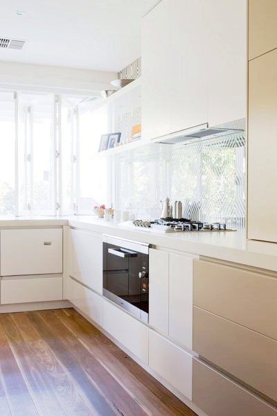
I like what Australian design firm Doherty & Lynch did with the backsplashes in these two kitchens.
In the first, they painted a kitchen wall with a blue ombre style stripe on the wall and then installed floating shelves. In the second kitchen below, black and white graphic wallpaper is applied to the wall and then covered with either clear plexi or glass.
Both have big visual impact and are very unique.
Good DESIGN IDEA in my view. Take a look.
What do you think of these desing ideas for backplashes? Like or dislike?
Happy Tuesday!
xo
Coco
Photos: Doherty Lynch


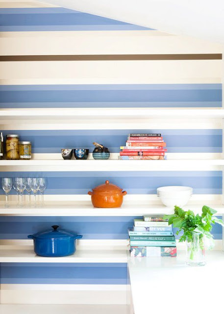
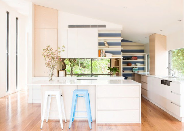
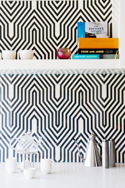
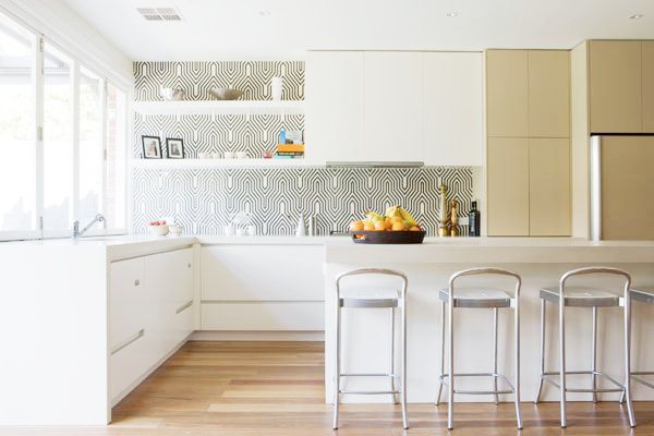



I love the idea of something visually fun and different. Me likey!!
I love this! Do you think it looks good because the kitchens are both very simple and white? I would love to do something similar in my kitchen but I have dark gray/black granite and dark wood cabinets. Do you think this would translate?
They are awesome; like you, agree as a good design idea. Before I read that there was some sort of cover protection over the wall covering, I was wondering how they would make sure it didn’t deteriorate. Thanks for sharing; always looking for new ideas and inspiration!
http://www.donnaviningblog.com
I love this! Often kitchens are treated rather clinically in design, but I think the backsplash is the perfect place to have a little fun!
I love the idea! Who says backsplashes only have to be tile,and if you tire of it you do something different not a huge commitment. I saw one the other day that had the union jack on the back wall loved that idea!
http://www.dawnajonesdesign.com/
The pattern in the kitchen wall is so beautiful! 🙂
This is interesting – but realistically a waste of space. Shelving in a kitchen invites dust of the greasy variety to its surface (not a good image and a pain in the *** to keep clean!). The use of either pattern as a backsplash is really quite clever.
Take this idea to the next step and it makes one wonder what the impact of an interesting stencil might create (tons of them available at online sources). Choose the pattern – choose your own ‘POP!’ of color or clever use of light and dark and you will have something completely original!
Thank you for sharing with us!
Some great inspiration here. Absolutely love the idea of horizontal stripes with floating shelves and that shade of blue works so well with white.
I really love the blue alternating striped wallpaper behind the white floating shelves!
I LOVE this idea, the black and white is my fave!!
fortheloveofblack.blogspot.com
The 2nd one for me is amazing, and what a great idea to also apply the plexi glass?! I could see myself doing something like that.