logo
inline logo
  • Blog
  • Design
    • Kitchen
    • Bath
    • Bedroom
    • Living Room
    • Outdoor Living
  • Style
    • Fashion
    • Best of
    • Design On Sale
  • Projects
  • Travel
  • Shopping Guides
    • Gift Guides
    • Resources
    • Wishlist
  • About Coco
    • Meet Coco
    • Press
    • Contact

What are you looking for?

main logo
  • Blog
  • Design
    • Kitchen
    • Bath
    • Bedroom
    • Living Room
    • Outdoor Living
  • Style
    • Fashion
    • Best of
    • Design On Sale
  • Projects
  • Travel
  • Shopping Guides
    • Gift Guides
    • Resources
    • Wishlist
  • About Coco
    • Meet Coco
    • Press
    • Contact
imagestyle
share
home design ideas

DESIGN IDEA: CUT IT UP AND FRAME IT!

January 6, 2011
  • Share

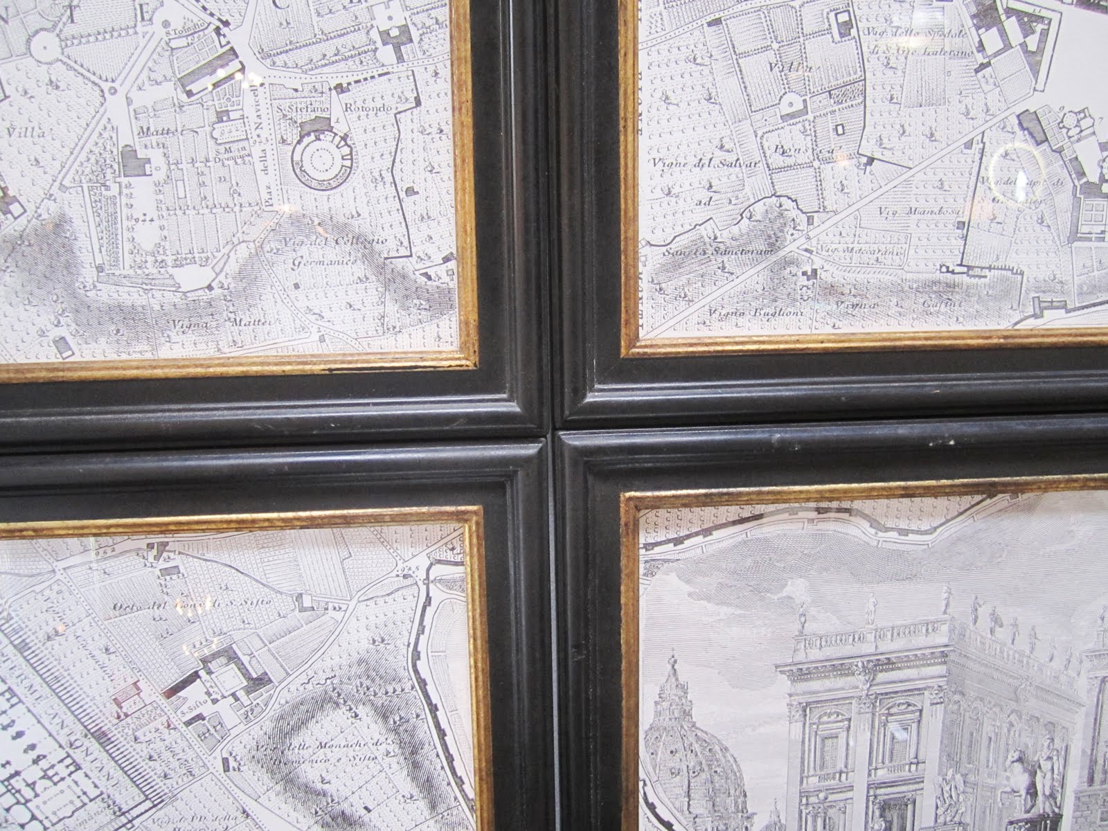
Photos in this post by Coco of COCOCOZYClose up of an old map cut up and framed in sections
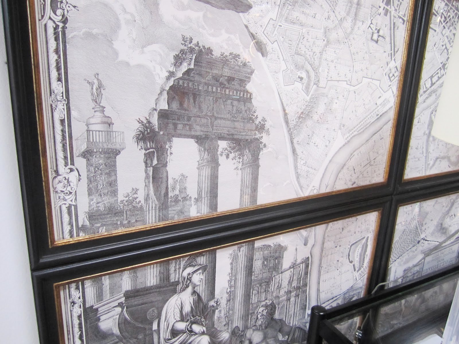
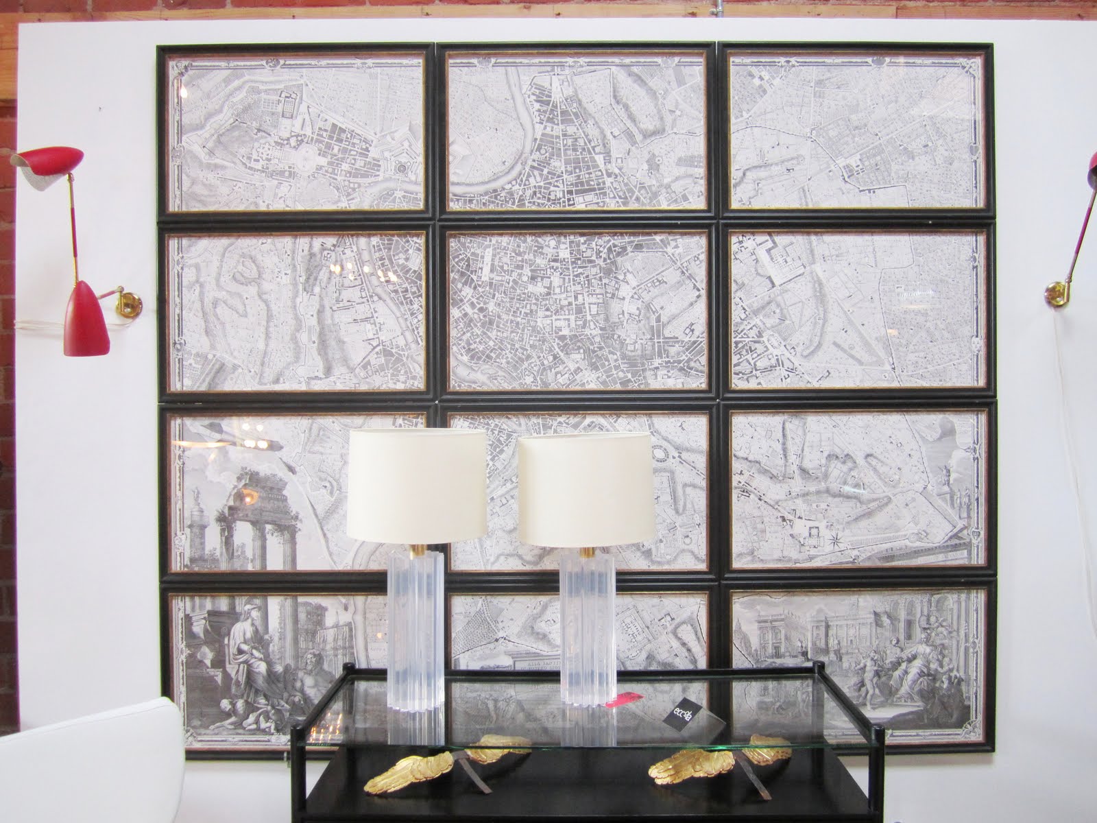
Was in chic Los Angeles store eccoLA and I saw this piece of art…well these pieces of art.

It is actually a huge interesting map…I think of old Rome…that has been cut apart, framed and then put back together again. Love it! Adds visual interest to what otherwise would have just been a huge map on a wall covered in glass.

Could be done in so many styles and with so many different kind of printed pieces…

I have a few vintage posters given to me years ago. I don’t think I would ever put them on my wall as they are because they just look like old posters (not anything collectible)…but maybe I could use this technique on them to make them more interesting to the eye? Thinking….I could give it a try!

Or if you have a photograph you love and aren’t necessarily into putting just plain huge photos on your wall as art, you could blow it up, cut it up and frame the pieces in cool wood or metal picture frames and hang.

Could see this used on a great photo blown up to cover an entire wall in a dining room for example!
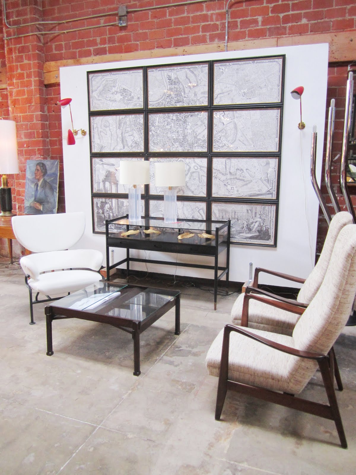
Room with brick wall with an Old map cut up and framed in sections behind a glass viewing table, three armchairs and a coffee table with a glass table top and iron legs

Close up of the intersecting corners of a cut up and framed map
View of the entire map and it's black framed sections

What do you think? Any other ideas for making printed art interesting? What do you think of this decorating and design idea? Do weigh in!

Happy Thursday!

xo
Coco

Photos in this post by Coco of COCOCOZY

image
DISCLOSURE: This post may contain affiliate links, meaning when you click the links and make a purchase, we receive a commission.
previous
next

related posts

anchor text
anchor text

My Spring Favorites

imageanchor text
imageanchor text
Meet Coco - Bring Style Home

Meet Coco - Bring Style Home

A Los Angeles native, Colette Shelton, also known as “Coco”, is an entrepreneur, design blogger and home furnishings designer.

Read More   read more

Looking for Something?

View All Posts
image

Earn Cash Back While Shopping for Summer

Chirpyest is the shopping platform I created. Using Chirpyest, anyone can earn money by shopping AND for sharing from over 800+ online retailers! Sign up for free! :)

Tap the "join Chirpyest now" link below or the image above to get started making money while you shop!

Join Chirpyest Now
Campo Teak Dining Table
Elegant Sideboard Table

Use Chirpyest to get 7.5% cash back from Terrain!

Join our mailing list
Sign Up Now
Close
Newsletter Sign-Up

Please join our mailing list

Recently Pinned

Recently Pinned

Resources

My list of favorite brands and retailers to shop.   Resources
image
write a comment
  • Share

19 responses to “DESIGN IDEA: CUT IT UP AND FRAME IT!”

  1. Tiffany says:
    January 6, 2011 at 9:03 AM

    I have done this. However the photo I used was a blown up, sepia photo of my child crying after a temper tantrum over a toy. I pulled out my camera, and just took a headshot. Of course that just peeved him off all the more! It is an amazing and comical piece of art. It is framed and it will soon fill our new dining room wall.

    Reply
  2. ~Johnna~ says:
    January 6, 2011 at 9:06 AM

    Brilliant! I have an antique map (new) =) I am going to do that with. Thank you!

    Reply
  3. The Shade Shop, Inc. says:
    January 6, 2011 at 9:30 AM

    Sure does turn ordinary into interesting! Framers will love it! And by the way, you keep right on saying “anyhoooo”!

    Reply
  4. vignette design says:
    January 6, 2011 at 10:26 AM

    I love this idea! And it’s perfect for filling up a large wall!

    Reply
  5. tilly | maison says:
    January 6, 2011 at 11:10 AM

    this is genius. i have a map of paris i’ve been waiting to frame, but felt a little blah. this might be just the ticket!

    xo
    carolyn

    Reply
  6. Pink Overalls says:
    January 6, 2011 at 1:07 PM

    At first I thought this was an old metal window frame. It’s a bunch of thin frames hung tightly together, right? I like this idea. I bet a window sash would work in a similar way, as frames for a large print or poster cut up.

    Reply
  7. Wendy says:
    January 6, 2011 at 1:14 PM

    I love it! I did something similar with nautical charts we found on Ebay.
    http://www.flickr.com/photos/28664363@N03/5328197001/

    It has places that are meaningful to us (where we met, where we grew up). It was a fun project.

    Reply
  8. Laura says:
    January 6, 2011 at 2:20 PM

    Such a great way to add some drama to a big space and to the piece of art! Love this idea.

    Reply
  9. Dovecote Decor says:
    January 6, 2011 at 2:23 PM

    I love it, and we have a map of Paris grouping like that on our website. I’ve seen a scenic Zuber paper nicely framed up and used for large spaces, that the family has enjoyed in several houses. They can be made up in screens and placed behind a sofa, as well. You are preaching to the choir here!
    Best,
    Liz

    Reply
  10. Marilyn G Russell says:
    January 6, 2011 at 2:47 PM

    Wow, what an awesome idea and the makings for a great conversational piece.

    Reply
  11. and flowers pick themselves says:
    January 6, 2011 at 3:31 PM

    i love these ideas. very lovely!

    xo Alison

    Reply
  12. Stephanie says:
    January 6, 2011 at 9:57 PM

    Love how it looks like a window frame!

    Reply
  13. Nicole says:
    January 6, 2011 at 10:23 PM

    I love it!

    I want it!

    Awesome! 🙂

    Reply
  14. Interior Design Musings says:
    January 7, 2011 at 4:33 AM

    very clever! Love the look. M.

    Reply
  15. a designer + a contractor says:
    January 7, 2011 at 8:10 AM

    love this look! adds such great interest but is very cohesive.

    Reply
  16. Leisel says:
    January 7, 2011 at 8:10 AM

    I actually purchased one just like this from Voila! Super interseting store on La Brea. But I purchased Paris.

    Reply
  17. Anonymous says:
    January 10, 2011 at 5:32 PM

    Not to detract from the idea, as I think it is a wonderful look, but that is a Nolli map of Rome and it was produced in 12 separate plates (plus several additional sheets). It is usually displayed this way. Obviously you can still use this technique for other maps but I thought I would offer additional insight to this particular map. Also, if you are interested in a Nolli map I believe there are some reasonable facsimiles out there.

    Reply
  18. Carson Lee says:
    January 21, 2011 at 1:57 PM

    The picture ofRome, but up and framed separately & put up on wall: cool.
    Would never have thought of this.
    Now — am picturing something….

    Reply
  19. Maria Alejandra Creative Prints says:
    February 16, 2011 at 4:41 PM

    what a great idea! I sell prints and I realized you have here so many good things, congrats!

    Reply

Leave a Reply Cancel reply

Your email address will not be published. Required fields are marked *

This site uses Akismet to reduce spam. Learn how your comment data is processed.

Instagram

Design by @covetnoir. A 1750 Georgian home in Surr Design by @covetnoir. A 1750 Georgian home in Surrey, restored back to its former grandeur.
Grade II listed and stripped of most of its original character by previous owners, this 9,000 sqft home with seven bedrooms, and five bathrooms was brought back to life for a French-Swedish couple raising two young kids here. The brief: Parisian luxe with a Scandinavian twist, and a design calm enough to keep the grand proportions feeling intimate.
Covet Noir rebuilt what had been lost: full plasterwork, raised & fielded panels, a bespoke decorative ceiling, and added a cantilevered limestone staircase with Nero Marquina cabochon inlay in the entrance hall. The material palette leans into marble and alabaster, softened with boucle and brushed cottons, chosen to hold up to two kids and two dogs without losing the elegance. Antique furniture and architectural fittings were sourced throughout to keep the project sustainable, alongside ground source heating.
Grand bones, calm hand. This is the kind of restoration we could look at all day. 🤍
📍 Surrey
🏡 Design: @covetnoir
📸 @taranwilkhu
Which vaulted ceiling style is more your speed? Dr Which vaulted ceiling style is more your speed? Drop your answer 👇
A — Warm wood beams and stone
B — Light and airy with floor-to-ceiling windows
A great vaulted ceiling doesn’t just add height. It changes how a room feels entirely. The best ones make you stop, look up, and never want to leave.
Save this for your next build or renovation inspo. 🖤
@coletteinteriors | @houseofrolison | @chatwinhomes | @ryanstreetarchitects | @katemarkerinteriors | Interior: @stephaniekrausdesigns Architecture: @bennett_architecture_studio
Before you start moving furniture, ask yourself thBefore you start moving furniture, ask yourself these three questions:
Does this improve the room’s function?
Does it create a better focal point?
Does it make the space easier to walk through?
If the answer is “no” to all three, maybe it’s just the rearranging itch talking. 😅
Save this for the next time you’re tempted to move every piece of furniture in your house.
This is the house that stopped us mid-scroll and k This is the house that stopped us mid-scroll and kept us there.
A 90s home in Amman, Jordan, entirely remodelled by local artisans. Neo-Florentine bones, Levant-eclectic sensibility, arched passageways, and a flea-market-meets-commissioned-art collection that makes every wall feel intentional.
What makes it work: restraint where you’d expect excess, and boldness where you’d expect safety.
This is what happens when a home is built by people who actually know the place. 🖤
Save this, it’s a masterclass in culturally rooted design.
Design: @tristanauer
📷: @amaurylaparra
#housetours #beautifulhomesfeature #interiordesigninspo
Which room would you go black in first? Drop your Which room would you go black in first? Drop your answer 👇
A — The kitchen
B — The bathroom
C — The living room
D — Somewhere unexpected
Black is not a bold choice. It’s a neutral, and one of the most versatile ones in design.
The rooms that get it right treat black the same way others treat white or greige: as a foundation that lets everything else breathe. The texture of the wall. The warmth of the wood. The drama of the marble. Black doesn’t compete, it amplifies.
Save this the next time someone talks you out of going dark. 🖤
@steveandfilip 📷 @rymcdon | @seanandersondesign (2&3) | @jpzinteriors | @coletteinteriors | @ashleymartinhome
Follow on Instagram
footer logo

Interiors

  • Kitchen
  • Bath
  • Bedroom
  • Living Room
  • House Tours
  • Outdoor

Style

  • Fashion
  • Best of
  • Travel
  • Design on Sale
  • Coco's Projects

About

  • About Coco
  • Press
  • Contact
  • View All Posts

Join our mailing list

Sign Up Now
© 2026 Cococozy | Terms & Conditions