logo
inline logo
  • Blog
  • Design
    • Kitchen
    • Bath
    • Bedroom
    • Living Room
    • Outdoor Living
  • Style
    • Fashion
    • Best of
    • Design On Sale
  • Projects
  • Travel
  • Shopping Guides
    • Gift Guides
    • Resources
    • Wishlist
  • About Coco
    • Meet Coco
    • Press
    • Contact

What are you looking for?

main logo
  • Blog
  • Design
    • Kitchen
    • Bath
    • Bedroom
    • Living Room
    • Outdoor Living
  • Style
    • Fashion
    • Best of
    • Design On Sale
  • Projects
  • Travel
  • Shopping Guides
    • Gift Guides
    • Resources
    • Wishlist
  • About Coco
    • Meet Coco
    • Press
    • Contact
imagestyle
share
home design ideas

DESIGN IDEA: FLOATING SHELVES ON GRAPHIC WALLS!

May 18, 2011
  • Share
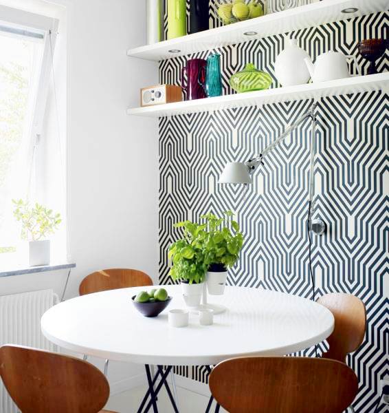
Breakfast nook with one wall covered in a bold graphic print, floating shelves holding bright colored containers, a white round table, and wooden Eames chairs

I like this idea.  Before you plan on putting up some floating wall shelving for storage or display…why not, cover your walls in a bold graphic wallpaper.  Fun for a small nook or a feature wall in a room.  Cute.  Right?

Do you like or do you hate?  Please weigh in.

Happy Wednesday!

xo
Coco

P.S.  Today is the last day to enter the COCOCOZY giveway over on Coco+Kelley blog!  Head over to enter so you have a chance to win either a pillow or a throw from the COCOCOZY collection! We lost about 200 entries with the Google/blogger shutdown last week…so make sure you check to see if your entry made it!  Will keep fingers crossed for you!

Photo: Skona Hem

image
DISCLOSURE: This post may contain affiliate links, meaning when you click the links and make a purchase, we receive a commission.
previous
next

related posts

anchor text
anchor text

My Spring Favorites

imageanchor text
imageanchor text
Meet Coco - Bring Style Home

Meet Coco - Bring Style Home

A Los Angeles native, Colette Shelton, also known as “Coco”, is an entrepreneur, design blogger and home furnishings designer.

Read More   read more

Looking for Something?

View All Posts
image

Earn Cash Back While Shopping for Summer

Chirpyest is the shopping platform I created. Using Chirpyest, anyone can earn money by shopping AND for sharing from over 800+ online retailers! Sign up for free! :)

Tap the "join Chirpyest now" link below or the image above to get started making money while you shop!

Join Chirpyest Now
Campo Teak Dining Table
Elegant Sideboard Table

Use Chirpyest to get 7.5% cash back from Terrain!

Join our mailing list
Sign Up Now
Close
Newsletter Sign-Up

Please join our mailing list

Recently Pinned

Recently Pinned

Resources

My list of favorite brands and retailers to shop.   Resources
image
write a comment
  • Share

15 responses to “DESIGN IDEA: FLOATING SHELVES ON GRAPHIC WALLS!”

  1. First House on the Right says:
    May 18, 2011 at 12:06 PM

    I love this idea but don’t love this particular wallpaper. Have a small nook am planning to wallpaper before I add floating shelves so interested to see how it will turn out. Nicolex

    Reply
  2. Conspicuous Style Design Blog says:
    May 18, 2011 at 12:23 PM

    I’ve always loved floating shelves. These look great on the graphic, but I would like them on a plainer wall, too

    Reply
  3. Ashley says:
    May 18, 2011 at 1:31 PM

    LOVE it! Love modern wallpaper and floating shelves!

    -Ashley
    http://www.DesignBuildLove.co

    Reply
  4. Sudha says:
    May 18, 2011 at 1:46 PM

    creates a dramatic effect..love the graphics on floating shelves

    Reply
  5. LiveLikeYou says:
    May 18, 2011 at 1:52 PM

    Great idea. Do you know where the wall paper is from?

    Reply
  6. designchic says:
    May 18, 2011 at 4:00 PM

    I love the way they look…add a wonderful contrast to the graphic paper!!

    Reply
  7. Zsa Zsa says:
    May 18, 2011 at 7:04 PM

    Ahh what a great idea for the extra books and whatnots lying on my desk! Graphic wallpaper looks gorgeous with floating shelves! Thanks for the inspiration. 🙂

    Reply
  8. Kim Grey says:
    May 18, 2011 at 7:15 PM

    Great look! I love it!

    Reply
  9. Karen says:
    May 18, 2011 at 7:17 PM

    Love the idea, but not this particular wallpaper. I think it would make me dizzy.

    Karen T.

    Reply
  10. Houndstooth and Nail says:
    May 18, 2011 at 7:30 PM

    A-mazing!

    Reply
  11. meenal bishnoi says:
    May 19, 2011 at 4:16 AM

    love them..but not this wall paper..i think they’d look better on a plain black wall..thanks for sharing..have a lovely day..do visit my blog when you have a moment..xx meenal

    Reply
  12. The Cuban In My Coffee says:
    May 19, 2011 at 4:50 AM

    I like the idea, and think something this busy could work well in a child’s room where things can go a bid more on the wild side (at least for me) I would love to see them on a different paper.

    Reply
  13. Vera says:
    May 19, 2011 at 5:35 AM

    I like this but it’s hard when you post these amazing palaces first. Floating shelves are great and the extra printed wall paper makes it that much more special. Nice!

    Reply
  14. cubicle57 says:
    May 25, 2011 at 11:10 AM

    I love it. So striking in a breaky-uppy negative space way. Wish I were brave enough to tackle wallpaper or patient enough to stencil.

    Reply
  15. Sacred and Profane Designs says:
    March 15, 2012 at 7:02 AM

    Love the retro, mod feeling!

    Reply

Leave a Reply Cancel reply

Your email address will not be published. Required fields are marked *

This site uses Akismet to reduce spam. Learn how your comment data is processed.

Instagram

A suburban house doesn’t have to feel like a compr A suburban house doesn’t have to feel like a compromise after city living. It just needs the right bones.
Custom millwork. Steel-framed doors. A main level that finally flows the way it should. Every space here earns its place, nothing feels like leftover square footage.
Swipe through and tell us which room you love the most. 👇
@kaminskipew | 📷: @varneyphoto
These rooms were already working. Then artwork hapThese rooms were already working. Then artwork happened.
A blank wall isn’t neutral, it’s a missed opportunity. The right piece doesn’t just fill space, it gives a whole room a reason to exist.
Which before-and-after made you gasp? Drop your answer 👇
Designers of featured images:
@macahuneeusdesign | @morrisoninteriors | @rosencodesignstudio | @nicolehollissf | @haynesrobertsinc Photography: @douglasfriedman
Sage and olive aren’t just a kitchen trend, they’r Sage and olive aren’t just a kitchen trend, they’re a whole-house commitment. The right shade shows up in the cabinets, the walls, the vases, the trim, and somehow never feels like too much.
The spaces that get it right pair it with warm oak, aged brass, and something worn-in: an antique dresser, a vintage runner, a hand-thrown vase.
Which sage and olive room would you want to move into? Drop your answer 👇
amberinteriors @shadedeggesphotography | @madelineharper Photo: @sherrelldesignstudio | @loveandinteriors | @daleyhome | @lindenandcointeriors | @rosencodesignstudio | Design: @amnachaudhryinteriors Photography: @casamiavisuals
Starting the week with good energy, a little confiStarting the week with good energy, a little confidence, and absolutely no reason to wait for Friday to feel fabulous. 😉
Try these little things to lift your mood today:
✨ Put on the playlist that makes you happy
☕ Grab your favorite coffee
👗 Wear the outfit that makes you feel confident
☀️ Step outside and soak up some sunshine
🤍 Or simply give yourself a few minutes to reset
Good energy doesn’t always have to come from something big. Sometimes, you can create it yourself.
Here’s to a feel-good Monday! 🖤
Proof that pattern mixing isn’t a risk, it’s a ski Proof that pattern mixing isn’t a risk, it’s a skill.
Heidi Caillier Design took this historic San Francisco home and layered floral wallpaper, striped drapery, checked linens, and antique textiles room after room without a single one feeling overdone. Marble mantels, gilt mirrors, brass fixtures, and warm wood floors do the quiet work of holding it all together.
This is what happens when “more” is chosen on purpose.
Save this for the masterclass in mixing prints. 🔖
Design: @heidicaillierdesign
📸 @haris.kenjar
Follow on Instagram
footer logo

Interiors

  • Kitchen
  • Bath
  • Bedroom
  • Living Room
  • House Tours
  • Outdoor

Style

  • Fashion
  • Best of
  • Travel
  • Design on Sale
  • Coco's Projects

About

  • About Coco
  • Press
  • Contact
  • View All Posts

Join our mailing list

Sign Up Now
© 2026 Cococozy | Terms & Conditions