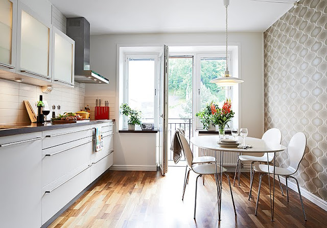
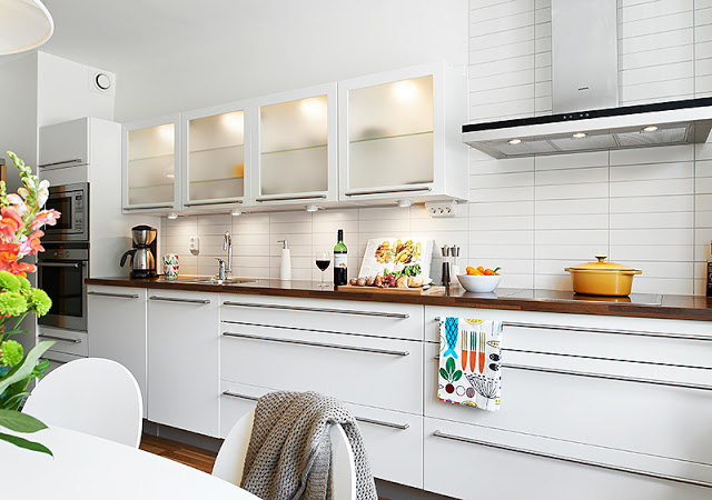
When designing a kitchen in a small space…why not do it on one wall…and why not make it long?
I like this small eat in kitchen. Very neat. Long wide lower cabinet drawers with super long pulls keep the lines very clean in the space. Also the long ceramic field tile backsplash laid by stacking the tiles vertically mirrors the same elongated lines in the upper and lower cabinetry.
Nice.
Below is an example of one of those super long long drawer pulls!
| 20″ Jako Satin Finish Stainless Pull – $19 (various sizes available) |
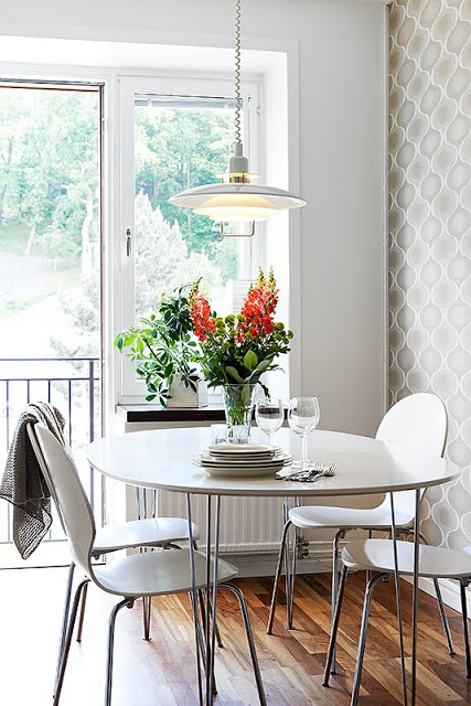 |
| The long one wall kitchen allows for enough space for a small breakfast nook with a small oval table and four chairs. (above) |
What do you think of this small kitchen. Do you like it? If not, what might you change about it?
Oh did I mention the cute wallpaper, the dark counters and the hardwood floors…they all work!
Happy Friday!
xo
Coco
P.S. If you are going to the Atlanta International Gift and Home Furnishings Mart this week, please stop by the Christian Mosso Associates Showroom in Building 1, 9th Floor. I’m there for the next few days showing off the COCOCOZY home furnishings collection. I have so much fun meeting all of you at these shows…so please please stop by. Also, we’ve added a new style to the collection for this market…would love to see what you think!
P.P.S. Here’s a look at the little COCOCOZY section at the Christian Mosso Associates Showroom:
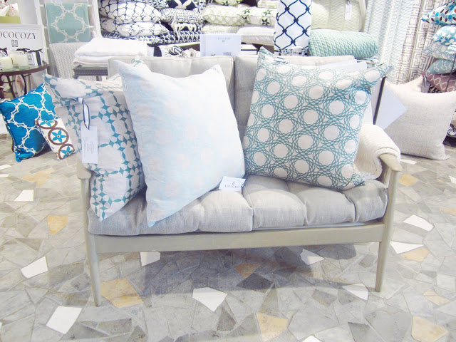 |
| COCOCOZY Natural Linen pillows on a Chelsea Textiles settee in the showroom. (above) |
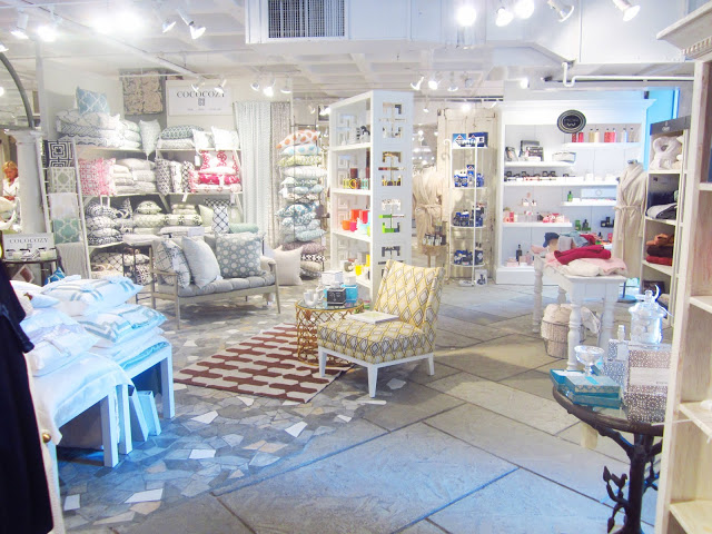 |
| COCOCOZY textiles are next to Jonathan Adler candles and Kumi Kookoon in the showroom this year! (above) |
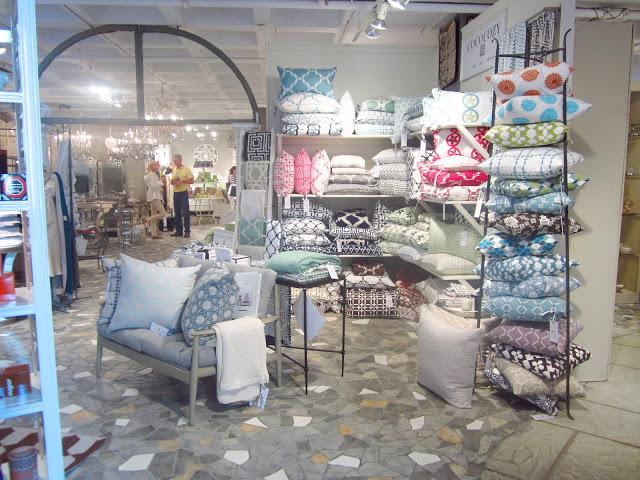 |
| Here’s my little display at the Atlanta showroom. (above) |
P.P.P.S. Will share so many more photos of the show and the showroom! So many beautiful things to see at market.
P.P.P.P.S. Went to a fab dinner last night at Bocado here in Atlanta with TW, CC, JM, JH and A. We had such a blast. Lots of conversation and good times. Typical, us gals at the table couldn’t stop chatting and the guys were just watching us saying that they couldn’t hear a thing we were saying because the restaurant was loud and we were talking at such a fast high pitch! Oh well guys…you’ve got to learn to keep up. Haven’t seen TW since she had her little baby and she looks fantastic…and CC looked adorable too wearing some fabulous Prada wedges. Oh…major admission…I ended up eating carrot cake! I haven’t had any real sugar in about 7 months. It was DELISH!! Why did I give up sugar? Here are some blurry pics I took at Bocado last night!
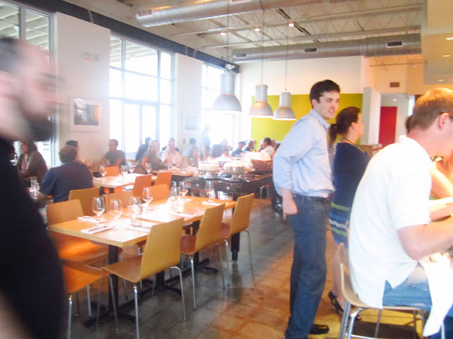 |
| Bocado in Atlanta. (above) |
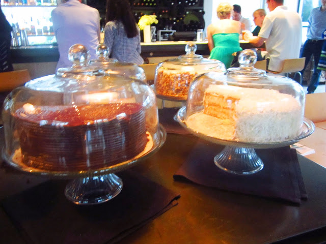 |
| Let them eat cake! (above) |
P.P.P.P.P.S. Happy Friday the 13th!
Photos: Stadshem; Coco of COCOCOZY





Ah im so mad i can’t come by the showroom because of work. Im a huge fan of your prints and patterns and i was hoping to pick up a throw pillow or two! good luck!!
LOVE the kitchen. And the display looks FABULOUS. Those patterns and colors are so modern but have an interesting reference to traditional textiles. Love them.
Love the idea of kitchen on one wall, and it is a very nice space. I wish they had run the cabinets up to the ceiling and mimicked the shapes in the wallpaper, which is beautiful in the backsplash as right now it reads like one giant rectangle.
Love that kitchen…so clean and fresh looking. Good luck in Atlanta…your booth looks fantastic!
Great kitchen! Love the clean lines with the gray and white.
Very efficient use of space.
Ohhh I love the Kitchen and the long lines. Very Nice. Makes the space look clean and simple. The first thing I noticed was the wall paper, that’s my fav!!
Good Luck at the Atlanta International Gift and Home Furnishing Mart this week… your textiles look AWESOME in the showroom! Keep up the good work…
Your set-up looks awesome! Hope you’re having fun in Hotlanta!!
Surprisingly, I like that kitchen a lot! I usually gravitate toward kitchens with a large island in the center, sort of dividing the space into work areas. But this is really pretty and unique! I also really love the breakfast nook — so cute. 🙂 Thanks for sharing the inspiration.
This space looks so much like my kitchen! This is exactly where the cabinets are, the table with the 4 chairs and the door leading to our veranda! Only the colors are different. What I would change in the picture above is the oval table, I think it takes too much space. Maybe a rectangular or a square one would save some space for passing through.
I do like it — the wood countertops and floors balance the white. It’s contemporary, but not cold. I would have liked to see the wall cabinets go to the ceiling (it looks like there might be some sort of vent by the oven, though)or the tile continued up above the wall cabinets to the ceiling.
beautiful Coco! I hope that you’re coming back to NY next month. You’ve been such an inspiration to me!
Love the long kitchen but especially love the wall paper. Any more shots of that??
Do you know where the kitchen table and chairs are from?