I live in Beverly Hills in a 3 bedroom house. I knew my guest room on the second floor would be the perfect room for the makeover. It overlooks the courtyard and has a beautiful view of palm trees in my front yard. It’s a lovely room – but definitely in need of a makeover.
BEFORE
The room was simple and very plain. It was a nice space but lacked some style. When Home Depot reached out I figured why not! That is such a great opportunity to have some fun decorating my home for fall and showcasing that Home Depot sells home decor.
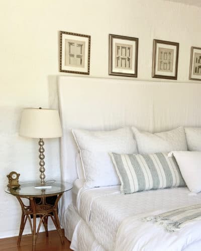
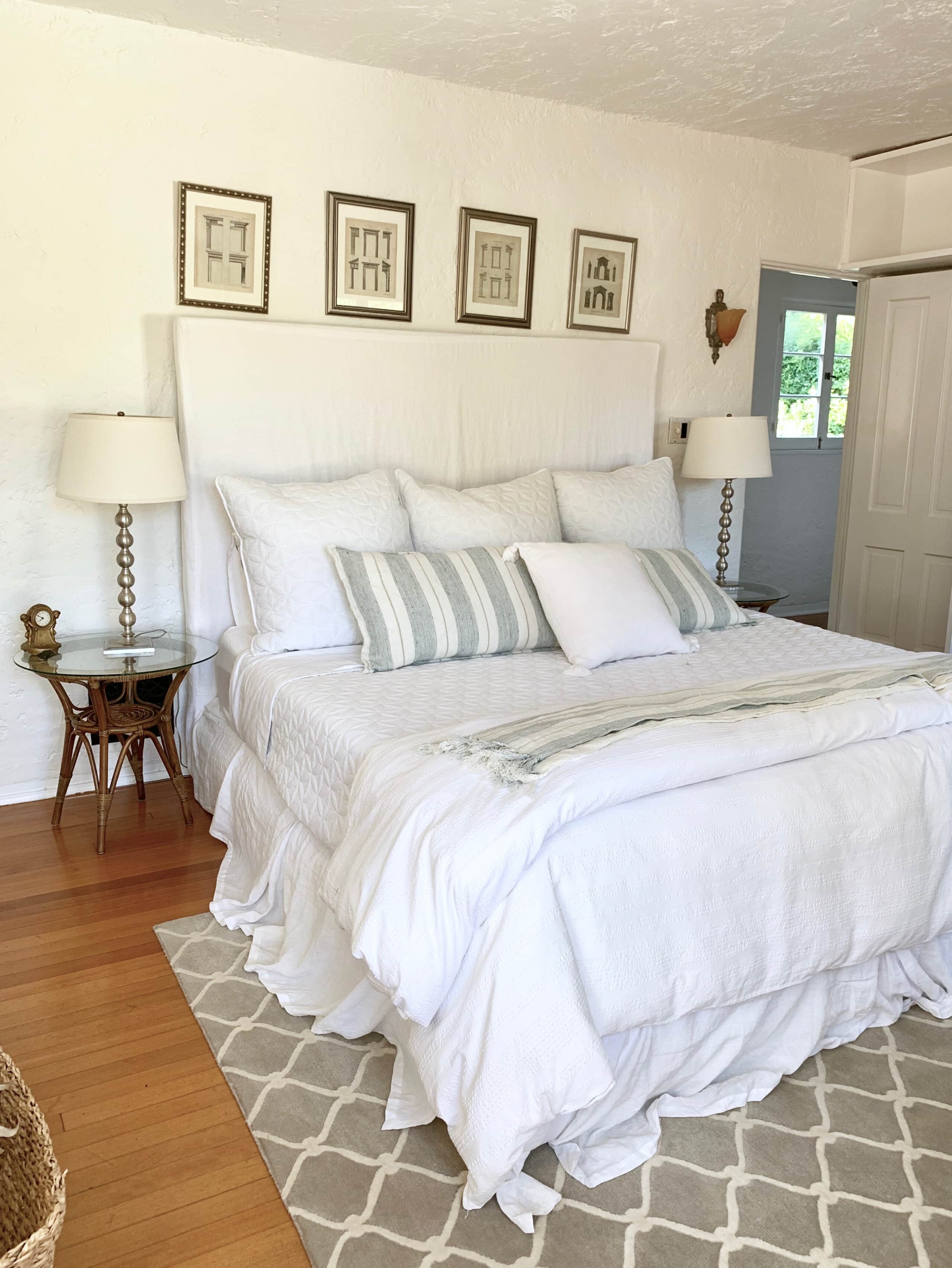
I originally designed this room with a very simple approach. I chose some vintage Heywood Wakefield tall dressers, a high slipcovered linen bed and headboard from Pom Pom at Home.
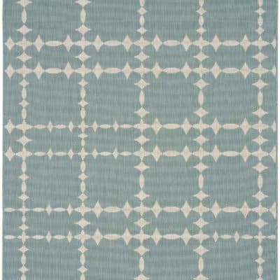
I also added some art and prints I had gotten at a London flea market. But, we can’t forget about the rug! It’s a COCOCOZY “Fence” rug from my rug collection in the color linen.
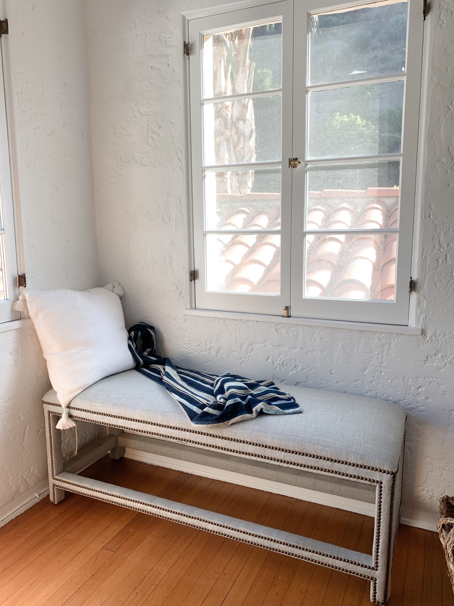
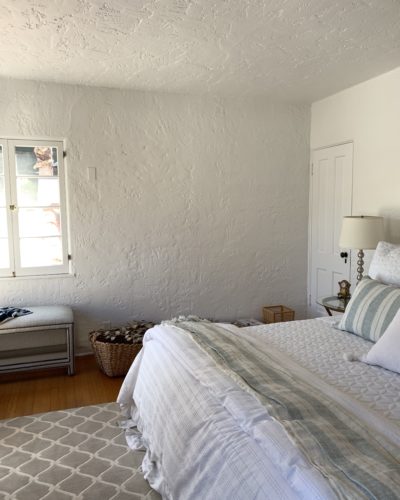
In the window area, I kept it simple with a louging bench and a throw. It looks nice, but it has a lack of visual interest.
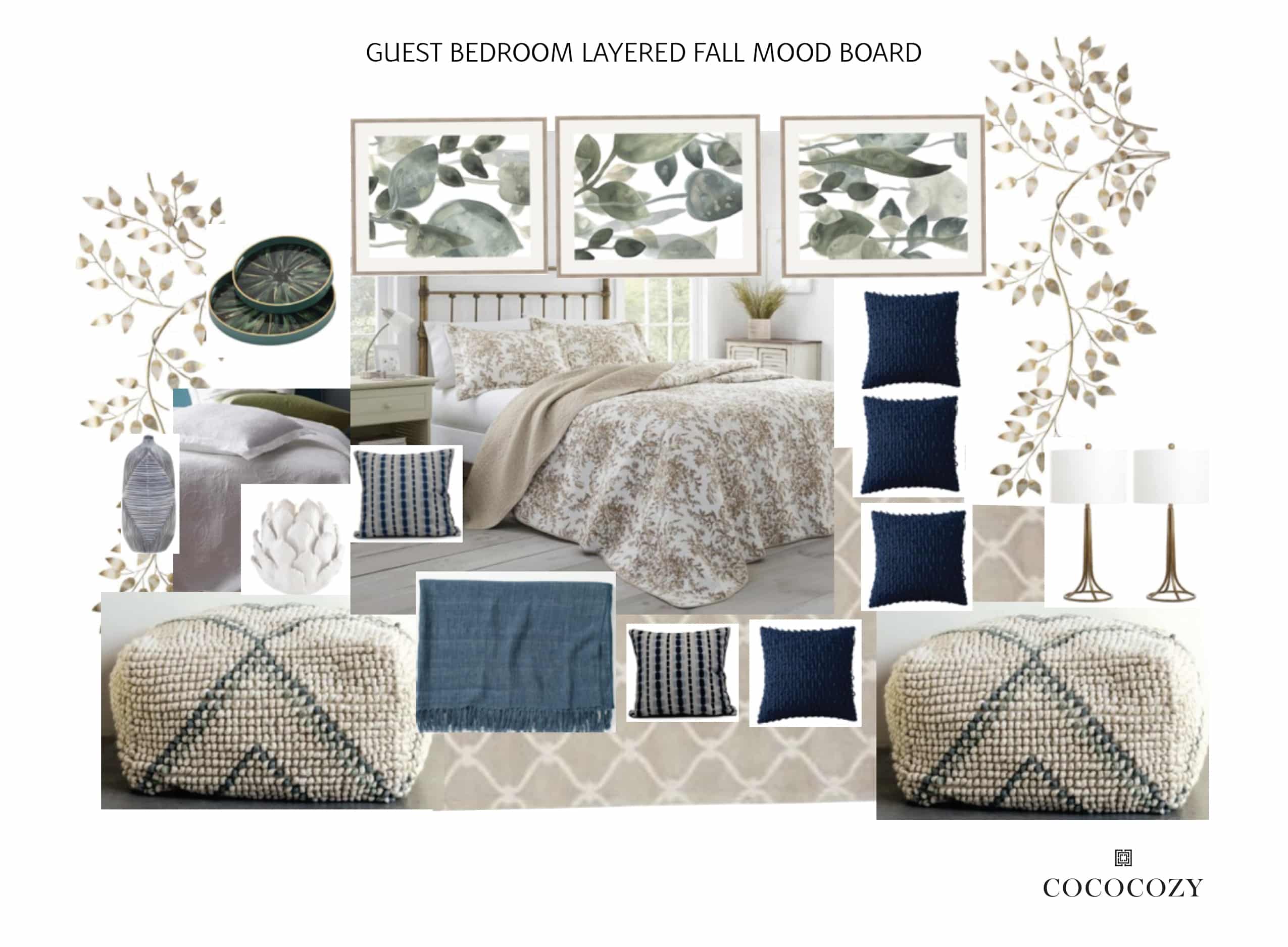
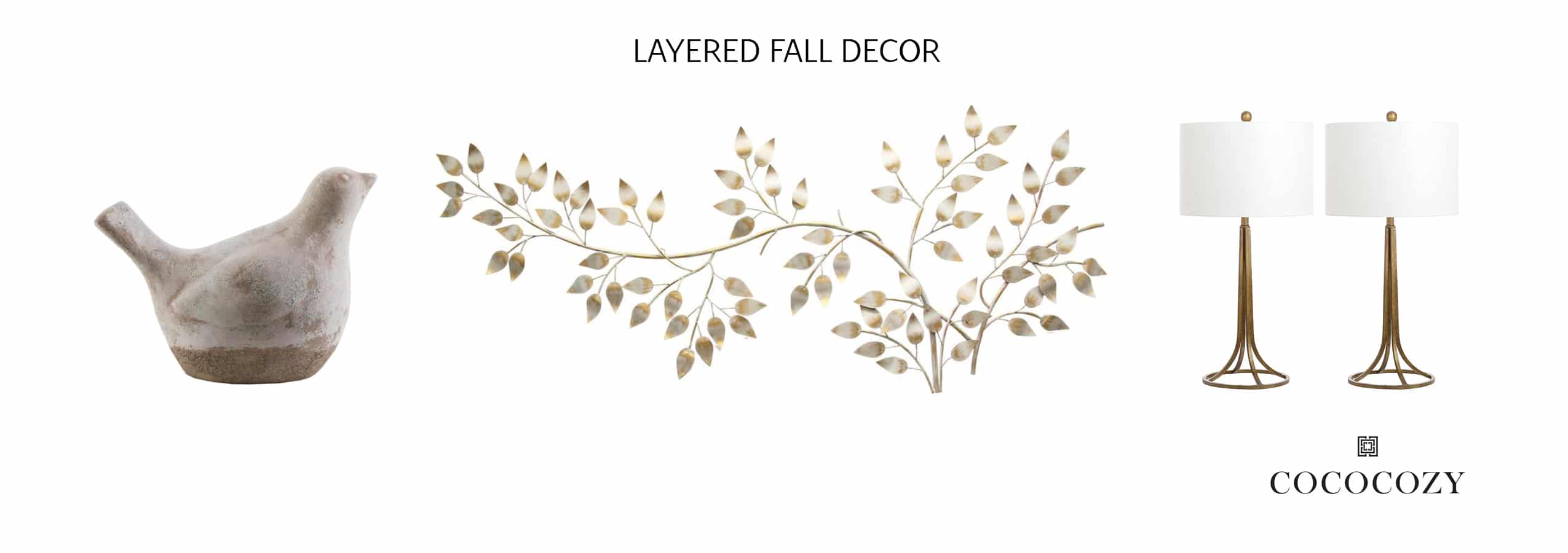
I knew the fall theme should feature lots of neutral colors that go with the existing rattan nightstands, honey-colored vintage dressers, the COCOCOZY rug, and the floors. I thought what better way to ring in fall than with a foliage theme! Once I nailed down the theme I put together this mood board.
MID DESIGN PROCESS
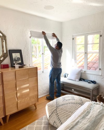
The windows did not have blinds on them before and it was really bright during the day. I added in some easy to install Roman Shades for a bit of function.
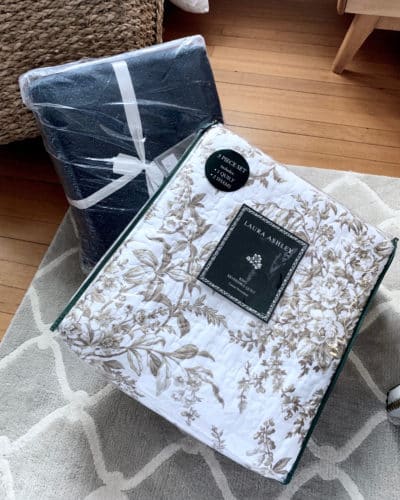
I wanted to add a bit of pattern into the space so I chose this white matelasse blanket and a printed Laura Ashley quilt and pillows.
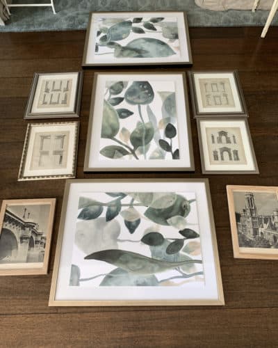
This was when I initially laid everything out to see what I was working with for the gallery wall.
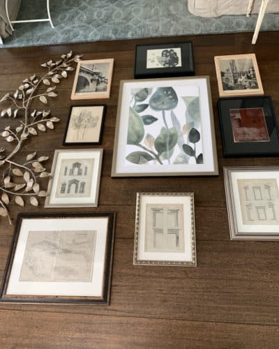
After some editing and addition, this is where I ended up with my end goal for the gallery wall.
FINISHED DESIGN
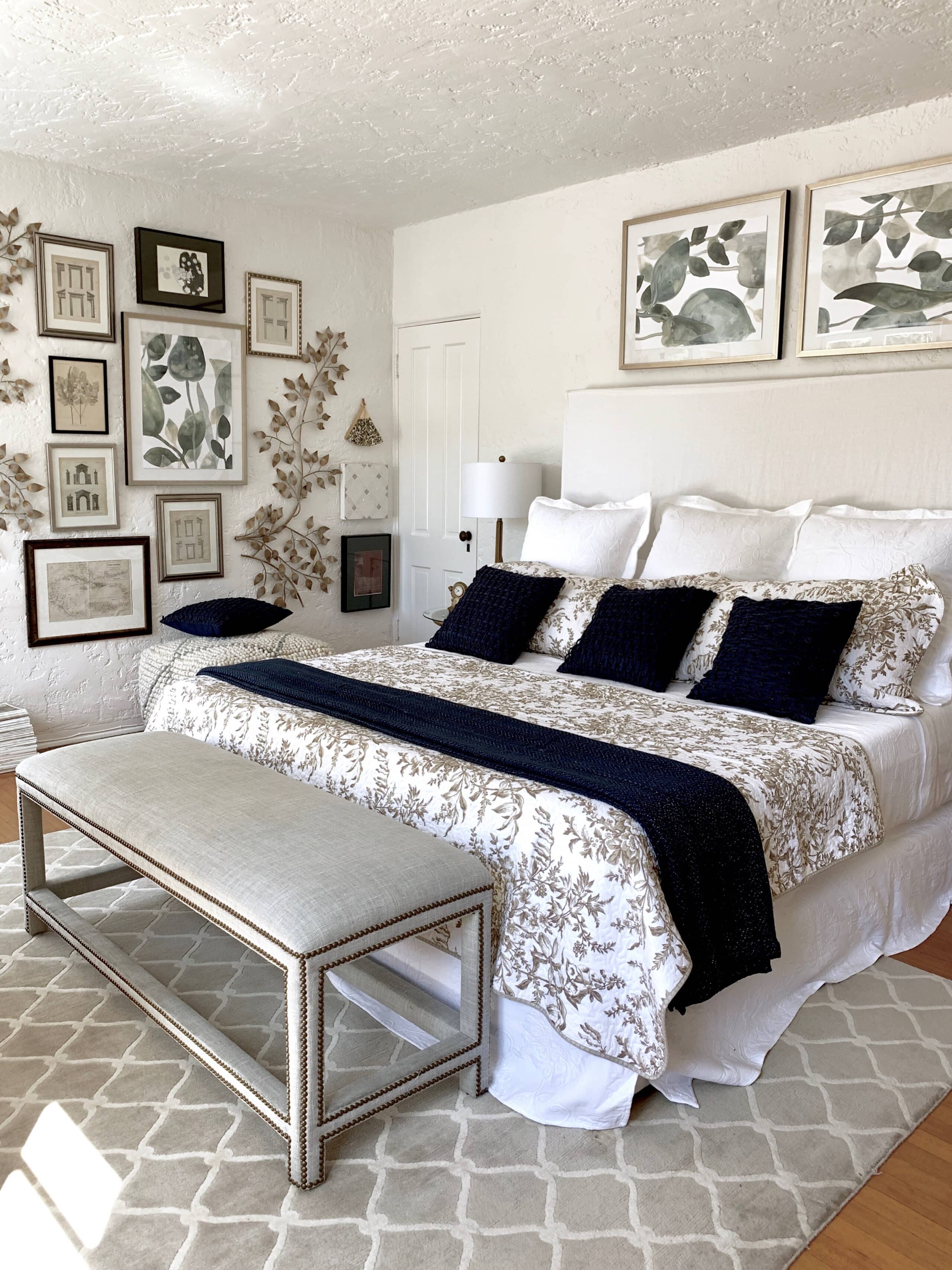
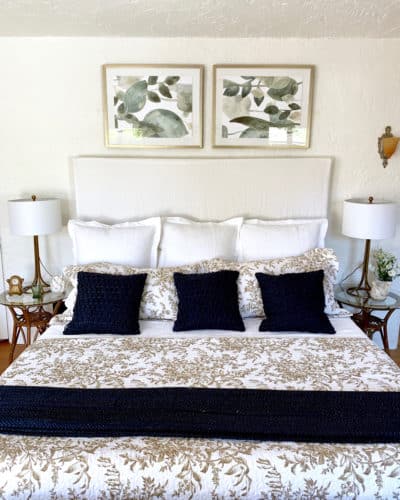
I found some great large green watercolor prints of leaves on the home depot site. I turned two of them on their side over the bed and the other became the center of a gallery wall.
The Placement of the second pouf is perfect for extra seating or to leave extra throw blankets. I love how it looks under the gallery wall. It’s interesting to add something to the lower section of the wall.
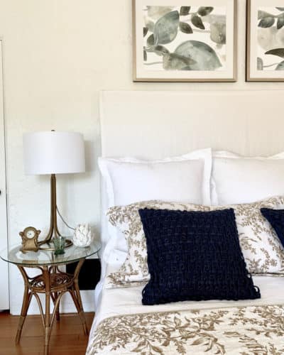
This closeup of the bed really highlights the bedding. I love the combination of the printed comforter in contrast to the navy accent pillows + throw. I think the lamp looks great on the nightstand.
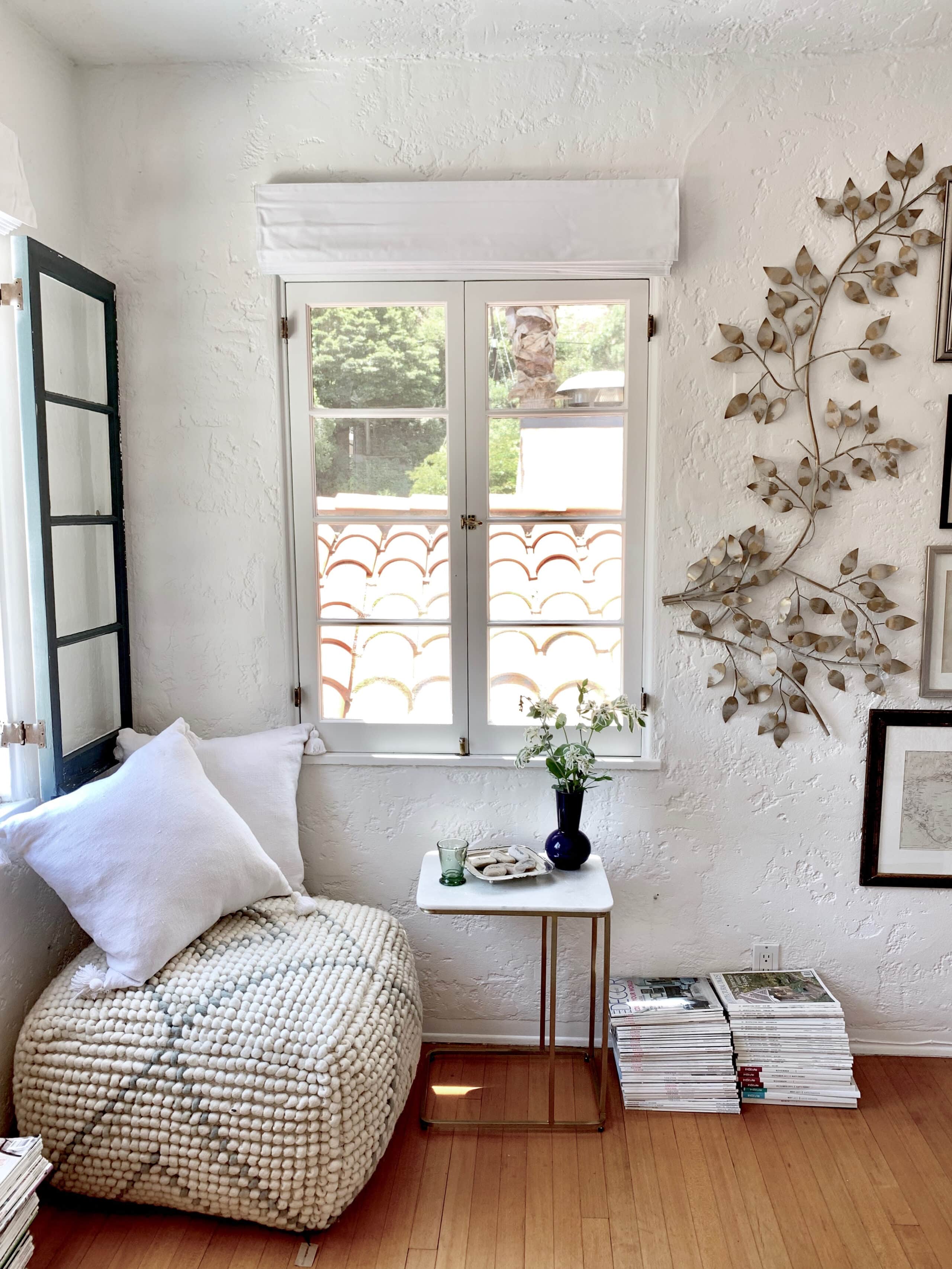
I updated the seating area to feel a bit more personalized and invited. The pouf is playful and fun while the table adds a purpose for reading or placing a cup of tea. I stacked a bunch of magazines as decor and entertainment for guests to browse.
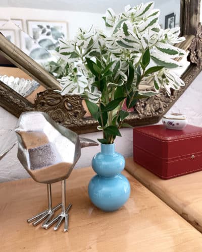
Just some little decor items on the dresser. I love the combination of silver, teal, and red. It’s the perfect amount of style without being too cluttered.
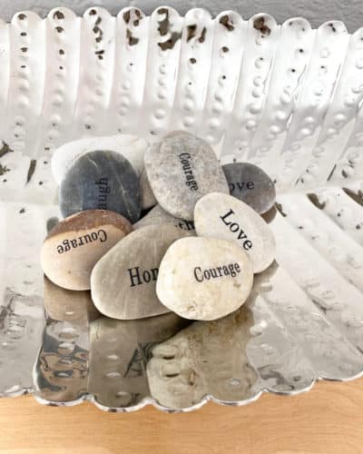
I also added in some decorative stones that have words of inspiration on them and left them in trays around the room – guests will be invited to take a motivational stone with them!
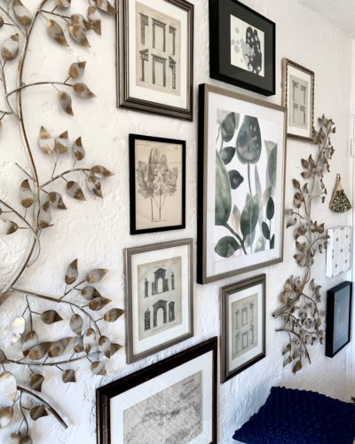
Here is an up-close view of the final gallery wall once it was all hung. I’m thrilled with how it turned out. The proportions of all of the pieces work well together.
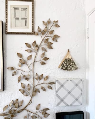
This side of the gallery wall is a bit simpler. I love how the gold metal leaf sculpture looks like its growing up the wall.
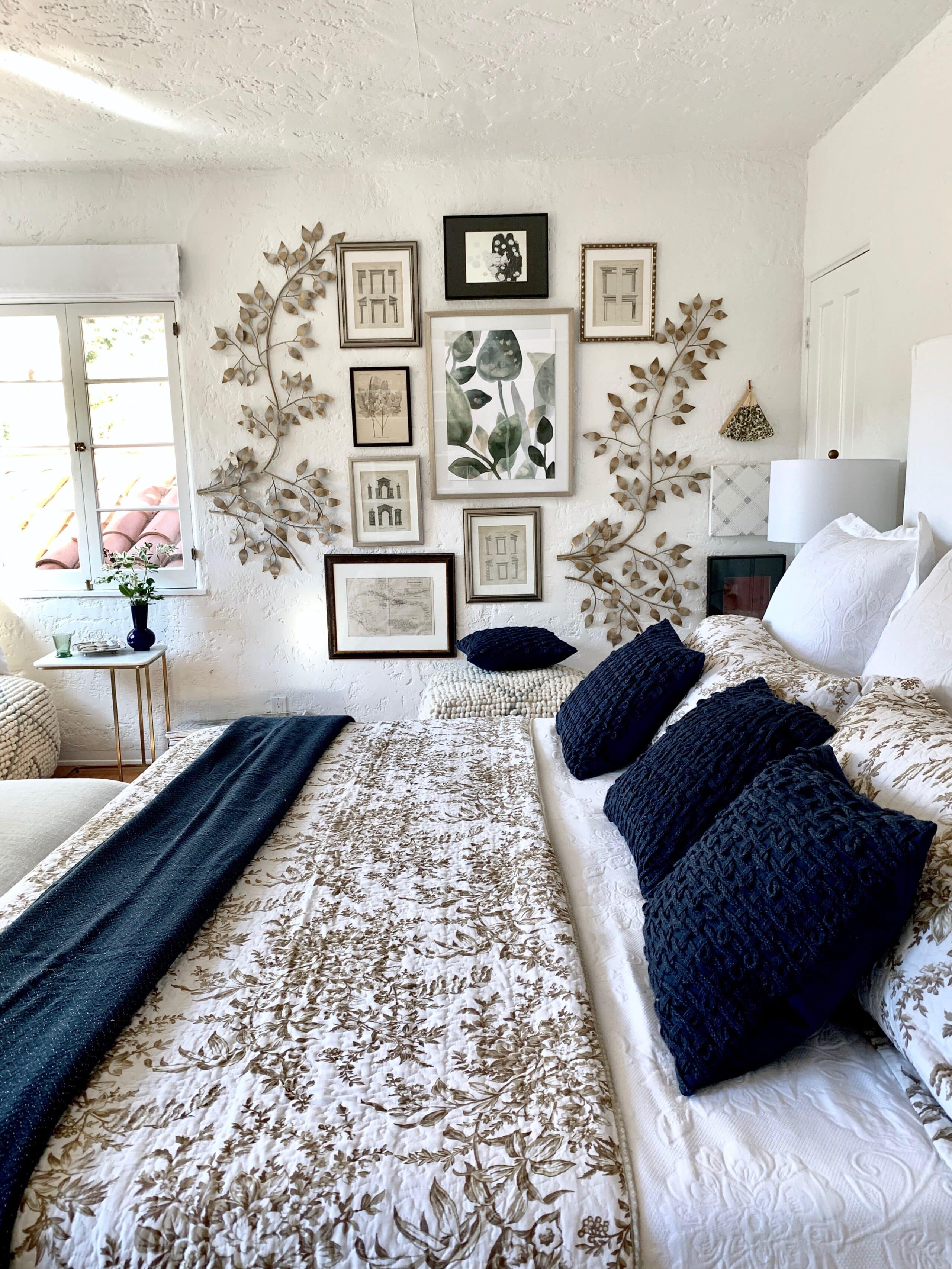
On the gallery wall, I surrounded the green watercolor print with large metal wall art that I positioned on the wall vertically and then added in some architectural antique prints I had. Then I added an antique map of the Caribbean where my mom is from, two original pieces of art that I had bought at auction, and a sparkly Swarovski encrusted square that my friend had made. I knew I wanted a large scale gallery wall to create a wow moment.
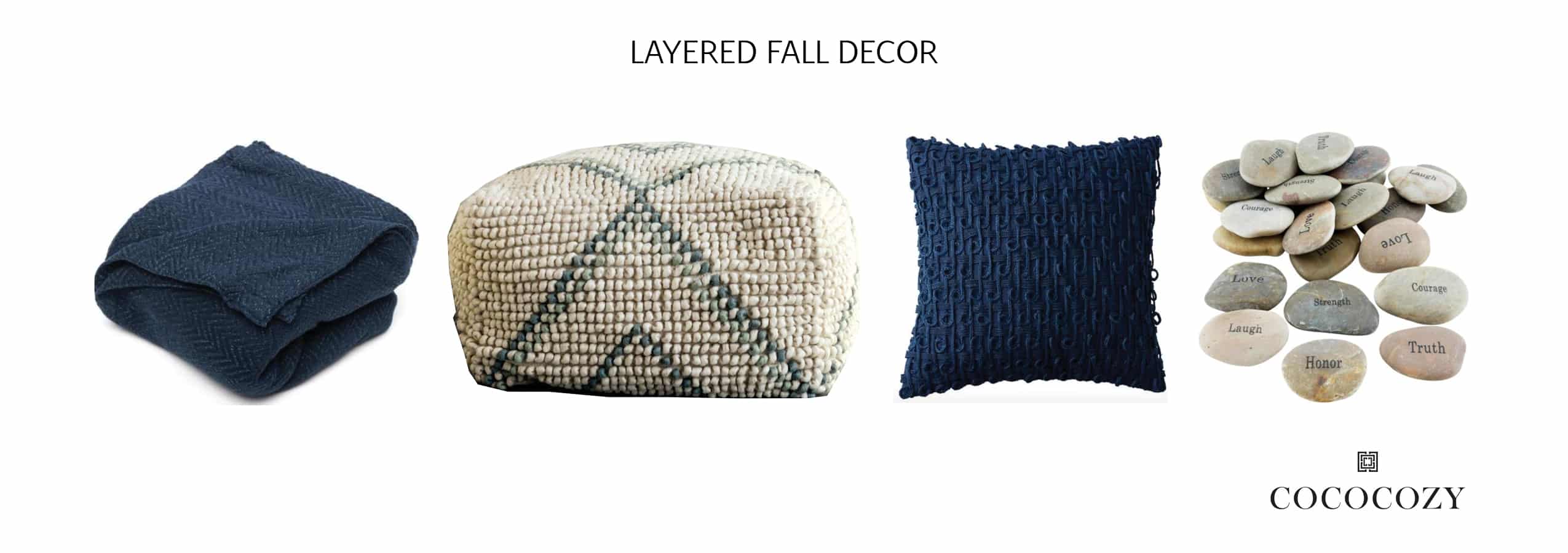
Navy Throw, Pouf, Navy Pillow, Stones
I wanted to keep the color palette light while also adding in some hints of navy to make it feel more like fall. The navy throw + pillow look great in contrast to the lighter colored objects in the room. The pouf is so playful and fun! The stones add a perfect touch of nature.
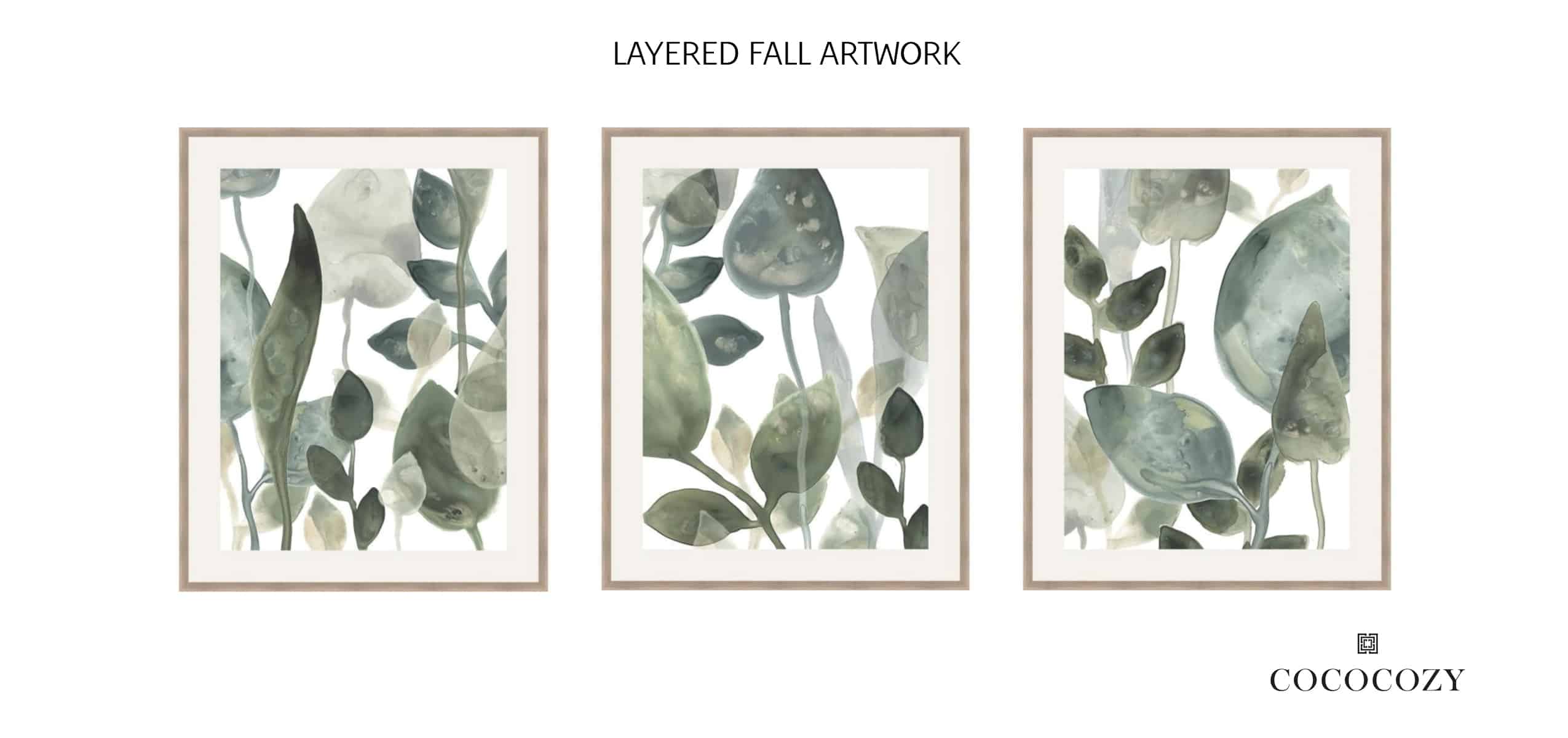
Green Leaf Water Color 1, Green Leaf Water Color 2, Green Leaf Water Color 3
When I found these watercolors I knew they would be perfect for the space! They went well with the color palette and have a great calming effect.