logo
inline logo
  • Blog
  • Design
    • Kitchen
    • Bath
    • Bedroom
    • Living Room
    • Outdoor Living
  • Style
    • Fashion
    • Best of
    • Design On Sale
  • Projects
  • Travel
  • Shopping Guides
    • Gift Guides
    • Resources
    • Wishlist
  • About Coco
    • Meet Coco
    • Press
    • Contact

What are you looking for?

main logo
  • Blog
  • Design
    • Kitchen
    • Bath
    • Bedroom
    • Living Room
    • Outdoor Living
  • Style
    • Fashion
    • Best of
    • Design On Sale
  • Projects
  • Travel
  • Shopping Guides
    • Gift Guides
    • Resources
    • Wishlist
  • About Coco
    • Meet Coco
    • Press
    • Contact
imageinteriors
share
COCOCOZY DESIGN HOUSE

Interior Paint Makeover – Benjamin Moore Bright

February 7, 2019
  • Share
It is all about interior paint today at the COCOCOZY Design House.  This 1930 built Spanish Colonial Revival needed brightening up on the interior so I went with the cleanest brightest Benjamin Moore color I could find.   I used Super White OC-152 throughout the house with dark trim and few spots even boast a wonderful teal color as well that I used on the exterior doors.  Here’s a look on how the remodel project shaped up vis a vis interior paint colors…

Benjamin Moore Paint Update

Alt tag for benjamin moore
share

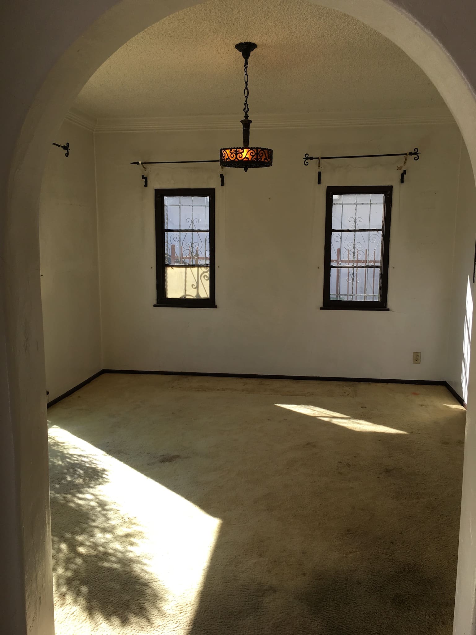
This is what the dining room looked like before. It was dark and unwelcoming. I knew it needed a bright color to bring out the natural sunlight and make the room feel bigger.

Alt tag for benjamin moore
share

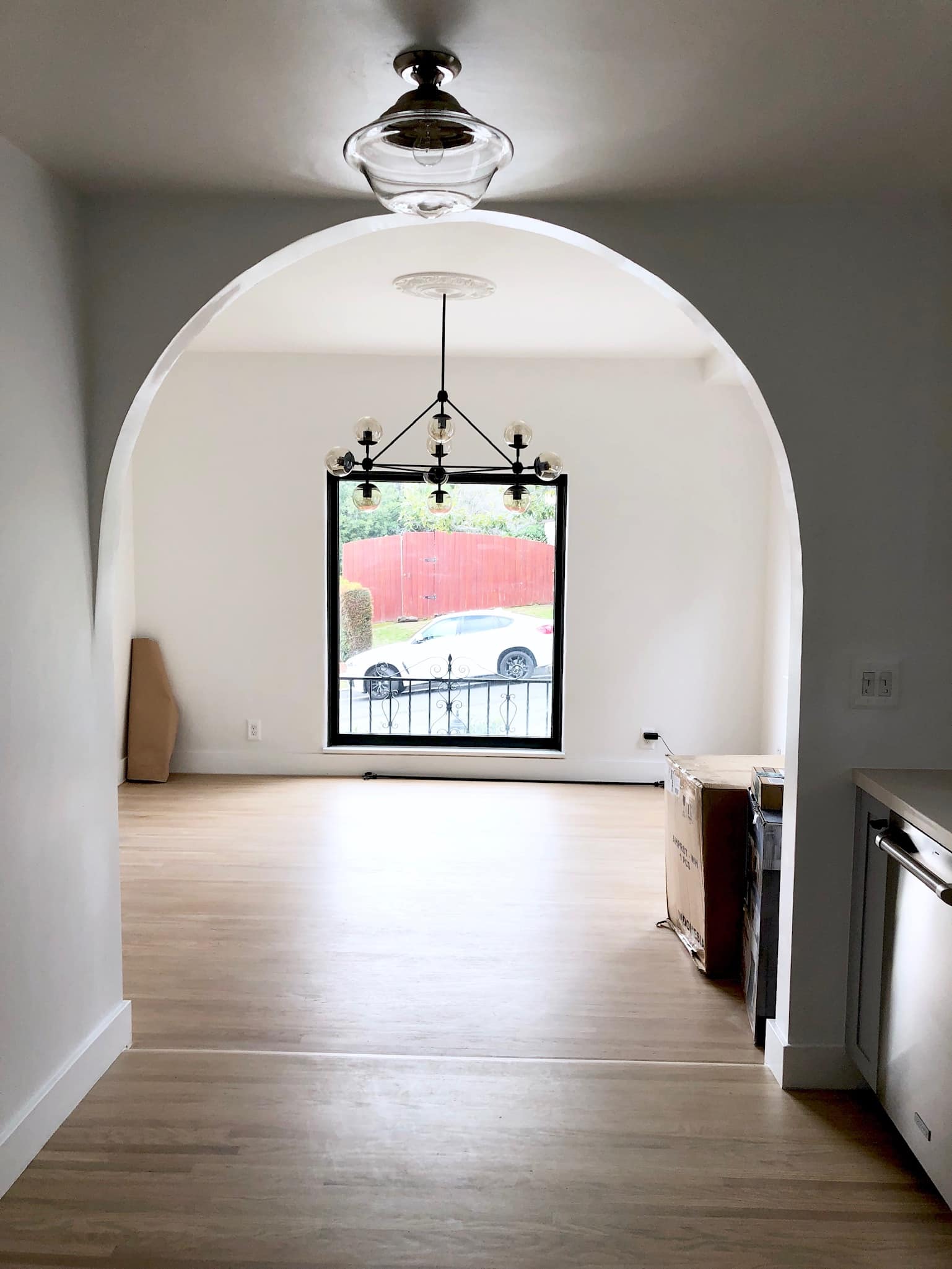
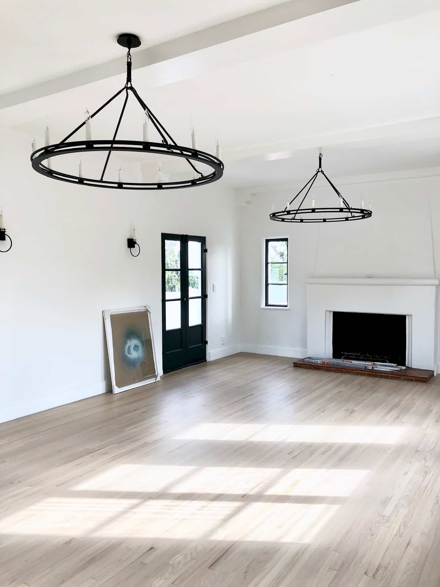
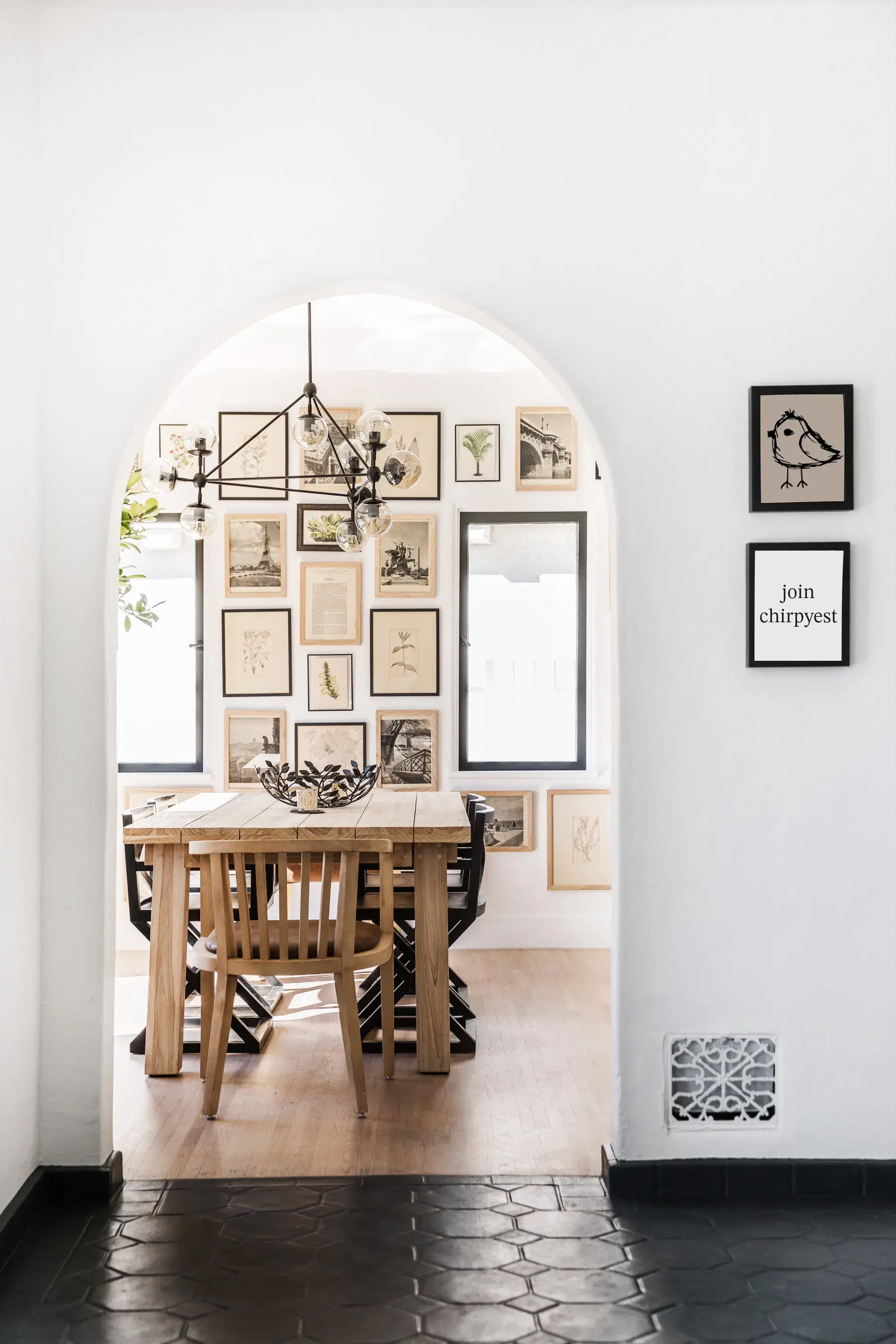
And what a difference it made! The sunlight just bounces off the floor and white walls. I love it with the contrasting trim. I wanted all of the interior side of the windows trimmed in the same color as the exterior trim which is Blacktop 2135-10.

Alt tag for benjamin moore
share

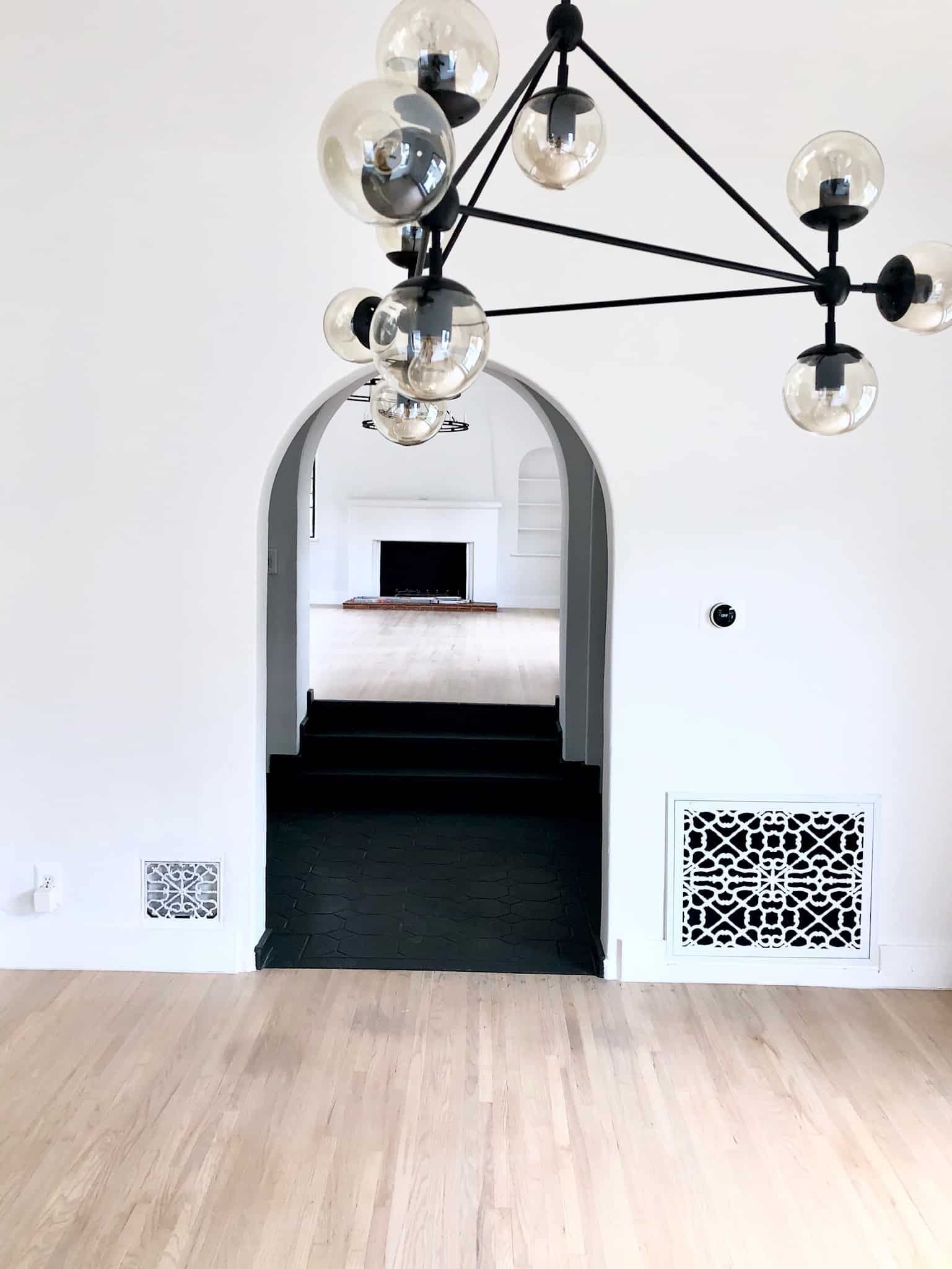
On the foyer floor I also used Blacktop with a bit of grey highlights that we had a faux finisher come in and paint in.

Alt tag for benjamin moore
share

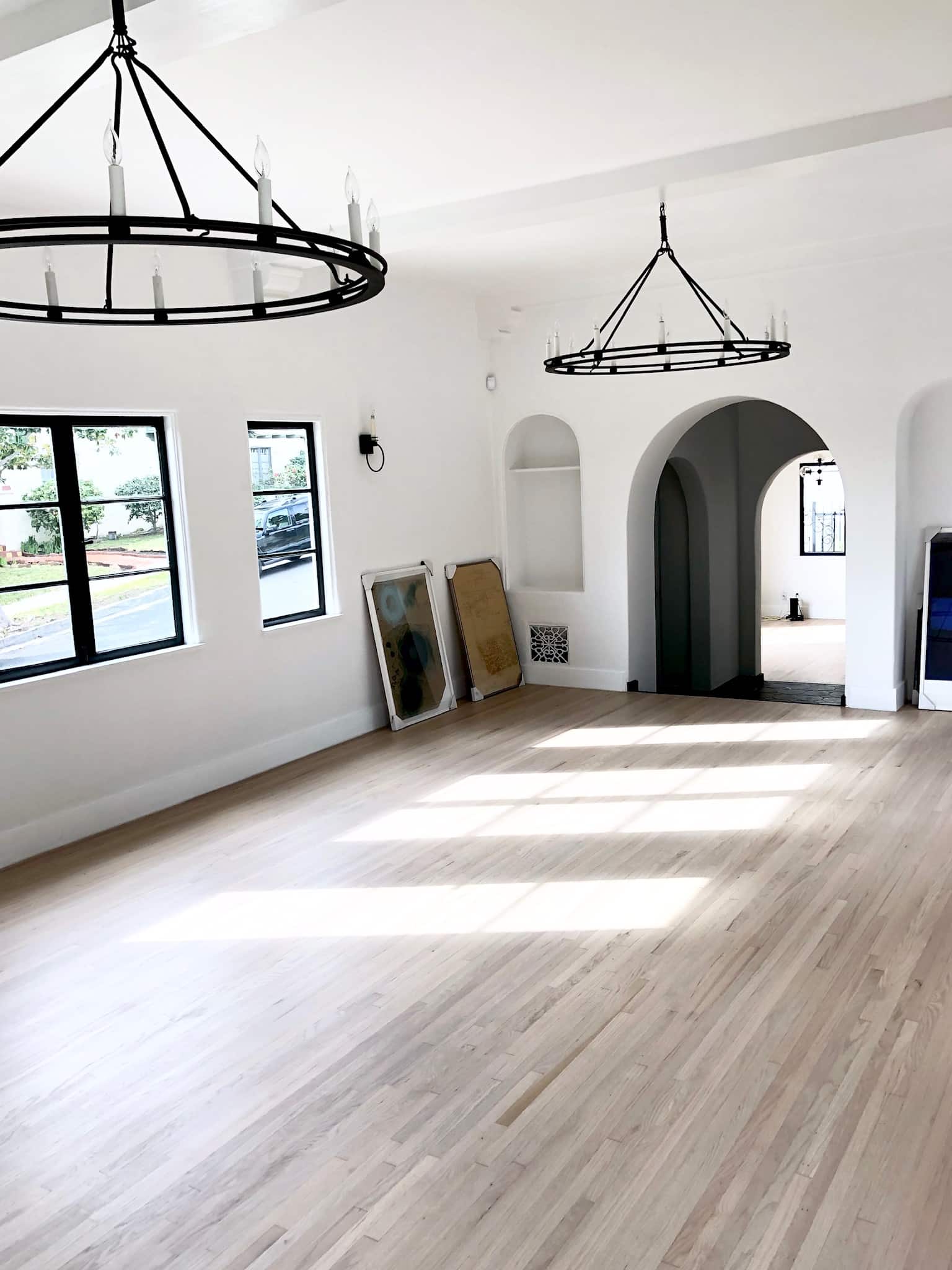
This is the living room!

Alt tag for benjamin moore
share
Alt tag for kohler kitchen
share

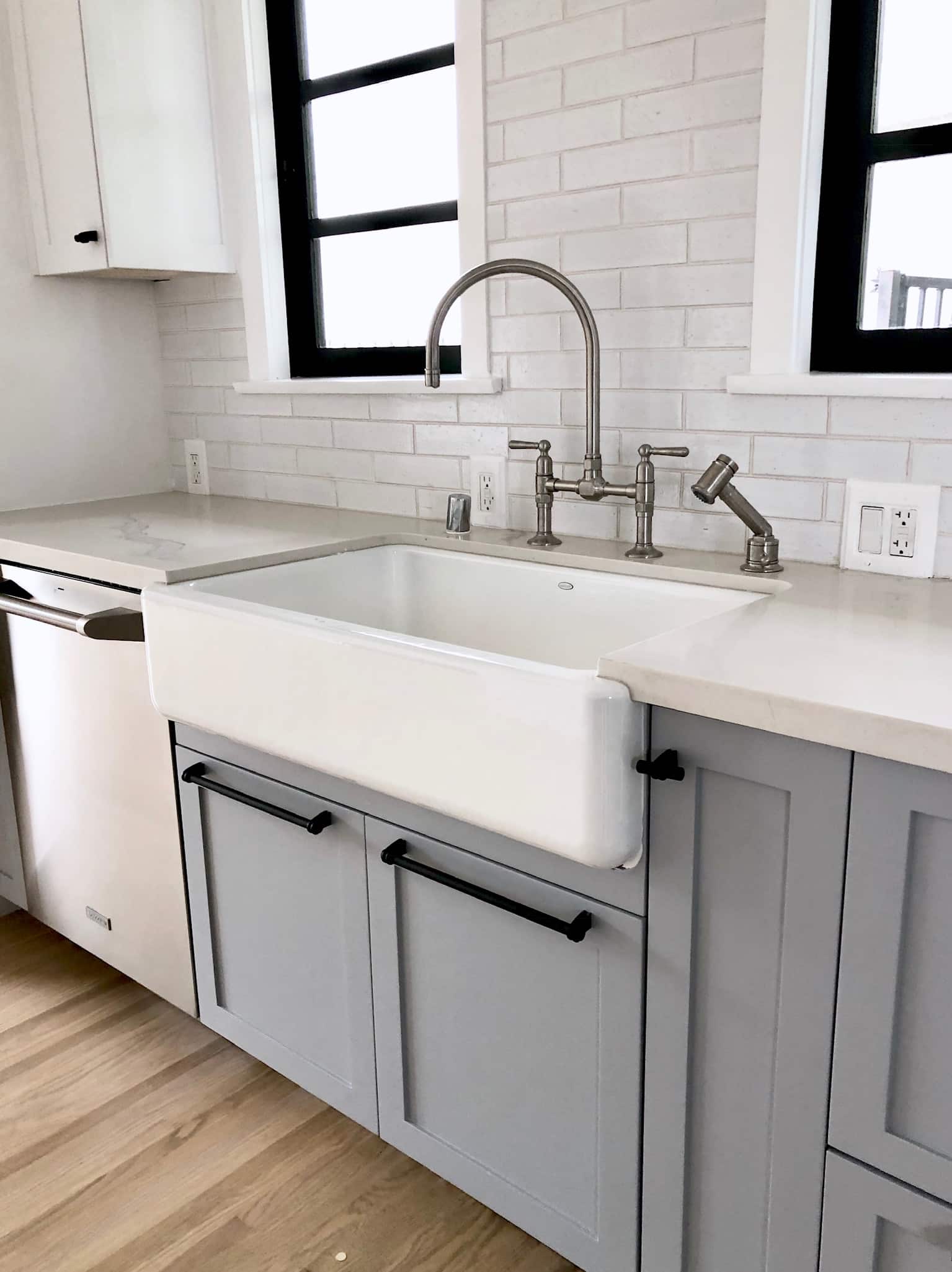
I went with a two-toned kitchen for the COCOCOZY Design House. The upper cabinets were also pained Super White. For the lower kitchen cabinets, I went with Silent Night 1613. I love the depth that two-toned kitchens create.

In total, I used these colors throughout the house:
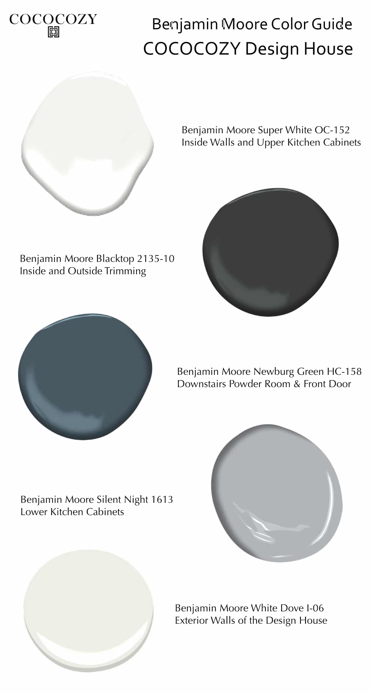
  • Benjamin Moore Super White OC-152 for the walls, upper kitchen cabinets, master bath cabinet
  • Benjamin Moore Blacktop 2135-10 for the trim
  • Benjamin Moore Newburg Green HC-158 for the powder room
  • Benjamin Moore Silent Night 1613 for the lower kitchen cabinets

I kept the same color scheme throughout and used these colors on the exterior of the house:

  • Benjamin Moore White Dove I-06 for the exterior field color
  • Benjamin Moore Blacktop 2135-10 for all of the trim
  • Benjamin Moore Newburg Green HC-158 for the front and kitchen doors

Alt tag for Benjamin Moore Mood Board .001
share


What do you think of the colors I chose for the COCOCOZY Design House?


xo
image
DISCLOSURE: This post may contain affiliate links, meaning when you click the links and make a purchase, we receive a commission.
previous
next

related posts

anchor text
anchor text

My Spring Favorites

imageanchor text
imageanchor text
Meet Coco - Bring Style Home

Meet Coco - Bring Style Home

A Los Angeles native, Colette Shelton, also known as “Coco”, is an entrepreneur, design blogger and home furnishings designer.

Read More   read more

Looking for Something?

View All Posts
image

Earn Cash Back While Shopping For Fall

Chirpyest is the shopping platform I created. Using Chirpyest, anyone can earn money by shopping AND for sharing from over 800+ online retailers! Sign up for free! :)

Tap the "join Chirpyest now" link below or the image above to get started making money while you shop!

Join Chirpyest Now
Elegant Sideboard Table

image

Use Chirpyest to get 5% cash back from Lulu & Georgia!
Join our mailing list
Sign Up Now

Recently Pinned

Recently Pinned

Resources

My list of favorite brands and retailers to shop.   Resources
image
write a comment
  • Share

6 responses to “Interior Paint Makeover – Benjamin Moore Bright”

  1. Franci says:
    February 12, 2019 at 6:18 AM

    Love the home! Can you share info about the wood floors? Are they red or white oak, and what kind of finish?

    Reply
    1. COCOCOZY says:
      February 18, 2019 at 6:12 PM

      Thank you re: the home. Glad you like it! They are red oak floors with a custom stain that I worked with my wood flooring contractor to create.

      Reply
      1. Sommer George says:
        July 11, 2019 at 1:44 PM

        Cococozy, The wood floor finish in this home is absolutely beautiful. Wow. I recently moved from LA to Oklahoma and my husband and I are remodeling a home for our family. I’ve been searching high and low for flooring inspiration for the remodel we’re doing on a 1930’s colonial house with red oak floors. Now I have hope! If you are comfortable sharing the information, would you mind letting me know what stain products your flooring contractor used to create this finish? I’d be so very grateful.

        Reply
        1. COCOCOZY says:
          July 14, 2019 at 7:46 PM

          Hi! Thank you. This was a custom mix we worked on for quite some time. I don’t even know if wood floor guy could recreate it. We actually did the floor once and then I had him do another wash over it because the color was not quite right. Sorry that couldn’t be more helpful!!

  2. christy Hivner Wissing says:
    March 7, 2019 at 1:46 PM

    I love this transformation. What is the lighting you used for the one with the glass globes. Thank you Christy

    Reply
  3. Shamira Ulrich says:
    April 4, 2021 at 7:14 PM

    Love this look! In the living room, the baseboards look like a different white than the walls? I like it but am wondering if it was just the lighting? Thanks!

    Reply

Leave a Reply Cancel reply

Your email address will not be published. Required fields are marked *

This site uses Akismet to reduce spam. Learn how your comment data is processed.

Instagram

A soft touch of pink, layered into the space. Not A soft touch of pink, layered into the space. Not overpowering, just enough to warm everything up, walls, upholstery, even the smallest details.
It shifts the mood completely. Calmer, softer, and a little more lived in.
Save this if you’re leaning toward softer, warmer spaces. 🌸
1. Design: @brianwoulfe 📸 @benandersphotographer
2. @eadieandcrole 📸 @boz_gagovski
3. @amyastley
4. Design: @katie_harbison 📸@helencathcart
5. @carlgergesarchitects
6. Design: @lindsayrhodesinteriors
📸@lelanief⁠
7. Design: @mintysynthinteriors
📸 @lacey_land
#pink #interiordesign #paris #viral
What makes the Saint-Martin Apartment in Paris so What makes the Saint-Martin Apartment in Paris so hard to look away from is the deliberate clash Sophie Dries @sophiedries_ created and didn’t try to resolve.
The bones of the apartment are pure Haussmann: ornate cornicing, carved boiserie, a marble fireplace with a gilded mirror. Everything a 19th-century Parisian apartment should be. Then she placed a near-black dining table with brass-legged stools into the middle of it. A raw concrete-look bathroom behind the grandeur. Dark, sculptural objects on surfaces that were built for delicate things.
It works because she didn’t try to blend the two, she let them sit in contrast. The apartment feels lived-in and specific because of it.
→ Save this if you’re mixing old architecture with contemporary furniture.
📸 @stephanjulliard
#interiordesign #parisapartmenttour #parisianstyle #contemporarydesign #interiorarchitecture
From classic to modern, rustic to minimal, the pap From classic to modern, rustic to minimal, the paper lantern just fits. It softens the room, diffuses the light, and rounds out even the sharpest architectural edges without demanding any attention. 🏮
Are you into paper lanterns, or do you prefer a more structured statement light? 🧐
1. Design: @brownstoneboys Photography: @frankfrancesstudio
2. Design: @calicowallpaper Photography: @william.jess.laird
3. @alexanderdesignbuild
4. Design: @emmanuelle_simon Photography: @damiendemedeiros
5. Design: @katie_sargent_design Photography: @gemmola @living_inside_agency
6. Interior Design: @jesseparrislamb
Photography: @katesjordan
7. @christinacolestudio
8. Photography: @annastathakiphoto Design: @anewday_interiordesign
9. Design: brownstoneboys
Photos: @nickglimenakis
#parisjetaime #paris #lantern #interiordesign #decor
Streets of #Paris. 📍 Rue de Castiglione — Laid ouStreets of #Paris. 📍
Rue de Castiglione — Laid out under Napoleon in the early 1800s, this neoclassical street connects Place Vendôme to the Tuileries Garden in one clean, symmetrical line.
Place de Furstenberg — A tucked-away square in Saint-Germain-des-Prés that was once home to the painter Eugène Delacroix, and still feels like little has changed.
Les Antiquaires on Rue du Bac — A street with centuries of history, now best known for its cluster of antique dealers trading in furniture, paintings, and curiosities and home to @les_antiquaires_paris bistro which is an easy spot to grab a bite near the Seine.
Musée du Louvre — Built as a medieval fortress in the 12th century, it became a royal palace, then the world’s most visited museum, home to the Mona Lisa and tens of thousands of other works.
Église Saint-Sulpice — Paris’s second-largest church, with a gnomon installed inside to track the sun’s position and help calculate the liturgical calendar.
Les Deux Magots — The Saint-Germain café where Simone de Beauvoir, Sartre, and Hemingway once gathered, and a lasting symbol of Paris’s literary culture.
Place Vendôme — Commissioned under Louis XIV, this octagonal square is anchored by the Vendôme Column, cast from cannons captured at the Battle of Austerlitz.
Shops, people, and buildings that make you stop for a second and look up. Every corner feels different. Old, detailed, and full of life. Sometimes this is the best part. Just being here. ❤️
#parisjetaime #parisfrance #parisianlife #streetsofparis
Nour Arida’s (@nouraridaofficial) Paris apartment Nour Arida’s (@nouraridaofficial) Paris apartment was designed to feel like a little piece of Beirut — a pied-à-terre that keeps her connected to Lebanon while living in France.
Architect Carl Gerges @carlgergesarchitects built the whole interior around warmth and softness: a caramel sofa, a pink kitchen, milky whites throughout. Nothing sharp, nothing cold. The palette reads as indulgent without trying. It’s the kind of space that feels like it was chosen for comfort first and aesthetics second, even though both are clearly considered.
What’s easy to miss is the restraint underneath it all. The softness works because it’s disciplined. Every piece earns its place in the same tonal story.
→ Save this if you’re building a warm, tonal interior from scratch.
📷 Photography: @ambroisetezenas
🏛 Architecture: @carlgergesarchitects
🪴 Interior styling: @sarahvonsaurma
#paris #interiordesign #apartmenttour #parisianstyle #parisapartments
Follow on Instagram
footer logo

Interiors

  • Kitchen
  • Bath
  • Bedroom
  • Living Room
  • House Tours
  • Outdoor

Style

  • Fashion
  • Best of
  • Travel
  • Design on Sale
  • Coco's Projects

About

  • About Coco
  • Press
  • Contact
  • View All Posts

Join our mailing list

Sign Up Now
© 2026 Cococozy | Terms & Conditions