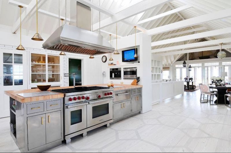
| A huge kitchen in Sagaponack home (in the Hamptons) features state of the art appliances, stainless steel lower cabinets, brass pulls and a graphic painted floor. (above) |
KITCHEN WEEK continues!
Three kitchens…three different parts of the country…three different looks – one designer – Nate Berkus.
I know it may seem cliche given his success on all fronts…but I must say Oprah’s interior designer and now t.v. host Nate Berkus does know how to decorate.
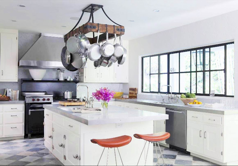
Here are some kitchens Nate and his team have cooked up (couldn’t help myself for the pun…sorry). Of course you know I’m loving the painted floor in the first kitchen (can’t seem to stop with this painted floor business). I even think the moody masculine feel of the last kitchen works too. Nate seems to like mixing stainless steel lower cabinets with brass handles and pulls…interesting choice in two of these spaces…but it seems to work.
Which of these Nate B. kitchens do you like best and why? Anything you might try in your own space?
Happy Tuesday!
xo
Coco
P.S. Please remember to send in photos of your own kitchens. I would love to see and maybe post during this KITCHEN WEEK! I got a few great pictures yesterday! More please. Email to [email protected]!
Photo: Nate Berkus





Love #2…that gorgeous floating rack would fit right in (where do I find that shelf?)
I love the first one because it is open and airy. The pitched ceiling is gorgeous w/ the beams. I have 2 skylights in my kitchen but in between them the ceiling is low. My dream is to open it up completely and give some volume.
I prefer #2. Why? It’s more “doable” for me! I love the stainless steel appliances with the white cabinets and the checkerboard floor. Not crazy about the stainless cabinets though. All three are beautiful though.
#3 – I love the warm teak counter tops and the cage pendants. I really like the pot rack in #2.
I like the second one the best but more than that I love everything hanging from the ceilings…the pendants and the rustic pot rack are awesome!
Good job staying focused and bringing us lovely kitchens two days in a row 😉
#2 is the exact layout of my kitchen and just how I want it to look, right down to the floors. This will now serve as my new inspiration photo for the project!
#3….love the glamorous silvery wood mixed with the warm countertops, and the cage lights are gorgeous!
Stacy @ http://www.conspicuousstyle.com
I love the first one, except for the size (it’s waaaaay too big) and the second one, except for the ugly stools.
I love the beams and the open feeling in #1…Love the white cabinets and marble floors in #2…Love the light fixtures and warm tones in #3…too hard to choose!
Maybe it’s the white backdrop, but I love the first one. Shiny!
too hard to decide! i love different elements from all three… but i think i like #1 the best.
#2, love the wall of windows and checkerboard floor! Looks comfy and livable!
Is it just me, or is #1 way too big?! It seems completely impractical!! Although I’m sure the owners have chefs cooking for them 😉 #2 and #3 are a toss up! Love them both!
-BOO
My vote is for #2. I love the long bank of windows. I can just imagine the view.
I like elements of all three, but to be honest, wouldn’t want any of them?!?! Guess I’m more of a Peacock gal…
It would have to be number 1 for me as I love the the beams. Mimi xx
I’m afraid I’d like to pull something from each one! The floor in # 1, the pot rack in #2, and the textures in #3. My question is, why is the oven where it is in #1? Isn’t that an odd placement….weird to me.
Coco,
I look forward to the rest of your week of posts. We’re in the midst of our kitchen renovation in our 1889 Victorian house. We’re close (cabinets in but not yet painted, soapstone and marble in, plumbing in, and even we are back in after our renovation exile), but not quite finished. Lots of photos and descriptions of our process and quandaries over at our blog: Apropos of Nothing
I like them all, but my fave is number 2.
Floors in #1
windows in#2
backsplash in #3
Hahahah- This is fun! I’ll take #2 with the floor from #1 and trade the pot rack for 2 of the pendants in #3. LOVE #2’s windows.
I love #3 for the warmth of the counter tops with the coolness of the gorgeous cabinets. I also love the statement pendants. It’s definitely far from cookie-cutter.I do love the window in #2 though.
Wait…who am I kidding, I would go crazy for any of them, rather than mine!
A toss up between 2 and 3, number 1 looks way too commercial and resembles a restaurant kitchen, nothing homey about it whatsoever, the others have a commercial touch to them but still feel residential and are well done.
Wow…all three are truly great. My number ONE choice would be #3 but with white cabinets? I absolutely love two islands. The first kitchen makes me feel naked? Like I am making pasta and I can’t get to the other side? lol.
Gorgeous selection! All three are amazing. I particularly love the floor and size of #1; however #3 is so different that is really stands out!
*** All the “breathing space” in NUMERO UNO truly “FLOATS M*Y BOAT”!!! Upon seeing it my first thought ws “Ahhhhhh…”…
THANKS!
Linda in AZ *
[email protected]
that FIRST one is so unreal….WOW. I like how the stove is in the middle…and its such a huge space!
http://www.madebygirl.com
madebygirl.blogspot.com
I love these kitchens! Particularly the last one, although I wonder if the stainless steel cabinets would get lots of finger prints on them?
http://www.thewillowblog.com
I love the 3rd one. I love the mic of the kitchen with those pendant lights, the tile back splash and those silver cabinets. Very interesting take on a kitchen.
I really love 1 and 3. Love the white in one, but not too practical with my 6 kids. Love the cozy feel in 3.
#3 all the way! I quite liked #2. Until I saw #3. The hanging lamps are adorable and I can’t quite profess enough how *much* I like the metal – teak combo. Win!
Seeing that Nate is a good friend of mine. I love all of his work.
I especially love the last kitchen.
But all of them area smashing.
Rashon aka Mr. Goodwill Hunting