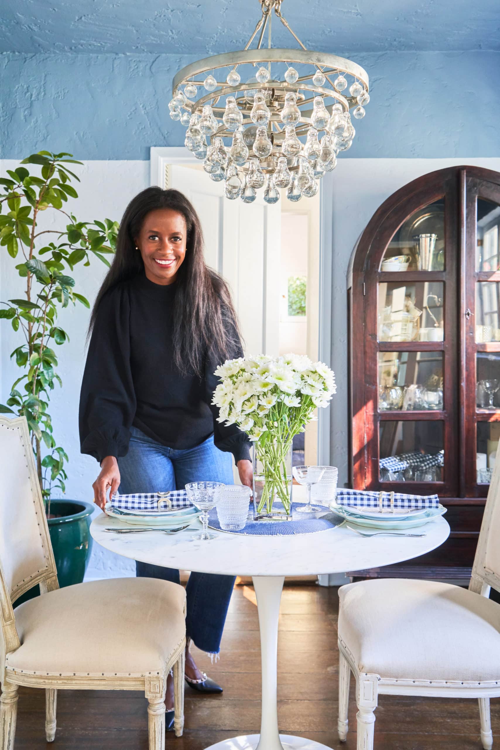
It’s crazy what a layer of paint can do to transform a space. The stunning colors and finish are thanks to Curator’s paint. Curator has quite an amazing story – the Curator team traveled across Ireland sourcing and collaborating with 29 Irish designers and artisan in order to develop a range of 144 inspired colors. With the paint, the light is this room is stunning and lights up the blue walls with ease.
In the before image, it’s clear my breakfast room was cute but was a bit bland and missing life. In theory, white walls are a way to keep a space light and airy but I think in this room a lot of the light is missing. The new paint color really lets the light in this room shine.
A further shot of the space before continues to show that the space was cute, but missing something. I was inspired by the painting right outside the breakfast room. Created by my friend and artist Sarah Robarts the painting is a gorgeous combination of blue, green, and white. I knew right away that using blue would be just what I was searching for and would really highlight the furniture I already have in the space.
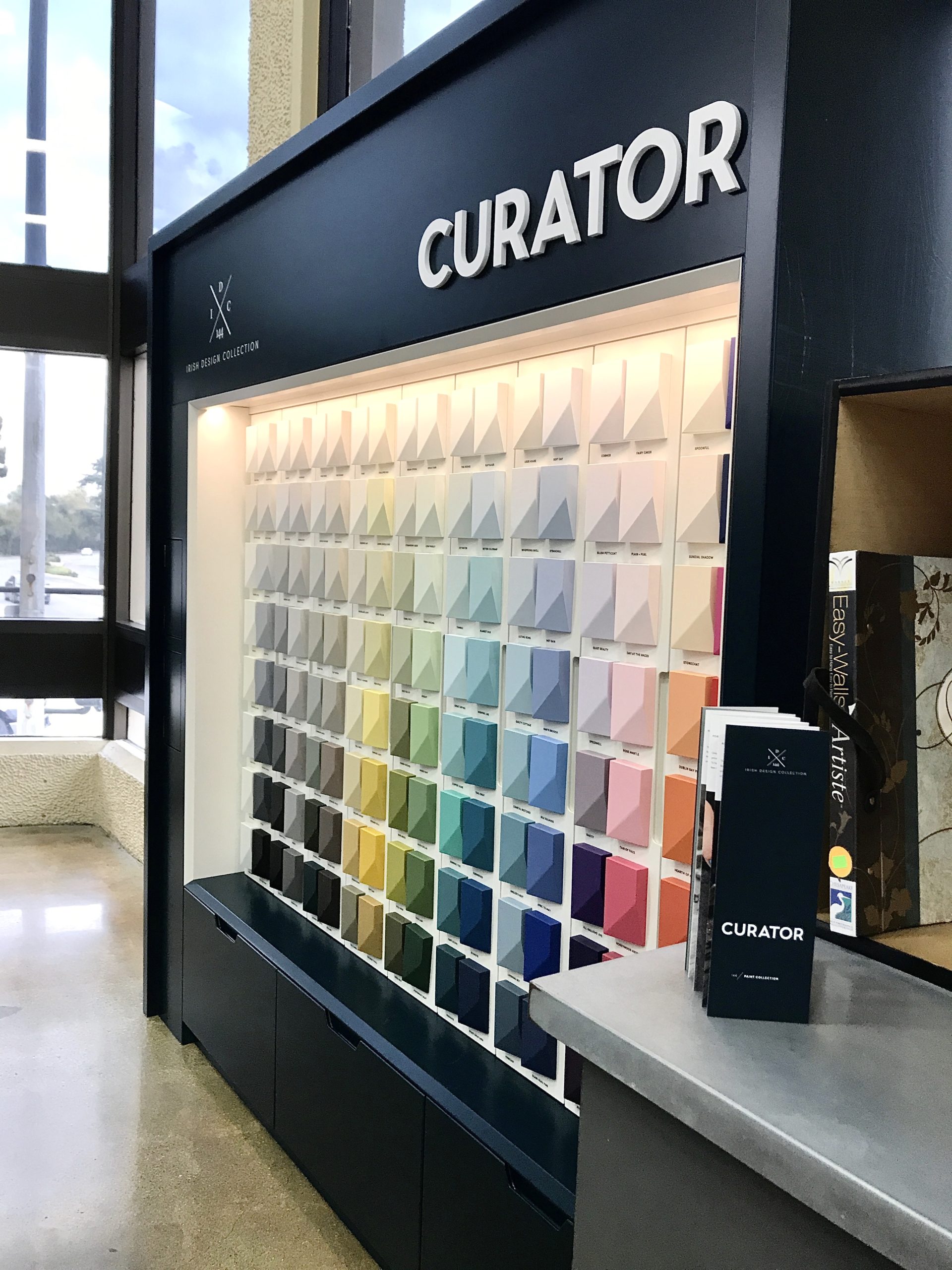
I was thrilled to learn that this Irish based paint company is available at Dunn-Edward stores in Southern California and Arizona. I went to pick out my paint and was in awe of the stunning color range and finish options. Curator’s 144-colour collection is a blend of ultra-premium quality paint with stunning colors infused with native Irish art and design. The paint comes in five unique finishes – I went with a matte since my walls are textured.
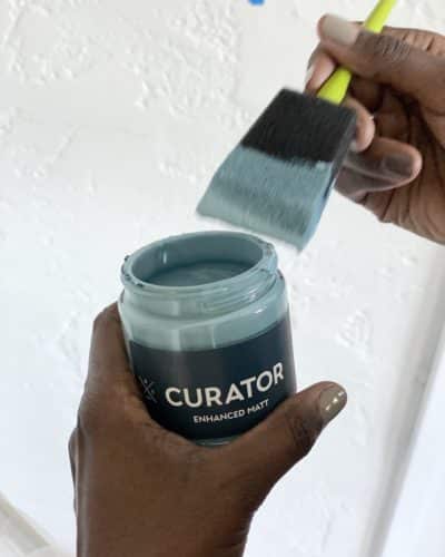
Here I am getting ready to swatch some colors. I love their minimalist packaging. Plus who can resist this gorgeous teal color.
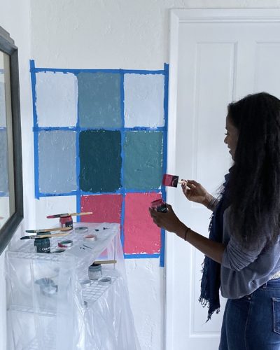
Here are all of my swatches together. It’s pretty clear I had a focus on blue but I also tried out some pinks just to see.
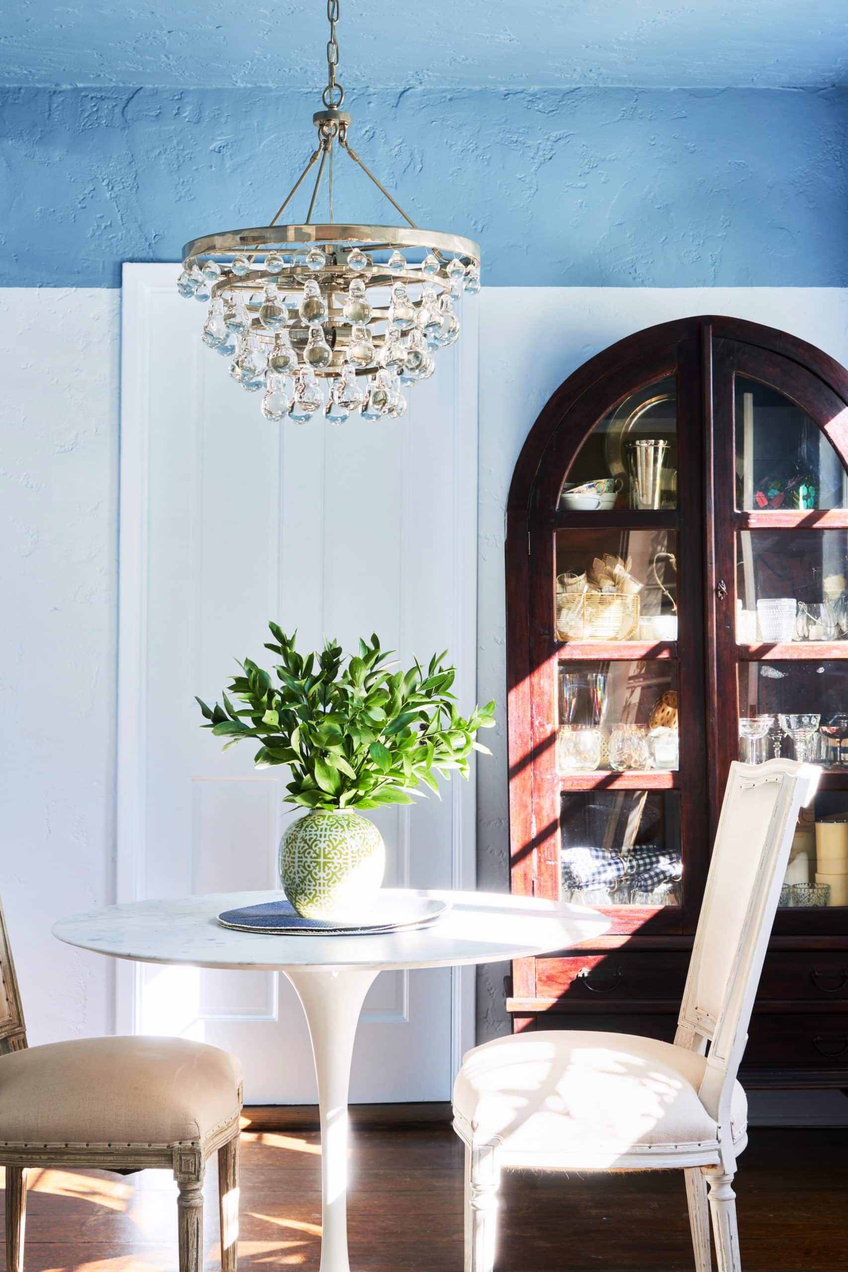
I chose “Soft Day” for the walls because I thought this soft light blue would be calming and would absorb the bright natural light nicely.
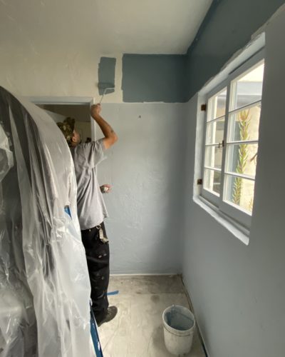
Looming Sky was perfect for the top of the walls and ceiling. I loved the moodiness of this deeper blue and thought it was a nice complementary contrast to the lighter blue below.
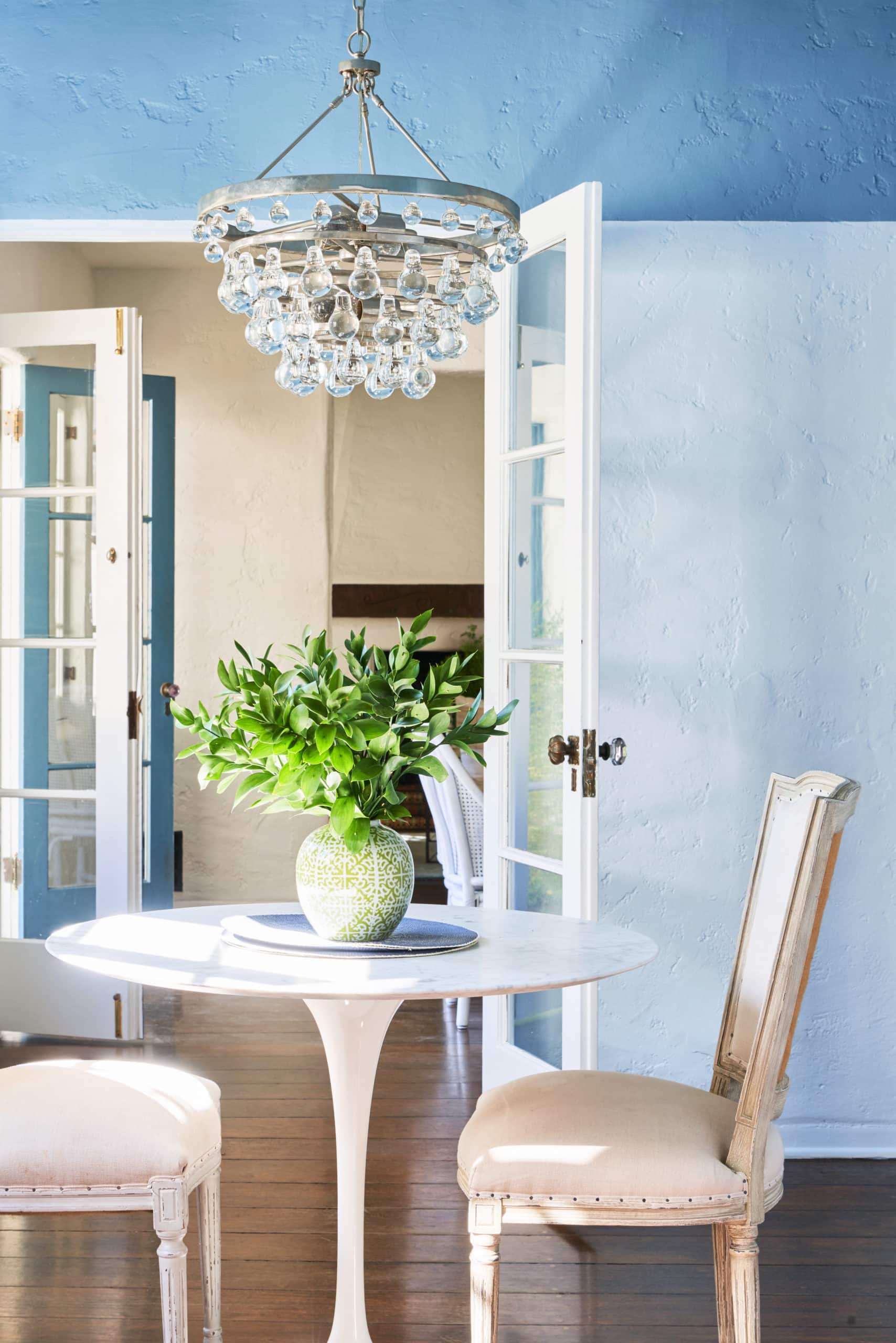
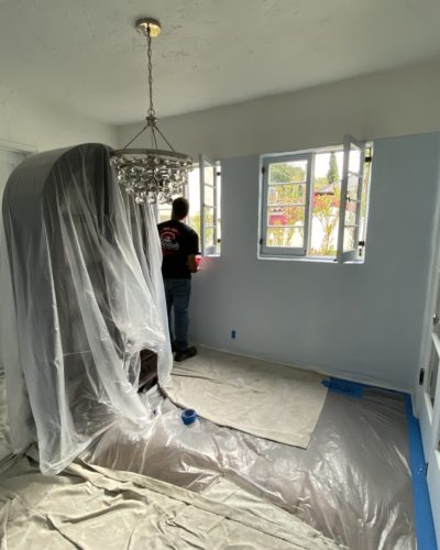
Time for the grand reveal! I went with blue and took it to the next level with a two-tone design for drama. Soft Day is on the walls and Looming Sky is on the ceiling. After seeing how fantastic the blue turned out I can’t believe I was considering pink for a moment. In the end, blue was a perfect choice that really allows this space to shine.
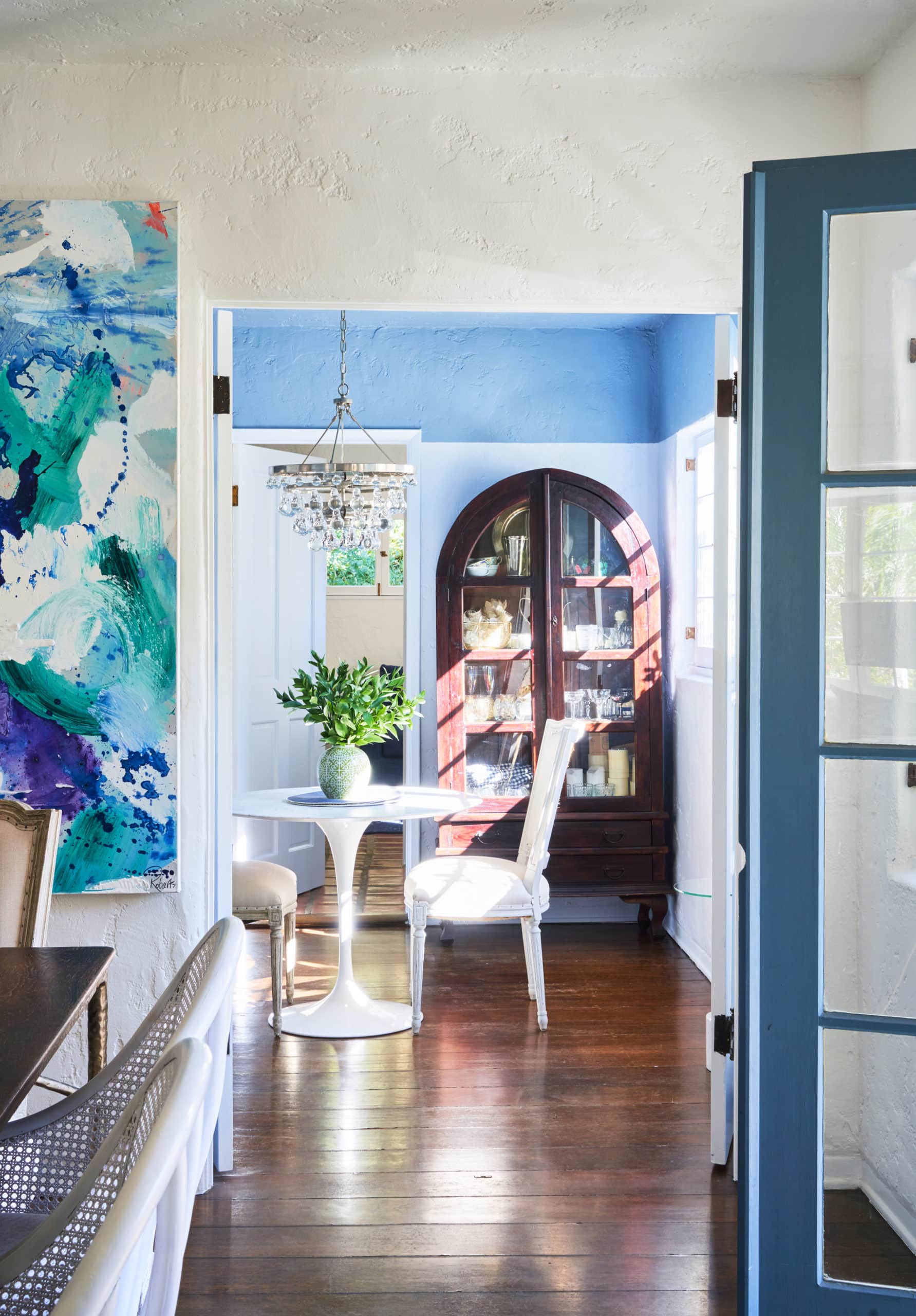
From this angle, you can see how the paint choices were inspired by the painting and how they blend beautifully in the space. I also took it one step further by painting the door and window trim the wall color instead of doing a contrasting color so the room feels fully engulfed in the great blue color.
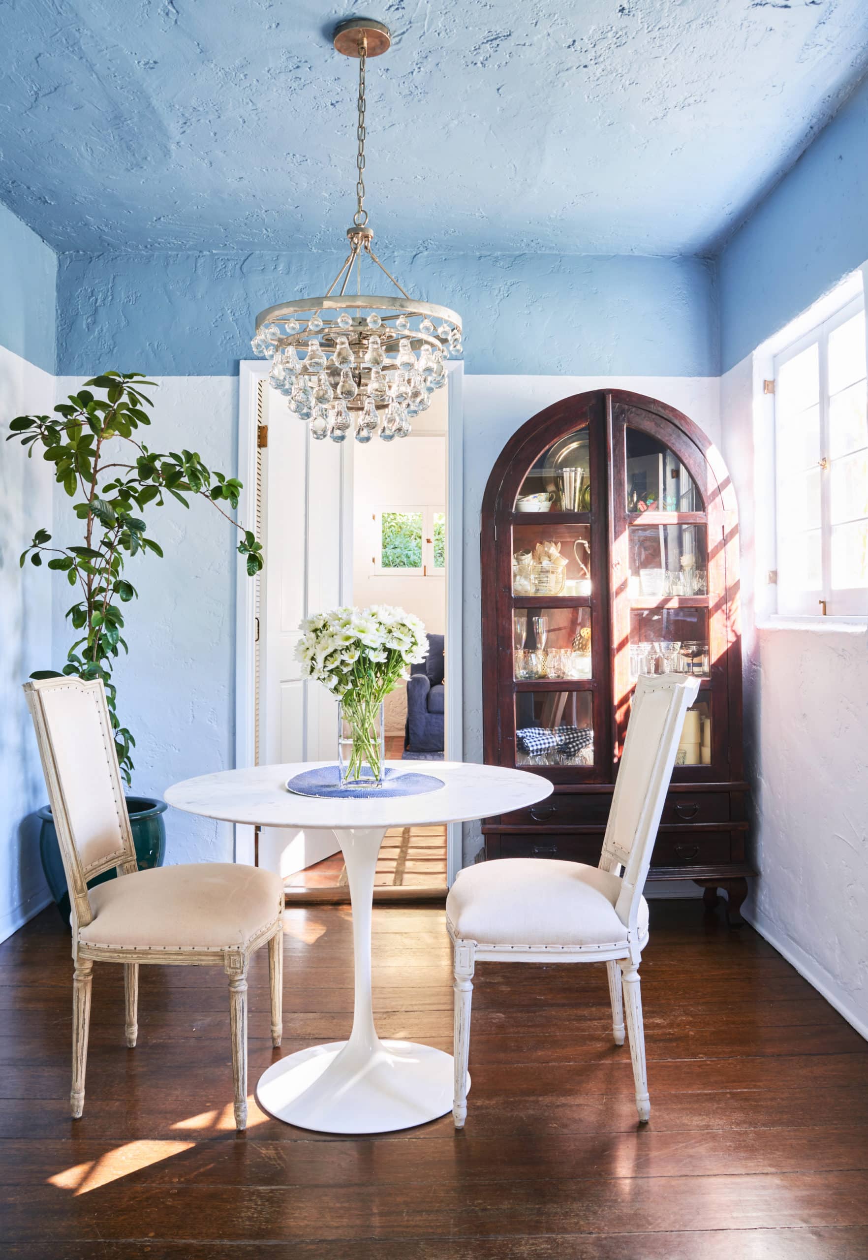
I’m in love with how my breakfast room makeover turned out and I’m so happy I went for the two-toned design. It makes this room infinitely more interesting and full of color. The dark hutch in the corner was a bit overwhelming in the white space. Now that it’s blue it really shines as a contrasting color.
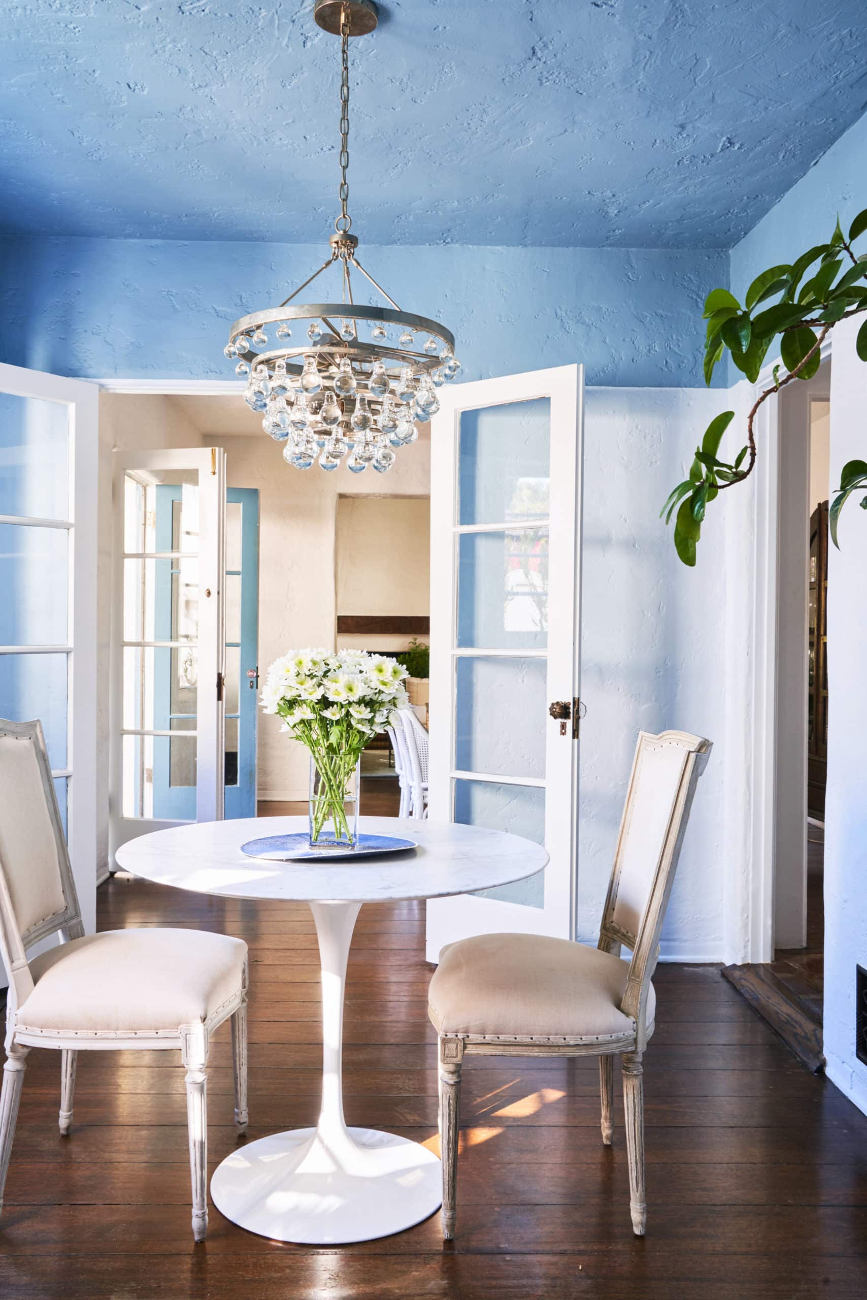
I’m also very glad the idea came up to paint the doors. That helped to really transform this room. Best of all – all of my furniture looks great with the new paint color. One could even argue the furniture looks even better than before.
That’s it for now! I hope you enjoyed seeing my breakfast room makeover and got some inspiration on how paint can easily transform a space. Also, don’t forget to check out Curator’s range of top quality paint for your home makeover!


Beautiful makeover for an already lovely space. Thank you for the info on Curator, too.
Thank you! And my pleasure!
Wow! The paint makes this room look and feel like I’m on a Greek island paradise vacation!