All photos in this post by Coco of Cococozy
The Gentleman’s Study at the Greystone Mansion in Beverly Hills, CA (above)
It has been a week since I was wandering the halls of the historic Greystone estate. Veranda magazine hosted a really fun showcase house there to show off the mansion and the work of several interior designers.
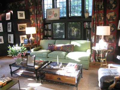
This Gentleman’s Study on the mansion’s first floor was one of the first rooms I saw….a room that was totally mesmerizing. The piece de resistance for this room – the wall covering!
The room felt exactly like what you would imagine a Gentleman’s Study would feel like…a place where a man of men would come to read, ponder, work, brood, and after a dinner would drink cocktails and smoke cigars with his friends. Sophisticated, comfortable, dark and masculine. A manly man’s home office and library.
Okay…I say the room was masculine…but frankly, as a girl, I’d be perfectly happy having that room as my Lady’s Study. If this was my study, here’s what I would do there: I would read and re-read several Jane Austen novels and secretly read a few John Grisham novels too; peruse US Weekly, OK and In Touch magazines for all of the latest dirt; comb over several home decor magazines for ideas; write notes to friends on girly stationery; nap on the comfy upholstered sofas and chairs; pull out my computer and work on Cococozy and aimlessly scan the internet for hours on end; occasionally blast some great Kanye West and start dancing; sit and just stare; map out my next travel adventure on the fabric walls (not writing on them or anything, probably just looking at them and thinking “huh, I wonder if I should go there…or there…or there?”); invite friends over for light snacks and tea (I only do Earl Grey tea with two inches of steamed soy, no foam, and the bag has to be removed after a short bit so as not to make the tea too dark – I know TMI (too much information); after dinner, invite more friends over for more snacks and champagne and for perhaps an episode of “The Bachelor”. 🙂
I am sure the designer didn’t conceive these girly type of endeavors going on in this men’s room when he designed it…but he designed such a cute room…cute girly things could definitely transpire there too!
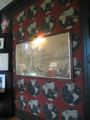
The fabric covered walls with the striking red, black and white map or globe like pattern were so stunning that I actually didn’t notice anything else in the room. Wall covering and curtains were all made of the same “Globe” fabric…creating a bold visual statement.
It seems Los Angeles interior designer Peter Dunham was responsible for the worldly fabric…oh yes, and for the design of the room. Only after I got home did I actually look at my photos and notice that the room was neatly appointed with a large green sofa, some bamboo looking coffee tables, several armchairs, a chaise and lamps…turns out all from Dunham’s store Hollywood at Home.
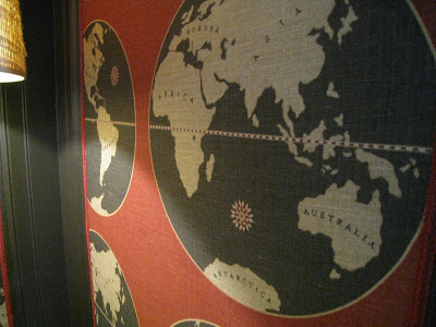
Peter Dunham’s new “Globe” Hand printed Belgian Linen fabric features a repeated pattern of a round world map. Fabric upholstered walls are trimmed with black molding. (above)
Tip: If using wall paper or patterned fabric or a painted design on a wall, do not be afraid to add another layer of pattern in the form of art, wall hangings or mirrors.
GREAT WALLS! A world apart from anything I have ever seen!
Do you like these walls, do you hate? How could you imagine using this “Globe” fabric? Please click on “comments” link below and let me know!
All photos in this post by Coco of Cococozy





I think this room is fabulous and like you I would be very happy doing all those wonderful things us girlies like to do. Would I be brave enough to use this fabric on my walls? Not sure, When it came to the crunch I probably would choose something more……girly!