
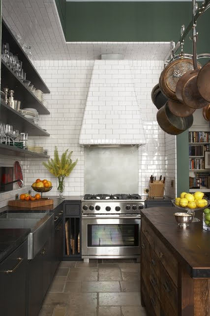
Was browsing through one of my favorite design sites, Remodelista, this morning and saw this cool kitchen from Made, a design firm in NYC.
Thinking a lot about kitchens and cooking lately as I have invited family members over for Christmas! Oh dear… I say oh dear not because of family but because I have not a moment to spare to plan a proper dinner. I have a photo shoot for some fab home furnishings I will be bringing to you in 2011 (I wonder how many of you actually read the blog…if so, you will know that this is the first mention I’ve made of my new venture. By the way, just to clarify, I don’t expect anyone to read my jibberish at all as I am a pictures only type of girl…have had a hard time concentrating long enough to read anything as of late…I have kind of regressed to being 3 year old that can only look at things with big pictures and I have other people tell me what is going on… LOL!). That photo shoot lasts until the week hours of Thursday night/Friday morning…so all my prepping has been focused on that. Christmas dinner will just have to come together…it will! I need an extra set of hands. I really do!
Anyhooooo….love this space, the stone field tile floors, the rustic wood cabinetry, the large island with the pot rack hanging above, the open shelving above the stainless country sink…a warm cozy space with that manages to feel perfectly polished and a little rugged at the same time!
The best part of this kitchen I think is the fully tiled hood with white subway tiles that go up to the ceiling and then onto the ceiling. So cool…I would call this floor-to-ceiling-to-ceiling tiles!
Love this…
What do you think?
Happy Tuesday (still raining here in Los Angeles!)
xo
Coco
Photo: Remodelista





I like the fact that it is asymmetrical but i don’t think it really works in this kitchen – it actually takes away from the lovely flooring and i find that it makes the kitchen appear smaller.
Love it as well – great combination ofvintage and modern feel!!
While this may not appeal to everyone, the border tile design on a high ceiling drops it down giving the room a warmer feeling. Dorothy Durbin Designs
I love this and feel exactly like quintessence- the vintage and modern mix is fabulous!
I love how the kitchen is tiled. I am thinking about tiling an accent wall in my main level poweder room… maybe small rectangular tiles in a herringbone pattern. Thanks for a great post!
oh this crazy rain. I feel like I’m on a movie set. Although I’ll admit, I kind of like having some “real” weather. 🙂
Well, I read what you write and I say “Congratulations” on the expansion of your biz. It makes perfect sense because you have a great eye for style. I can’t wait to see what the whole new venture entails.
shelly leer
modhomeecteacher
lovely. is that a copper countertop on the island?