 |
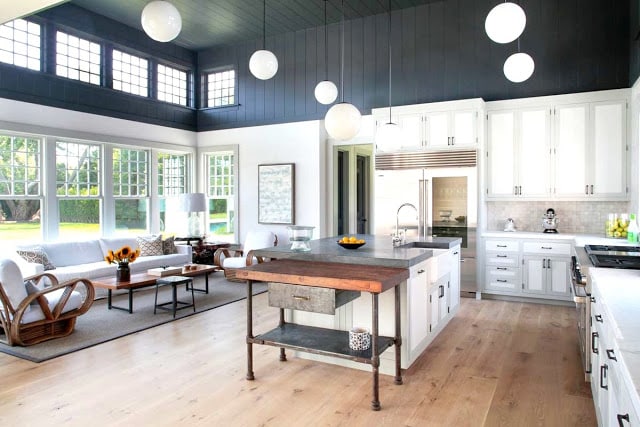
| A color blocked kitchen in gray and white! (above) |
Oooohhh…I like this modern farm style open floor plan kitchen, den, dining room from Dan Scotti Design. Two toned walls and cabinets make a huge design statement. I love the high ceilings, charcoal gray wood paneling and the clerestory windows. So much light but effectively incorporates a rich dark color.
So many styles mixed in one space but they work…the farmhouse style feeling kitchen with its gray (maybe soapstone counters), the rustic country knotty pine wide plank wood floors, the Palm Beach like rattan furniture in the den and then the mid century dining table and Hans Wegner chairs in the dining room. Doesn’t feel like all of those styles should work together but they do.
Nice, bright, airy, convivial space. Perfect for cooking big meals and inviting lots of people over.
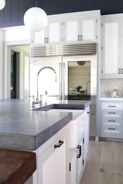 |
| The kitchen island features gray soapstone counters and white cabinet doors framed in a light gray….love the see-through glass door refrigerator too! (above) |
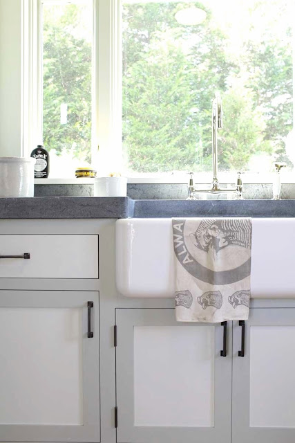 |
| The farm house kitchen sink in white and with a lovely picture window (above) |
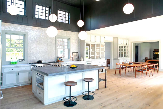 |
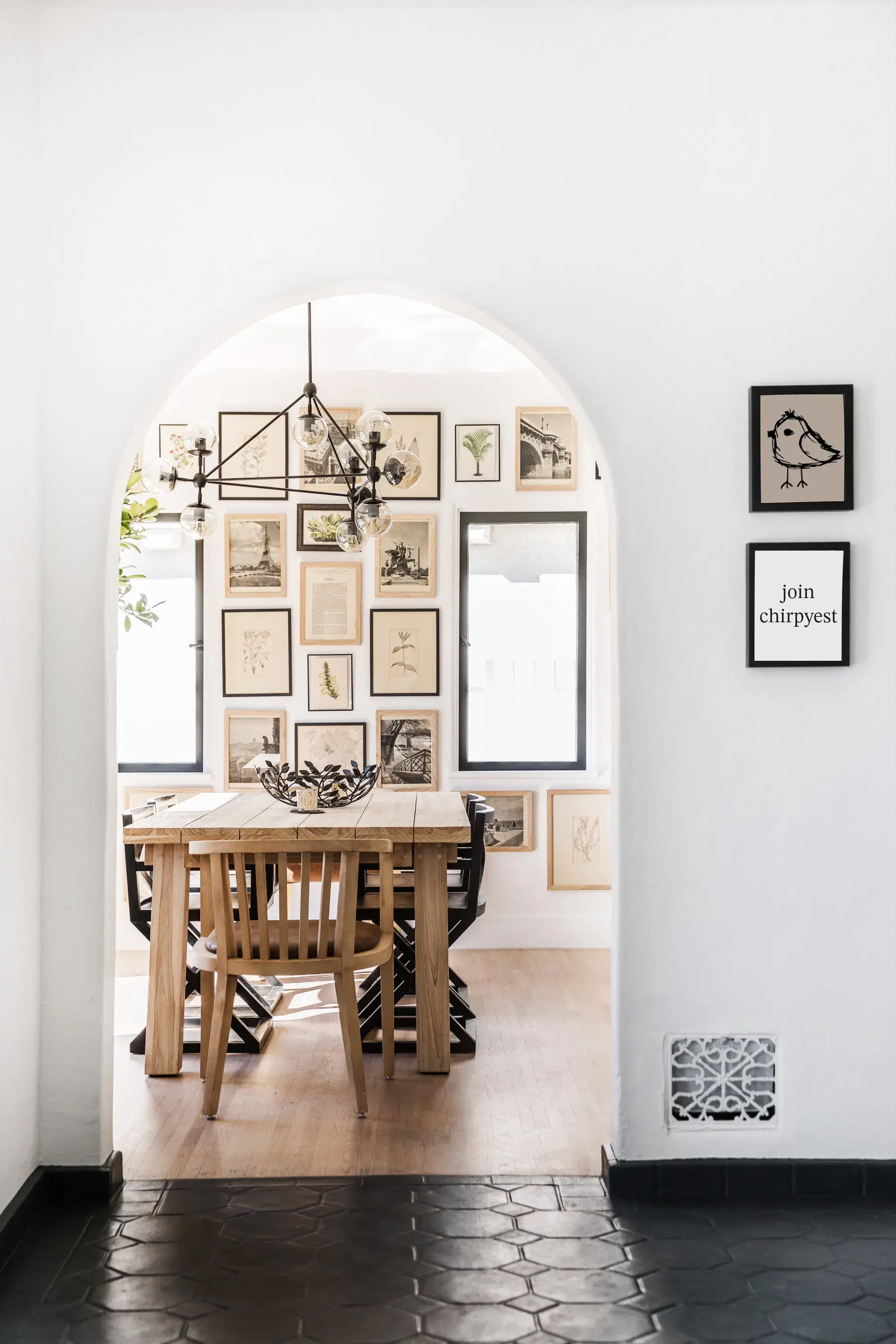
| The kitchen with its knotty pine hardwood floors also opens up to the dining room with a mid-century modern table and Hans Wegner chairs. (above) |
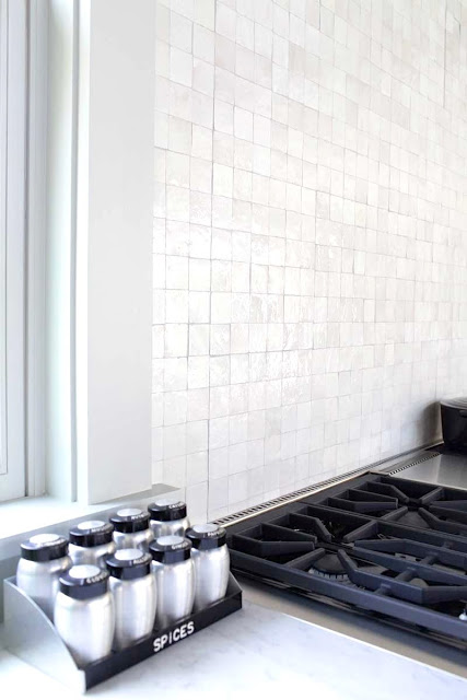 |
| Mosaic tile backsplash covers the wall behind the stove and sink. (above) |
So what do you think of this two toned kitchen? Like or dislike? What might you add to it or take away.
I would leave it as is…although I might change out the round pendant lights…not sure but I might.
Happy Wednesday.
xo
Coco
P.S. Soooo many of you have asked about the turquoise painting in my living room featured on Monday’s post. I went to the artist and will reveal who it is by tomorrow and more of his latest work! Please stand by.
Photos: Dan Scotti Design





Yeah! I can’t wait to find out who the turquoise painting artist is! It is beautiful! Thank you in advance for sharing.
Maybe the counters are polished concrete? Did you see the concrete-like lines in the close-up? Hmmm. Lovely, whatever it is!
A nice compact kitchen.Would look nice in a weekend cottage.
LOVE!
This is gorgeous. Love the soapstone, love the ceiling, LOVE the lighting!
At first I thought I loved it, but I think it would have been much more stunning to have the white go all the way up to the ceiling, not so sure about the cut off line.
Like, Like Like! But I get what you mean about the light fixtures….I like these, but there are so many out there that would also be great. Pinned it!
Good evening, can you tell me the brand color of the charcoal grey paint? Thank you.
Hi! I know I’m really late to the game but I love this kitchen so much. Are you sure the third pic is the same kitchen? I can’t for the life of me figure out where it is supposed to be… Happy New Year 🙂