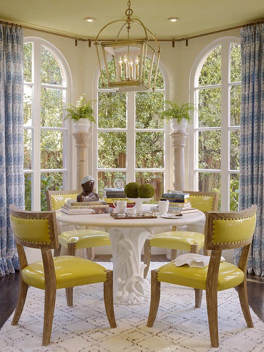
Traditional doesn’t have to be stodgy. See this kitchen and breakfast nook…100%traditional but with a freshness that speaks modern.
I like this cheerful showhouse space composed talented San Francisco interior designer Palmer Weiss. Love the use of yellows and blues and white and brown. A nice combination.
Bright and happy and well appointed.
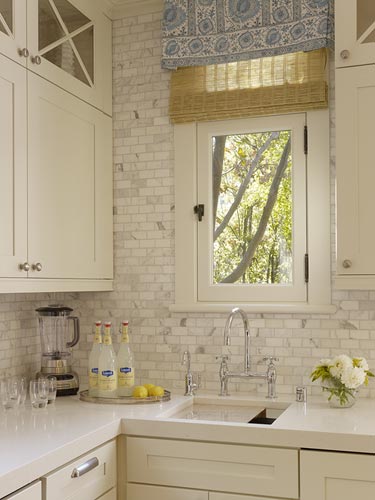
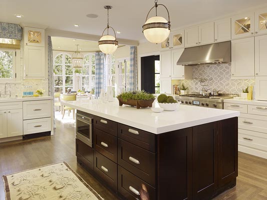
Ceasarstone counters combined with a Carrara marble subway tile backsplash in the kitchen just works…not to mention the great use of the graphic grey Ann Sacks mosaic tile on the stove backsplash!
I can imagine a family enjoying this space.
Happy Monday!
xo
Coco
Photos: Palmer Weiss






Very nice pictures! Reminds me of spring! 🙂
Have a nice day!
Hugs from Lillian, Norway.
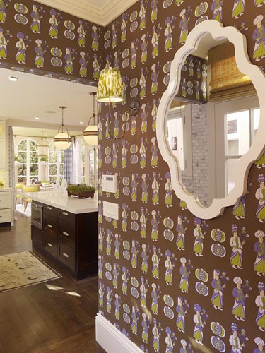
That wallpaper! It’s pretty crazy, but I think I like it. Good colors, which seem pretty unusual/unique for wallpaper.
Love those yellow chairs!
Jennifer
LOVE the backsplash tile behind the sink and the stovetop!!
Loving the feel, it’s the perfect recipe for a cheery, happy space. The countertops, backsplash and stove backsplash tile are perfect compliments.
really beautiful! Happy Monday to you too!
Yes, the Ann Sacks backsplash above the range is the showstopper for me. I will admit that I would rather of seen a different color for the valance and drapes in the nook area, maybe something in yellow to play off the chairs or a fun bright green.
I adore that little corner with the sink – there is something so European countryside about it!
I have to say, I’m not so crazy about the Roman columns the potted plants are sitting on in the breakfast nook. They work with the room, but they are just simply not my taste.
I was lucky enough to see this room in person and meet Palmer Weiss. She is super sweet and the room is beautiful! Love the yellow vinyl chairs and the Katie Ridder wallpaper.
Oh, outstanding decor! Love the kitchen!
xo
Luciane at HomeBunch.com
What great colors, and that backsplash behind the stove, wow!!
I love the tile over the stove, the lights over the island, and the countertops. I do not like the wallpaper or the drapery fabric.
Seriously? This is a showhouse? Not sure why they were trying to go for the vintage look; even the chairs in the breakfast nook were something that immediately reminded me of when I was little in the early ’70s and there’s no need to address the wallpaper. Is this for a retirement community? The lighting, the cabinetry, even the extremely boxy, extremely dark island.
Two thumbs down.
Nice and bright 🙂
http://australiennechic.blogspot.com/
Love the kitchen and the lantern fixture in the breakfast room is fabulous!!
So happy cheery and bright. I personally liked it, its very inviting and isn’t that what a kitchen space should be all about? I love it..thanks for featuring!
I am not a big fan of blue and yellow combinations but I love the bright clean freshness of the rooms-those yellow chairs!
Most of my clients love the traditional style, and it’s fun to see how traditional can be punched up a bit. I love so much of what Palmer Weiss does…she’s pretty genius. Loved this home!
I liked the cool organized look and the white and dark cherry looked good together. Yet, I would have desired to observe some character from some traditional design.
LOVE LOVE the light fixture above the table. Any idea where it is from or who is the manufacturer?
I love the kitchen, very bright and beautiful combination. The wallpaper, well, not my thing but the colors are great -I am just not too much into wallpaper, I like paint because you can switch colors easier, change is my best friend!
Franziska
..I checked out Palmer’s website, very nice stuff 🙂
LOVE the wallpaper!
The yellow chairs are just so chic and updated feeling… Love them! And although the wallpaper, by itself, would not seem like an ideal choice for this kitchen, it really does work when you look at the space, as a whole! I give it two thumbs up!
Love that Draperesque table with the yellow chairs.Exciting choice.